The 10 Best Fonts for Logo Design
Choosing the right font for your company's logo is one of your most important branding decisions. The font conveys the personality and values of your brand and makes a lasting first impression on customers. But with thousands of fonts, how do you narrow the options to find the perfect logo font?
As a branding expert who has worked with hundreds of companies on logo design over the past 15 years, I've identified ten that consistently test well and make for highly effective logo fonts. In this article, I'll walk you through my top 10 best fonts for logo design and branding and give tips on using each font for maximum brand impact.
Statistics show how much font choice affects brand perception – 93% of consumers say they're more likely to trust a company with a professionally designed logo. And the right font is a critical component of logo design. Studies have found that the font alone accounts for around 40% of a logo's impression on viewers.
So, choosing that magical typeface is a big deal. Over the years, I've compiled data on which fonts consumers respond to best in logos across various industries. I'll share that exclusive insight with you here so you can decide which fonts communicate the ideal brand image for your company.
The fonts I'll cover have been strategically selected and vetted for logo design. My recommendations are based on years of working directly with clients to test fonts using focus groups and surveys. I'm excited to share these fonts that have been proven to create compelling brand identities time and time again.
Let's dive in!
Table of Contents
Top 10 Fonts for Logo Design
1 – Helvetica

Helvetica is arguably one of the most ubiquitous and influential sans serif typefaces of the 20th century. Designed in 1957 by Swiss typographers Max Miedinger and Eduard Hoffmann, Helvetica embodied the modern, progressive spirit of the post-war era with its uncompromisingly rational and objective aesthetic.
Unlike earlier grotesque sans serif designs like Akzidenz-Grotesk, Helvetica exhibited purity of line and form, with carefully balanced strokes, subtle curves, and exceptional legibility. This visual clarity and neutrality made Helvetica appealing to the emerging international corporate and design culture in the 1960s and 70s. Major multinational brands like American Apparel, Target, and Jeep adopted Helvetica for logos and advertising, taking advantage of its ability to convey professionalism, reliability and timelessness.
Part of Helvetica's popularity stems from its flexibility and range. While it projects a pared-back, functional image, Helvetica can also take on warmer, more inviting qualities depending on its use. Designers have created endless variations over the decades, playing with weight, italics and colour to give Helvetica a friendlier or more playful personality where appropriate. This chameleonic adaptability explains its enduring appeal over generations of changing aesthetic tastes.
Today, over 50 years since its design, Helvetica remains one of the most ubiquitous fonts, its clean efficiency embodying the pared-down aesthetic of modernism. While some decry its overuse, Helvetica remains an iconic typographic workhorse, its simplicity and legibility lending clarity, authority and visual identity to all designs and mediums.
2 – Futura
Futura, designed by Paul Renner in 1927, is one of the most iconic and influential sans-serif fonts. Its sleek, geometric letterforms epitomise the aesthetics of the Art Deco and Bauhaus movements. Renner sought to create a typeface stripped of all unnecessary decoration and instead derived from simple geometric forms – near-perfect circles, triangles and squares.
This gives Futura its characteristic machine-age look and feel. The round o's pointed t's, and arrow-like v's appear crisp and efficient on the page. The consistent strokes and circular curves lend a sense of balance and symmetry. Uppercase letters are based on pure geometric shapes, while lowercase letters introduce subtle humanist details for improved legibility.
As a geometric sans-serif, Futura has an appearance of rational order and forward-thinking modernity. This made it well-suited for advertising new technologies and transport in the late 1920s and 30s. Futura was employed extensively in promotional material for the Bauhaus school, Volkswagen, and the Berlin metro system.
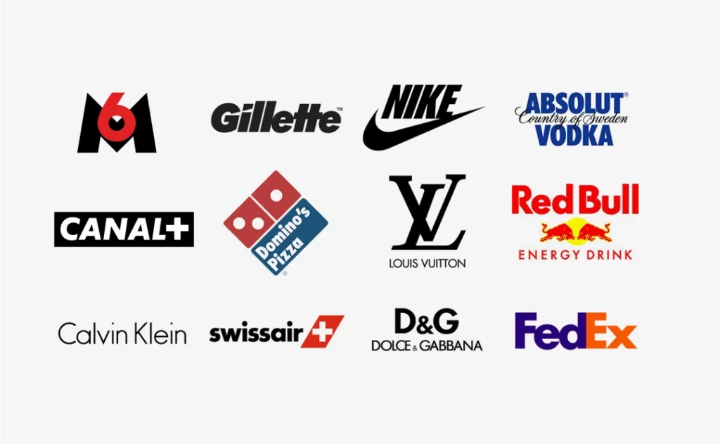
Today, Futura remains a trendy font. Its clean efficiency makes it versatile for display use in logos, headlines, and small text settings. Over 500 corporations, including prominent names like Nike, Gillette, Omega, Nestle and Paypal, use Futura in their brand identities. It conveys modernity, innovation and efficiency.
Futura is truly a classic that has spanned decades. As a timeless geometric sans-serif, it will continue to be a go-to choice when a minimal, contemporary and highly legible typeface is required. Paul Renner's Futura remains one of the most recognisable and influential fonts nearly a century after its creation.
3 – Avenir
Avenir is a sans-serif typeface designed in 1988 by Adrian Frutiger, the acclaimed Swiss typedesigner behind other popular fonts like Univers and Frutiger. The name “Avenir” means “future” in French, reflecting the forward-thinking, modern aesthetic Frutiger sought to create with this clean and streamlined font.
With its excellent legibility and universal appeal, Avenir quickly became a popular font after its release. It has been described as having a neutral yet friendly appearance, making it versatile for many applications. The letterforms are uncomplicated and unfussy, with a relatively low stroke contrast and even spacing between letters. This lends Avenir a very balanced, harmonious look and improves readability.
Subtle details add visual interest and keep Avenir from appearing too stark or cold. For instance, the terminals or ends of the letters have a gentle rounding, adding a softness that counterbalances the directness of the sans-serif style. The ‘t' has a curved tail, and the uppercase ‘G' has a spur, giving it a distinctive personality. Overall, Avenir communicates sophistication and elegance but in an understated way.
Many major corporations have utilised Avenir to express their brand identities. Fashion houses like Dior and Ralph Lauren employ Avenir for a modern, stylish look. Digital-first companies like Linkedin and Aol also use Avenir as their primary font, with its digitally-native features suiting their technology-focused services. Avenir's clean lines and easy readability make it versatile across many media, from logos to websites to printed materials.
Nearly 35 years after its initial release, Avenir feels contemporary, fresh and relevant. Its timeless quality stemming from Frutiger's masterful design ensures Avenir will maintain its popularity and influence far into the future, living up to its name. Avenir's wide use confirms its status as one of the most essential and iconic sans-serif fonts of the late 20th century.
4 – Garamond

Garamond is a timeless and elegant old-style serif font that has endured for centuries as a typographic classic. With its origins dating back to the 16th-century Parisian punchcutter Claude Garamond, this refined French Renaissance typeface continues to captivate designers and readers alike.
The graceful thick and thin strokes accentuating the contrast between Roman and italic letterforms give Garamond a highly legible yet understated beauty. Subtle curled serifs and tails add a touch of delicate decoration that does not overpower the font's fundamental readability. This delicate balance between form and function is why Garamond remains a paragon among serif typefaces.
Garamond's old-style characteristics—the angled stress of its letterforms, moderate stroke contrast, short ascenders and descenders—give it a warm and inviting texture that flatters the page. This makes Garamond an excellent choice for body text, as its refinement does not call undue attention to itself yet adds an air of polished elegance to the reading experience.
The timeless versatility of Garamond has led many major global brands to incorporate it into their visual identity, including companies like Rolex and Abercrombie and Fitch. The font skillfully conveys tradition, trust, and prestige across any medium while remaining highly readable.
After centuries of evolution in printing and design, Garamond endures as a cornerstone serif whose beauty and legibility transcend fleeting typographic trends. Its grace, subtle ornamentation and elegance give this French Renaissance-era typeface an abiding sophistication that continues to influence typography today. Garamond remains a testament to the vision of its originator, Claude Garamond, whose exquisitely balanced letterforms honour the very origins of Western typography.
5 – Gotham
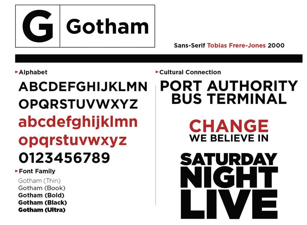
Gotham is a popular, geometric sans serif font inspired by the bold signage found in mid-20th century American architecture. Designed by Tobias Frere-Jones for Hoefler & Co. in 2000, Gotham has a sleek, modern, and urban aesthetic. With its clean lines and lack of flourishes, Gotham projects a straightforward, no-nonsense attitude that came to represent change and progress in the 2000s.
The prominence of Gotham rose significantly when it was chosen as the primary font for Barack Obama's 2008 presidential campaign. Obama's team felt Gotham effectively communicated their platform of hope, forward motion, and bold vision for the future. The font appeared on all of Obama's branding, slogans, posters, and merchandise, helping unify his campaign visually. Gotham became synonymous with Obama's historic presidency and now evokes a sense of contemporary American politics and patriotism.
Outside of politics, significant brands have utilised Gotham to tap into the font's versatility and ability to communicate directness and confidence across applications, from NHL to Red Cross to Virgin Airlines; Gotham's clean lines and minimalist style work as well in headlines and small copy. Gotham suggests sleekness and modernity for today's companies. Even over two decades after its release, Gotham remains one of the most popular and influential fonts, particularly for brands wanting to project boldness and straightforward messaging. Its legacy is tightly tied to the cultural zeitgeist of 21st-century America.
6 – Brandon Grotesque
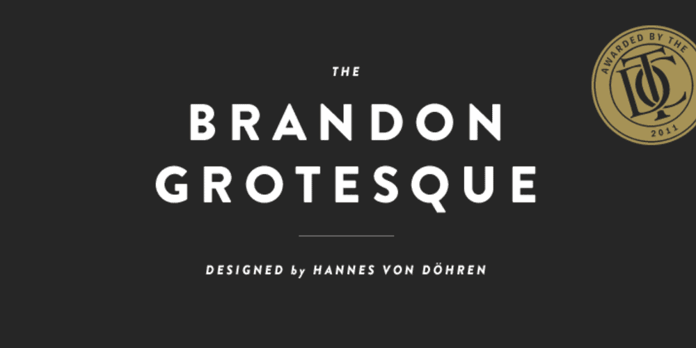
Brandon Grotesque is a charming and vibrant sans-serif typeface that injects a sense of playfulness into any design. Designed by Hannes von Döhren in 2009, this font features subtle rounded corners and a slightly tilted axis that gives it a quirky, off-kilter vibe.
Despite its informal nature, Brandon Grotesque maintains an air of sophistication that allows it to be versatile across many applications. The letterforms are well-balanced with even colour, making Brandon Grotesque highly legible at both large and small sizes. This clarity allows it to work digitally on screens and in print.
With its blend of friendliness and refinement, Brandon Grotesque has attracted some significant brands that aim to connect with audiences in an approachable way. Media conglomerate Comedy Central uses the font for its bold, conversation-starting identity. Creative agency Colossal utilises Brandon Grotesque to convey their fun, innovative spirit. The social media management platform Sprout Social deploys the font to create an open, human presence online.
Brandon Grotesque is an excellent choice for companies and organisations looking to add character and vibrance to their visual identity. Its distinctive personality captures attention while conveying accessibility. Brandon Grotesque is especially well-suited for logos of lifestyle brands, tech startups, creative agencies, and youth-oriented businesses that want to express energy and originality. With its contemporary edge and unconventional appeal, Brandon Grotesque helps brands make connections and leave impressions.
7 – Univers
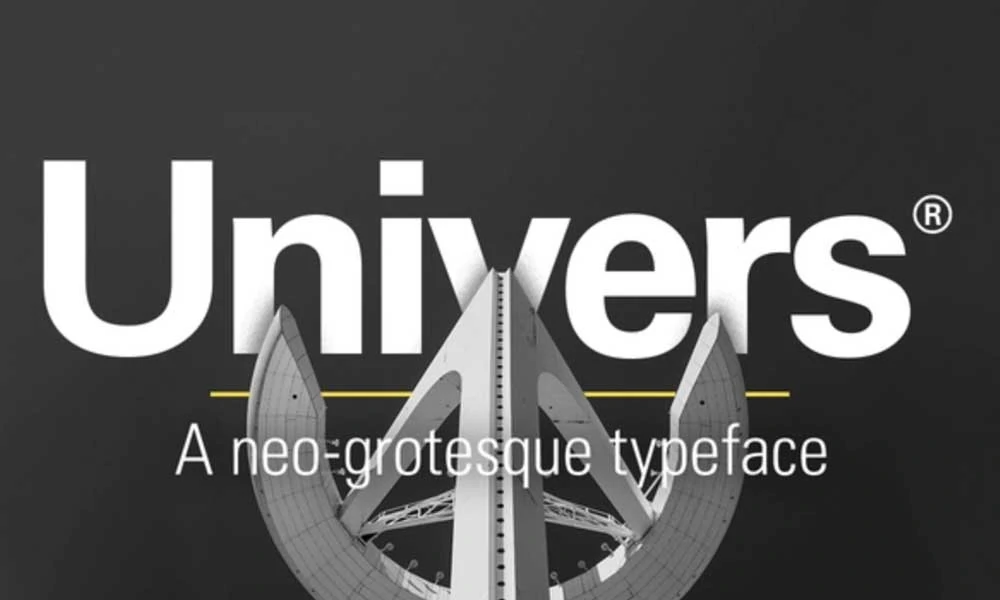
Univers, designed by the renowned Swiss typographer Adrian Frutiger in 1954, was groundbreaking as one of the first complete and consistent font families. With its range of weights and widths, Univers pioneered the idea that a typeface could comprise a diverse yet cohesive family of fonts.
Most fonts stood alone then, with type designers focusing on creating individual, distinct styles. Frutiger's novel approach was to design Univers as a system where all the font variants related and complemented one another. This allowed designers much more typographic flexibility while maintaining visual harmony.
The 21 original fonts of Univers form a neo-grotesque sans-serif family whose hallmark is its geometric construction and purity of line. This precise, rational design evokes concepts of progress and modernity. Univers lends a sense of steadfastness, stability and forward-thinking vision when used in logos.
Univers was an ideal choice to express eBay's contemporary, international outlook when incorporated into its logo in 1996. Despite its systematic geometry, Univers has enough personality in its curved shapes and abrupt cutoffs to make the eBay wordmark distinctive and memorable. The custom modifications also add unique characters.
The balanced, versatile Univers family has proven highly appealing to global companies and organisations. Its mix of universality and quirkiness allows logos to communicate reliability and humanism. Univers remains relevant over half a century after its completion as Frutiger's insightful vision enabled it to transcend its time and continually adapt to new design eras.
8 – Proxima Nova

The Proxima Nova font family, designed by Mark Simonson, has grown to include an impressive 48 different fonts since its initial release in 2005. This highly versatile and expansive family of sans-serif fonts covers various weights, widths, and styles.
Proxima Nova is popular and widely used because of its clean, modern aesthetic and excellent legibility across print, web, and digital interfaces. The rounded terminals and open counters create a smooth, approachable vibe, while the proportions and spacing ensure that words flow smoothly and are easy to parse visually.
In just over 15 years since its debut, Proxima Nova has become one of the most ubiquitous web fonts. It is used on thousands of websites, including major brands like Twitter, Samsung, and eBay. The font works wonderfully for headlines and text blocks, lending a contemporary feel that is still neutral enough for diverse applications, from editorial sites to e-commerce platforms.
Proxima Nova's success stems from its visual appeal and how thoughtfully crafted and versatile the family is. There are multiple weights from thin to extra bold, condensed to wide versions, and alternate styles like italic and small-caps. This allows designers tremendous flexibility in fine-tuning typography for any project.
By offering such a broad spectrum of font variations united by a consistent, recognisable look, the Proxima Nova family has become a go-to choice for graphic designers, web developers, and other creative professionals since it burst onto the scene in the early 2010s. Mark Simonson's creation has become one of the most ubiquitous and popular commercial fonts in contemporary use.
9 – Avant Garde
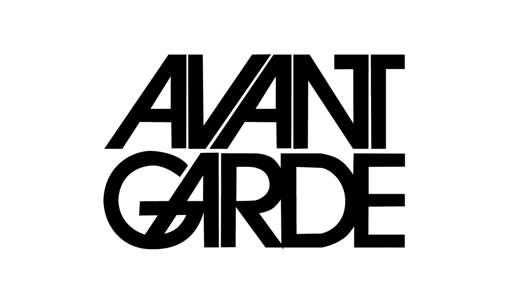
The bold and geometric sans serif font Avante Garde was released in the 1970s, designed by typography legends Herb Lubalin and Tom Carnase. Despite being over 50, Avante Garde has a timeless, cutting-edge look that feels modern in 2023.
With its thick, angular letterforms and unusual shapes like the pointed ‘A' and ‘V', Avante Garde makes a striking, eye-catching statement. This distinct styling has made it a go-to font for brands that want to convey edginess and modernity and push the boundaries of tradition.
Big-name companies like sportswear giant Adidas and real estate firm Remax have used Avante Garde in their logos and branding to communicate their forward-thinking sensibilities. The font's solid geometric shapes and almost futuristic vibe align well with active, youthful companies aiming to shake up their industries.
But beyond just logos, Avante Garde is highly versatile and can be used in all kinds of applications, from packaging to posters, website headers, t-shirt designs and more. Its legibility and ability to command attention make it ideal for delivering bold messaging.
Few fonts were designed in the 20th century, and Avante Garde has aged. Its distinctive look feels as contemporary and boundary-pushing today as it did 50 years ago. Avante Garde maintains its relevance and stands out as a font that can make designs feel cutting-edge, no matter what era they are created in.
10 – Open Sans
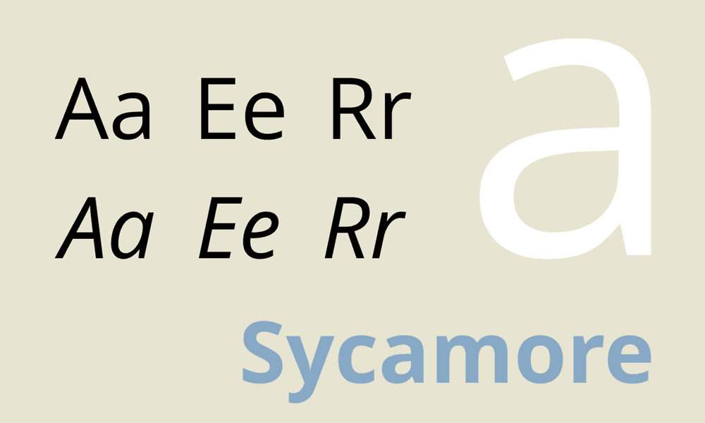
Open Sans is a humanist sans serif font that has become one of the most widely used fonts in the world since its release in 2010. Designed by Steve Mattson for Ascender Corporation and commissioned by Google, Open Sans aims for legibility and neutrality to work across various uses.
Open Sans has an inviting and approachable feel with its open letterforms and subtle curves. The roundness of letters like o, e, and s gives Open Sans a more organic and softer appearance than sharper geometrical sans serifs. This allows text set in Open Sans to be highly readable, even in long passages or small sizes, while retaining a modern and friendly voice.
Open Sans can adapt to many visual identities as a humanist sans serif without strong idiosyncrasies. Variable weights and widths allow it to scale from delicate hairlines to bold headlines. This flexibility has made Open Sans extremely popular for branding, especially in tech and digital media.
Overall, Open Sans has been a hugely successful typeface because it is versatile and legible. Its ubiquity shows how its neutral but warm appearance and excellent readability work well for continuous reading and display settings across desktop, web, mobile, and print. Open Sans proves that contemporary humanist sans can become a modern classic.
How to Choose Fonts for Logo Design
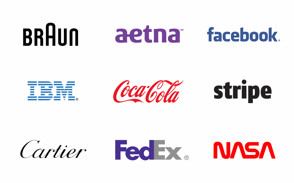
A logo is often the first impression a company makes on potential customers. An effective logo establishes your brand identity through visual elements like colour, shape, and typography. Selecting the right font is crucial for creating a memorable and appropriate symbol. Here are some tips on choosing fonts for logo design:
Consider the Industry and Brand Personality
Font selection should complement your industry and the image you want to portray. For example, tech companies often use sleek, geometric sans serif fonts that give a modern, high-tech feel. In contrast, traditional serif fonts like Times New Roman convey heritage and reliability for law firms or banks. If your brand has a playful, casual personality, you may want a fun handwritten or display font. Make sure the font resonates with your target audience.
Prioritise Legibility and Readability
While you want a stylish font, it should be simple enough that your logo becomes easy to decipher. Avoid intricate script and display fonts with many curlicues in the letterforms—these are best used sparingly as an accent rather than the primary logo typeface. Instead, opt for simple, clean fonts with easily recognisable letterforms. Stay away from fonts with odd spacing that could break up words.
Be Wary of Trendy Fonts
Font trends come and go; you want your logo updated after a few years. Classic, versatile fonts that have stood the test of time are always a safe bet. Trendy fonts also get overused—you want your logo font to be distinctive, not something that blends into the crowd.
Consider Length and Versatility
Ideally, your logo should work in various sizes and contexts—from website headers to product packaging to business cards. Long brand names and slogans may require a condensed font to fit in smaller spaces. On the other hand, a font with wide, spacious letterforms can allow shorter words to breathe. Choose a font family with a good range of weights and styles for flexibility across logo applications.
Review on Screen and in Print
Make sure to view your logo fonts on both digital and print materials. Some intricate fonts don't render well digitally. On the flip side, sans-serif fonts often look best on screen, while serif fonts are more readable in printed materials. View your logo in different sizes and contexts to ensure it's legible.
Choosing the perfect font takes experimentation. Start by narrowing down your industry and brand identity. Compile 2-3 potential font families and view test logos with each. Seeing it used in context often gives a better sense of fit and legibility. With careful font selection, you can design a logo that instantly communicates your brand.
How Many Fonts Should You Use in a Logo?
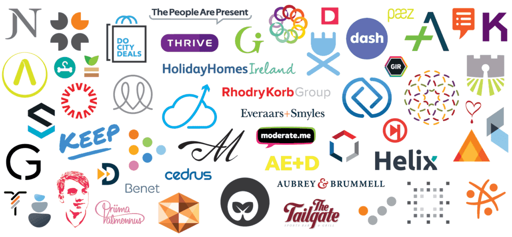
One of the most important decisions when designing a logo is selecting the font or fonts. The number of fonts used impacts the logo's legibility, versatility, and ability to convey the brand identity. While there are no complex rules, experts recommend using only one or two fonts for most logos. Here are some key considerations when deciding on the font(s) for your logo:
- Legibility: The primary purpose of a logo is to present the company or product name in a clear, readable way. Multiple fonts can clutter the design and make it hard to decipher the word. Sticking to one or two easy-to-read fonts keeps the focus on the name itself. Popular font choices for logos include simple sans serifs like Helvetica and Arial.
- Versatility: An effective logo must work across different mediums and sizes – from business cards to billboards. Multiple fonts that look good at a large scale may be illegible when sized down. Limiting one or two fonts creates a more adaptable logo in any format.
- Brand identity: Fonts carry associations that can reinforce or detract from the desired brand image. For example, serif fonts convey tradition, while sans-serif fonts feel more modern. Carefully select a font(s) that align with the personality you want to project. Using just one or two fonts keeps the image cohesive.
- Consistency: Companies aim to present a consistent face to customers across touchpoints. Maintaining the same one or two fonts in the logo, packaging, website, signage, and other branding creates a unified visual identity. This consistency strengthens the recognition of the brand.
- Simplicity: Consumers today are exposed to many marketing messages competing for attention. A logo with too many fonts looks busy and feels confusing. The simpler the design, the more memorable it becomes. One or two thoughtfully chosen fonts keep the logo clean, uncomplicated and recognisable.
In summary, while there are rare exceptions, experts strongly recommend using just one or two fonts in your logo design. Limiting the number of fonts optimises legibility, versatility, brand alignment and recognition. Aim for a simple, focused logo that conveys your company's name and image. With careful font selection, a one or two-font logo can become an iconic signature for your brand.
Conclusion
Selecting the perfect font requires balancing legibility, flexibility, tone, and brand personality. Simple, neutral sans serif fonts like Helvetica and Avenir work for straightforward, professional brands. Elegant serif fonts like Garamond convey tradition and expertise. And geometric, informal fonts like Gotham and Brandon Grotesque create an approachable, youthful effect. Consider the historical context and modern impressions of various fonts during your logo design process. Your typography choices will shape how consumers perceive and interact with your company.
