The Art of Simplicity: Top 10 Minimalist Logos
Minimalism has become a significant trend in logo design over the past decade. Brands are moving away from complicated, cluttered logos and embracing simple, clean designs that convey the essence of their company with just basic shapes and fonts.
But what exactly constitutes a “minimalist” logo? Generally, they contain only the bare essential elements needed to represent a brand. This means no excessive detail, effects, gradients or illustrations. A minimalist logo relies on simple geometric forms, strong lines, custom fonts and negative space to communicate and stand out.
When designed well, minimalist logos can be incredibly eye-catching and memorable. Who hasn’t seen or recognised iconic brands like Nike, Apple, Target or FedEx? Their logos are prime examples of “less is more”.
Intrigued by the power of minimalism? Let’s count down the top 10 most brilliantly minimalist logos that exist today:
Table of Contents
10. Medium
The logo design for Medium, the popular online publishing platform, is simple and eloquent. It uses the basic shapes of an ‘M' formed from ovals and a perfect circle – nothing more. The grayscale colour scheme keeps it minimalist as well.

By using shapes and letters in such a strategic, well-balanced way, Medium evokes feelings of writing and reading. The logo brilliantly reflects the brand’s mission to provide a clean, intuitive publishing tool. Every aspect of it aligns with those core values.
Over 50 million readers have come to rely on Medium’s streamlined interface to consume content. They recognise the platform’s commitment to clutter-free publishing whenever they see this skillfully minimal logo.
9. Muji
Japanese retail company Muji takes a “no-brand” approach to its products and retail stores. Its name even translates to “no brand, quality goods” in Japanese. True to its name, Muji relies on minimalist design to differentiate itself.

Muji’s logo puts this minimalist style on full display. The company’s name is typed out in a thin, sans-serif font. While simple text logos can feel uninspired, Muji’s typography has personality. The font has squared-off edges, giving it a modern, industrial feel.
The letters are also bold and closely stacked, taking up space. This block-style text aligns with the bulkiness of Muji products and shelves. Without any images or symbols, Muji’s logo embodies the brand’s commitment to “no-brand” through scaled-back, functional design.
8. Subway
The famous Subway logo is a classic early example of graphic minimalism. Since its debut in 1968, it has relied solely on the company’s name, coloured bars mimicking a subway line and a yellow arrow forming the letter “U”. Nothing more.
Despite lacking extra elements, the iconic logo has incredible energy. The slanted letters subtly imply forward movement while the arrow drives the eye along. The racing stripes extract the speed from an actual subway. The off-centred, upward orientation connotes ascension and progress.
Such clever use of colour, orientation and typography to express concepts like movement and transportation – without decorative graphics – is the essence of minimalism. Over 50 years later, when people see those parallel yellow and green bands, Subway’s brand instantly comes to mind.
7. Google
The Google logo has become synonymous with uncluttered web design. What started as an amateur type treatment of the name became one of the most iconic logos ever. Its legacy remains a testament to the effectiveness of minimalism.
Compared with search engines of the 1990s featuring cluttered buttons and options, Google’s clean homepage and logo felt revolutionary. The wordmark’s humble, playful look aligned well with the superior simplicity of Google’s interface.
Today, the logo retains that minimalist quality, setting it apart from other tech logos. Millions of searches daily begin with people recognising those modest colours and Quadraat Sans Serif typeface. It shows that with a strong concept, a logo doesn’t need visual stunts to be hugely impactful.
6. FedEx
Sometimes, a minimalist logo can hide unique creativity behind its simplicity. Such is the case for global delivery juggernaut FedEx. At first glance, the FedEx wordmark looks straightforward—bold blue letters with an orange arrow nestled between the “E” and “X”. Nice and clear.
However, observe closer, and you’ll notice the genius hidden “arrow” created by the negative space between the letters “E” and “x”! This second hidden meaning demonstrates the masterful use of negative space and visual puns to add depth to an otherwise ordinary logo.
The FedEx logo is legendary among designers as one of the most clever logos ever made. It incorporates two concepts into one economical design, a superb example of “less is more” done right!
5. Spotify
An energetic logo bursting with musical flair is fitting for new-age music streamer Spotify. Instead, Spotify leans into minimalist aesthetics for an unexpected modern look and feel.

The iconic Spotify logo features circle, square and triangle shapes in fresh Kelly green on a black background. These primary geometric forms reference musical notes and soundwaves. That’s it! Such an abstract treatment fits Spotify’s avant-garde ethos while differentiating it from old-fashioned competitors.
By resisting the temptation to be too literal with musical imagery, Spotify created a versatile icon representing the brand across digital platforms. While some meaning is sacrificed for minimalism, the resulting logo is flexible, ownable and distinctly Spotify.
This ingenious logo proves that embracing minimalism, rather than fighting it, can result in clarity and branding magic. It reflects Spotify as a youthful innovators rather than another streaming service.
4. Nike
In the logo design realm, Nike’s “Swoosh” symbol ranks among the greatest minimalist triumphs ever. The elegant curved check mark encapsulates motion, speed and athletic prowess with a few solid strokes. Nike's Swoosh feels light years ahead compared to shoe company logos cluttered with realism, literal graphics and gradients.
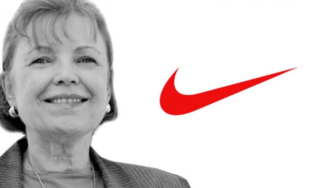
Legend goes that Nike founder Phil Knight originally only paid $35 for the game-changing logo design! Talk about a return on investment. Today, the Swoosh adorns footwear, apparel and equipment as one of the most ubiquitous brand emblems globally.
Clean lines, ideal proportions, brilliant placement – the Nike logo exemplifies everything effective minimalist design should be. It demonstrates the timeless power of simplicity and space to capture energy and emotion. Even among other giants, Nike’s logo stands out as a 1 in 100-year brand mark.
3. Target
Another top brand that nailed minimalism early? Retail superstore Target with its famous red “bullseye” logo. The iconic and inset circles have graced Target locations since 1962, making it one of the longest unchanged logo marks among leading chains.
The balance, space and intense colour combine to form an “on-target” bullseye graphic that instantly sticks in memory. As Target grew from a regional chain to a national staple, the logo emerged as the perfect embodiment of the “discount chic” shopping experience.
Today, Target is the 8th highest revenue-earning retailer globally. That meteoric rise from tiny Midwest stores to mega-brands can be primarily attributed to branding strategies like the minimalist logo. Its simplicity and boldness reflect Target’s “cheaper but cooler” ethos.
2. Apple
Any discussion of minimalism must include tech juggernaut Apple – a master of simplified product design and slimmed-down branding. Apple has relied chiefly on its bitten fruit icon for decades to cultivate its hip, cultured image. But why an apple?
Unlike most iconic logos, the story behind Apple’s is surprisingly random. Early Apple ads featured images of Isaac Newton sitting under an apple tree, but Steve Jobs worried people wouldn’t get it. He demanded something simpler and more universal.
After scrapping complex concepts, the bitten apple emerged arbitrarily as the least complicated option. Yet its clean lines, human touch and absence of tech cues perfectly captured Apple’s pioneer spirit and obsession with simplicity.
Much like Apple’s approach to computers and devices, the company’s logo presents customers with only what is essential– no bells or whistles. Look no further than this forever influential emblem for an excellent example of branding best practices.
1. Mastercard
And lastly, the most ingeniously minimalist logo goes to Mastercard. What started as a fairly basic iteration for the global credit giant has morphed into an exceptional case study for effective “less is more” branding.

In 1969, Mastercard adopted its interlocking red and yellow circles with a central white starburst to attempt a contemporary update. The minimalist concept stuck, withstanding decades of change and propelling Mastercard to become the #1 payment brand globally.
However, it was in 2006 that Mastercard took brand simplification to genius heights. They completely stripped away the name text and the starburst graphic, leaving only the two overlapping coloured circles! This shockingly gutsy move met both scepticism and applause from the marketing world.
However, the elegant, uniform circles perform flawlessly at 14mm sizes while retaining brand recognition. What started as a humble logo redesign resulted in an industry-leading lesson about the power of subtraction. Mastercard’s brilliant embrace of actual “less” qualifies it as the #1 most minimal logo today and tomorrow.
Qualities of Effective Minimalist Logos
Several shared features have risen since spotlighting ten brilliant minimalist logos across industries. What qualities allow them to excel at communicating identity and recognition?
Here are five traits of highly effective minimalist logo design:
Simplicity
Exclude nonessential imagery so only vital brand elements remain. Let space and clean shapes speak.
Symbolism
Infuse geometric forms with meaning that captures a brand's values, strengths or purpose.
Custom Typography
Make strong word marks more unique through customised fonts, spacing, orientation and alignments.
Conceptual
Clever concepts like visual double meanings, negative space or cultural cues give energy to minimalist logos.
Scalability
Remain effective at all print and digital applications, including minimal resolutions.
More Minimalist Logo Inspiration
Sold on the fascinating appeal of minimalist logos? Here are five more excellent examples to admire:
1. IKEA
This Scandinavian furniture giant keeps true to the brand’s Swedish roots with Nordic blue and yellow colours. Clean lines and simple shapes feel friendly and practical—echoing an accessible, functional shopping experience.

2. Amazon
Amazon's simple logo doesn’t try to be overly complex to convey books or retail. Instead, it uses familiarity with the company name and a clever arrow from A to Z to imply selection. The smiling arrow also hints at customer satisfaction.
3. Samsung
Samsung Electronics elongates and bends its name to form an abstract oval symbol, representing power and reliability. Simple yet strong!
4. Adidas
Iconic Adidas Originals trefoil references founder Adolf “Adi” Dassler’s dedication to quality, durability and performance without excessive detail.
5. LG
At first glance, many wonder about these simple letters forming the electronics company LG. But looking closer reveals a charming visual secret—the L and G shapes hiding a friendly, winking face! Clever damaging space strikes again!
Key Takeaways
After reflecting on these diverse but skillfully crafted minimalist logos, several key learnings present themselves:
Keys to executing highly effective minimalist logo design include:
- Hone in on the absolute core visual essentials during the logo creation process
- Embrace space rather than fearing it—use it thoughtfully
- Spotlight typography by minimising decorative elements
- infuse straightforward geometric shapes with deeper symbolic meaning
- Consider visual tricks like negative space, illusion or cultural cues to add extra dimensions
Benefits gained from adopting a minimalist logo style
- Instantly noticeable and highly memorable brand recognition
- Derive energy and motion from clean lines and directional forces
- Conveys style and sophistication for the modern era, capturing consumer sentiments
- Scales consistently across endless brand applications from mobile to environmental
- Future-proofs a brand by offering aesthetic and conceptual flexibility over decades
As renowned designer John Maeda put it:
“Minimalism is not a lack of something. It’s simply the perfect amount of something.”
These ten logos indeed prove Maeda’s philosophy to be true!
FAQs
Still hungry for more minimalist design wisdom? Check out these common logo questions:
What makes a minimalist logo more engaging and memorable than complex image-heavy logos?
Simplified logos excel at capturing attention because they offer visual clarity and breathing room. Our brains process graphics more efficiently when the composition isn’t overloaded. Space to rest the eyes also makes minimalist logos more striking. Clean shapes keep the focus on the branding.
What core elements must a minimalist logo contain to achieve strong brand recognition?
1 – Thoughtful, strategic use of colour
2 – Custom, memorable typography and symbols
Vibrant, on-brand colours repeated over decades of products sink them deep into customer memory. And even if shapes/icons evolve, maintaining the same font or wordmark keeps minimalist logos forever recognisable.
Should every business adopt a minimalist approach?
Generally, minimalism universally helps logos stand out while remaining professional. But in some unique cases, companies want folksy, sentimental marks that directly represent their offering. Think bakeries or pet services. Here, illustrative/photographic logos resonate better with their customer demographics.
How can overly simple logos still tell a story or reflect important brand traits?
Minimalism doesn’t have to mean boring! Clever concepts like visual double meanings, negative space, specific shapes or suggestive imagery allow straightforward logos to communicate more profound stories. For example, the arrow in Amazon’s smile links to selection/delivery, while Google’s playful colours hint at its friendly corporate culture. Even fundamental logos can pack personality through strategic intent during the design process!
Should I change my existing elaborate logo to embrace minimalism?
If your logo is ageing poorly or fails to reflect modern branding, consider adopting minimalism through gradual logo evolution versus complete revolution. However, dramatic pivots risk damaging brand equity. Evaluate logo recognition studies first if awareness remains strong, and then lean into iconography in creative new ways versus abandoning legacy designs outright in the name of trendiness. Take a balanced, strategic approach.
