Everywhere we look—be it websites, billboards, or business cards—we encounter fonts. Think of them as the attire for our words.
Fonts craft an ambiance, establish a mood, and convey a brand’s essence. Much like our clothing reflects our personality, fonts narrate a tale for our content. Their role? Absolutely pivotal.
Shifting focus to a trending style: retro fonts. Recall those classic soda labels or cinematic posters from the 1950s? Their charm is rekindled, only now in the realm of pixels.
Modern-day brands and creative minds are journeying back in design time, rejuvenating these vintage treasures. What’s sparking this renaissance? Let’s explore further.
Understanding Vintage Fonts
Definition and Characteristics
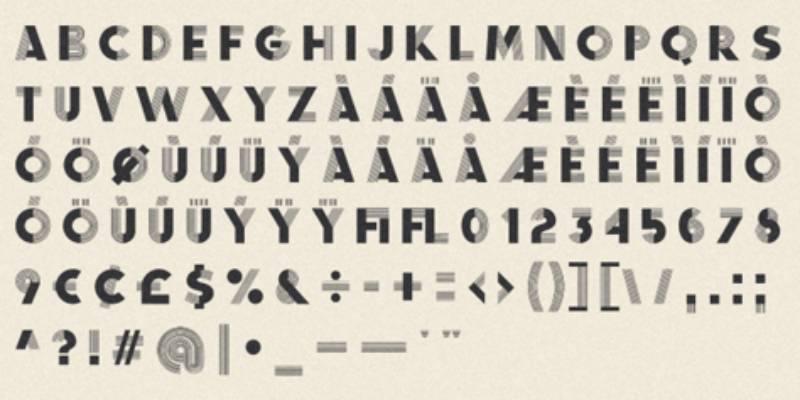
Okay, so vintage fonts. What are they, really? They’re the fonts that transport you back in time. They might have a worn, weathered look, or they might just echo the design styles of days gone by.
They’re like that old vinyl record – classic, timeless, and full of stories.
Think of intricate details, faded colors, ornate embellishments. Some are loud and bold, others soft and subdued. They’re not just old; they’re gold.
Historical Context and Evolution
Imagine it’s the roaring ’20s. Jazz music is everywhere, flapper dresses are in, and Art Deco is the design style everyone’s obsessed with. Those bold lines, geometric shapes? Yep, they influenced fonts too.
Fast forward to the ’50s. Think of diners, neon signs, and jukeboxes. Those swanky, curvy fonts on signs? That’s mid-century design making its mark.
Now, come back to the present. The digital era. The past is knocking on the door, and we’re answering. These bygone eras are now influencing our modern designs. We’ve taken what’s old, given it a twist, and made it new again.
Popular Vintage Fonts You Can Use
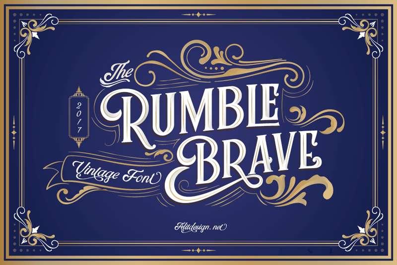
This collection gracefully merges Vintage with Victorian Classic elements. It offers three font styles: serif, script, and dingbat, coupled with ornamental designs featuring gradient variations.
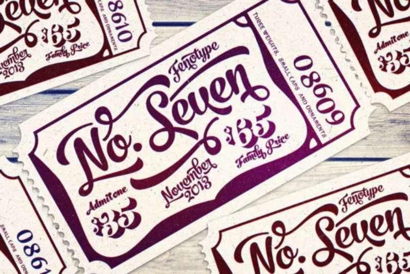
A vintage font radiating timeless elegance and class, No.Seven draws inspiration from classic typography, setting the stage for a refined aesthetic.
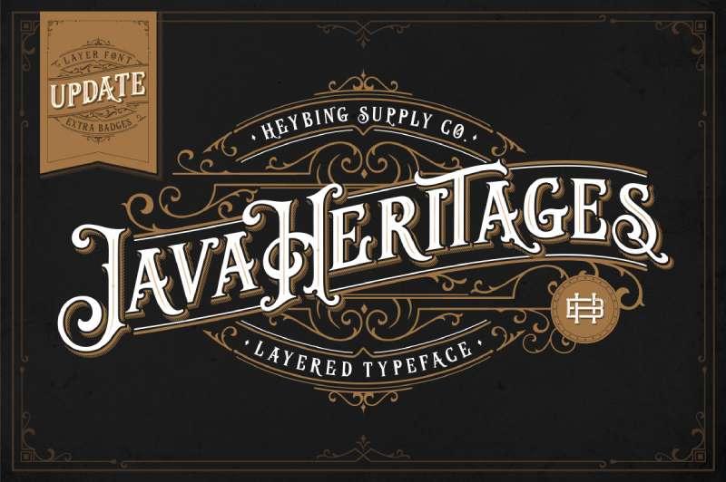
Java Heritages provides a handcrafted, vintage ambiance deeply influenced by the Art Deco era. It also comes enhanced with bonus features like ornaments and frames.
S&S Nickson presents a diverse vintage font ensemble comprising serif and script versions. Its retro essence makes it apt for an extensive array of design endeavors.
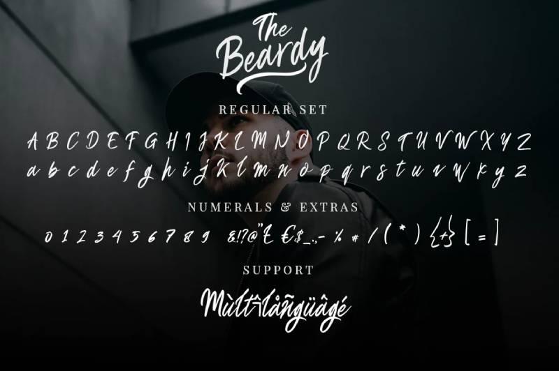
Bold, rugged, and inherently vintage, The Beardy takes cues from traditional signage, becoming an ideal pick for striking headlines.
Budge seamlessly weaves vintage charm with contemporary elements. Its pristine and graceful structure makes it apt for a spectrum of design works.
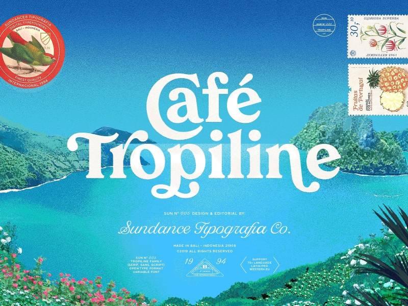
Tropiline embodies a vintage spirit infused with a retro tropical aura. With its serif and script variations, it’s tailored for designs evoking nostalgia.
Creative Vintage Serif and Script Fonts
A collection that brings forth an assortment of vintage serif and script fonts, each with its distinctive style, ensuring an array of imaginative design solutions.
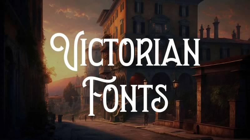
Drawing inspiration from the intricate designs of the Victorian era, this collection brings to life ornate and decorative vintage fonts, adding a sophisticated touch to your projects.
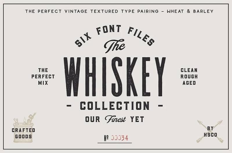
Immerse in the Prohibitionist era’s essence with this vintage font set, echoing the aesthetics of vintage whiskey labels.
Why Choose Vintage Fonts?
Timeless Appeal
Vintage fonts have this charm that never fades. They’ve stood the test of time. And just like that leather jacket in your closet that never goes out of style, these fonts always feel relevant. There’s this universal appeal that just doesn’t wane. Everyone, from millennials to boomers, can connect with them in some way.
Versatility in Design
Think vintage fonts are just for retro projects? Think again! They’re popping up everywhere: modern websites, hipster cafe menus, even tech startups’ branding.
They can be classy or casual. High-end brand? There’s a vintage font for that. DIY blog? There’s a vintage font for that too.
Emotional and Nostalgic Connection
There’s something magical about nostalgia. It tugs at our heartstrings, evoking memories and emotions. That’s the power of vintage fonts.
They remind us of simpler times, of stories our grandparents told us, of childhood memories. Using them in design taps into this emotion, creating a connection that’s more than just visual. It’s visceral. It’s like flipping through an old photo album, feeling all warm and fuzzy inside.
Popular Vintage Font Styles
Serif and Slab Serif
Serif fonts have these tiny little “feet” or extensions at the ends of their letters. It’s like each letter has its own pair of fancy shoes. These give off a classic, traditional feel. Ever seen a fancy invitation or a book cover? Chances are, you’ve seen a serif font.
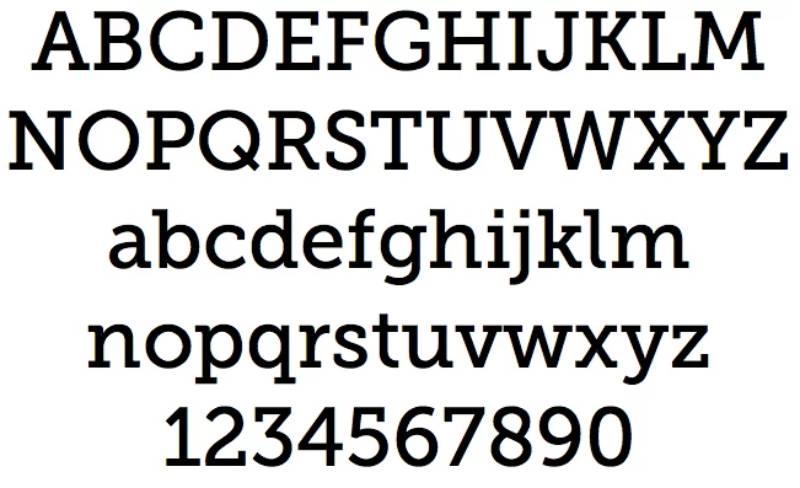
Then, there’s slab serif. These are like the bolder, chunkier siblings of serif fonts. Think of them as the weightlifters in the font family. These chunky extensions add a more robust and modern vibe. Great for making bold statements!
Script and Hand-lettered
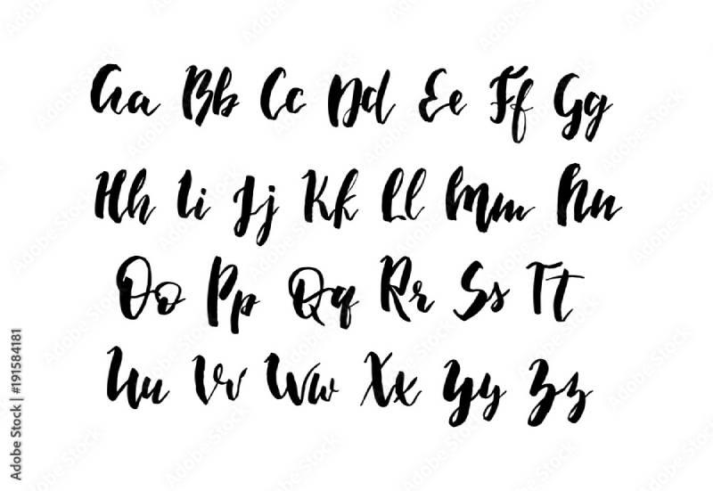
Alright, imagine someone with super neat handwriting decided to turn their style into a font. That’s script fonts for ya. They flow, they’re elegant, kinda like calligraphy. Perfect for anything that needs a touch of class or femininity.
On the other side of the spectrum, we got hand-lettered fonts. They’re like the doodles of the font world. Casual, free, like a handwritten note from a friend. Great for informal settings or to add a personal touch.
Display and Decorative
Now these, these are the rockstars of the font world. Display fonts are made to be seen. They’re not shy. Bold, quirky, unique – they want to stand out. Perfect for headers, logos, or anywhere you wanna grab attention.
Decorative fonts, well, they’re in the name. They’re all about the bling. Crazy designs, patterns, and sometimes even a tad over the top. But in the right setting? They shine!
Top Sources to Find Vintage Fonts
1001Fonts: A Diverse Collection
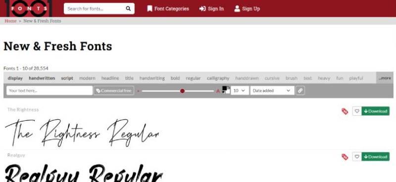
Man, if fonts were candy, 1001Fonts would be a massive candy store. You want vintage fonts? They got loads. Dive into their vast collection, and you’ll find something that hits the spot.
DaFont: From Classic to Quirky
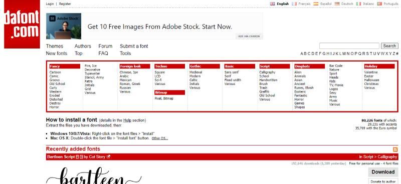
Ever been on a hunt and stumbled upon a treasure chest? DaFont feels like that.
FontSpace: Curated by Real People
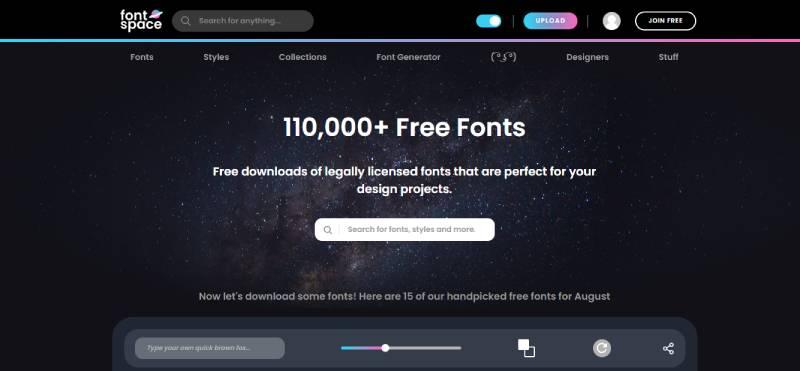
What’s cooler than a font website? A font website where real humans curate the collection. FontSpace is that cool kid in class who always knows the trends. Their vintage fonts? Top-notch.
Freepik: Travel Back in Time

While Freepik is known for its graphics and vectors, they’ve got a secret stash of vintage fonts too. Like a trip down memory lane, their collection is a throwback to the good old days.
BeFonts: From Retro to Modern
Want to dance between decades? BeFonts lets you do just that. From the swingin’ ’60s to the radical ’80s, they’ve got a font for every era.
Tips for Using Vintage Fonts
Pairing Vintage with Modern Fonts
Okay, imagine vintage fonts are like cheese. Delicious on their own, but pair them with the right wine (or in this case, a modern font), and it’s a match made in heaven. Play around, mix and match, find that perfect combo that makes your design pop.
Look at tattoo websites, for example. Usually, the use a mix of vintage and modern fonts and it looks amazing.
Considering Readability and Accessibility
Cool fonts are, well, cool. But if folks can’t read them, what’s the point? Always keep readability in mind. Big headers? Sure, go wild. But for long texts, make sure it’s easy on the eyes.
Using Vintage Fonts for Branding
Here’s a secret. Vintage fonts can give your brand a unique identity. They tell a story, evoke emotions, and create an instant connection. Whether you’re a coffee shop or a tech startup, there’s a vintage font out there that can define your brand’s voice.
Legal Considerations
Understanding Font Licensing
When you grab a font, it’s like adopting a pet. There are some rules and care instructions that come along with it. That’s what font licensing is all about. Just because you found a dope vintage font online, doesn’t mean you can use it however you want.
Think of it this way: Fonts are art, right? Artists, they need to eat too! Licensing helps ensure that artists get credit (and bread) for their hard work. So, every time you want to use a font, especially in commercial work, make sure you have the rights.
Free vs. Paid: What’s the Difference?
Moolah makes the world go ’round. With vintage fonts, you’ll stumble across both free and paid options.
Free fonts? Awesome for personal projects or when you’re on a tight budget. But here’s the kicker: Some free fonts come with strings attached, especially when you’re diving into commercial projects.
Paid fonts, on the flip side, often come with more perks. Think extended character sets, better quality, and sometimes, a warm, fuzzy feeling that you’ve supported a designer out there.
To break it down:
- Free Fonts: Great for personal use, but tread carefully with commercial projects.
- Paid Fonts: More features, professional feel, and you’re supporting someone’s art. Win-win!
FAQ about Vintage Fonts
What’s a vintage font anyway?
Man, vintage fonts are just like a trip down memory lane. Think of those old-school movie posters, 50’s diners, and stuff your grandpa might’ve written in his journal.
They’ve got that classic, nostalgic feel, you know? These fonts usually have those distinct characteristics that transport you to a different era. It’s like they’ve got the essence of the past captured in each letter.
Are they all from the same era?
“Vintage” covers a broad range of time periods. You’ve got your Victorian era fonts, the roaring 20’s, the funky 60’s… all the way up to the flashy 80’s.
Can I use them for my business?
Totally! Vintage fonts can give your brand a unique and nostalgic vibe. Just make sure it aligns with your brand identity. For instance, if you’re opening up a retro cafe or a shop selling vinyl records, these fonts can be your best buddies.
But if you’re all about futuristic tech? Might be a mismatch. Always consider the message you want to convey.
Are they free?
Well, my friend, it depends. There are loads of free vintage fonts on the internet. Websites like Dafont and Font Squirrel? Gold mines.
But if you’re looking for something really specific or unique, you might have to shell out some bucks. Always double-check the licensing though, especially for commercial use.
Any popular ones I should know?
Oh yeah! Some classics include “Baskerville”, “Goudy Bookletter 1911”, and “Bodoni”. And don’t forget “Futura” even though it’s kinda leaning to the modern side, it’s got that vintage charm. You’ve probably seen them around without even realizing.
How do they differ from modern fonts?
Great question! Vintage fonts have more ornamentation, curvier lines, and sometimes even more dramatic contrasts in their strokes. They echo the design aesthetics of their respective eras.
On the other hand, modern fonts? They tend to be cleaner, simpler, more minimalistic. It’s like comparing a classic Mustang to a Tesla – both cool, just different vibes.
Can I mix vintage with modern fonts?
Mixing? Absolutely! It’s like blending old-school rock with modern beats. But you gotta be careful – ensure they complement and don’t clash. Balance is key.
Maybe use the vintage font for headings and a modern one for body text. Remember, you’re creating an experience for the reader. You want harmonious, not chaotic.
Do they work for logos?
Oh, for sure! Vintage fonts can give your logo a timeless feel. It shouts ‘established’ and ‘trustworthy’. I mean, think of brands like Coca-Cola or Ford.
Their fonts? Timeless. But again, it’s about what your brand stands for. If you’re going for a classic, enduring vibe, vintage fonts can be your jam.
What about legibility?
Legibility’s a biggie. Some vintage fonts, with all their flair and flourish, can be a tad tricky to read, especially at smaller sizes. Always, always test it out.
Make sure your audience can easily read what you’re putting out there, whether it’s on a business card or a billboard.
How do I choose the right one?
Ahh, the million-dollar question. First off, think of the mood you’re going for. Is it classy 20’s or groovy 70’s? Then, consider the context: Is it for a book cover? A wedding invite? Maybe a wedding website? Or maybe you’re using it in home décor to add a vintage message on the wall.
Conclusion
Venturing into the realm of vintage fonts feels like donning an old, yet stylish leather jacket. Even if it hails from yesteryears, it exudes unmatched elegance when worn.
These fonts encapsulate nostalgia. They reminisce about bygone times, whether it’s through their intricate curves, distinctive edges, or the aura they emit. They’re not just typefaces; they’re timeless relics.
Utilizing a vintage font isn’t merely a design choice; it’s an ode to history, tales of yore, and the journey of design.
Every design endeavor has a unique essence. Just as DJs select the perfect track to set the mood, designers should be discerning about their font selections. Vintage typography is a fantastic asset, but it must align with the project’s spirit.
Visualize a vintage typeface on a sleek, modern app—feels out of place, right?
A few pointers:
- Understand Your Project’s Essence: Is it laid-back or formal? Retro or futuristic? This insight steers your typography choices.
- Experiment Vigilantly: Before finalizing, experiment with the font’s appearance in diverse settings, sizes, and hues.
- Embrace Minimalism: Though it’s tempting to indulge, occasionally a touch of vintage for headings, complemented by a simple font for body content, works wonders.
Always trust your instincts. If a font feels harmonious, embrace it; if not, reevaluate.
About the Author

Bogdan Sandu
Bogdan is a designer and editor at DesignYourWay. He's reading design books the same way a hamster eats carrots, and talks all the time about trends, best practices and design principles.