Ultimate Guide to Gaming Website Design
The outlook of your fun-based portal is more important than you think. All platforms serve particular goals that are similar in most industries:
- Being helpful to people (information, digital entertainment, etc.)
- Investing in a brand and gaining better recognition
- Promoting products and increasing traffic
- Etc.
Talking about gaming website design reveals all that through colours, contrast, shape, symmetry… Let's list essential elements vital for improving or building a new project.
Table of Contents
Difference Between Good And Bad Design
What do poor-styled video game websites look like? Here are three tell-tale signs that something is wrong and needs improvement:
- Outdated fonts that used to be popular somewhere in the 90s
- A wild mixture of not matching colours that confuse and doesn’t serve any purpose
- Too much info on the screen with not enough white space
Game development is not only about creating a platform. It’s vital to know how to attract people. Even a good one will be ignored if published on a portal with poor design. Let’s have a look at what aspects matter.
Create A Gaming Website: 8 Tips In Mind
Know Your Audience
This is one of the most fundamental things to do for any portal. It is necessary for advertising and promoting strategies. You’ll use various ads to attract more people to your platform. It won’t be effective without an average portrait of interested people. You’ll focus on everyone, which won’t bring as many people to you as you want.
Which is better: 15,000 random users or 1,500 game-oriented ones? If you target the second group, you’ll get better results. Having paid for fewer ads, you’ll still attract more people. Focus on those who are potentially interested in the entertainment you offer.
Defining the critical preferences of your audience has an additional advantage. You’ll know what games each group likes and create group-oriented pages. Imagine you want to add an intellectual puzzle to your portal. And you already know who will most likely be fascinated by it. For example, older players who like mental challenges. Then you target this group, generate traffic, and enjoy excellent metrics.
There are many guides on identifying and describing your audience in detail. Do it yourself or delegate this task to someone who can do it professionally. Check out this video if you decide to do marketing research.
Be Creative

Your platform must be ideal for attracting users for digital fun. If you’re its creator, make sure you plan every detail. From colours to the interface layout and the distribution of icons. And if you delegate this task to someone else, describe your portal’s design vision clearly. Check out this video to get an inspiration boost. It features the best templates to be used this year. But don’t forget about a creative element, too. Think about adding something that will help you stand out among your competitors. This example of a game art studio has nailed the task perfectly.
Kizi’s main page has all the necessary elements. Top-rated video games are the focus, classification is convenient, and navigation – is easy. Viewers enjoy big-screened previews of trendy options to see what it’s like. But the most crucial element is their charming mascot – an awesome green dragon. It likes to play, so it invites the website’s visitors to amusing toys. By the way, this resource has been recently redesigned. It used to lack some of its now shining features. The renovation feels satisfying and makes your pastime here pleasant.
Right now, the most popular adventures are Traffic Jam 3D, Real Bus Simulator 3D, and Twerk Run. They can be launched right from the main page. Just click on the title you like to run it right through your browser. It’s so cool to provide people with toys that are so easy to access! If you make something similar, it’ll be a fantastic pastime zone!
Choose A Cool Colour Palette

Here is a free tip to make the best portal: communicate through colours. Pick a unique hue scheme that no one else uses. But be careful: too many of them will lead to a confusing effect. People won’t know what to look at. So they’ll leave and search for a less toxic place instead. But if you use them wisely, you’ll emphasise certain page parts. For instance, the subscription button.
There are some nuances in the text contrast, too. It should be obvious enough for pleasant reading. As a rule, a good designer knows all this stuff. Just keep an eye on this aspect during the development stage.
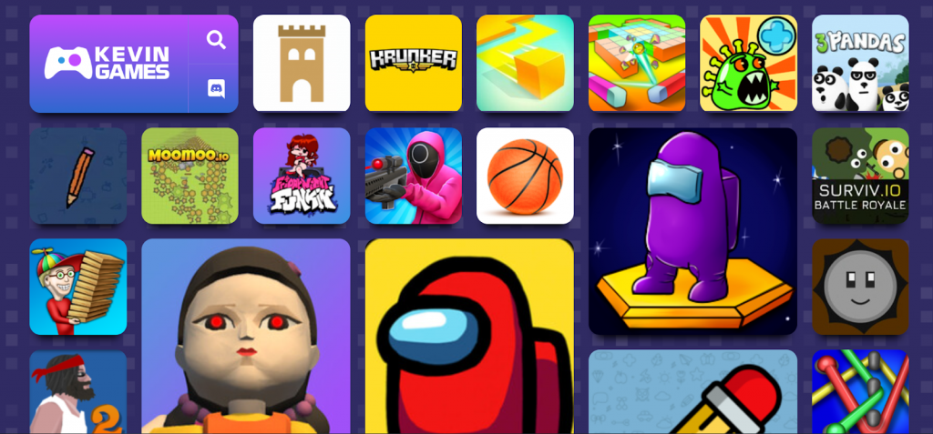
Let’s have a look at Kevin Games as an example. Check out its chosen colour: purple. It symbolises trust, happiness, and creativity. The developers picked it to communicate these qualities and create the right gaming atmosphere. As for other elements, it’s excellent, too. The navigation bar is below: first, you see the most played toys. If you want something else, pick a category.
This portal is also known for investing in high-quality textual support. Each title has short but clear descriptions. We discuss its importance in the next paragraph.
Provide High-Quality Textual Content
Writing a good description of every digital toy is not easy. With hundreds of titles, there is no way you can do it on your own. Hire authors or freelancers to do this task. Additionally, each text should have the same pattern so your readers get used to it. They’ll know which part will be the most useful to them. Predictability will please your audience and make them come for more.
But never forget that it’s web-based entertainment. No one comes there to read poems. Each description should be short and lack water-driven or too general sentences. If you can cross them from the paragraph without losing much meaning, then it’s useless.
When you deal with content, keep an eye on symmetry and harmony. You’ll have a set of icons reflecting toys and their names. Make sure that they all follow a unified pattern to avoid a mess. Clicking on them should lead to a page with the text below. It should describe what they’re about to see if they click play. And it should be the same with any browser adventure. As we’ve stated above, it creates a feeling of something familiar. People will know which areas to look at if they need specific info.
Follow the Trends

Do you want to always have gamers on your portal? Find out what exactly can lure them. Of course, you should pay attention to the content and publish promising titles. But it’s also important how you arrange them on the pages. Right now, placing cute icons on the front page is considered attractive and modern. Scrolling down reveals more options to dive into. As a rule, the lower, the less popular. So, it’s better to put the trendiest adventures at the beginning. Let’s have a look at a decent example to support this idea.
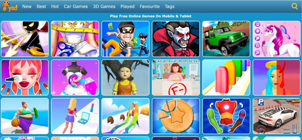
Yad is an excellent place to get entertained. The main page is made of 2 parts:
- Icons of cool toys to enjoy. They’re located in the middle and attract anyone’s attention. All because they dominate the space and are the first thing a visitor sees
- Horizontal navigation bar. It’ll send you to any category you like. There are new, car-based, 3D options, etc.
Adding to that, it has a calm-coloured pleasant background – light blue. Accompanied by a friendly mascot (an orange badger dog), the overall style seems pleasant. Creating something similar will surely benefit your portal.
However, this website has a minor drawback. If you tap on any icon, it’ll launch. There will be a short description below it. From our point of view, it’s too short. It doesn’t give enough info to understand what’s inside.
Optimise for Mobile Devices
According to Statcounter, PCs and consoles no longer dominate the market. People used to go online only through desktop gadgets. But the introduction of more portable technology has turned the world upside down. Small hand-held smartphones turned out to be more popular. Almost everyone in the world has one or more of them. They’re an integral part of our life now. Global statistics show that the mobile market share is over 60%! The rest is shared between desktops, tablets, and PCs.
The chances that your portal will be browsed via mobile gadgets are pretty high. Make sure your UI user interface is friendly on any mobile gadget. It’s a way to reach out to as many users as possible. If they launch a game, it should look nice on any screen size.
There are lots of websites that fail to recognise the importance of this. They only focus on PCs or tablets. Imagine how much traffic they lose because they haven’t adapted to smaller devices! Luckily, there are lots of automated instruments to make development easier. If you don’t do it yourself, ensure your designers see this.
Make It Multi-Language

The browser gaming industry allows you to offer fun-based digital worlds to anyone! There are no borders: your audience can be from any country. All of them will go online and start looking for a place to unwind. They’ll type it in their language. So make sure your platform is translated into more than one.
English is a must (it’s an international language in almost every country). Look at your audience’s geo: where do they play from? Provide all pages in German and French, whether in Germany or France. And so on. You’ll be able to reach out to a broader pool of people in this way. A multi-language portal bypasses all linguistic barriers and provides fun no matter what users speak.
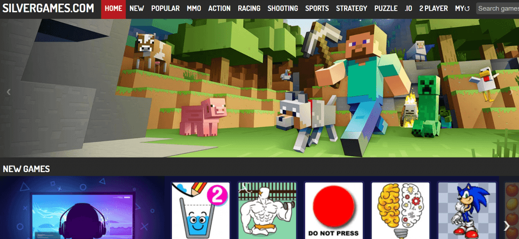
Check out Silvergames. It has an excellent and not ordinary design: a combination of black and white. This adds a classical yet minimalistic-based modern flair to the portal. The front page has a slider with top adventures.
As for the toys, the collection is rich: there are hundreds of options to jump into. The selection bar is at the upper part of the screen. But if you scroll down, you’ll also see lines of icons organised into categories. MMO, action, racing, shooting, puzzle, sports… You name it! Any genre you like is indeed displayed there. Enjoy them in 5 languages: English, Russian, German, French, and Spanish.
Support Your Community

If you create a gaming website, visitors won’t enter the package. Just adding games is not enough. You’ll need to advertise yourself and form a community of followers. Start to develop social media channels. Publish exciting content and invite people to enjoy adventures on your portal. Accordingly, if they get to your website first, make sure they notice links to your profiles.
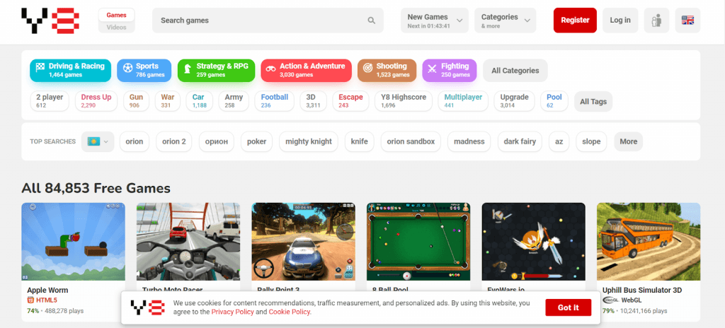
Take a look at Y8 with what seems to be thousands of online titles. It’s one of the oldest platforms that retains its initial recognisable retro style. The white background introduces enough space between icons. As a result, the page doesn’t seem overloaded with content. Visitors see lots of titles the moment they enter the portal. If they need to narrow down the options available, they click on a category they like.
Wrapping Up
Of course, you can ignore the importance of style. But don’t expect the audience to grow: they’ll migrate somewhere convenient and pleasant to the eye. However, invest in its outlook to improve your project and avoid stagnation.
How to make a game website that will reach the most impressive list? We’ve reviewed several examples of good portals and pointed out their nice touches. Use them to build a perfect platform of your own. And then turn it into a powerful marketing tool. Read this article to know more about how you can do it. Use the ideas revealed there to create a high-quality gaming website design.
