Branding Tips for TV Logos and Streaming Service Brands
Graphics are the first things viewers see when they visit any channel. With dozens of streaming services platforms and hundreds of TV channels available, catching the audience's attention in the competitive TV streaming market requires some doing.
If you want viewers to stop and stare and keep tuning in, your brand's name and logo should stand out.
When you are doing live streaming, it is essential to remember that your viewers should be able to tell in one glance who you are and what you are about. To reinforce their logo Identity, livestreamers often turn to graphics to increase engagement among the audience.
Here are a few tips for new graphic designers on how the top 10 streaming services are branding themselves with design elements and logo ideas that light up the small screens you can use to show off your brand's personality.
Table of Contents
Colour

Choosing the right colour palette is vital in creating compelling and engaging visual content for television. The colours you select should complement the tone and theme of your show or commercial.
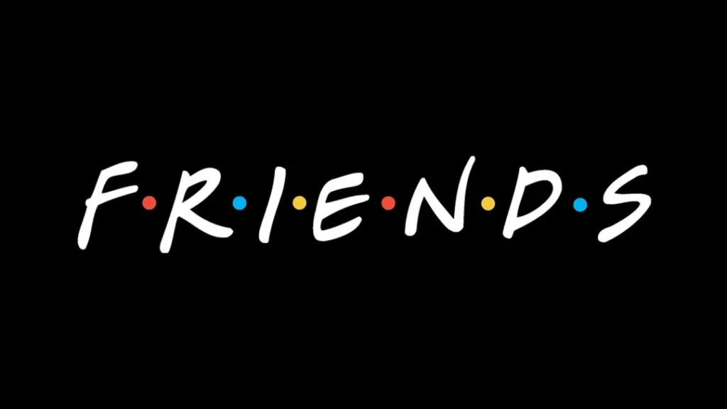
For cheerful comedies, bright, vibrant hues work best. Opt for vivid shades of red, orange, yellow, green, blue and purple to elicit energy, joy and lightheartedness. You can incorporate these colours into your logo, graphics, set design and costuming. Just ensure the colours are clear and manageable on the screen.
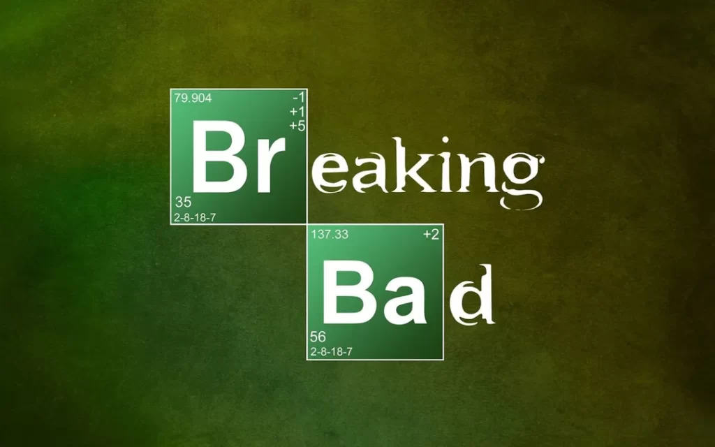
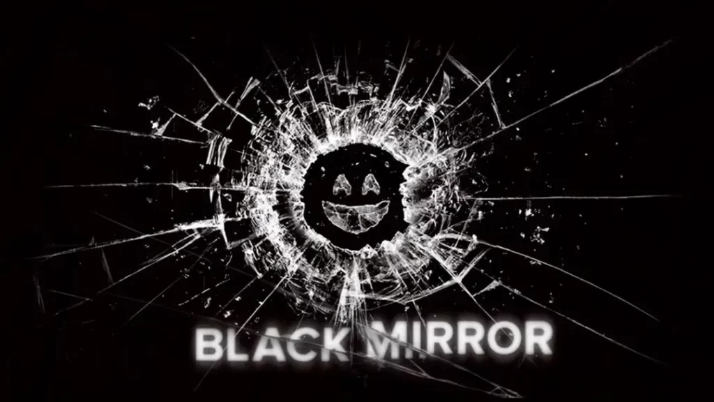
In contrast, serious dramas and intense serial programs benefit from black, white, grey and other muted, neutral tones. These sombre colours help set the mood and draw viewers into the solemnity of the content. Characters' wardrobes, backdrops and logos typically utilise these hues to align with weighty subject matters.
Consider using muted versions of primary colours like soft blues, greens and yellows for educational shows. These gentle shades are pleasing to the eye and help maintain audience focus as information is presented. Avoid colours that are too bold or neon, as these can be jarring and distracting in an instructive context.
Pay close attention to contrast when selecting your colour scheme, no matter the tone of your television content. High difference between colours, such as navy blue and neon yellow, helps your graphics and logo pop on screen. This is especially key for small television screens, where highly contrasting colours will stand out even at a distance. Just be sure the contrasting shades complement each other and don't clash.
With a thoughtful, tailored colour palette, you can set the right visual tone for your television content and capture your audience's attention. Always consider the mood you want to convey and choose your colours accordingly. Vibrant for comedy, muted for drama and soft for educational programs. And remember, plenty of contrast!
Layout

With televisions ranging dramatically in size, from massive big-screen TVs to tiny smartphone displays, it's crucial to design your TV logos to look great at any scale. Whether your logo will appear in opening credits, as an on-screen bug, or in other graphics, optimising it for the medium is vital.
Consider creating your logo in different layouts and sizes for maximum visibility and impact across varying screen dimensions. Design a large, horizontally oriented version that will pop in opening sequences and full-screen transitions on big TVs. Then, create smaller, compact square and vertical layouts optimised for small on-screen placements like bugs and graphics.
Simplify and reduce detail in your logo mark for smaller sizes, sticking to bolder shapes and lines that read clearly when reduced. Choose a font that maintains legibility at even the smallest on-screen sizes for text-based logos. Sans-serif fonts work better than serifs for TV.
Maintain colour consistency across layouts and watch your contrast levels. Higher contrast between colours on smaller screens will help your logo stand out. Moderately increase contrast for smaller versions if needed.
Test your logo at actual screen sizes to ensure it works. View it on large, high-definition displays and small smartphone, tablet or computer screens. Make tweaks and adjustments at each size until your logo is optimised for any TV format.
With strategic design tailored to the medium, your TV logos will represent your brand in top quality regardless of screen size. Crisp, consistent and highly visible, will connect with audiences whether they're watching from a wall-sized television or a palm-sized mobile device.
Typography

Choosing the right font is an impactful way to set the tone and convey the essence of your TV content through your logo design. Consider font styles that align with and complement the genre, mood and era of your programming.
For fun, fanciful shows, consider playful script or handwritten fonts. These tend to have flowing, whimsical letterforms that pair well with lighthearted content. Sans-serif fonts like Arial or Helvetica have a sleek, contemporary look fitting for modern settings. Serif fonts like Times New Roman have a traditional, classic style that can work for historical dramas.
Whatever font style you choose, opt for bolder weights and designs. Heavy, thick letterforms are easier to discern on screen, especially at small sizes needed for bugs and graphics. Thin fonts can disappear or become illegible. Be sure to test your font at actual screen sizes to ensure clarity.
When selecting your font, also consider personality and brand expression. Is your content serious or silly? Traditional or cutting edge? Your font should reflect and reinforce your desired brand identity. Pair a playful script with comedy or a bold sans-serif with hard-hitting investigative reporting.
Blend good visibility with a genre-appropriate style for the perfect TV logo font. Give audiences a taste of your content through smart typography choices. With legible, bold letterforms and thoughtful font selection, you can reinforce your brand aesthetically across any screen size.
Symbol

Though often overlooked, integrating a distinctive symbol into your TV logos is an impactful way to establish your brand and stand out from competitors. Rather than just stylised initials or text, a thoughtfully designed icon can capture attention even at small on-screen sizes.
When developing your symbolic logo mark, aim for simplicity. Complex, intricate graphics will get lost on TV, especially when resized as bugs or graphics. Streamline your icon with clean, bold lines and recognisable shapes. Remove any non-essential details for maximum clarity at every scale.
Stick to one or two colours for your symbol. Vivid, high-contrast shades are most visible on television. Black, white and bold primaries like red, blue and yellow are ideal. Avoid gradients, subtle hues and low-contrast combinations.
Test your logo symbol at actual screen sizes and resolutions. Refine until the icon translates clearly on large, high-def displays and smaller smartphone screens. Distinct, understandable symbols will register subconsciously with audiences, even busy channel surfers.
With a sharp, easy-to-process logo mark, your brand identity gains an instant visual foothold. Viewers will come to recognise and remember your distinctive icon everywhere, from tune-in graphics to closing credits. So, ditch the expected initials and make your TV channel stand out with a clean, simple, and memorable symbolic logo design.
Special features

Television has evolved tremendously, from limited black-and-white airwave broadcasting to unlimited digital streaming in vivid colour. But despite massive technological shifts, the significance of a strong logo has remained constant. An impactful logo is still crucial for establishing brand identity and recognition in today's crowded streaming landscape.
When designing modern TV logos, incorporate distinctive features that align with current broadcast trends while creating a timeless mark. Consider framing your logo symbol or stylised initials within a simple shape, as many major networks do. NBC's peacock icon sits within a circle. CBS's eye logo is encased in a box. Frames add structure, allow more straightforward symbols, and give designers creative constraints.
You can also spell out your entire brand name in a stylised logotype within a shape. Monograms using initials work, too. The key is picking clean lines, legible typography, and high-contrast colours that pop on screens. When framing your core logo mark, experiment with symmetrical shapes like circles, squares, and triangles.
A unique yet versatile logo framed in a bold, geometric shape checks all the boxes for a streaming-ready brand identity. Your logo will stand out in digital programming guides, as on-screen bugs, and beyond. Pay homage to classic TV logos while crafting an iconic brand symbol perfect for modern televised content.
Wrapping Up the TV Logos Tips
Creating a strong, recognisable brand and logo is make-or-break for standing out in today's crowded streaming television landscape. You can craft a distinctive identity that captivates audiences across devices by optimising your logo for on-screen visibility, aligning your typography and aesthetics with your content, and incorporating bold, strategic design choices.
Consider all the factors covered here—colour psychology, composition, simplicity—and test relentlessly at actual television, smartphone, and monitor sizes. A thoughtfully designed logo sets viewer expectations and becomes a beloved, unmistakable icon of your programming. With so much choice available at the click of a button, a streamlined yet striking logo can differentiate between a viewer picking your content or moving on to the next service.
So, take the time to develop a versatile brand mark that encapsulates your channel's essence. Build TV logos that look as great on a 50-inch television as it does in the corner of a tablet screen. Make strategic creative choices that resonate with your target demographic. And most importantly, let your logo speak to the singular, compelling content only your streaming channel can deliver.
