


Feeling nostalgic? We’re going to look back in time to explore the era-defining graphic design movements, trends, and illustration styles over the past ten decades.
Studies of design and illustration have always given historians intriguing insights into changing trends in aesthetics, buying patterns, and popular culture, but it’s also invaluable for designers to know what has influenced and continues to influence their work today.
Most good design looks back to a defining era, and different eras of graphic design offer different insights. Love vintage graphic design movements, or simply want to find out more about how designers worked in the past? You’ll want to keep reading!
Do you prefer to watch videos? Then you cannot miss this new course by Laura Keung from the Envato Tuts+ YouTube channel. Learn more about the iconic eras of design and different styles through the decades:

Pay a visit to Envato Elements to source vintage-inspired photos, illustrations, fonts, and templates. You'll find resources from different eras of graphic design. Channel a bygone time in your own designs by following the graphic art styles of different graphic design movements.
Jump to content in this section:


1920s Graphic Design
The 1920s marked one of the most important and exciting decades for the visual arts, and its remarkable influence is still felt across the design industry today.
The ‘Jazz Age’ marked an era of new social freedoms and economic growth, and favoured design styles followed suit. At the start of the decade, more fluid, realist graphic art styles such as Art Nouveau were still very popular across the commercial arts, but by the middle of the decade this was dramatically replaced by new modernist styles which were gaining traction in Europe.


Art Deco, a style defined by modernist, geometric designs and luxurious materials and colours, first emerged in France but quickly grew in popularity, becoming one of the first international graphic design movements and resulting in some of the most glamorous buildings, interiors and artworks the world has ever seen.
Particularly in New York, the post-war economy was booming, and in this atmosphere of financial excess, advertising design experienced an incredibly creative period. Poster artists embraced the Art Deco style wholeheartedly, focussing on creating strong graphic layouts, with rich colour palettes and geometric type graphic art styles. The glamour of flapper girls, exotic travel, and new food and drink dominated billboards, enticing viewers to dance the Charleston or buy Coca-Cola.

 What Is Art Nouveau?


 Art Deco Graphic Design: Let's Talk About This Trend


 30+ Best Art Deco Fonts

 How to Design an Art Deco Wedding Invitation (With Design Examples)
1930s Graphic Design
The excesses of the 1920s unfortunately couldn’t last forever. The Great Depression had a sombre influence over 1930s graphic design, with a more restrained form of Art Deco which focussed on curved forms replacing the glitter and glamour of the decade before. In poster art, we can see how the rich palette of colours from early Art Deco is replaced with more subdued tones.


Also influential during this decade was the accessibility of modern technology for consumers. Electricity, the automobile, and the telephone made radical changes to daily life, and design increasingly reflected this.
The Futurist art movement emphasized the supremacy of technology, speed and industry in an ever-changing world. Designers and illustrators focussed their efforts on giving a sense of movement and scale to their 1930s graphic design. 3D-style gradients and textures also became popular, helping poster work feel immersive and larger than life.


 How to Create a Vintage Movie Text Effect in Adobe InDesign

 How to Create a Vintage Brush to Add Texture in Illustrator


 How to Create a Bauhaus Poster in Adobe InDesign
1940s Graphic Design
With the outbreak of the Second World War in 1939, fascism began to creep across Europe and threatened to spill over onto a global platform during the early part of the 1940s. This frightening new reality led to the once commercial emphasis of design being replaced by propaganda and motivational imagery.
Some of the most interesting 1940s graphic design examples to emerge in this period were those of the Soviet propaganda artists, who were inspired by Art Deco and Constructivism (a Russian art movement which emphasized art as having a social purpose) but developed a unique and direct style rendered in sombre shades of red, black and grey.
Stylistically, modernism was becoming a more influential movement, and we can see this in the use of abstract illustration, irregular layouts, and minimal colour palettes. At the start of the 1940s, realist illustrations which romanticized battle were very popular, but by the end of the decade, consumers were ready for something very different. That shaped the way 1940s graphic design looked.
We can see the roots of the Mid-Century Modern movement in design and illustration from late 1940s graphic design. Visible brush strokes, witty designs and rich colours marked the end of the dark days of war and heralded a sunnier Post-War period.


 Vintage Trend: Best Mid-Century Fonts


 41 Best Bold Retro Fonts to Download

 A Guide to Vintage Design Styles

 Design a Vintage ‘Wizard of Oz’ Movie Poster in Adobe InDesign
1950s Graphic Design
Designers have looked back to 1950s graphic design time and time again, and with good reason. The era was an incredibly rich, optimistic and exciting time for design. Just as we have today, there were many different trends which found their place in the Fifties design landscape.
In America, a booming economy meant that ordinary homes now had kitchen appliances, motor cars, and televisions, all of which were advertised heavily to the public. Across commercial advertising we see atmospheric, cheerful illustrations and photos in pastel ice-cream shades or Technicolor brights. The sense of movement, youth and excitement generated by this style of image is infectious, and still has remarkable influence over advertising design today.


Meanwhile, other designers were exploring modernism’s potential and giving it a fun, playful twist. Flat design was made popular by the Mid-Century Modern movement, which focussed on playful patterns and textures, and used simple, pared-back colour palettes in earthy shades.
The Fifties were also a time for boundary-pushing in typography and typeface design. Perhaps the most famous example is designer Paul Rand’s reimagining of the logo for IBM in 1956. With its distinctive jaunty, geometric lettering, this type style influenced the perky, animated character of other typefaces which came to dominate billboards and signage across the last half of the decade.

 What Is Swiss Design and Why You Should Know Its History

 1950s Logos: Iconic 50s Logo Design, Examples, and Inspiration

 50s Graphic Design: Mid-Century Modern to Swiss Style

 Everything You Wanted to Know About Helvetica
1960s Graphic Design
1960s graphic design tended to split into two main stylistic groups. Some designers continued to evolve the simple, modernist style favoured during the 1950s, and many were influenced by the Swiss Style, which came to have a huge influence over layout design and typography during the decade.
The Sixties were also a wonderful time for modernist illustration, with artists like Charley Harper exploring geometric shapes, stylized design and grainy textures in their drawings. Their simple, striking work had commercial appeal, making them a perfect fit for advertising work and textile prints during the period.


The other popular design movement in 1960s graphic design was a reaction to the restrictions of minimal, modernist design. Psychedelic design was influenced by the free love movement, rock ‘n’ roll, and hallucinogenic drugs.
Graphic design merged with art, as designers and illustrators became more experimental and threw out the traditional rule books preaching grid structures and ordered layouts. A rainbow of acid colours, fluid lines, and trippy patterns came to define the look of the pop culture scene of the Sixties, and it’s still much more evocative of the Sixties in popular culture today than its modernist counterpart.


 How to Create a 60s Retro Flyer Design

 1960s Logo: Retro 60s Logo Design, Examples, and Inspiration

 How to Design a Retro 60s Flower Pattern


 60s Graphic Design: Pop Art to Psychedelic Design
1970s Graphic Design
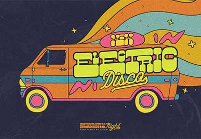
1970s design has enjoyed a recent revival in design, fashion, and illustration, and perhaps this is in part because it’s such a rich resource for retro design in so many forms. The decade was defined by a diverse range of pop culture and social movements, which allowed individuals to express who they were more boldly through fashion, music, and art. Punk, Disco and the hippy movement were just a few of the cultural trends which defined the decade, and their influence spilled over into the world of design.


In 1970s graphic design, we start to see photography becoming more dominant, with illustration taking a more supportive role in magazine and ad design. Photography, as with everything in the Seventies, explored extremes—it was either moody greyscale or disco-bright Technicolor. Magazines like Rolling Stone embellished photos with anarchic collage touches, bright colour, and ‘look at me’ typography.
Developments in typesetting technology also helped the Seventies to become the decade that is defined by jaw-dropping typography, which is at turns both garish and revolutionary. Three-dimensional effects, curved lettering and cartoonish proportions make for type that pushes the limits of good taste, and has become the defining characteristic of 'retro' design.
- 70s Logo Design: Groovy Logos From the 1970s and Retro Logo Inspiration

 35 Cool Funky Fonts (Funky 70s and Retro Disco Fonts)

 A Look at Graphic Trends That Define the 70s (Retro Fonts, Text Effects, and More!)

 44 Best Chunky Fonts (Big, Bold, Beautiful Thick Fonts)

1980s Graphic Design
In the decade of boom and excess, there’s also nothing subtle about Eighties design. Topping the Seventies for sheer ‘look at me’ value, this decade carried over the more brash elements of Seventies design, such as disco typography, and exaggerated them even more.
Punk still had a huge influence on popular culture in the early 1980s, and an anarchic use of colour was used by designers to contrast against newspaper-clipping text and moody silhouetted photography. Anti-establishment British bands like The Smiths and The Clash used traditional design elements like serif typefaces and reimagined them with a neon colour palette and jumpy grids, creating engaging, confrontational album art in the process.


In the latter part of the decade, garish, neon-saturated styles came to dominate commercial design and spilled over into music and the arts. Some of the most recognisable design traits of the Eighties can be sourced from the inescapable type styles that were developed from the mid-Eighties onwards. Sharply italicized lettering fonts in neon pinks and purples adorned album covers and advertising billboards alike.
While not all 1980s graphic design is considered to be indeed ‘good’ at all, let alone tasteful, thankfully some designers were still creating amazing work, some of which has come to be recognized as iconic and well-loved as examples of ‘nostalgia art’ decades later. Some of the most incredible design during the 1980s appeared on movie posters, with complex collage designs, super-bright colours and highly detailed layouts. Illustrations were hyper-realistic and dramatic, with exaggerated light and shadows.


 Retro Design Trend: Create the 80s Style With Fonts, Text Effects, and More!

 35+ Best Retro 80s Fonts to Download in 2024


 How to Create an 80s-Inspired Double Exposure Manipulation in Adobe Photoshop

 1980s Logos: Retro 80s Logo Design Inspiration
1990s Graphic Design
The designs that defined the 1990s take a little longer to come to mind than the visual culture of the hippy 70s and brash 80s, but it’s actually an incredibly significant decade for the development of graphic design as we know it today. Digital design technology had evolved and become more accessible (remember Microsoft Paint?), which meant that the days of creating layouts by hand were fast disappearing. As a result, layouts took on a more polished, clean appearance.
While design may have cleaned up its act, its influences were altogether much rougher around the edges. Grunge was a significant influence across pop culture, fashion and design over the early part of the decade, and in many ways this clashed with the clean, tech-forward focus of designers who were embracing digital design wholeheartedly.
You can’t mention Nineties graphic design without paying homage to American art director David Carson, who founded the alternative music magazine Ray Gun in 1992. A world away from the measured minimalism of digital design, he ‘broke the grid’, experimenting with collage-style type and edgy photography. It remains the most evocative design example of the grunge era.


Towards the middle and later part of the decade for 1990s graphic design, minimalism became the order of the day, which felt completely refreshing after the scruffy grunge years. Calvin Klein pioneered minimalist graphic design in his adverts featuring a waif-like Kate Moss posing next to an ultra-simple, watermarked logo design. It marked a new era for advertising design in which less became more, setting the benchmark for the pared-back fashion advertising we see in print today.

 How to Create a Retro 90s Grunge Photo Effect in Adobe Photoshop

 How to Create a 90s Abstract Rave Poster in Adobe Photoshop
- Rebellious Design: Brutalism Meets 90s Graphic Design

 Trend Watch: Retro 90s Design


2000s Graphic Design
While the 90s marked the first venture into digital design for many designers, it was inescapable during the 2000s. No longer was computer-aided design simply an option, it became a necessity, with designers needing to craft layouts that would work just as well on computer screens as they would on handheld devices like mobile phones.
Logos had been around for decades, but the 2000s were the boom years for branding, with some of the most iconic tech brands like Google, Twitter and Facebook creating and honing their brand identities during this decade. Logo design became a consuming area of focus for many graphic designers during this decade, with many judging the future success or failure of a business from the quality of their brand design.
The 2000s were a decade of great political and social change across the world stage, and design followed was often employed to raise awareness of causes such as environmental change and the impact of events like the financial crisis of 2007.
One of the most memorable examples of design as a political tool was Shepard Fairey’s “Hope” poster for the 2008 US presidential campaign. Stylistically, it referenced older street art styles, a hallmark of 2000s design, but the strong sans serif type and ultra-realistic portrait of Barack Obama made it feel fresh and relevant, and ultimately was a significant contributing factor to the success of Obama’s campaign.


 2000s Graphic Design: From the Y2K Aesthetic to Glitter Text and Emo

 How to Create a Paper Cutout Effect in Photoshop

2010s Graphic Design
The 2010s graphic design era saw plenty of incredible work and was an exciting decade for graphic design and illustration. While it can be difficult to assess the dominant trends of a decade that was so recent, we can already look back on a few styles that have proved to be almost universally popular.
Vintage mania hit the graphic design world at the start of the decade and remained very dominant in design. With the internet becoming an all-encompassing influence in people’s lives, vintage, folk and ‘hipster’ styles could be seen as reactions to a technology-mad world, even if antique-style textures and vintage logos were used to brand tech products!

 30+ Best Vintage Logo Templates (And Tips & Tricks on Creating Vintage Logo Design)

 How to Create a Vintage Type Postcard

 30 Stylish Vintage Fonts

 25+ Amazing Vintage Photoshop Filters & Old Retro Styles

 Adobe Illustrator Tips and Tricks: A to Z of the Best Hacks!

Graphic art styles in illustration also experienced a welcome revival in the 2010s, with flat design revisiting some of the modernist traits of mid-century design and vectorized and digital illustration evolving as an art form. We saw more explicitly tech-inspired graphic style art gradually creep back into illustration too, with different styles taking their cues from the ever-evolving world of web and app design.

 How to Create a Futuristic Fashion Portrait in Adobe Photoshop


 How to Make a Y2K Art Collage in Photoshop

 100+ Great Photoshop Tutorials for Clever Beginners


 How to Create a Set of Flat Animal Icons in Adobe Illustrator

Conclusion
A lot can change in a century! Graphic design eras and illustration offer amazing insights into the social and cultural trends and changes that defined decades. I hope you’ve found this trip of styles through the decades interesting and perhaps inspiring for your own creative work.
No designer can truly work in a vacuum, so it’s fantastic to be able to see what visual culture would have been a constant presence in the lives of your parents, grandparents, great-grandparents, and beyond.
What are your favourite eras of design? Head over to Envato Elements to find vintage-inspired designs and graphic style art to take a trip back in time in your own creative work.


