Logo Design Basics: The Fundamentals for Designers
A logo is the symbolic face of a business, its visual calling card in a crowded marketplace. More than just a decorative mark, a logo speaks volumes about a company's ethos, vision and brand promise. A great logo encapsulates the soul of a business.
Consider the iconic Nike swoosh. With one fluid shape, it conveys motion, speed, and athletic aspiration. The Apple apple-with-a-bite conjures images of forbidden knowledge and innovation. These logos have become visual shorthand for the core values of their brands. They serve as symbolic portals into the brand experience.
In our oversaturated media landscape, logos must work harder than ever to stand out. Like colourful plumage on a bird, they must attract attention and help customers identify brands at a glance. A clever, memorable logo can be seared into customers' minds, creating an intuitive bias toward that brand.
But a logo must do more than just identify – it must build affinity. An inspired logo creates positive associations and stirs emotions. It taps into customers' aspirations and convinces them, “This brand is for people like me.” Consider how the Swoosh and Apple logos have become badges of identity for their devotees.
In a fragmented world crying out for connection, a unifying logo becomes a reliable touchstone. It serves as a visual anchor for the brand in customers' minds, conjuring up a constellation of positive experiences and associations. A well-designed logo becomes a portal to belonging, a symbolic handshake welcoming customers into the tribe.
Table of Contents
Understanding Your Audience and Market
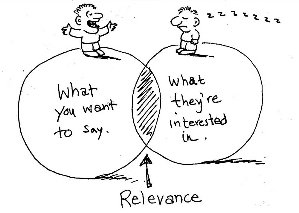
Understanding the target audience and the market is a critical starting point in logo design. Conducting market research can provide valuable insights into the preferences and expectations of the target audience, informing the design decisions to ensure that the logo resonates with them. It's also vital to analyse the symbols of competitors to ensure that the design is unique and stands out in the marketplace.
For instance, if a company is targeting a younger demographic, a vibrant, colourful, and modern logo may be appropriate. On the other hand, a business targeting an older, more conservative demographic might opt for a more traditional and restrained design. Analysing the logos of successful companies in the same industry can provide valuable insights into what works and what doesn't for the target audience.
Adapting the logo design to suit the specific industry and target market is also crucial. The logo should reflect the nature of the business and its industry. For example, a tech company might opt for a minimalist and modern logo, while a luxury brand might choose a sophisticated and elegant design.
Consider the logo of a brand like Harley-Davidson. The company's target audience is male motorcycle enthusiasts who value freedom, adventure, and rebellion. The Harley-Davidson logo, with its bold, masculine typography and classic shield and bar design, perfectly reflects these values and appeals to its target audience. This example highlights how understanding the audience and market is crucial in logo design.
The Design Process
Logo design is a process that involves several steps, from initial research and brainstorming to concept development, refinement, and, finally, the creation of the final design. The first step involves understanding the brand, its mission, values, target audience, and market position. This forms the foundation upon which the logo will be built.
Sketching is an integral part of the logo design process. It allows designers to explore different ideas and concepts quickly and efficiently. Sketching can lead to unexpected design solutions not discovered through digital design alone. For instance, the Twitter logo, a simple, stylised bird, was born out of a sketch and has since become one of the most recognisable logos in the world.
Obtaining feedback and iterating on the design is another crucial step in the logo design process. Input from stakeholders, as well as target audience members, can provide valuable insights that can help to refine and improve the design. This iterative process ensures that the final logo design is not only visually appealing but also effective in communicating the brand's identity and values.
Consider the evolution of the Starbucks logo. The original design, which featured a detailed illustration of a siren, has undergone several iterations to become the simplified, stylised siren logo we know today. Each iteration simplified the design further, improving its scalability and recognition while maintaining its connection to the brand's nautical theme.
Critical Elements of Logo Design
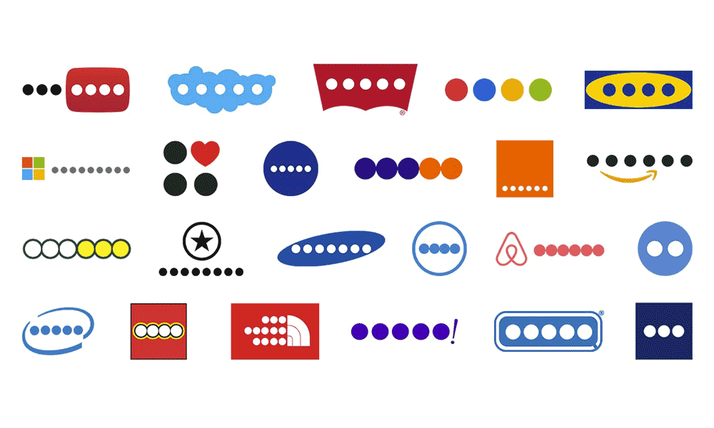
Creating a memorable and effective logo involves several key elements. Simplicity is often cited as one of the most essential principles of logo design. A simple, uncluttered design is more accessible to recognise and remember, making it far more effective in establishing a strong brand identity. Ensuring scalability and versatility is also crucial, as the logo needs to work well across different platforms, mediums, and sizes.
Take the logo of McDonald's, for example. The golden arches are incredibly simple, yet they are one of the most recognisable logos globally. The simplicity of the design contributes to its memorability, while its scalability allows it to be used in everything from giant billboards to small digital ads.
Balancing shapes, symbols, and text is another critical logo design element. A harmonious design can effectively communicate the brand's identity and values. For example, the Adidas logo balances shape and text ideally. The three stripes, arranged to form a mountain, symbolise challenges and overcoming them, aligning with the brand's mission to support athletes in achieving their goals.
Colour Theory in Logo Design
Colour is a powerful tool in logo design. It can evoke specific emotions and perceptions, influencing how a brand is perceived. Understanding colour theory is crucial in creating a logo communicating the brand's personality. Contrasting colours can make a logo stand out, while Pantone colours ensure consistency in print and digital applications.
Coca-Cola is a prime example of effective colour use in logo design. The vibrant red colour is not only eye-catching but also evokes feelings of excitement and passion, aligning with the brand's energetic and joyful image. Pantone colours ensure that the red is consistent across all mediums and applications, maintaining the brand's strong visual identity.
Choosing the right colours for a logo is more than just selecting colours that look good together. It's about understanding the psychological effects of colours and using them strategically to convey the desired brand personality. For instance, blue is often used in corporate logos to describe trust and reliability, while green is famous for environmentally friendly or organic brands to symbolise nature and health.
Typography in Logo Design
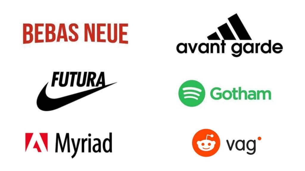
Typography is another crucial aspect of logo design. The font choice can significantly influence the logo's overall look and feel, and it plays a pivotal role in conveying the brand's personality. A well-chosen font can enhance readability and create a strong visual impact.
Take the logo of Google, for example. It uses a simple sans-serif font that is easy to read and has a modern, friendly appeal. The different colours of the letters add a playful touch, reinforcing the brand's image as innovative and approachable.
Combining different font styles can create a unique and distinctive logo. However, it's vital to ensure that the fonts work well together and don't clash. The balance between cohesion and contrast is critical to successful typography in logo design.
Logo Design Software and Tools
There are numerous software and tools available for logo design, with Adobe Illustrator and Canva being among the most popular. These tools provide a range of features and capabilities that can assist in creating a professional and effective logo. Vector files are often used in logo creation due to their scalability and versatility.
Adobe Illustrator, for instance, is a vector-based design tool that allows for the creation of logos that can be scaled to any size without loss of quality. It also offers a wide range of tools and features for drawing, colouring, and text editing, making it a versatile tool for logo design.
In addition to professional design software, there are also online logo makers and design templates available for those with limited design experience or budget. These tools can provide a quick and easy way to create a logo, but they may need more flexibility and customisation options offered by professional design software.
- Hardcover Book
- Bokhua, George (Author)
- English (Publication Language)
- 224 Pages – 08/02/2022 (Publication Date) – Rockport Publishers (Publisher)
Principles of Effective Logo Design
Several fundamental principles guide effective logo design. These include simplicity, originality, versatility, scalability, balance, and timelessness. A simple logo is likelier to be clear and recognisable, while an original logo can stand out from the competition and be memorable.
The principle of versatility ensures that the logo can be used in different contexts and applications, from giant billboards to tiny mobile app icons. Scalability ensures the logo maintains its visual impact and legibility at different sizes.
Balance is another critical principle in logo design. A balanced logo is visually pleasing and creates a sense of stability and harmony. This can be achieved by harmonising different design elements, such as colour, shape, and typography.
Finally, creating a timeless logo is crucial. A logo should stand the test of time and remain relevant and practical. This often means avoiding design trends that may quickly become outdated and focusing instead on creating a unique and timeless design.
Timelessness and Originality in Logo Design
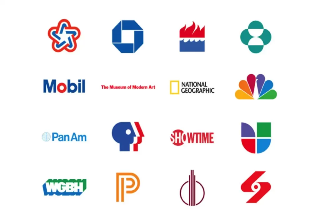
Creating a timeless and original logo is a critical goal in logo design. A timeless logo remains practical and relevant even as trends and styles evolve. Avoiding design trends and fads can help ensure the logo's longevity.
The logo of Coca-Cola is a classic example of a timeless logo. Despite minor tweaks and updates over the years, the basic design has remained essentially unchanged for more than a century. The logo's simple, elegant script and distinctive red colour have stood the test of time, and it remains one of the most recognised logos in the world.
Originality is equally crucial in logo design. An original logo can differentiate a brand from its competitors and create a unique brand identity. A logo should be distinctive and memorable, helping the brand to stand out in a crowded marketplace.
Logo Design Inspiration
Finding inspiration for logo design can come from various sources, from design galleries and branding books to nature and architecture. Looking at other logos, both successful and unsuccessful ones, can provide valuable insights into what works and what doesn't in logo design.
Websites like Behance and Dribbble offer a wealth of design inspiration, showcasing a wide range of logo designs from worldwide designers. Meanwhile, nature provides a myriad of shapes, colours, and patterns that can spark creative ideas for logo design. Even everyday objects can inspire unique and innovative logo designs.
While it's beneficial to draw inspiration from other logos, it's crucial to ensure that the design remains unique and doesn't infringe on any copyrights. The goal should be to create a logo that is distinctive and accurately represents the brand's identity and values.
Creating a Versatile Logo
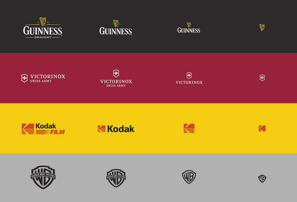
Creating a versatile logo is crucial in today's diverse media landscape. A versatile logo works well across different mediums and sizes, from large billboards and signage to small digital applications like websites and social media. It should maintain its visual impact and legibility, whether displayed full colour on a massive billboard or in a single colour on a small promotional pen.
The logo of Nike, for instance, is a prime example of versatility in logo design. The swoosh logo works well in various contexts, sizes, and applications. Whether on a billboard, a shoe, or a social media post, the swoosh is instantly recognisable and always maintains its visual impact.
The versatility of a logo also extends to its adaptability to different formats and mediums. A versatile logo should work as well in print as in digital applications. It should also be effective in both colour and black and white, ensuring its effectiveness in a wide range of applications and scenarios.
Balancing Proportion in Logo Design
Balance and proportion are essential principles in logo design. A balanced logo is visually pleasing and creates a sense of harmony and stability. This can be achieved by carefully considering the size, position, and weight of different design elements, creating a harmonious composition.
The logo of Pepsi, for example, is a study of balance and proportion. The circular shape, balanced colour distribution, and proportionate typography create a harmonious and visually pleasing design.
Creating a balanced logo involves more than just ensuring symmetry. It's about achieving a sense of visual equilibrium, where no single element overpowers the others. This balance can be achieved through the careful arrangement and proportioning of shapes, colours, and typography, creating a logo that is cohesive and harmonious.
- Airey, David (Author)
- English (Publication Language)
- 240 Pages – 08/20/2014 (Publication Date) – Peachpit Press (Publisher)
Avoiding Trends in Logo Design
While it can be tempting to follow the latest design trends when creating a logo, this can often lead to a design that quickly becomes outdated. Trends come and go, but a logo needs to stand the test of time. By creating a unique and timeless symbol, businesses can ensure that their logo remains relevant and effective in the long term.
Consider the logo of IBM. Despite being several decades old, the logo's simple, striped design remains as relevant and practical today as it was when it was first designed. The IBM logo is a perfect example of a plan that avoided trends in favour of simplicity and timelessness.
Balancing current design styles with long-term relevance can be challenging, but it's crucial in logo design. A logo should feel contemporary but not so tied to a specific era or trend that it quickly becomes outdated. Instead, aim for a plan that feels timeless yet fresh, ensuring its longevity and relevance in the years to come.
Wrapping up the Logo Design Basics
In conclusion, logo design is a complex process that involves understanding the brand's identity, conducting market research, applying design principles, and iterating based on feedback. A well-designed logo is crucial in establishing a solid brand identity, attracting customers, and conveying professionalism.
Applying the principles and techniques discussed in this article can help create a logo that is unique, memorable, and effective in communicating the brand's identity. The impact of a professionally designed logo on a business's success should be considered. It is not just a visual mark; it is the face of the company, a symbol of its values and mission, and a powerful tool for connecting with customers.
Last update on 2024-05-19 / Affiliate links / Images from Amazon Product Advertising API


