2008

article thumbnail

Now Hiring

Fonts by Hoefler&Co.

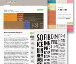
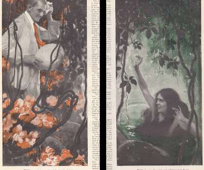
There are those designers in the world whose idea of design begins and ends with typography. I’m obviously one of them: before founding H&Co, my graphic design portfolio included book covers with carefully worked lettering atop “illustration TK,” and editorial design in which main features were ignored in favor of type-rich pages like the table of contents, where I really got to flex my muscles.

article thumbnail

PICTURES OF SOMEPLACE ELSE

Illustration Art

Last week's story about Martha Sawyers reminded me that many women's magazines in those days lured readers with tales of romance on a tropical island. Here we see an uninhibited island girl inviting a western dignitary in for a dip: Thousands of housewives in places like Kansas and Ohio turned regularly to Redbook , Cosmopolitan and similar magazines for stories of love under a tropical moon.

Travel 36
Insiders

Sign Up for our Newsletter

This site is protected by reCAPTCHA and the Google Privacy Policy and Terms of Service apply.

Trending Sources

article thumbnail

Typographic Gifts for Designers, Part 15

Fonts by Hoefler&Co.

If you’re an editorial designer, chances are that you’re familiar with the Society for News Design through its workshops, its excellent international conferences, and of course its annual. What you might not know is that SND operates the non-profit SND Foundation, which provides college scholarships, research grants, and travel stipends to help students attend its events.

Travel 40
article thumbnail

Change We Somehow Can’t Quite Believe In, Though We Just Can’t Put Our Finger On It

Fonts by Hoefler&Co.

Every four years, the month of November tenders an exciting opportunity for financial speculation, this year offering an almost practical alternative to your lending institution of choice (still solvent as of presstime) or your flameproof mattress. Behold the high-stakes world of political memorabilia, now doing brisk business on the internet. To my surprise and delight, this year’s “process pieces” about the election included dozens of articles about the Obama campaign’s

Fonts 40
article thumbnail

Let's Talk Trends: Designing for Maximum Impact

Speaker: Amber Asay, Creative Director and Founder of award-winning design studio Nice People

Understanding what trends are happening and how they’re impacting the competitive landscape is crucial to providing top dollar design strategy to your clients. With so many trends coming and going, it can be overwhelming to determine which ones you should capitalize on and which ones might not be worth the trouble. In this exclusive webinar with Amber Asay, we’ll explore graphic design trends that need to die, trends that are starting to pick up and why, trends that have come and gone, and how t

article thumbnail

Letterror at the Graphic Design Museum

Fonts by Hoefler&Co.

When we first met at the ATypI conference in 1989, Erik van Blokland, Just van Rossum and I were branded the “young turks” of typography, presumably because we were fifteen years younger than ATypI’s next-youngest member. Erik and Just were already notorious for their Beowolf project, which hacked the PostScript format in order to produce self-randomizing letterforms; this mischievous bit of culture jamming was enough to endear them to me, and to a generation of designers who h

More Trending

article thumbnail

Remembering Rauschenberg

Fonts by Hoefler&Co.

If you draw a line from Shinro Ohtake to Joseph Cornell , and another from Ed Fella to William Harnett , you will find yourself at a monumental, unavoidable intersection. At this great pinnacle sits Robert Rauschenberg, who died yesterday at the age of 82. I would have liked to have known him. His sincere appreciation for the pedestrian, which energized modern art, ultimately came to inform a major theme in modern typography as well. “I really feel sorry,” he once said, “for pe

Theme 40
article thumbnail

Our Middle Name

Fonts by Hoefler&Co.

Last month’s posts about the ¶ and the ß prompted a flurry of e-mail inquiring about other special favorites in the character set. Matt McInerney guessed correctly that the ampersand is one for which we have special affection, and asked if there was anything else we could say about it. How could we not? Ampersand, after all, is H&Co’s middle name.

Fonts 56
article thumbnail

What’s in a Font Name

Fonts by Hoefler&Co.

For as long as fonts have had names, they’ve had bad names. Historical inaccuracies have been common for two hundred years: typefounders of the Industrial Revolution groped for historical labels to apply to newly-invented styles ( Egyptian , Gothic , etc.), and it wasn’t long before typefaces began to bear the recognizable names of unrelated historical figures.

Fonts 41
article thumbnail

Typographic Gifts for Designers, Part 14

Fonts by Hoefler&Co.

Hot on the heels of my open question about artists and fives , I came across this marvelous photograph by Berenice Abbott featuring a pair of gorgeous fives in starring roles. Abbott is best remembered for Changing New York, her seminal collection of photographs that documents New York of the 1930s; it’s both an inspiration and a great resource for designers, especially typeface designers whose work is influenced by the public sphere.

article thumbnail

The Democratization of Design: Giving Creators & Marketers the Tools to Succeed

Brands must create and share impactful content to thrive, but they have less people, tighter budgets, and fewer resources to do so. Learn how to publish and market digital content with the same professionalism as organizations with million-dollar budgets.

article thumbnail

His Name Was Almost Legion

Fonts by Hoefler&Co.

James Mosley shared with me this striking photograph of some of the world’s oldest type-making material. These brass matrices, made by a Dutch punchcutter in 1508, are now in the collection of the Enschedé Museum in Haarlem. It’s remarkable that they’ve survived long enough to celebrate their 500th birthday. Especially enthusiastic type buffs might recognize these as the Great Primer Uncials that we adapted for our Historical Allsorts collection, but even the most devoted

Print 40
article thumbnail

Atoms & Aldus

Fonts by Hoefler&Co.

Last week I mentioned the atomic pen , which scientists used to construct some awfully tiny letters one atom at a time. These are small letters indeed: measuring two nanometers in height, they’re about ¹ ⁄ ₄₀₀₀₀ the thickness of a human hair, which surely gives their inventor sufficient authority to issue the casual throwdown that “it’s not possible to write any smaller than this.” But it is, of course, and the technique for doing

Print 40
article thumbnail

The World’s Most Perfect Script

Fonts by Hoefler&Co.

Typographically, the Republic of Korea has much to celebrate. The world’s first typefaces cast in metal were made in Korea: a fourteenth century book in the collection of the Bibliothèque Nationale de Paris establishes Korean printing from movable type at least as far back as 1377, though Korean typefounding may date to 1234, some 221 years before Gutenberg.

article thumbnail

Finds from the NYPL

Fonts by Hoefler&Co.

Some lovelies from the New York Public Library. —JH. No. 819191. Petits Genres, a lithograph by J. Midolle, 1834-1835. No. 419695. Photographs of British Algae, Vol. 1. A volume of cyanotypes by photographer Anna Atkins, 1843-53. No. 481256. Three several alphabets of the Japanese language, by Engelbert Kaempfer, 1727. No. 818525. The Prang examples of historic ornament: Arabian.

article thumbnail

Rethinking Creative Workflows: Increasing Efficiency in the Design Process

As the design industry evolves, teams are facing new challenges and a need to produce more outstanding creative work than ever. Leaders must learn how to adapt their processes to solve today’s—and tomorrow’s—unique design challenges. In this e-book, you’ll learn how to establish your creative workflow and leverage the power of CorelDRAW® Graphics Suite to streamline the entire design process, from start to finish.

article thumbnail

Obnoxious Character Recognition

Fonts by Hoefler&Co.

At the heart of the game of cat-and-mouse played by bloggers and spammers is Captcha , purveyor of those staticky demands to enter the code exactly as shown above. Captcha is premised on the idea that brains are still better than machines at reading text, and that by forcing visitors to decipher a distorted piece of typography, the system can successfully distinguish between humans and robots.

Coding 40
article thumbnail

The Oxford English Dictionary in Limerick Form

Fonts by Hoefler&Co.

Nineteen years of designing typefaces has amply proven H&Co’s Third Law, which states that for every act of exhaustive research, there is an equal and opposite act of total silliness. This principle extends from typography into other disciplines as well: behold — no kidding — the Oxford English Dictionary in Limerick Form. Precisely the kind of project that the internet was made for, the OEDILF (stop snickering!

article thumbnail

Type in Three Dimensions

Fonts by Hoefler&Co.

Taking a break from my top secret Independence Day project that combines typography and patriotism (more about this later ), I came across something marvelous that I had to share. The August 2008 issue of Print has this arresting image on the cover. I recognized that the typography grew out of our Gotham Rounded font, which is the magazine’s signature typeface, and had assumed that this treatment was a clever and curious bit of digital rendering on someone’s part.

Print 40
article thumbnail

The World’s First Graphic Design Museum

Fonts by Hoefler&Co.

On my first trip to Amsterdam in 1992, I spent a couple of hours having lunch at a pleasant café on Willemsparkweg. I’d come from seeing an exhibit of the year’s best book covers, and planned to spend the rest of the afternoon exploring the city’s many graphic design bookshops. A passing waiter, noticing my open sketchbook, idly asked me what I was designing.

article thumbnail

Creative Insights: Data-Backed Trends to Help You Design Successful Content

In today’s competitive markets, how do you make sure that your content not only stands out but performs well? How can you predict whether certain design choices will result in clicks, engagement, downloads, and other drivers of ROI? Shutterstock’s Creative Insights Report (Q3) is your window into the hottest trends that are transforming the creative world.

article thumbnail

A Parisian Palimpsest

Fonts by Hoefler&Co.

This one took me a minute. Gustave Peignot spent the last four decades of the nineteenth century acquiring small French typefoundries, which by 1899 were formally organized into the firm of G. Peignot & Fils. Twenty-three years later they would merge with the venerable foundry of Laurent & Deberny, and Deberny & Peignot would be born. Soon after, this collaboration would produce the most significant typefaces of the Art Nouveau period, designs by Eugène Grasset and Georges Aurio

article thumbnail

Unicode Poetry Slam

Fonts by Hoefler&Co.

I feel certain that I’ve seen the logo for Fermata Festival on canvas totebags at the greenmarket, and that Fox Fraction is part of the Action 10 News Team. I’m equally convinced that Falling Family and Feathered February are Lifetime Original Movies, and that Fit Fita Five once opened for Afrika Bambaataa at the Mudd Club. Legendary turntablist Fricative Fritu was the driving force behind that act, before leaving to found Forward Fostering Four in 1979; signed to Furx Records, they

article thumbnail

London Calling

Fonts by Hoefler&Co.

Just a quick note to let Londoners know that the Editorial Design Organization will be hosting an evening of editorial typography, featuring Janet Froelich of the New York Times Magazine, and Jonathan Hoefler of H&Co. Free to EDO members, £20 for non-members, £5 for students. American Night at the EDO. Wednesday, April 9, 6:00-9:00pm. Rootstein Hopkins Space.

Fashion 40
article thumbnail

Change We Can Believe In

Fonts by Hoefler&Co.

Above, the new face of British currency, announced by the Royal Mint. The striking new designs, selected from an open competition that attracted four thousand entries, are the work of a 26-year old graphic designer named Matthew Dent. They are Mr. Dent’s first foray into currency design. Below, the new five dollar bill, introduced last month by the United States Department of the Treasury.

Agency 40
article thumbnail

Web Design for All: Accessibility, Inclusivity and Beyond

Speaker: Eden Spivak, Design Expert and Editor at Wix & Nir Horesh, Accessibility Lead and Senior Product Manager at Wix

When we design products or websites for people like ourselves, there are many others who are, as a result, left out. From visually impaired users who rely on assistive technology, to people with a temporary injury such as a broken arm, tech users are forever diverse and beautifully unique. The products we design can, and should, reflect the extremely wide range of human experiences and needs.

article thumbnail

Two Fools

Fonts by Hoefler&Co.

I pretty much agree with Anil Dash on the topic of wacky April Fools’ jokes for websites, so instead I thought that today might be a good day to share a piece of genuine idiocy from the archives. By the time Tobias and I began working together in 1999, we'd been friends for a decade, and had spent most of the previous years in close contact by phone.

Fonts 40
article thumbnail

H&Co Crime-Fighting Division

Fonts by Hoefler&Co.

It was not a dark, stormy night at the H&Co offices, and she was not a dame in a red dress who spelled trouble with a capital T. It was last Friday afternoon, and the caller was Bill Bastone, founder and editor of The Smoking Gun, with a question about forensic typography. The story begins with last week’s report by the Los Angeles Times that murdered rapper Tupac Shakur was assassinated by associates of Sean “Diddy” Combs.

Fonts 40
article thumbnail

A Font Tip for Leopard Users

Fonts by Hoefler&Co.

A nifty feature of Mac OS X 10.5 (“Leopard”) is Quick Look , a tool in the Finder that allows you to preview collections of files at a glance. Popular for images, Quick Look is useful for fonts as well, as it allows both styles and families to be examined without leaving the Finder. In the Finder, select a bunch of fonts and hit the space bar.

Fonts 40
article thumbnail

What in the World is a Force Majeure?

Speaker: Michele Berdinis

This session will answer business law questions that people are asking most during the pandemic. If my business can’t pay its bills, can my creditors come after my personal assets? Do I have to pay the rent on my co-working space or office? Can my clients cancel signed contracts? Can I cancel contracts for things I no longer need because my business has slowed down?