Mother Design takes inspiration from the traditional butchers to give Fork & Good a refresh
Although many people like meat, they'll likely hate how it's sourced. They want better choices that are more ethical and sustainable for their health and the planet. Cue Fork & Good – a company that is pioneering the way meat is cultivated at scale and one that has enjoyed a rebrand courtesy of Mother Design.
Despite a competitive market and longstanding place in the sustainable food conversation, cultivated meat is still waiting to take off. Although labs and restaurants have experimented with high-priced prototypes, barriers like cost-effectiveness, scalability, and cultural scepticism have kept lab-grown meat products from gaining any traction in the mainstream. Until now, that is.
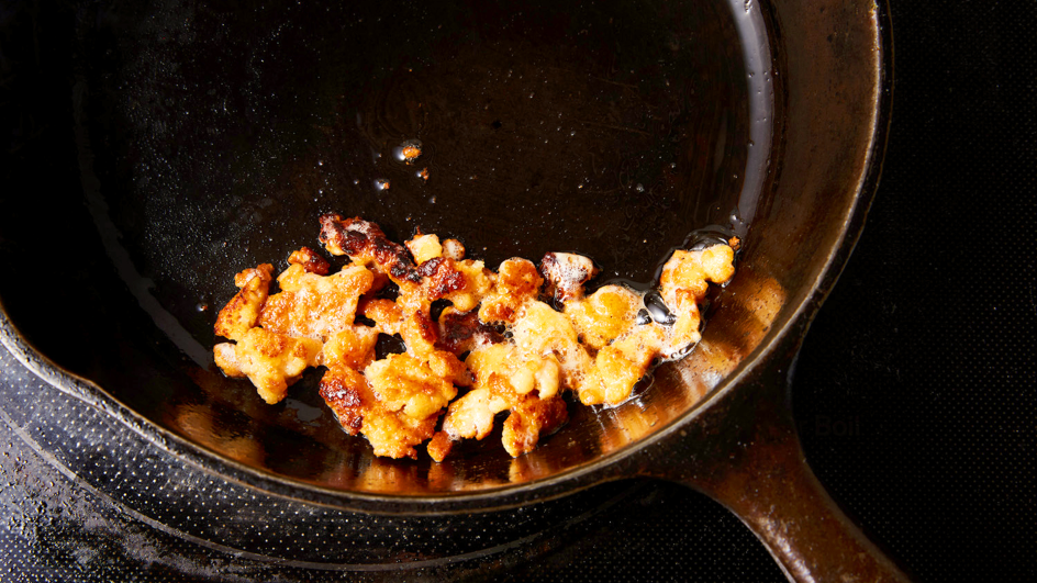
Fork & Good is paving the way for a new industry to thrive. Focusing primarily on ground pork – the most consumed animal protein on Earth – Fork & Good mainly partners with food trucks and fast casual establishments, offering tacos, dumplings, gyoza, meatballs, and more universally loved cuisines. "Fork & Good's mission is to create a future where everyone, anywhere, can enjoy the best of meat," says Mother.
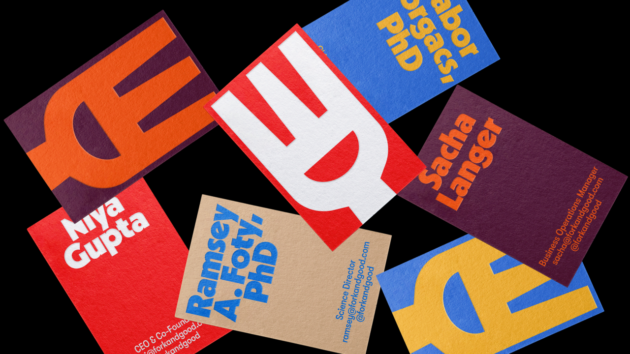
As part of this mission, the brand approached Mother to develop a fresh identity that "encapsulates the idea of infinite possibilities and accessibility for any cuisine, all meals – any Fork, all Good". Key elements of the rebrand began with the wordmark and logo. Mother studied brands with mass appeal and found inspiration in traditional butcher shop signage. The curvature of the mark emulates the characteristic cut-out in its new 'Smiley Fork' logo, and both curve and cut-out 'smile' express living, dynamic variations in both motion and static use cases.
The graphic language, meanwhile, features the same cut-out that informs the 'bowl' device in its graphic system – the two-dimensional container for various meals photographed in high contrast –and, paired with chopsticks found in the negative space between the fork's tines, further represents the universality to the brand's DNA.
For the typography, the brand's new font was chosen to "emulate the weight and curves of the 'Smiley Fork' logo," says Mother, with the negative space in the characters, notably that of the lowercase 'e', reinforcing the smile shape found in the logo, wordmark, and the 'bowl' graphic device. Moreover, the typeface is built on a geometric skeleton, reinforcing that the brand is universal.
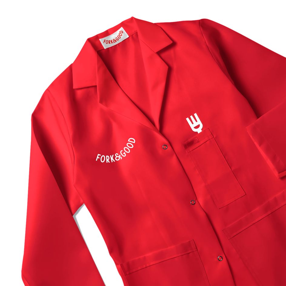
All of the above is wrapped in a vibrant colour palette of bright red, cool dijon, deep eggplant, and other tones that aim to be appetising and timeless. Supporting imagery, such as repetitive, food-wrapper-like patterns and bold food photography, completes the new look and feel. Motion brings brand assets and type to life via social media updates and a newly designed website.
"Food is a fundamental part of our shared experience on this planet; it can sustain us, bring us together and impact our culture," says Mark Sloan from Mother Design. "We're living in an age of staggering population growth, and since we're intelligent beings who recognise the finite nature of our ecosystem, we're constantly trying to figure out better ways to feed ourselves.
"The amazing minds at Fork & Good have cracked the code and are creating remarkable products which honour the role meat plays in our lives but also honour the lives of animals. The team at Mother Design is incredibly proud to have collaborated with them on their new visual identity, and we're looking forward to partnering with them as they continue to define a burgeoning industry."