FitzJohn’s by DutchScot
Opinion by Eleanor Robertson Posted 2 May 2023
When my partner and I first moved to London in 2014, surviving on scarcely more than minimum wage, it obviously seemed like a sensible idea to rent in Hampstead. We’d heard of the Heath, and were familiar with the Northern Line. The flat, apparently once a Sex Pistols’ squat, was tiny and hadn’t improved much since the 70s. Back then Johnny Rotten reported that ‘despite the lack of running water, it was better than home’. We had water (so much of it we flooded our neighbour twice), but no central heating. We should have seen red flags at the viewing, when we noticed the windows were clad in bubblewrap, but the estate agent swiftly redirected our attention to the location.
And he was right. Despite icicles in winter, we were a stone’s throw from Kenwood House and a dozen artisan bakeries. In summer, we’d crawl through the uninsulated loft space to the roof, where we’d share pastries from Ginger & White with the city’s plumpest pigeons, or picnic by the ponds. Instead of spending our weekends shlepping over to Acton or Colliers Wood, we let our friends flock to us… because Heath. As we clambered onto the lowest rungs of the career ladder, Hampstead was our sanctuary.
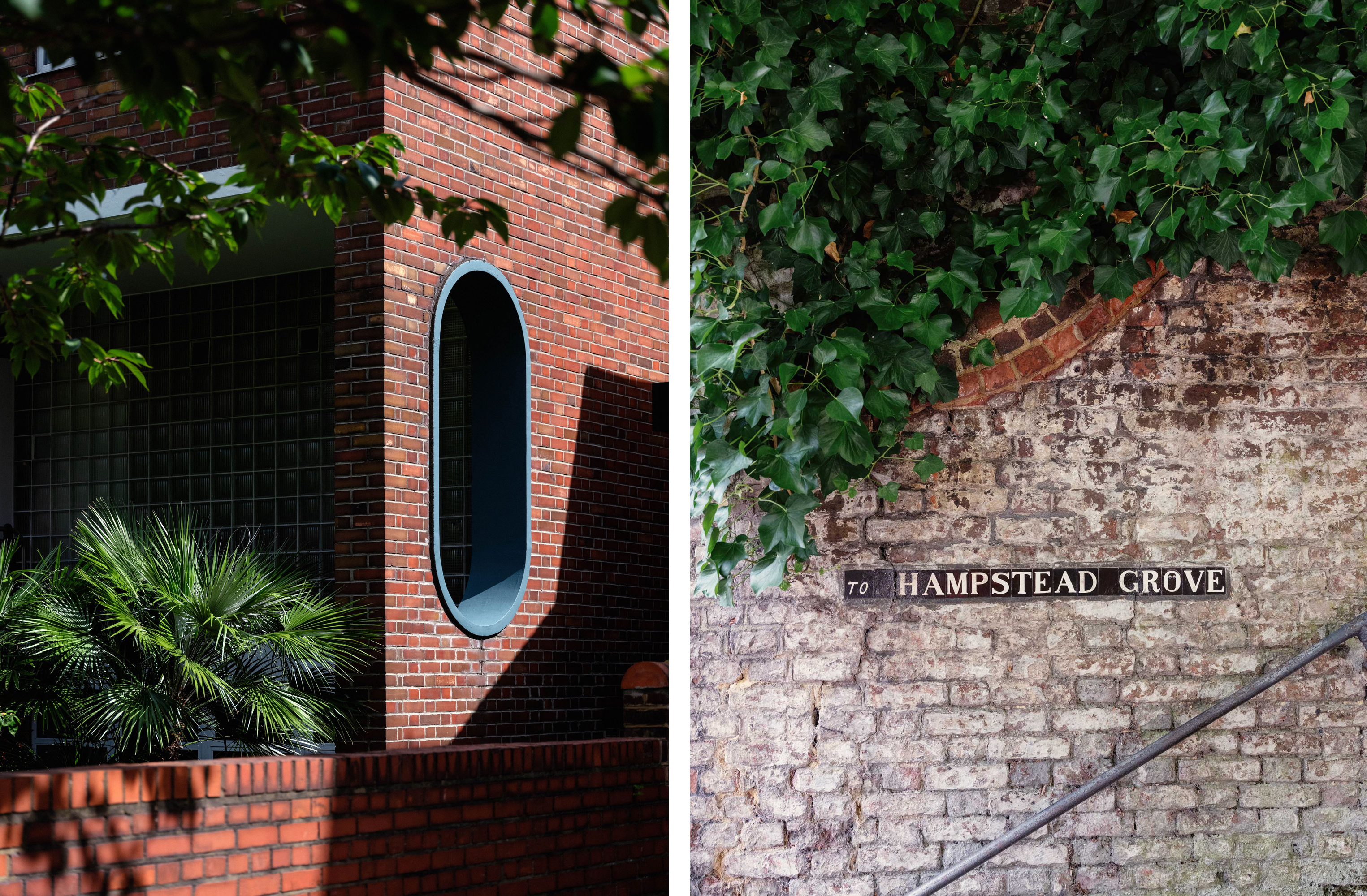
I’ll admit, therefore, that I have a personal soft spot for the eccentric typography found on the street signs of NW3. So, when I first saw DutchScot’s work for FitzJohn’s apartments, I was struck by a peculiar nostalgia. While the village is a notorious haven for oligarchs and tech entrepreneurs (our little studio, complete with airplane-sized bathroom, is now valued at over a million), it still appears to me – through rose-tinted glasses – as a bastion of bohemian living. Its shabby second-hand bookshops and tatty hippyish bazaars evoke humble joys and artistic allure. I can buy into DutchScot’s strategic departure from luxury (each FitzJohn’s complex has facilities to rival a five-star hotel) to focus on Hampstead’s rich creative history.

Nestled in one of North London’s leafiest enclaves, FitzJohn’s is a ‘distinguished but forward-looking series of 29 apartments’ designed exclusively for people over 60: ‘this isn’t a retirement home, more a place to enjoy the finer things in life’. The development is defined by its contemporary architecture created by Sergison Bates. The building itself is a bit of a lump (less Isokon, more identikit beige biscuit tin: lots of brick, deep-set portrait windows, flat facades). But the floorplans would be catnip to any designer worth their salt – and indeed they were.
![]()

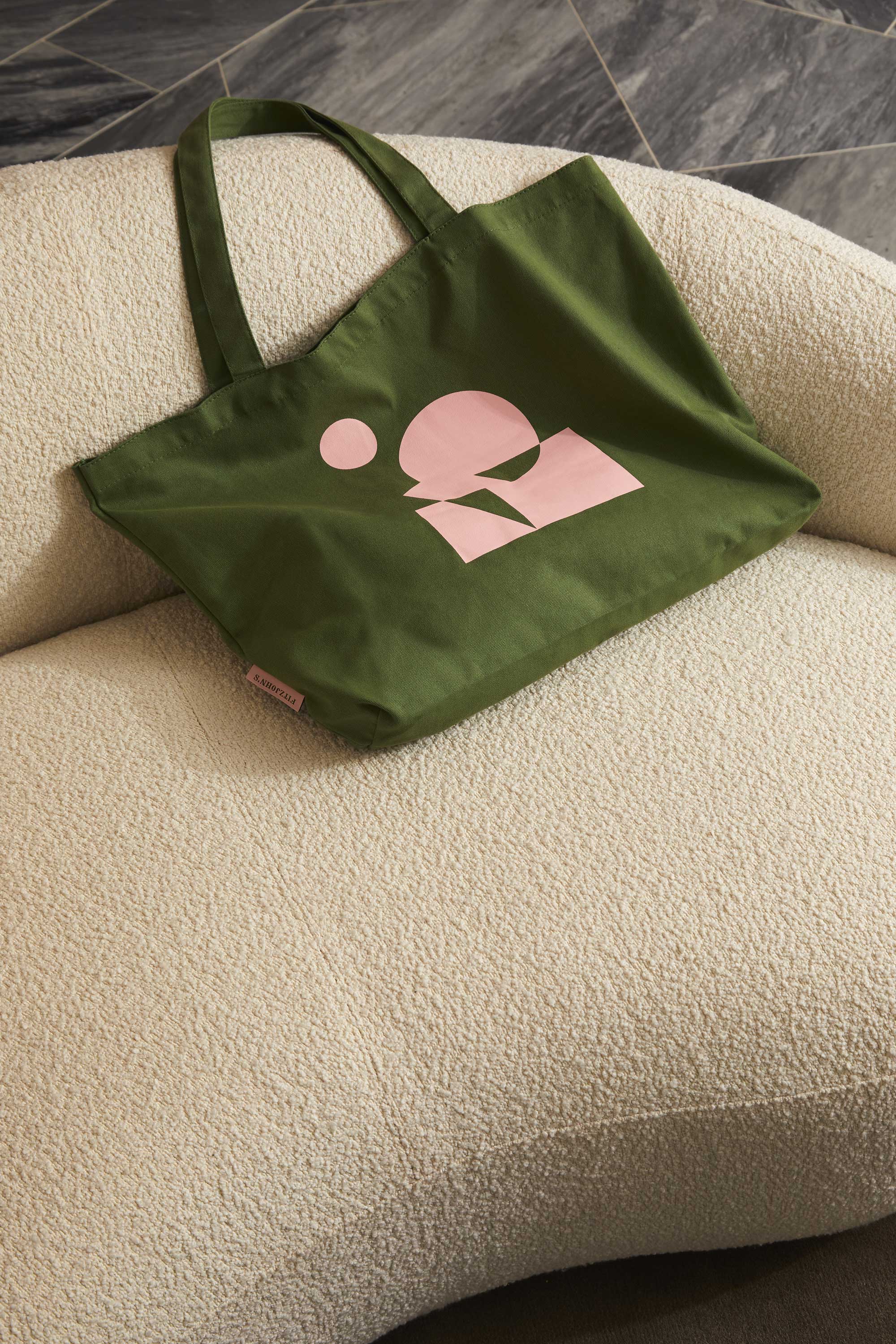
Each apartment in the development occupies an unusual and unique footprint – no two are the same – creating striking, geometric shapes that intersect and collide. Inspired by this, DutchScot’s identity is centred around a series of 29 abstract artworks, positioning each space for sale as an individual, one-off work of art ‘composed for modern living’. Despite the New London Vernacular (NLV to those in the know), these compositions of circles and squares cleverly beckon prospective buyers – the retiring champagne socialists – to imagine themselves as successors to the trailblazing Hampstead Modernists, Bauhaus émigrés, artists and challengers.


To further immerse buyers in this fantasy, the sales brochure contains a section featuring the creative residents of Hampstead, such as Henry Moore, Barbara Hepworth, George Orwell and Piet Mondrian. Meanwhile illustrator Emily Robertson was commissioned to create area maps, as well as little studies that breathe life into the communal areas of the development; the lobby, garden and ‘stretch studio’. These are charming and lend the brand a stylistic ‘cosyness’ – but they feel a touch at odds with the clean lines elsewhere. The photography, by Carol Sachs (whose clients include Condé Nast Traveler, Hermès, Krug, Patek Philippe and Times Luxx) is a better fit for the brand world, homing in on features that give a sense of what it would be like to live in a FitzJohn’s apartment (The Modern House was clearly a reference point). Supplementing these shots, there’s a gallery of images capturing the unique personality of Hampstead. We are sold a lifestyle, rather than a building.


Returning to the typography, which initially drew me in, the logo, fonts and layout pay direct homage to the local signage, adorned with distinctive ceramic tiles. Linotype’s Madison Antiqua serves as the foundation for an unconventional and expressive typographic approach, ranged left, right and staggered to create a seemingly improvised appearance. In larger headlines, select words are set in the condensed cut, enhancing the odd and irregular character of the postcode. And just as sans-serif letterforms sometimes creep into Hampstead’s street signs, the brand introduces Centra No.2 from Sharp Type as a supporting typeface.

DutchScot’s bold use of colour for FitzJohn’s deliberately goes against the clichés associated with the older generation – no bland neutrals here. ‘Again, inspired by the art world and Hampstead’s creative community, we knew we wanted a rich and varied colour palette,’ creative directors Jacob Vanderkar and Alex Swatridge explain. ‘We knew we’d want to tone it up and down so the navy and darker green provided a richness and level of sophistication. That is juxtaposed with the vibrancy of the pinks and oranges’. The result is contemporary and vibrant, capturing the charming, off-beat vibe of the area.
These days, I do wonder what it would be like to live on Flask Walk again. Perhaps I’d be able to enjoy a £10 pancake from La Crêperie without the subsequent guilt of having stuck it on a credit card? Perhaps not. But for those who can afford its delights, Hampstead is a pleasure garden – and this, above all else, has been captured by DutchScot’s work, emphasising the youthful vigour that living at FitzJohn’s could inject into later life. Playgrounds are for all ages, but especially the rich.
Fonts: Madison Antiqua & Centra No.2