Are you looking to make your next project stand out? The best Google Fonts are here to deliver.
We’ve curated the 30 best fonts you can find on Google Fonts to elevate your design while keeping it professional and on brand.

30+ Best Google Fonts for Professional Design in 2024
For the purposes of this article, we’re going to split our top Google fonts into Sans Serif and Serif options.
We’ve outlined the best Google fonts for headings, websites, tech logos , apps, coding, UX , graphic design, teachers, and more.
Also, see our features on the best font combinations and the best headline fonts.
10 Best Sans Serif Fonts on Google
For the complete list, scroll on!

Download all the Fonts you need and many other design elements, available for a monthly subscription by subscribing to Envato Elements.
Get unlimited access to a massive and growing library of 14 Million+ items.
10 Best Serif Fonts on Google
- PT Serif
- Bitter
- Merriweather
- Crimson Text
- Playfair Display
- Noto Serif
- Arvo
- Lora
- Libre Baskerville
- Cormorant Garamond
For the complete list, scroll on!
The Best Sans Serif Fonts on Google Fonts
1. Roboto
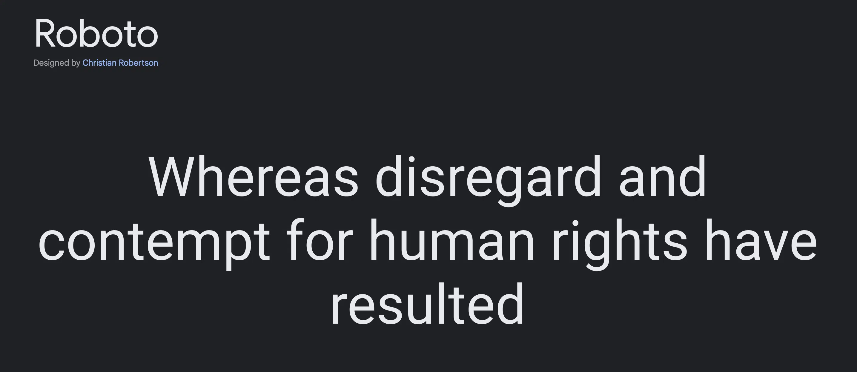
Among the list of the best Google fonts, we find Roboto to be particularly enjoyable and impressive as the first Sans Serif option.
This font boasts a refreshing and widely spaced design, available in six different weights, including its italicized counterparts.
Its versatility makes it a perfect fit for high-resolution screens and long-form texts, ensuring excellent readability in various contexts.
Whether used in digital platforms or print materials like magazines , Roboto stands out as a top choice in our font selection, consistently delivering exceptional results for a wide range of design projects.
2. Open Sans
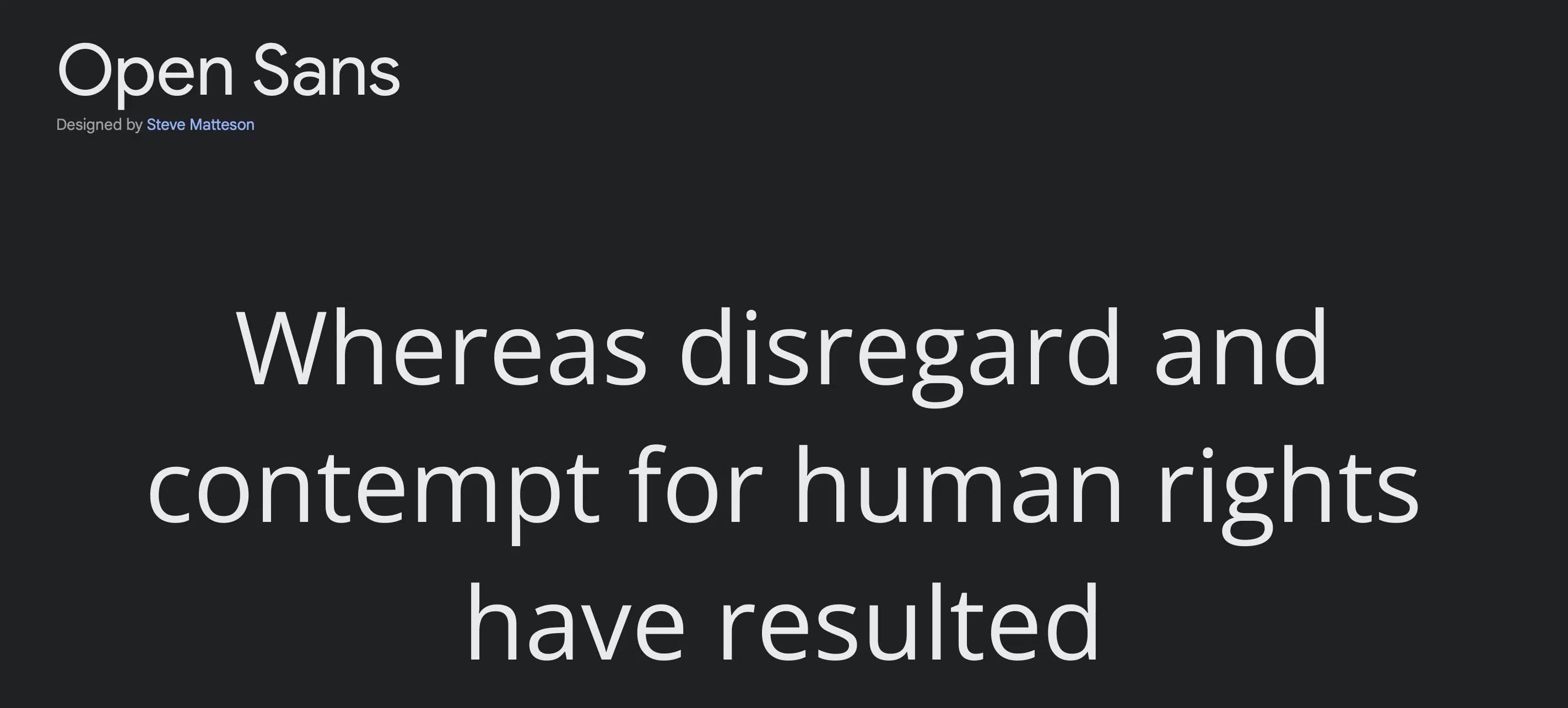
In our opinion, one of the best Google fonts that designers absolutely love for various types of media is Open Sans. Whether it’s for print, the web, branding , or mobile interfaces, Open Sans has a way of making everything look outstanding.
Its letterforms are generously spaced and highly legible, ensuring a smooth and easy reading experience.
With 5 weights available, including its italicized versions, this font offers a remarkable range of options to suit different design needs.
No matter the platform or medium, Open Sans consistently delivers exceptional results, making it a top choice for designers seeking both style and readability.
3. Lato
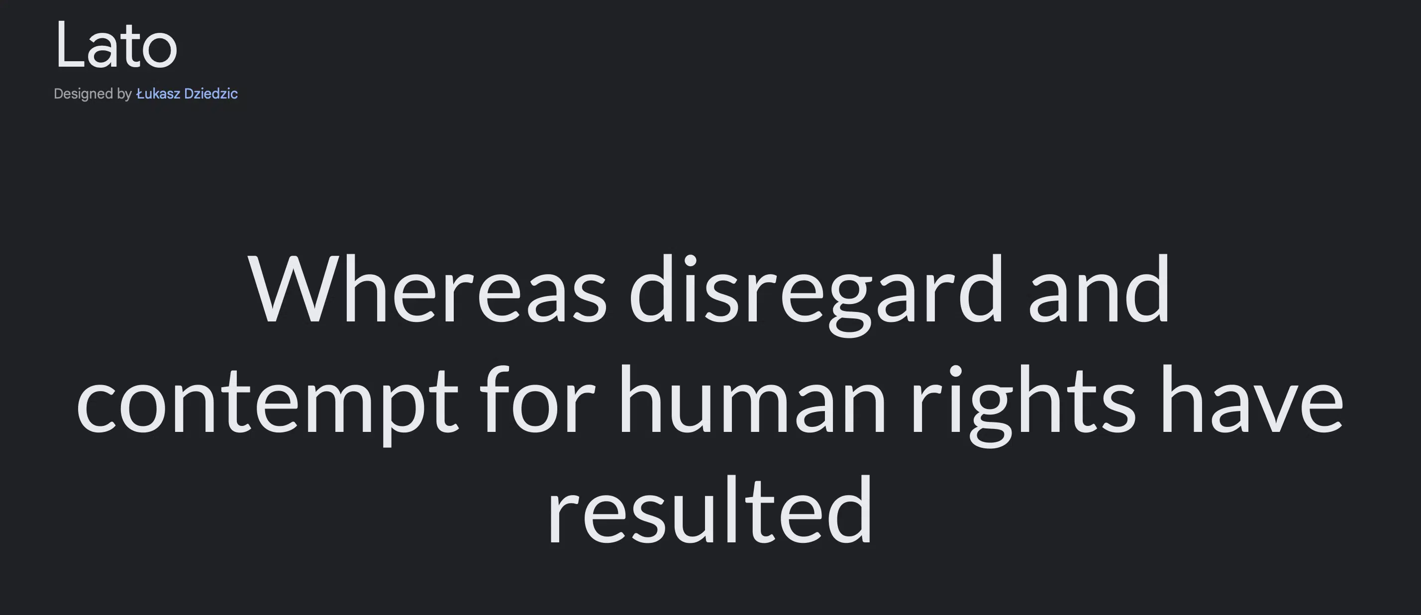
Another compelling choice among the best Google fonts is Lato , which comes in 5 weights, including italics, particularly for websites seeking top-notch typography .
With its fine edges and clean appearance, Lato exudes a sense of quiet sophistication while infusing a touch of freshness into any design.
Its versatility and balanced aesthetics make it a standout option for various projects, whether it’s for websites, branding materials, or printed media.
Lato’s ability to strike the perfect balance between elegance and modernity makes it a favorite among designers seeking a font that can elevate their creations to new heights.
4. Montserrat
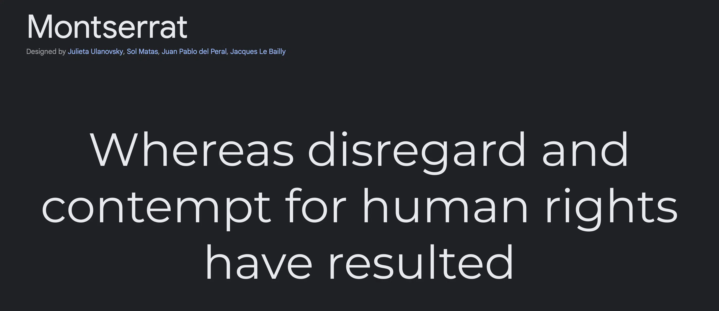
In our search for the best Google fonts, Montserrat emerges as an outstanding option with its distinctive wide spacing.
Offering an impressive selection of 9 different styles, including italics, Montserrat presents a loose and wide appearance that immediately catches the eye.
Its design is characterized by wider arches, breathier spacing, and a rounder quality, giving it a unique and dauntless appeal.
When it comes to branding concepts that strive to be clean and modern, Montserrat becomes an excellent choice.
Its striking visual elements make a powerful statement, ensuring that a brand’s message is clear and memorable.
Whether used in headlines, logos, or various design elements, Montserrat leaves a lasting impression and adds a touch of creativity and flair to any project.
5. Roboto Condensed
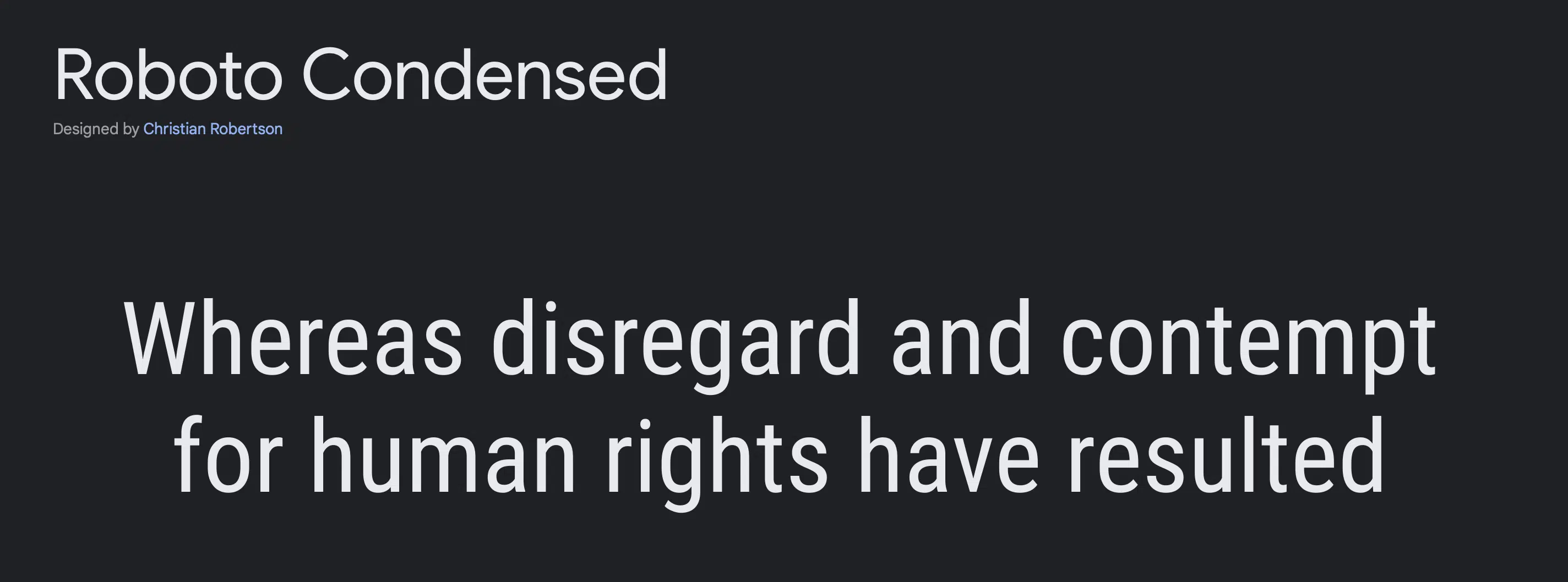
In our exploration of the best Google fonts, we can’t overlook the Condensed version of Roboto, which offers more pressed spacing.
This font family comes in three weights – Light, Regular, and Bold, providing a versatile set of options for various design needs.
Just like the original Roboto style, Roboto Condensed excels in readability, making it an ideal choice for long-form texts.
Whether it’s used in small or large sizes, this font maintains its comfort and legibility, ensuring a smooth reading experience across different mediums.
We highly suggest this font for social media brands , websites, print materials, or any other design project.
Roboto Condensed proves to be a reliable and stylish choice that never disappoints because its condensed design is a useful feature for dense texts.
6. Nunito
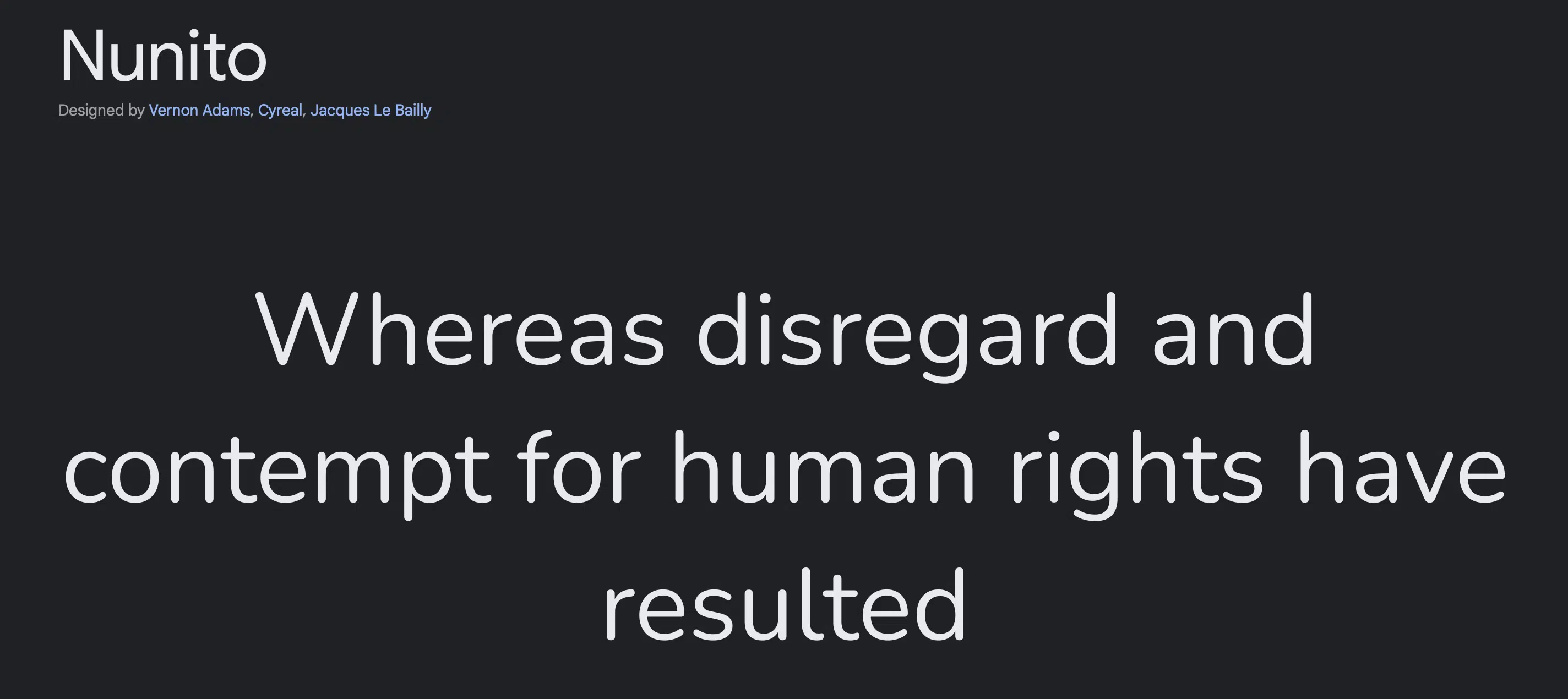
Great for titles, headlines, posters, or anything that demands attention – Nunito is the way to go.
Spunky with a wide layout, it grabs the eyes of any reader which is a perfect weapon for graphic text visuals. It comes in a hefty 9-weight option that also comes in italics.
7. Nunito Sans
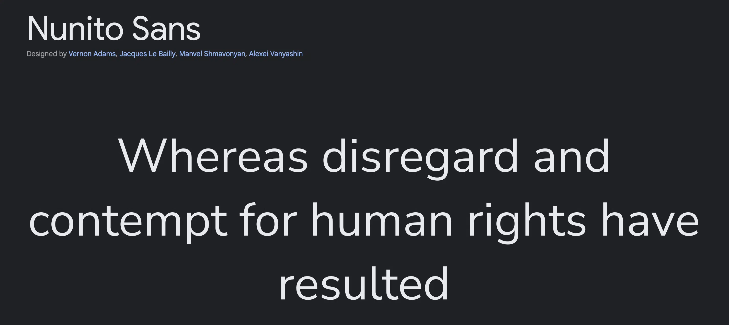
A variant of Nunito with subtle distinctions, Nunito Sans is another contender for texts of a firmer but open nature.
Projecting professional confidence, this font can make words hold integrity and depth.
8. Poppins
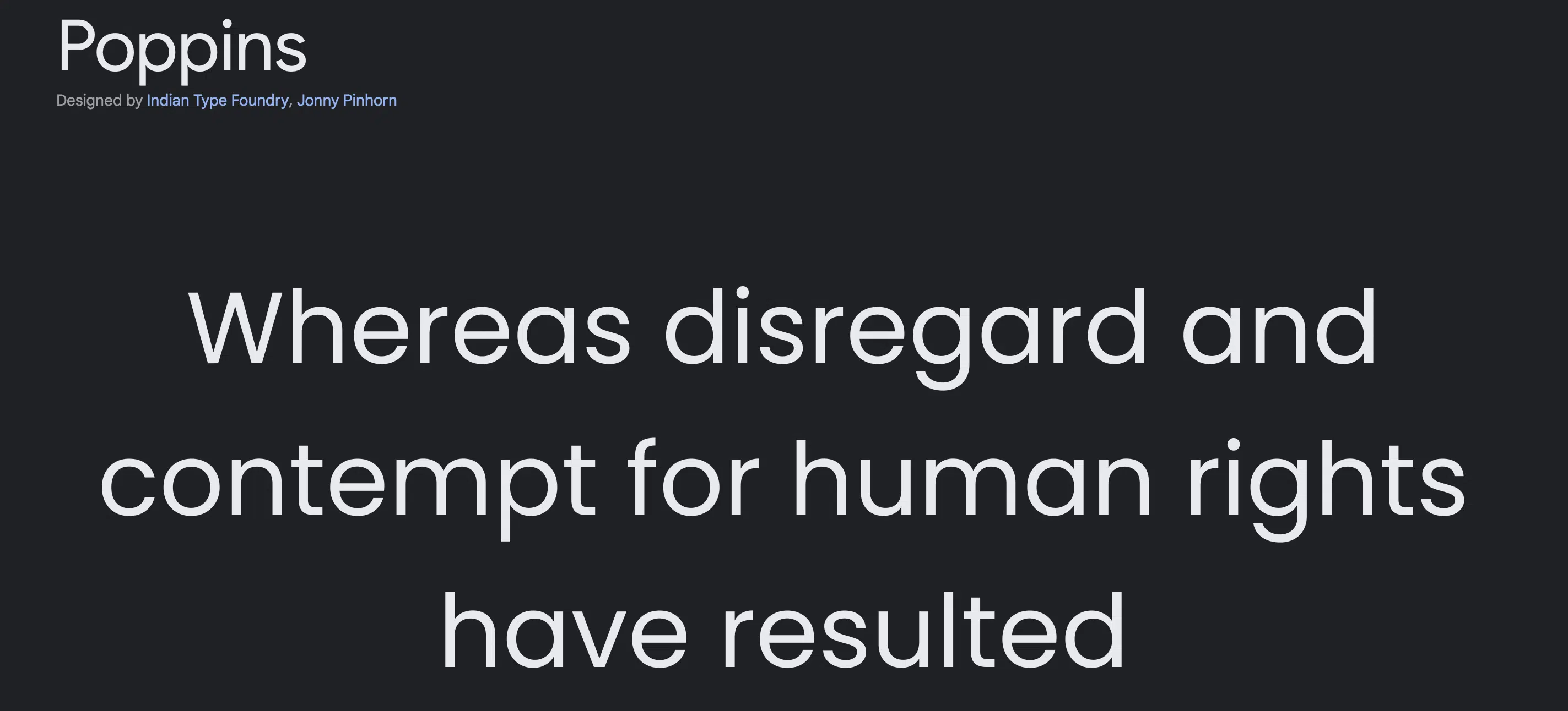
Slightly rounder on the edges, Poppins possess a friendlier aura.
Spaced normally but with a broader letter design, it also is a great font for headers and important text graphic designers may need in their pieces.
9. Mukta
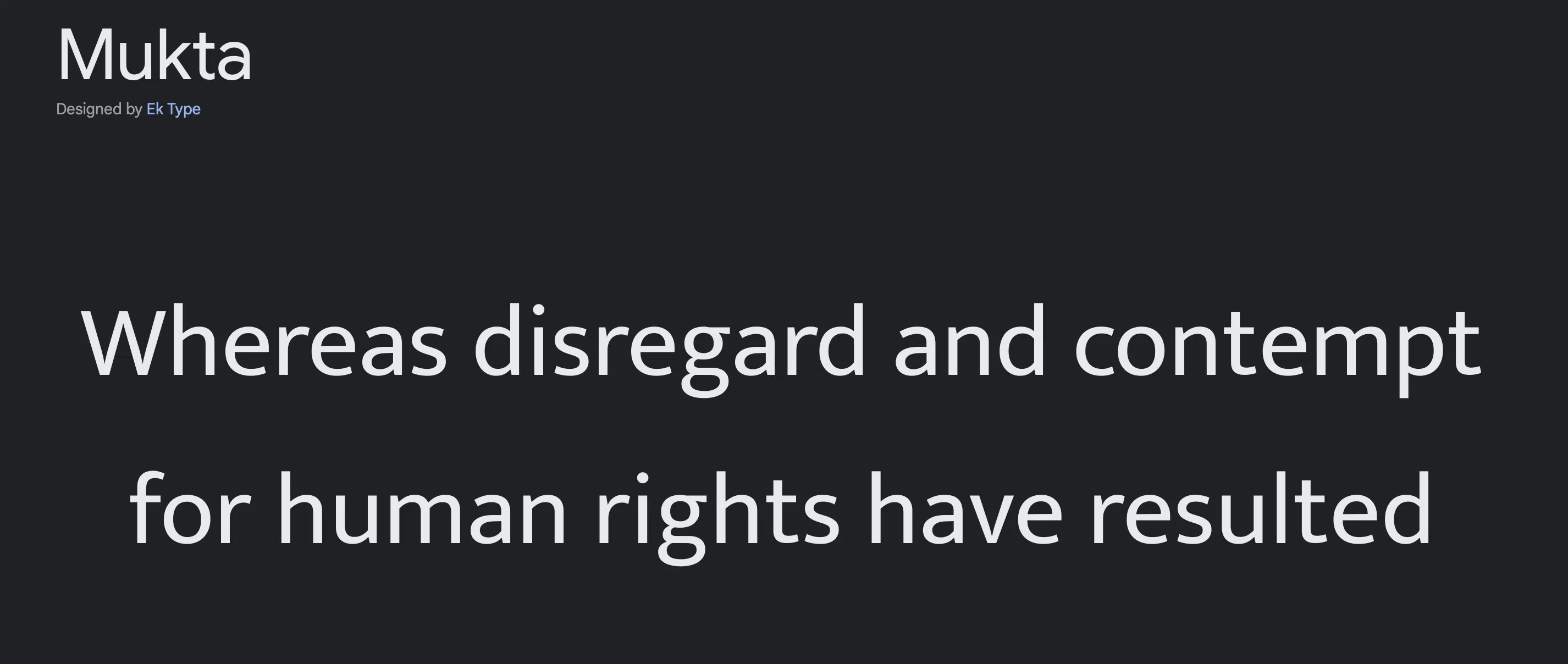
If you’re looking for a more stable-looking font sporting a consistent tone, then Mukta is just what you need.
It comes in 7 weights, italics included, and supports other scripts such as Latin, Tamil, and Gujarati among others.
10. Quicksand
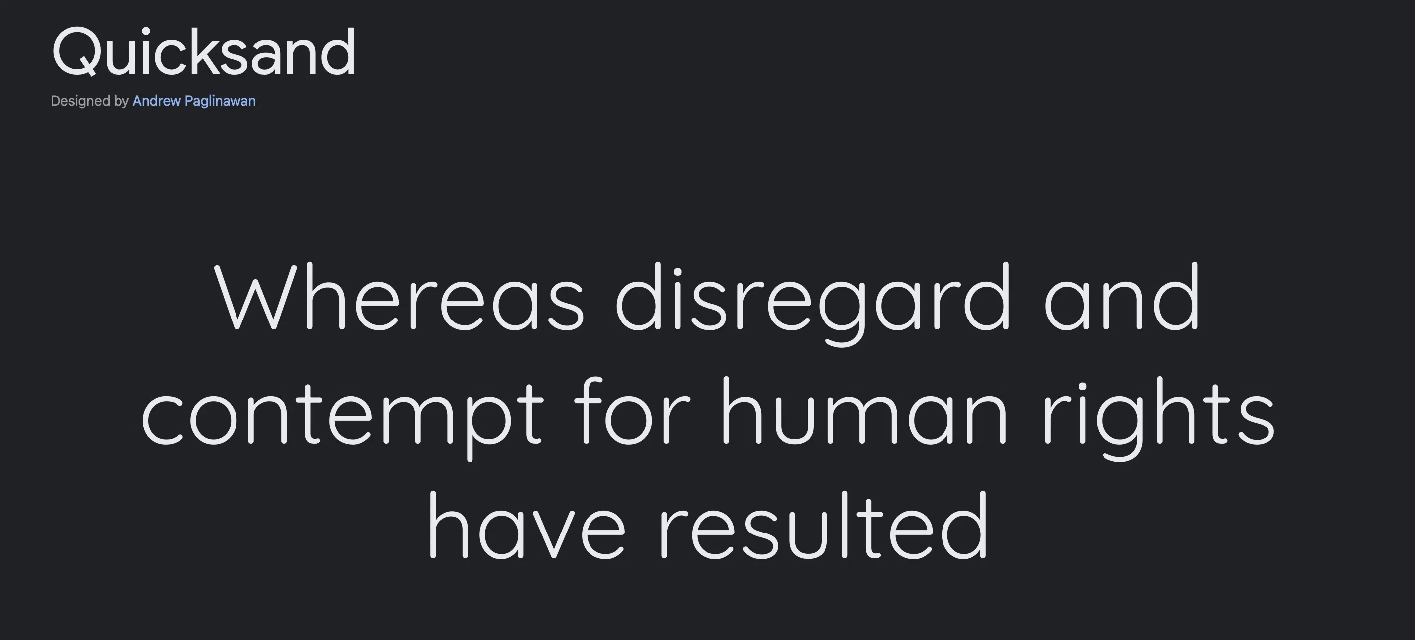
Sleek and emphatic is the vibe Quicksand embodies with a slimmer line and roomy spacing.
A touch of fun is added with its rounded edges and fuller arches and curves. Headlines, posters, and ads are a great medium for this quirkier sans-serif font.
11. Fira Sans
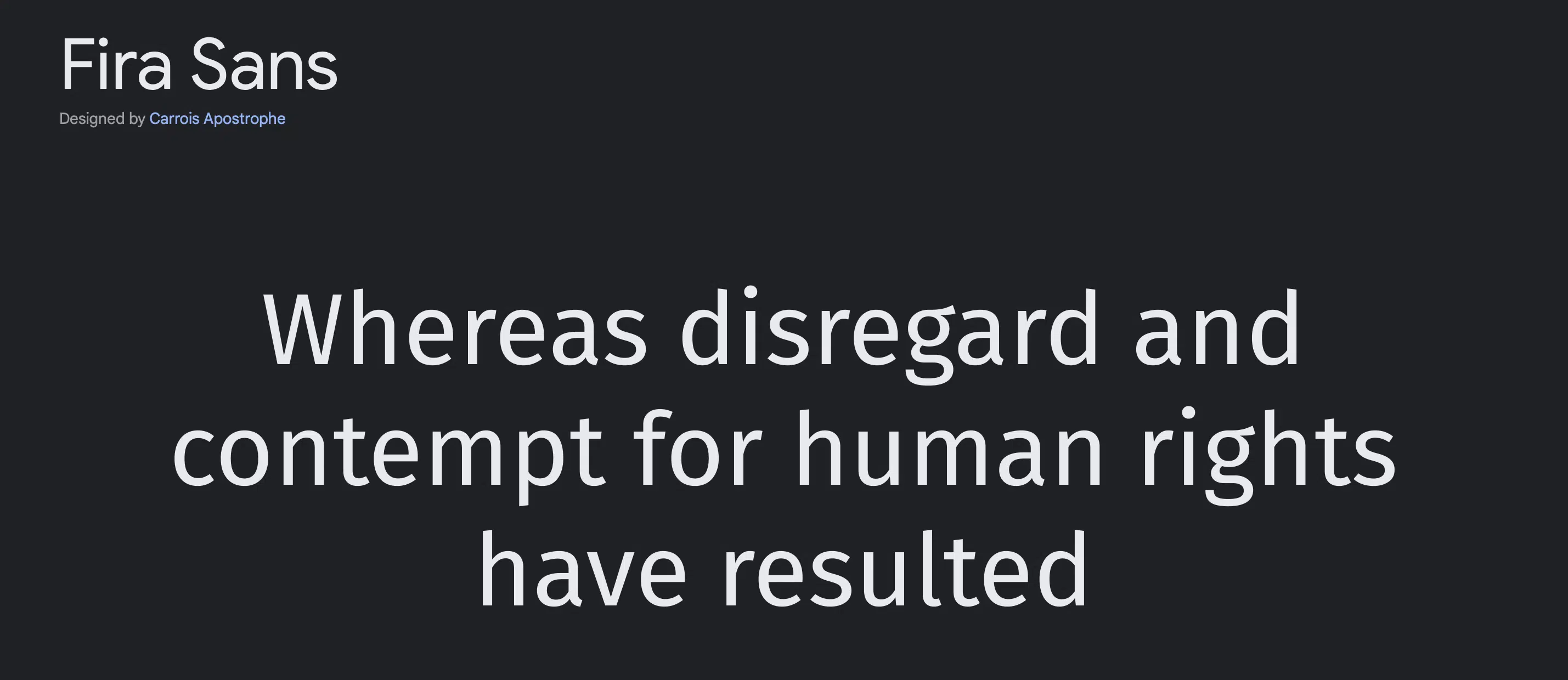
Fira Sans has an enthralling but subtle flair in the slightest of detail in its letterform (notice that ‘g’ in the example above) .
Business-like mixed with a twist of playfulness makes it a wonderful option for branding that endeavors to inspire youthful attention.
12. Rubik
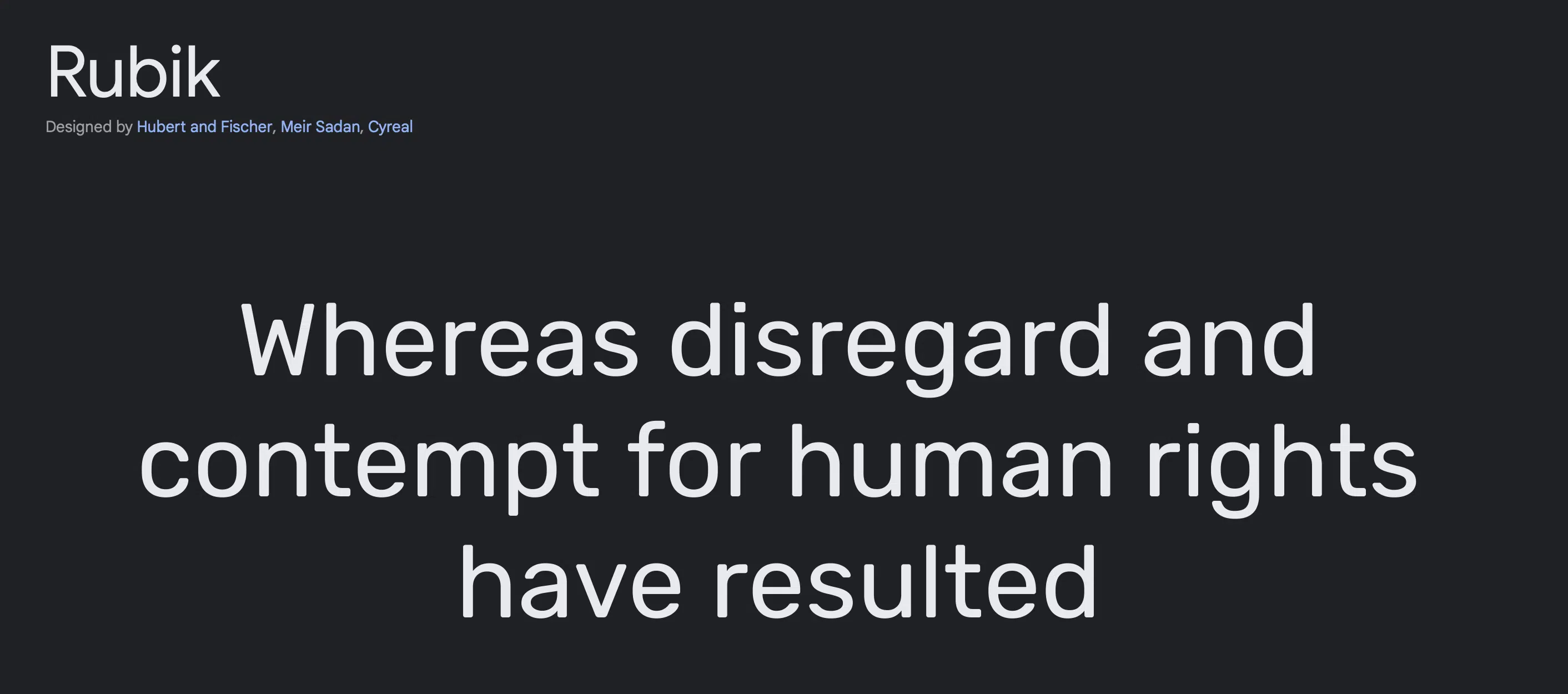
Shooting for bolder statements? Chunky and broad Rubik can be what you’re looking for. With 7 weights available along with italics, it can work for whatever purpose or medium your design requires.
13. Ubuntu
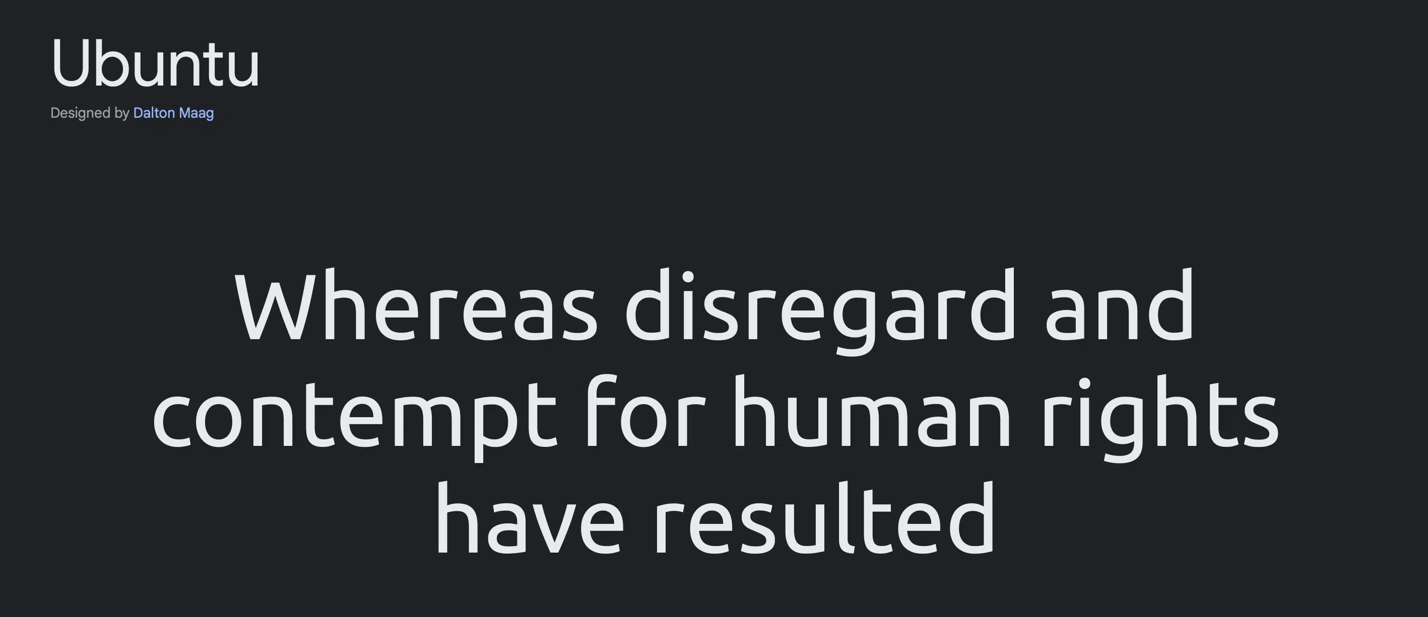
Next down the list is Ubuntu – with 4 weights including italics. Its lovely soft curves and vivid letters promote whimsy and spry energy.
Logos, ads, or posters are sure to capture any audience with their modern font.
14. Inter
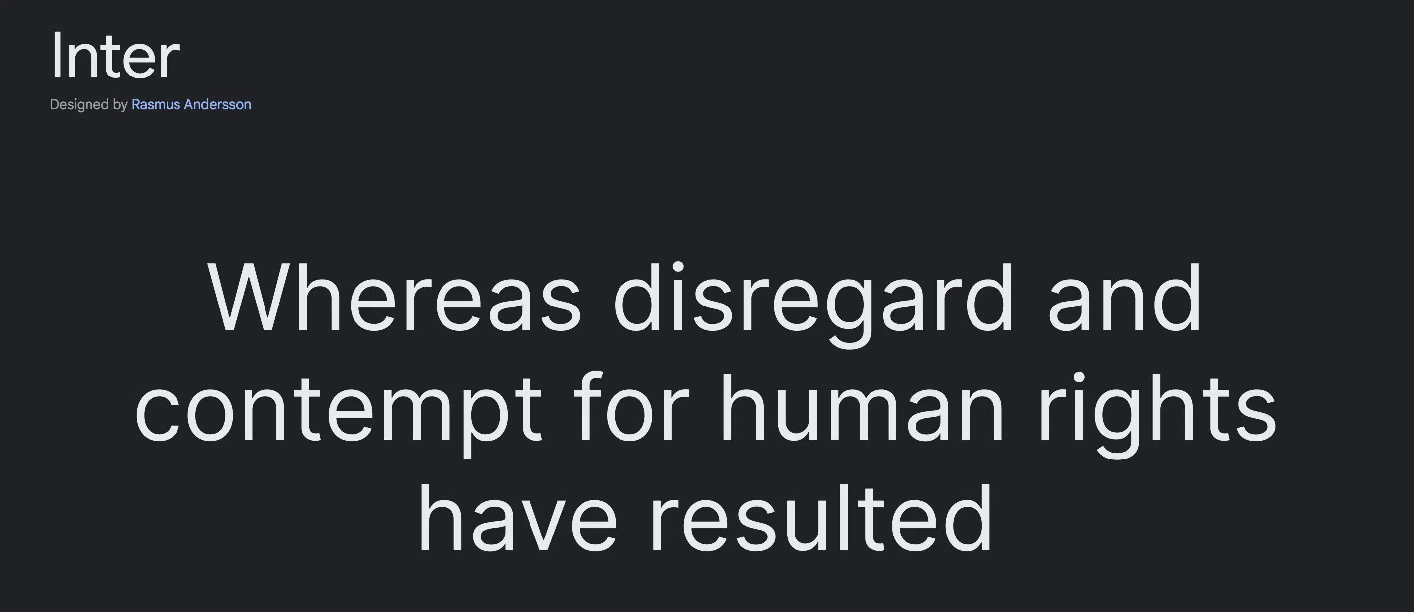
Best seen on websites and graphic ads, Inter is flexible for whatever is needed with 9 weights available on Google Fonts with italicized alternates.
The clear-cute lines and striking lettering give it an executive feel without being stuffy.
15. Work Sans
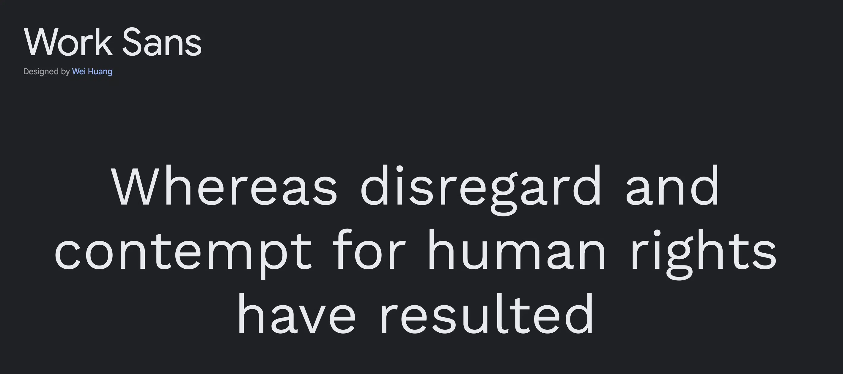
Another classic-looking design with a low-key panache, Work Sans lives up to its name as a great bet for professional-themed graphic pieces.
With 9 constructive weight options plus its corresponding italics, it is functional, fresh, and reliable.
16. Raleway
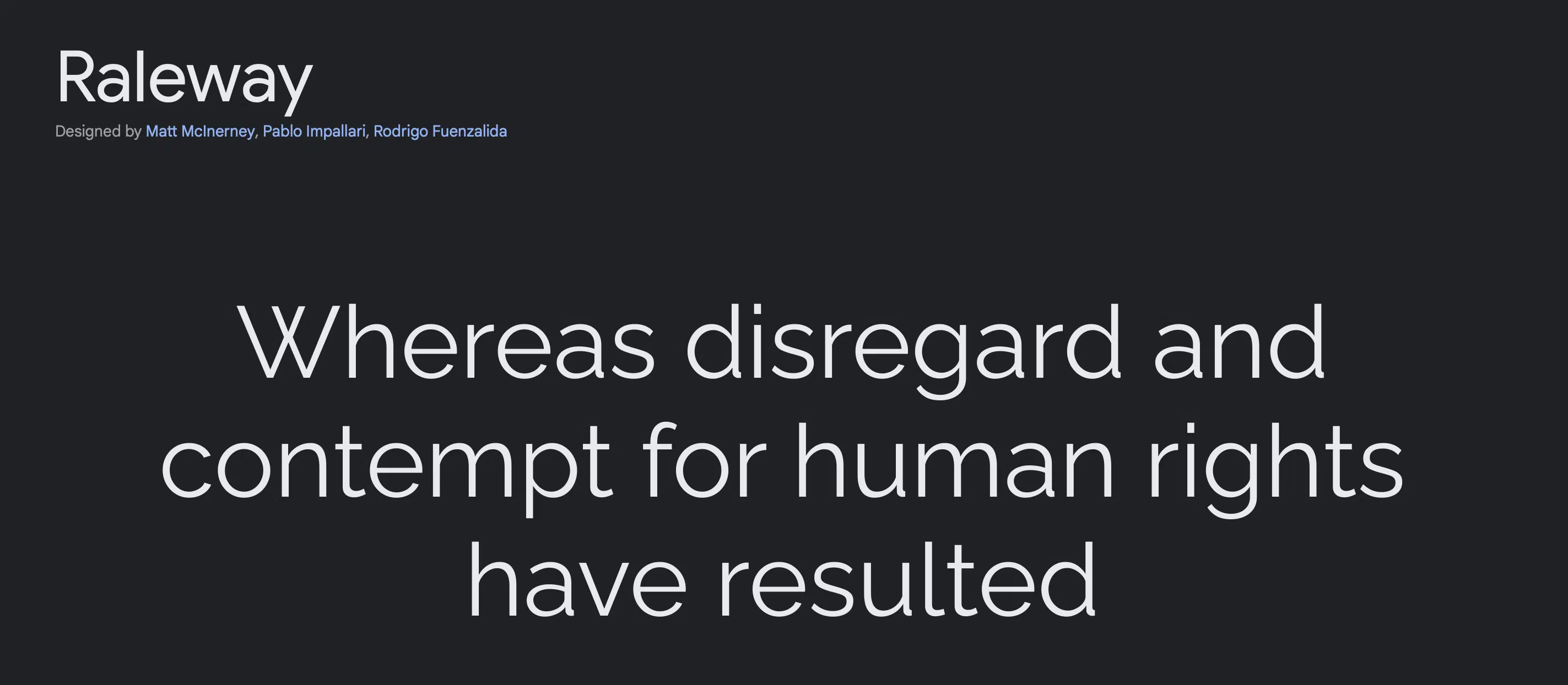
Capping the list off with Raleway – a pristine and elegant letterform. This final sans serif font is a testament that the littlest details make all the difference.
It sports 9 weight variations for your every graphic design need.
The Best Serif Fonts on Google Fonts
1. PT Serif
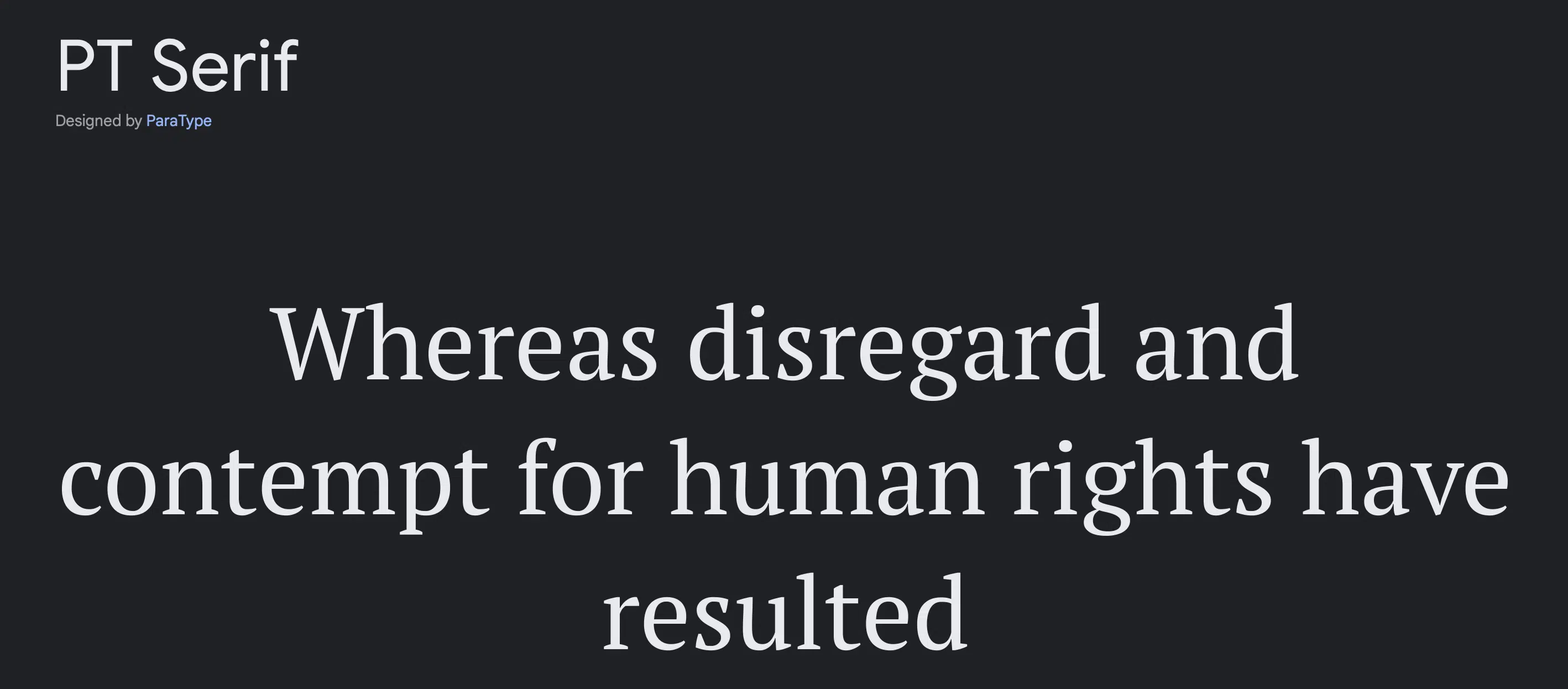
When it comes to choosing the best Google fonts for our projects, PT Serif has consistently stood out as a top-notch option.
We can’t help but admire its polished style, which exudes a sense of professionalism and elegance. The explicit and straightforward nature of this font makes it an excellent choice for conveying information with clarity and precision.
One thing that really sets PT Serif apart from other fonts is its ability to strike the perfect balance between formality and approachability.
The wide adoption of PT Serif on over a million websites speaks volumes about its proven track record in the design and branding world.
Its versatility is truly remarkable, as it adapts seamlessly to various design styles and branding requirements. Whether it’s used for body text, headings, or even logos, PT Serif always manages to impress.
As designers, we appreciate how well PT Serif complements other typefaces and elements in our compositions.
2. Bitter
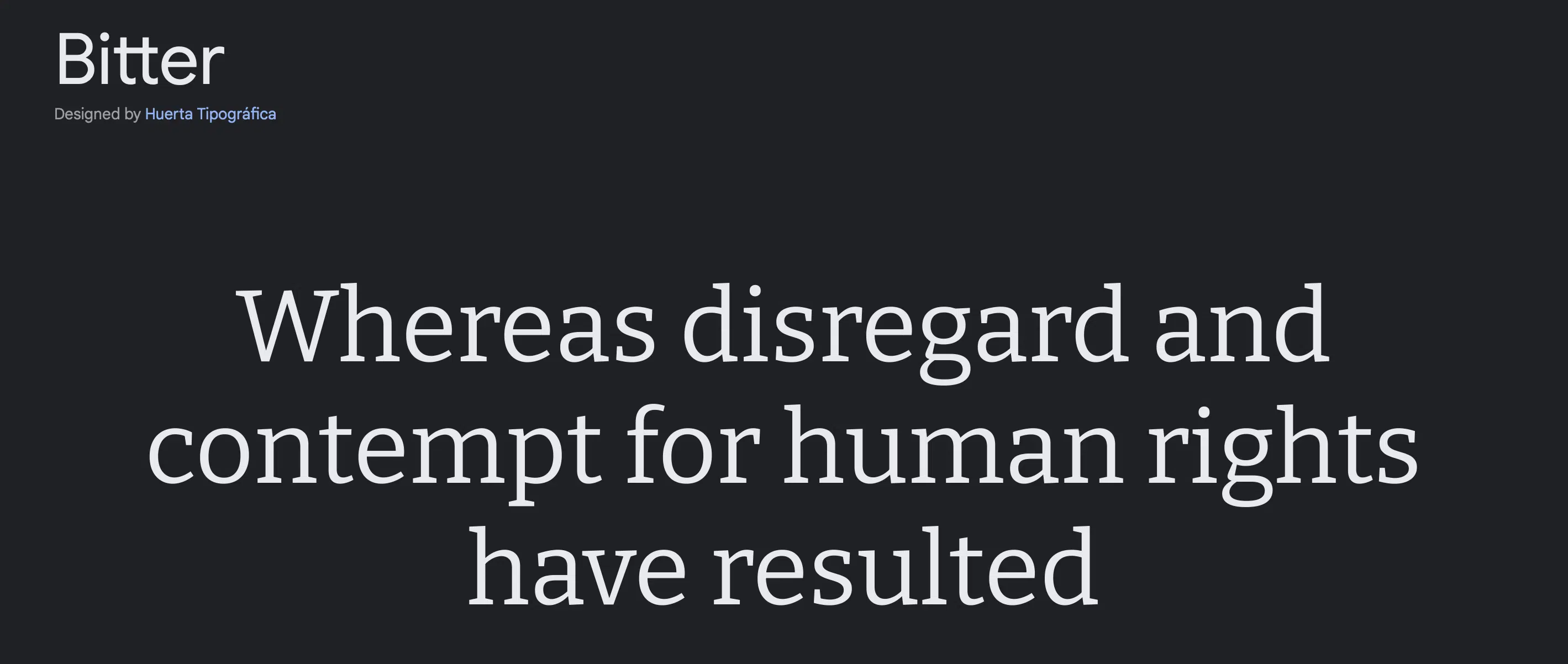
From our own experience exploring the best Google fonts, we came across Bitter , which undoubtedly stands as another strong contender.
Boasting an impressive feature count of over 700,000, this masterfully designed glyph showcases minute detailing and darker strokes, resulting in a sleek and sophisticated aesthetic that immediately catches the eye.
3. Merriweather
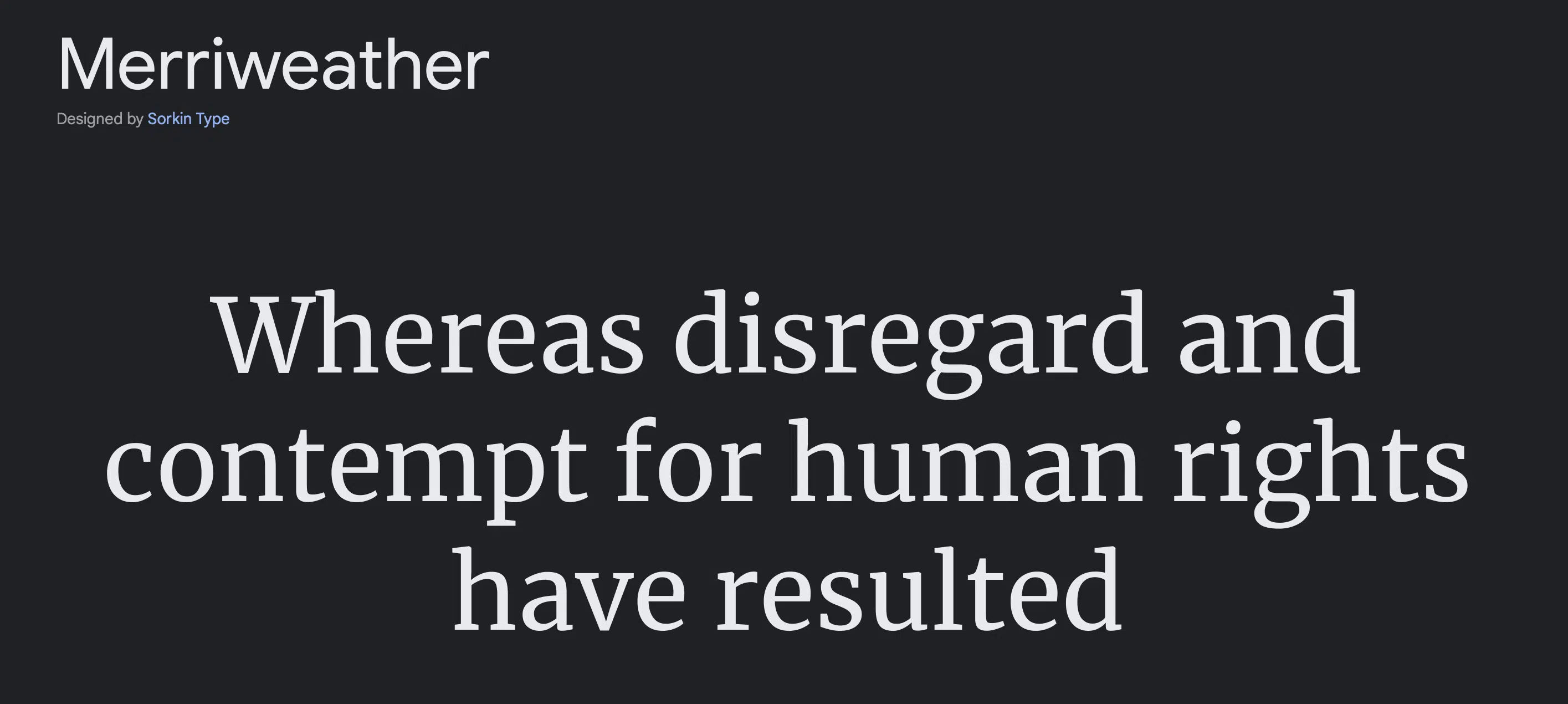
From our perspective, one aspect that truly impresses us when exploring the best Google fonts is the robust and modelesque forms of Merriweather .
This font’s letterface design is gracefully stretched taller, and its weight carries a heavier scale, resulting in effortlessly readable glyphs that undoubtedly leave a lasting impact across various mediums.
It’s no wonder why Merriweather remains a popular choice for websites. Furthermore, its readability makes it a standout option for any design project.
4. Crimson Text
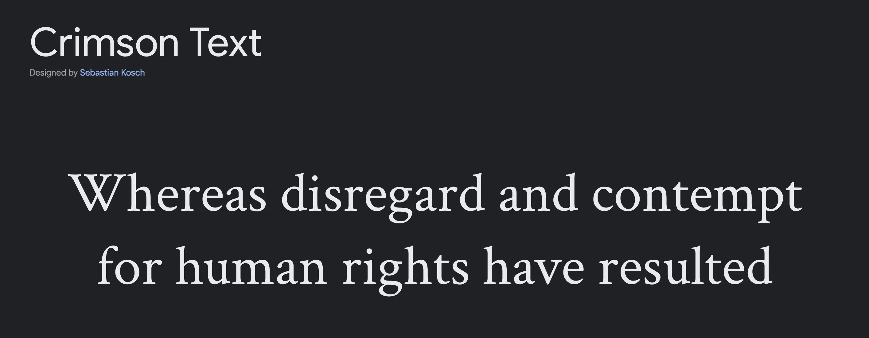
As we continue into this list of the best Google fonts, one that undoubtedly deserves the spotlight, especially for printed media, is Crimson Text .
In our own experience, we can attest to the fact that this font exudes a timeless elegance, making it an ideal choice for books, magazine write-ups, and newspaper articles.
With its impressive variety offered in 3 different weights, Crimson Text caters to various design needs while maintaining its classic charm.
This serif font’s roomy spacing provides a delightful and open reading experience, allowing readers to immerse themselves in the content without feeling overwhelmed by the typeface.
If you’re searching for a font that embodies traditional grace and readability for your printed materials, Crimson Text should undoubtedly be on your radar.
5. Playfair Display
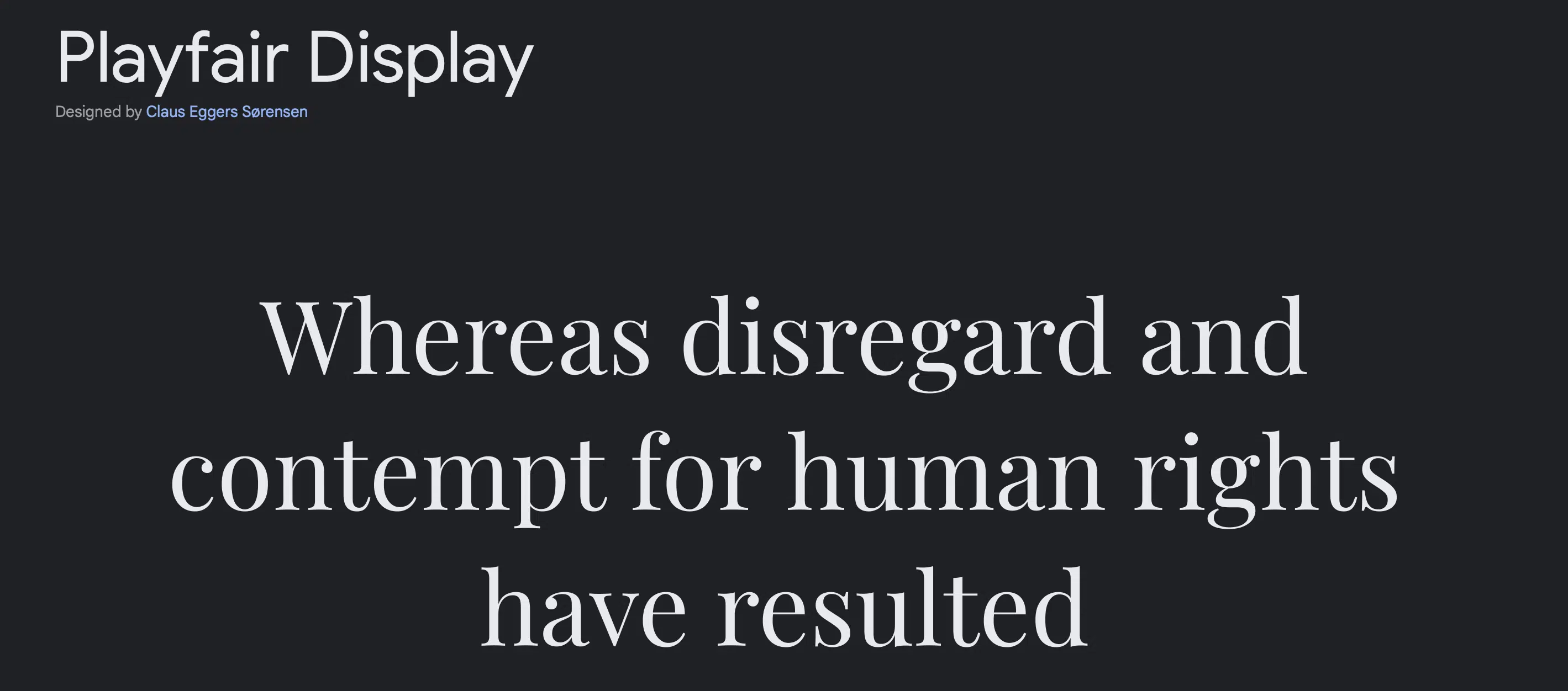
Based on our own encounters with the best Google fonts, we can confidently assert that Playfair Display is another remarkable font that falls into the same category as Crimson Text.
With its diverse range of 6 different weights, this font becomes an ace choice for creating stunning and eye-catching ads, captivating posters, and engaging flyers.
Its sleek and stylish design is sure to leave a lasting impression on any visual project.
You can’t go wrong with this slick font design that also supports multiple languages.
Regardless of the languages used in your designs, this font seamlessly adapts, ensuring your message reaches a broader audience without any hiccups.
When it comes to creating impactful visuals for various purposes, you truly can’t go wrong with Playfair Display.
6. Noto Serif
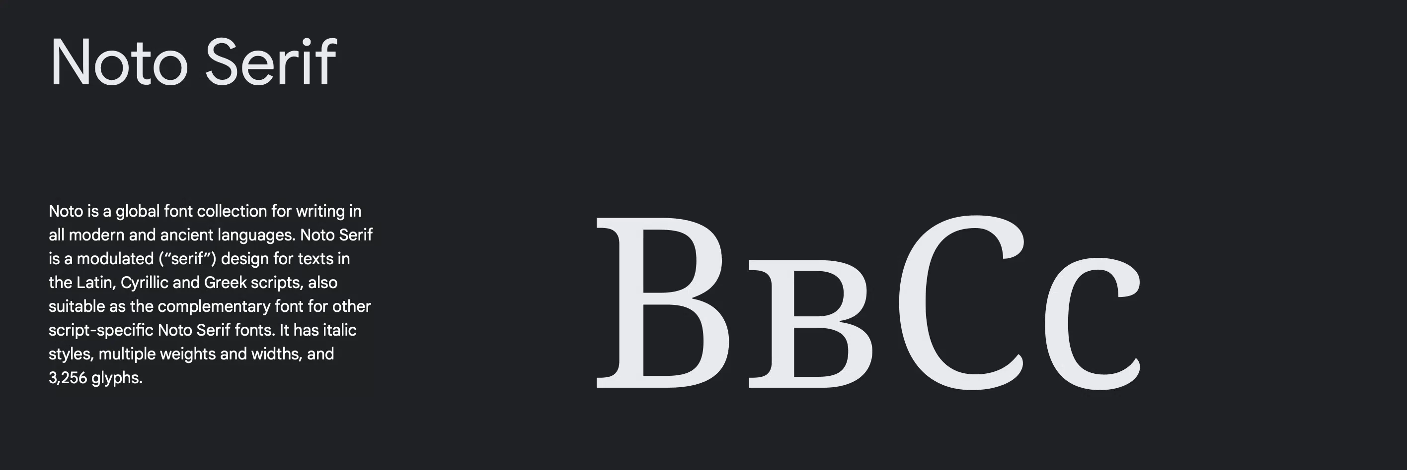
Next on the list is the sturdy and slightly beefy Noto Serif. Posh and flexible, this serif font offers not only 2 weights but a vast expanse of scripts in different languages.
With ample spacing and steadfast glyph design, it’s no surprise that Noto Serif is featured on more than half a million websites and is compatible with any peg graphic designers have envisioned.
7. Arvo
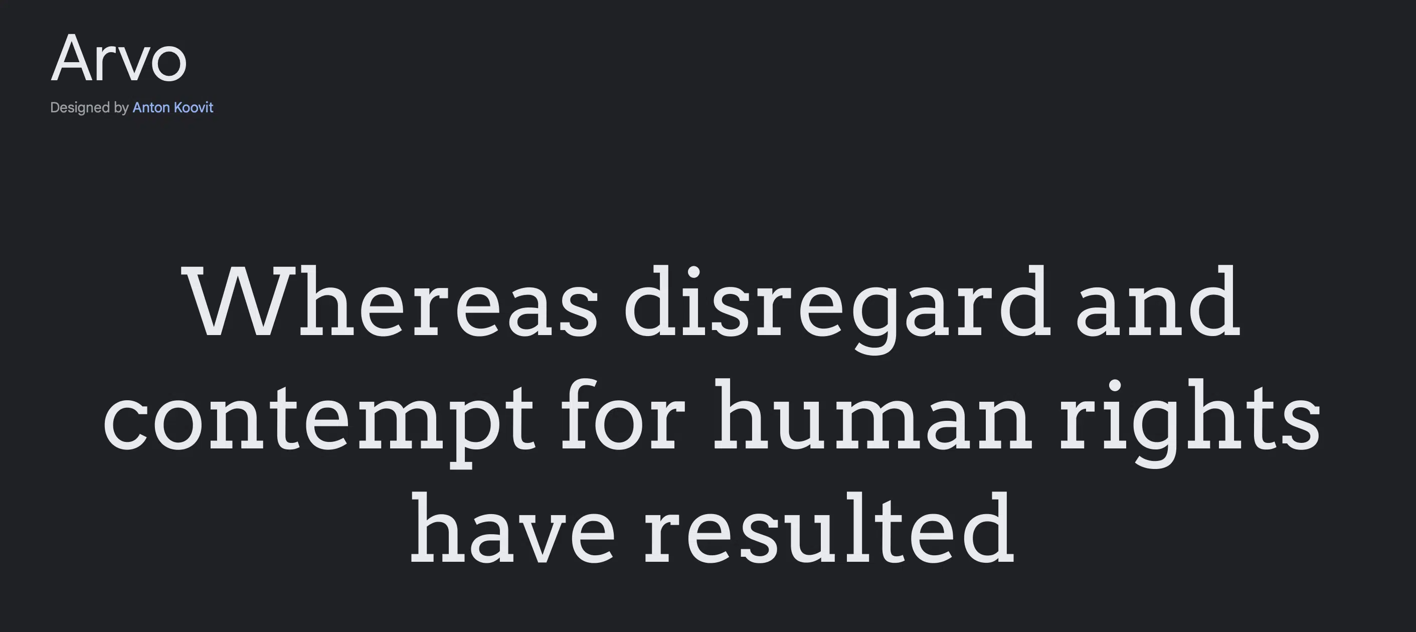
Of Finnish origins, this lustrous and heavy font design is equally creative as well as keeping an authoritative voice.
Best displayed on both printed media and on the monitor, Arvo is a fierce choice for headlines, headers, logos, and billboard ads owing to the thick letters that give it an impressive pull.
8. Lora
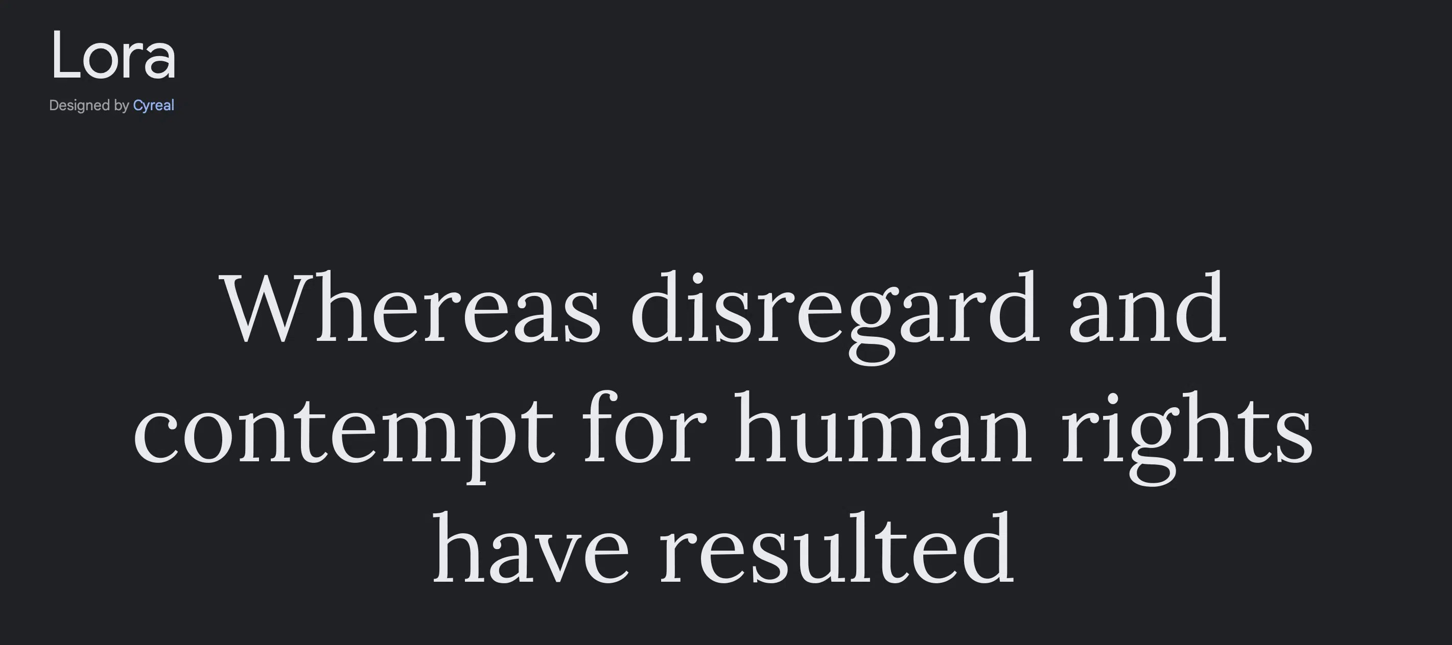
Lora carries sharper tails and contemporary air. An optimal choice for whether you need prints or need to have your design displayed on screens or on both!
It’s a sleek font that can be a great tool to tell your story.
9. Libre Baskerville
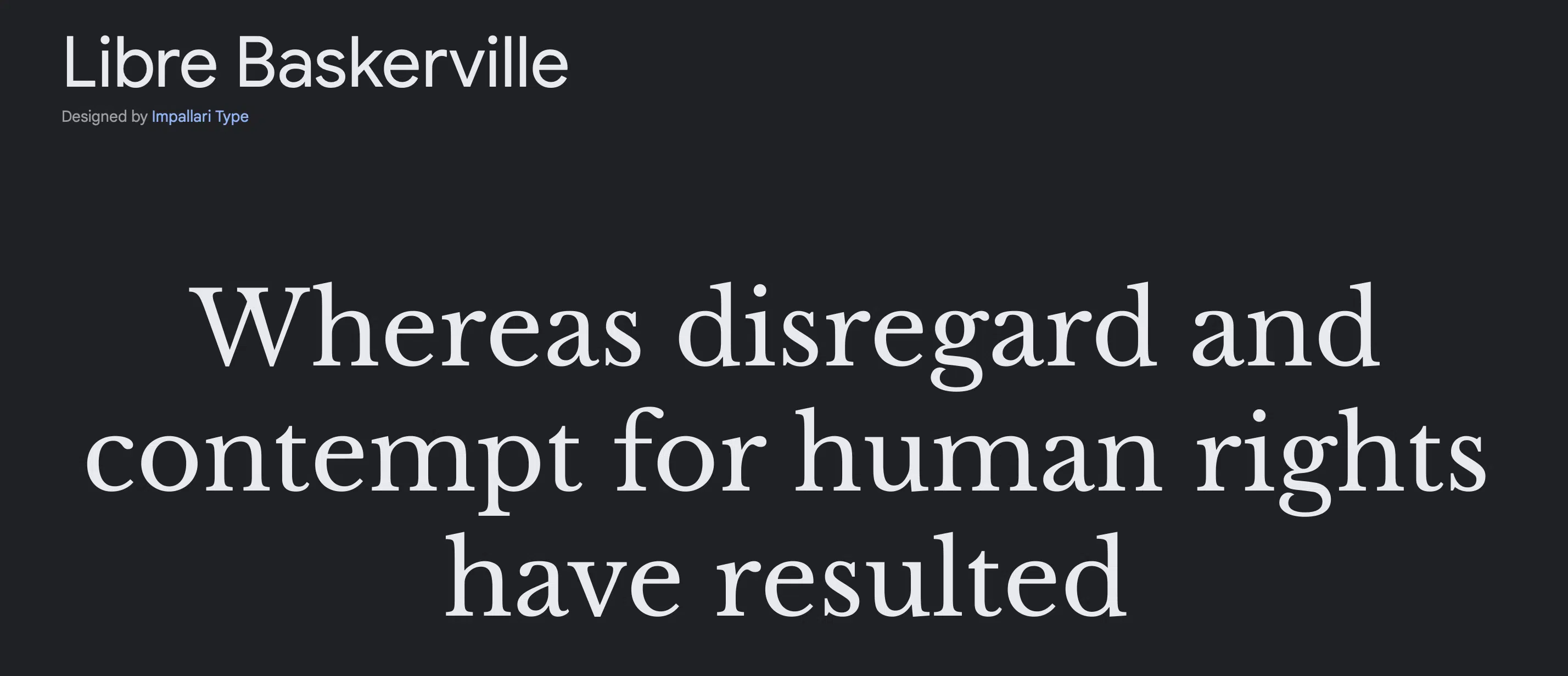
Libre Baskerville ‘s design might look familiar , as it’s been used on over 3 million websites as the long-form text font of choice.
Crediting its high readability are the length and width of the glyphs , which are optimized for bulkier reads.
10. Cormorant Garamond
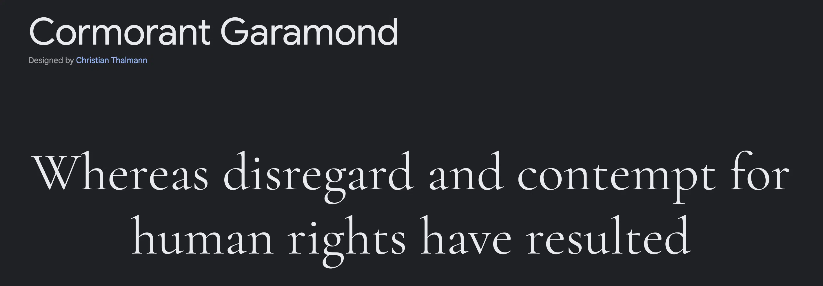
Gracefully stylish, Cormorant Garamond extends 9 inspired designs in 5 different weights for every graphic design peg.
A hit for the US market, this font type has been on more than 2 million websites in the country.
11. Spectral
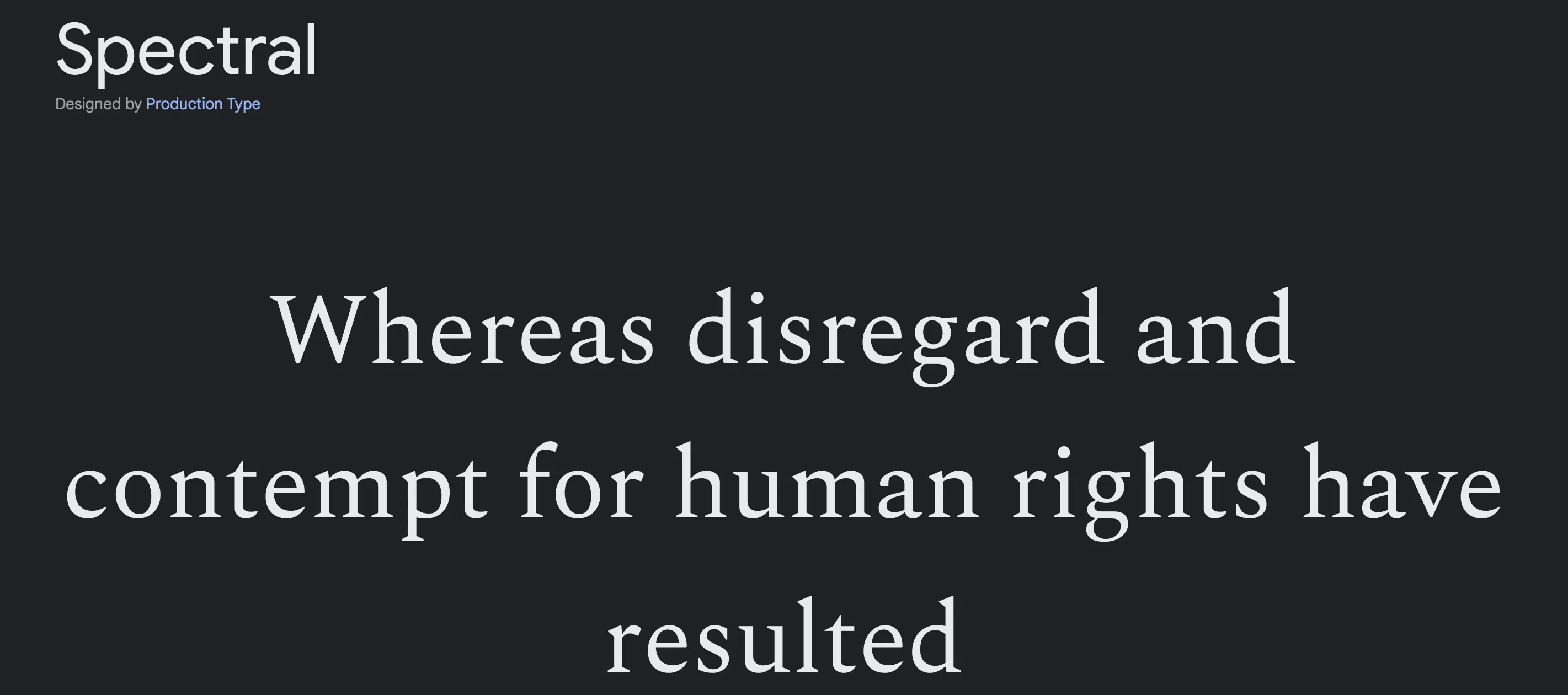
Available in 6 weights and matching italics, Spectral offers pliable utility in any canvas with its pronounced and shapely tapers.
This font manifests an aura of youthful professionalism which can be a valuable tool in shaping your design.
12. Eczar
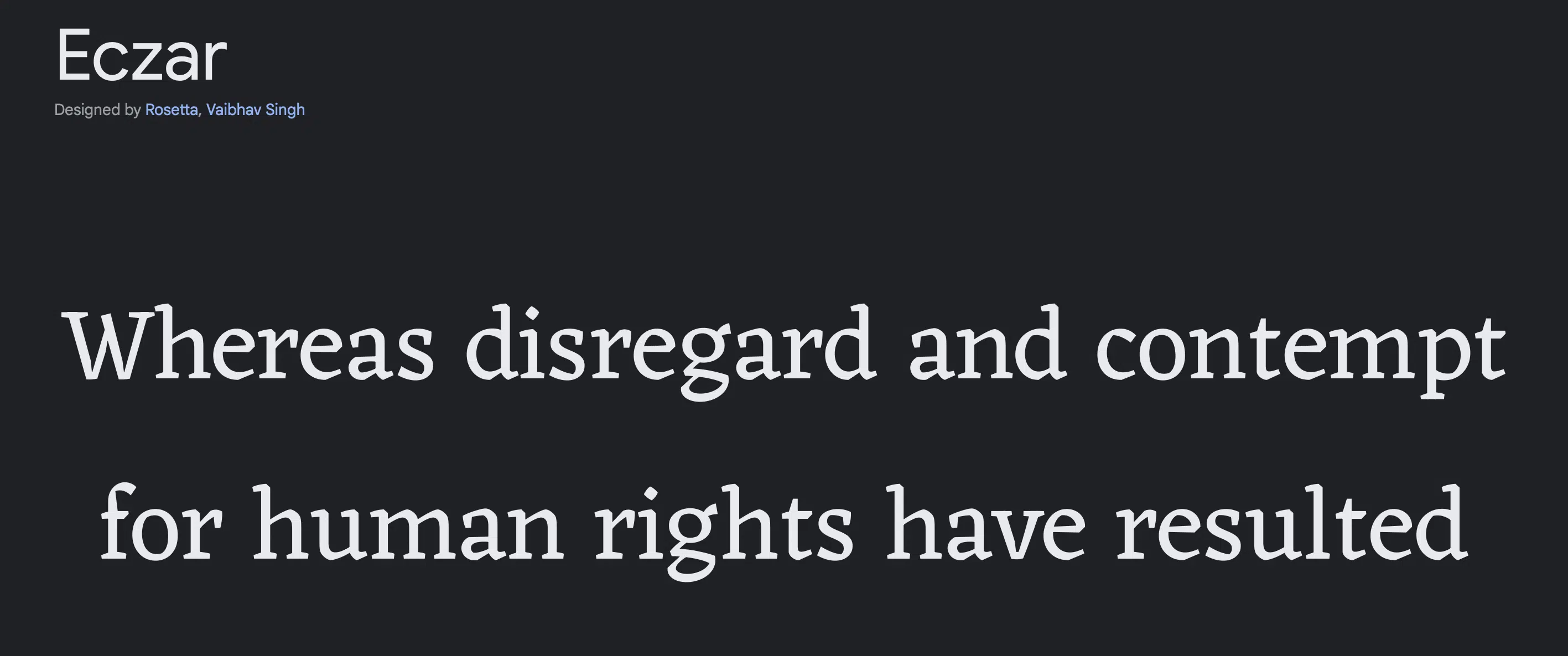
Symmetrical and delightful Eczar is another modern-themed font that can elevate your designs to fresher audiences.
Serving the style in 6 different weights it can be melded into any design to keep it current.
13. Alegreya
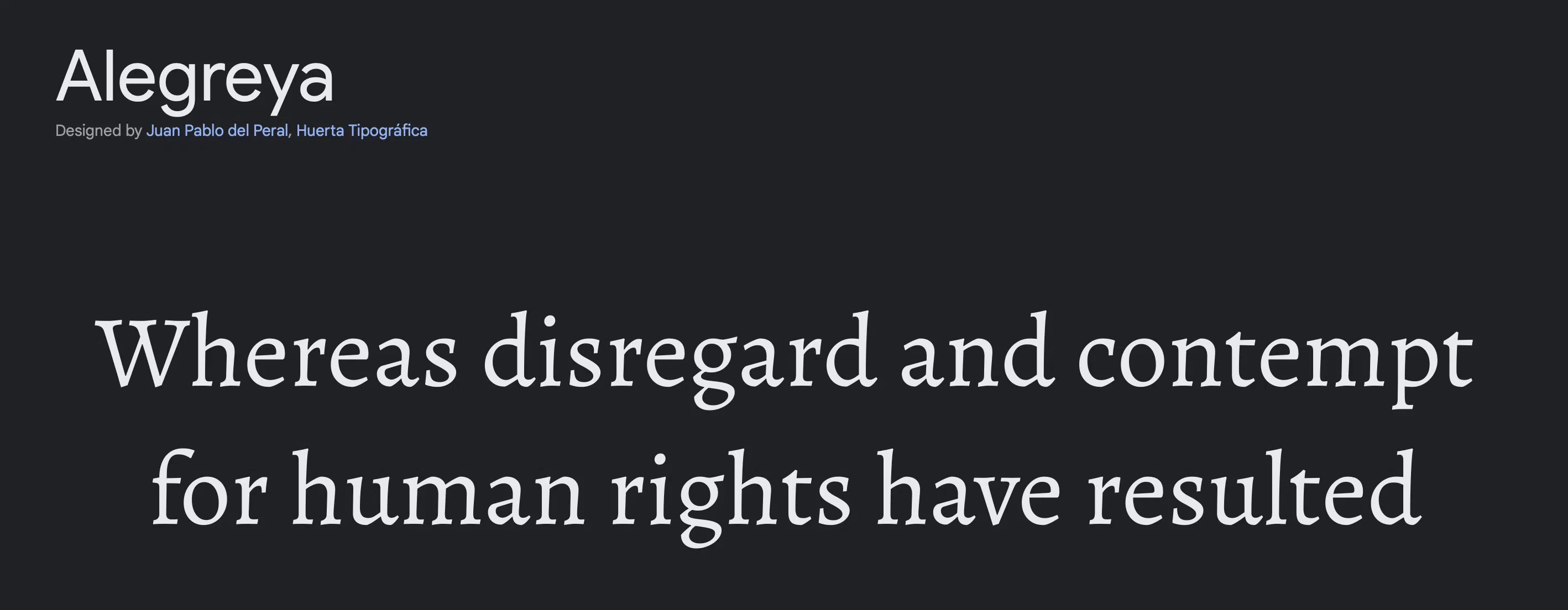
Where symmetry meets artistry, this next typefont offers 6 weights to cater to every purpose in a steady voice. Direct with a soft touch, this font works for both short and long-form texts.
14. BioRhyme
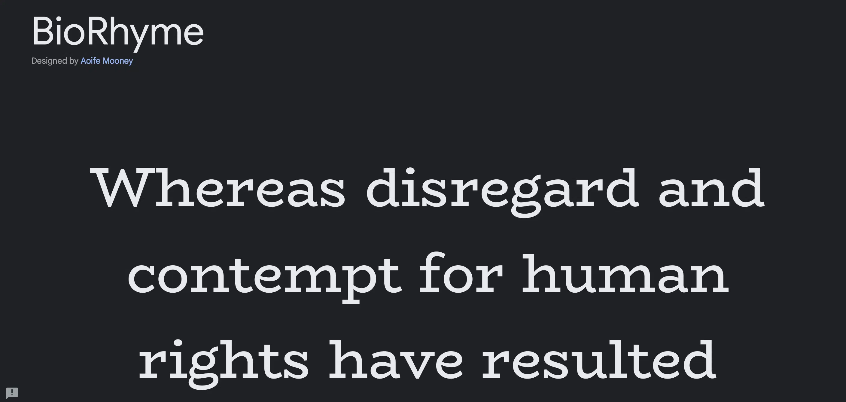
BioRhyme exudes confidence in bold glyphs and evident tails that extend – creating a more steadfast vibe in the texts. Serving graphic designers 5 weights, this firecracker of a style can make any project radiate.
15. Neuton
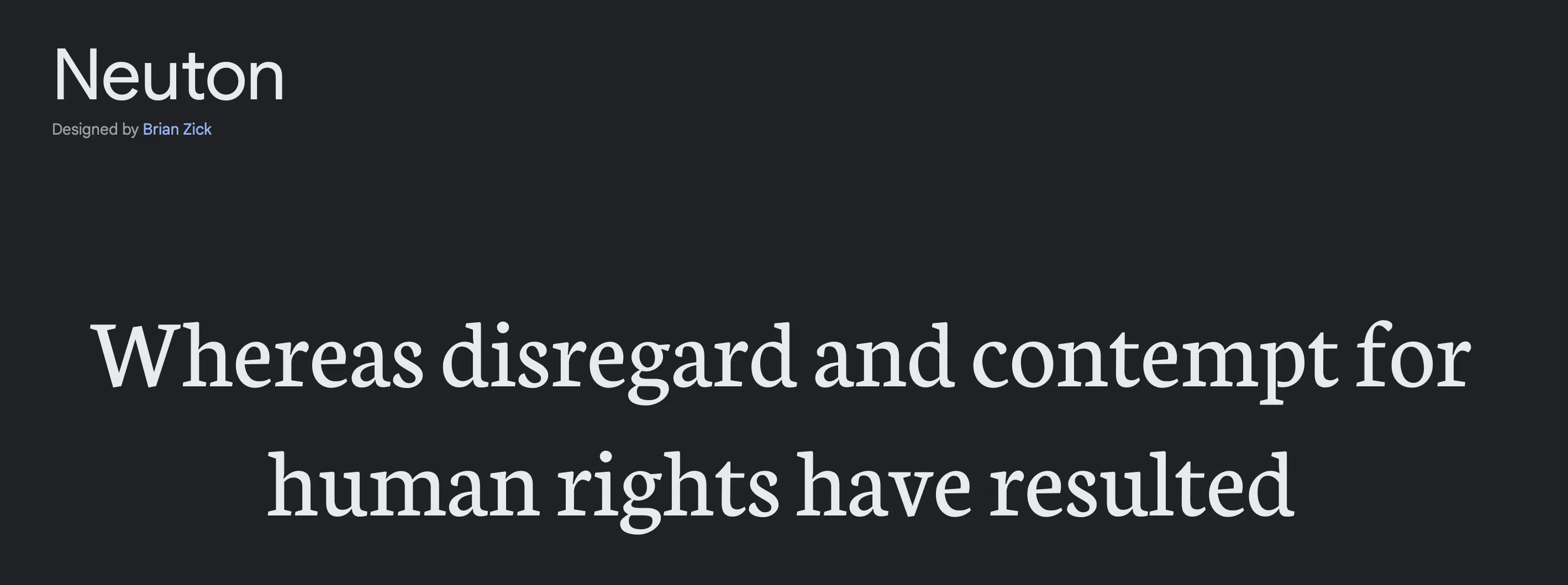
Finally rounding off the list, is Neuton. Perky from its refined tails and artsy rounded down lines, this serif font makes the best cheerful and lively energy for your graphic piece.
Serif and Sans Serif Typefaces – What’s the Difference?
This might sound pretty obvious if you’ve been in the design circuit for a while but folks who usually just browse fonts from a dropdown menu on writing platforms might be oblivious to this subtle but distinctive typography distinction.
So, what’s the difference?
Serif is the decorative line at the edges of the letters. They’re also known as tapers, tails, or feet. You’ve probably heard of the widely popular serif font – Times New Roman, from when you typed essays and reports from days of old.
Serif fonts are usually used on more formal articles or pieces of writing because it’s known to have higher readability and are generally more associated with sophisticated and traditional tones.
Sans Serif is simply the absence of a serif. And while serifs have a more serious feel, sans serif has a more relaxed and friendly quality. The fonts Calibri and Arial might ring a bell for most people as these are the most commonly favored sans serif options.
To give you a brief idea, here are some general tips for choosing a typeface:
Use Serif fonts if…
- You’re aiming for an established and traditional voice to back up your text.
- The text might be displayed on more compact prints (Serifs are known to still be highly readable even when it’s small).
- Your theme or branding calls for a more corporate thread.
Use Sans Serif fonts if…
- You want a modern touch to your design.
- You want something clean-cut and playfully creative.
- Your design is for fresh-leaning vibes which are great for marketing materials such as logos, graphics, or website designs.
Why Should Any Graphic Designer Bother to Know About All of These?
Fonts inject personality into the design giving it the feel graphic designers need to go for in every project.
Clients would obviously be asking for unique designs to get their brand to shine brighter than the competition and choosing just the right typeface to match that theme is one of the crucial elements to get them there.
A striking or daring concept would require bold sans-serif text that screams fearlessness and an adventurous spirit.
While dainty serif fonts are the way to go if you’re going for lighter and softer energy. The devil really is in the details when it comes to every element in your design and that includes the visuals of the texts you embed in them.
Best Serif and Sans Serif Google Fonts
With a better understanding of what makes one different from the other, it is crucial to wield these tools of design to not only build brand identity but also deliver the right message you’re zooming in with your graphic creation.
Equipped with a gallery of options for different focuses, your imagination can be anchored to an instrument to get it done.
All in all, the best Google fonts are spectacular additions to any design project, ensuring legibility, a dash of personality, and a cohesive look.
Which Google font are you excited to use? Let us know in the comment section!


