Agency: Hedger Mitchell Stark/GGK. Year: 1984. Art Director: David Kung. Copywriter: Mike Court. Typographer/Illustrator: Rabbit Studios.
What makes a good logo?
The best ones tend to be simple, beautiful and they contain a relevant idea.
When all those boxes are ticked, you should have something (to quote the great designer Paul Rand) that is ‘distinctive, memorable and clear’.
Attributes that certainly apply to the wonderful British Rail double arrow symbol designed by Gerald Barney at Design Research Unit in 1965.
Perhaps we should also add ‘timeless’ to our checklist. This logo looks as perfect today as it did nearly sixty years ago. Which is just as well because it’s still in use, despite the disastrous mess of UK railway privatisation. In the mid-90s, the rail infrastructure was sold off and dozens of franchises were awarded to private companies, each with their own often appalling branding. (Appalling customer service, and ticket prices too.)
But the double arrow logo remains under the National Rail brand, where it’s used to denote stations and also on tickets. There’s an interesting executional detail where the angled bars of the outer arrow lines taper towards their junctions with the horizontal lines. It’s an optical trick to make all the lines appear to be an even width.
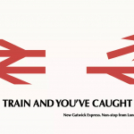
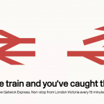
This iconic logo clearly describes the back and forth directions of travel over two parallel lines, representing a double-track railway. A nice idea.
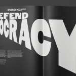
But in 1984, ad agency Hedger Mitchel Stark uncovered another brilliant graphic idea lurking within the symbol.
While pondering a way to advertise the new Gatwick Express service from London’s Victoria Station to Gatwick Airport, the creative team noticed that if the top arrow was separated from the rest of the logo, it became an airplane.
The communication was then completed with the simple copy line: ‘Catch the train and you’ve caught the plane.’ It’s interesting that the words ‘British’ and ‘Rail’ don’t appear anywhere, cluttering up the layout. They’re simply not necessary, given the two humongous, instantly recognisable symbols for the brand.
Full marks to the team for finding this graphic gift. A truly beautiful observation.
The rigid interpretation of most brand guidelines documents would certainly discourage this kind of playful appropriation of core branding assets. Especially if it involves messing with the logo. So this poster is a valuable reminder that we should always keep an open mind. The clue is in the name: ‘guidelines’. Not ‘rules’ and definitely not ‘straitjackets’.
Similarly, I would always defend an art director’s right to question the typography. The brand designer has no way of knowing all the possible nuances of communication necessary in advertising campaigns that haven’t been written yet. So clients, please take note, the guidelines document really should be just a starting point for the ad agency.
But in this instance, I wonder why the art director has chosen to use a typeface called Optima for the headline?
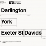
Design Research Unit’s brand guidelines specified Rail Alphabet; a bespoke typeface designed for British Rail by Jock Kinneir and Margaret Calvert in 1964. It has a kind of timeless (there’s that word again) Swiss Modernist feel. Similar to Helvetica but with a more consistent width of letter strokes, greater x-height for improved legibility and of course subtle differences in character shape. The recommended use of upper and lowercase also ensures maximum legibility.
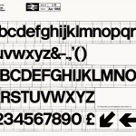
This is a deliberately neutral typeface. Typography intended to impart information without the style of the letters distracting from the message. It’s especially good for signage but of course it has many other applications too. So why not also the ads?
The typeface became a fantastic asset for British Rail. Totally synonymous with the brand due to its ubiquitous use across every touchpoint, including the trains, platform numbers, logo wordmark of course, and all the station names.
When Saatchi & Saatchi bought Hedger Mitchell Stark, and then went on to create many more great ads for British Rail, they switched to using the Futura typeface.
Again, I wonder why?
So just as an interesting exercise, here’s what the poster looks like when we use Rail Alphabet.
I think I prefer it. It looks good and seems more like British Rail speaking.
This poster is simple, beautiful and contains a relevant idea. It seems that our checklist for a good logo also applies to a good poster.
Source: Paul Belford | @paul_belford_ltd