Top 8 Banking App Design Trends: Crafting Functional Interfaces
Within the shifting terrain of financial services, banking app design is central to moulding consumer interactions, trust, and satisfaction. As a mobile application developers company, staying abreast of the latest trends is vital to crafting delightful user journeys. In this article, we’ll plunge into the cutting-edge banking app design trends that will revolutionise your application.

Table of Contents
Minimalism with purpose
Developers create intuitive navigations within often intricate mobile banking app designs by simplifying screens and zeroing in on essential elements.
Streamlined navigation
Minimalism encourages simplicity. Prioritise core functions—account overview, transfers, and payments—employing bottom tabs or a three-line drawer. Leverage whitespace strategically as a well-spaced layout reduces cognitive load.
Card-based interfaces
Replace lengthy lists with card-based interfaces. Each card represents an account, transaction, or service. Cards simplify information presentation and allow users to focus on relevant details. Use card size, colour, and typography to establish a visual hierarchy. Highlight important cards (e.g., primary account) prominently.
Microinteractions
These are button presses, loading indicators, and swipe gestures. An adeptly arranged micro-interaction turns a mundane task (like confirming a transfer) into a delightful moment.
Lettering and palette
Minimalist layouts use colours deliberately. Choose a palette that reflects your company's corporate image and evokes trust. To illustrate, Revolut employs vivid palettes to create a modern, energetic vibe. Minimalism doesn’t mean sacrificing readability. Use legible fonts with ample spacing. Bold headings and clean typefaces enhance clarity.
Real-life examples
- Revolut’s UI combines trendy aesthetics with usability. Bold colours, simple icons, and intuitive navigation make it a standout choice.
- N26’s card-based design streamlines banking tasks. Each card represents an account or transaction, minimising clutter.
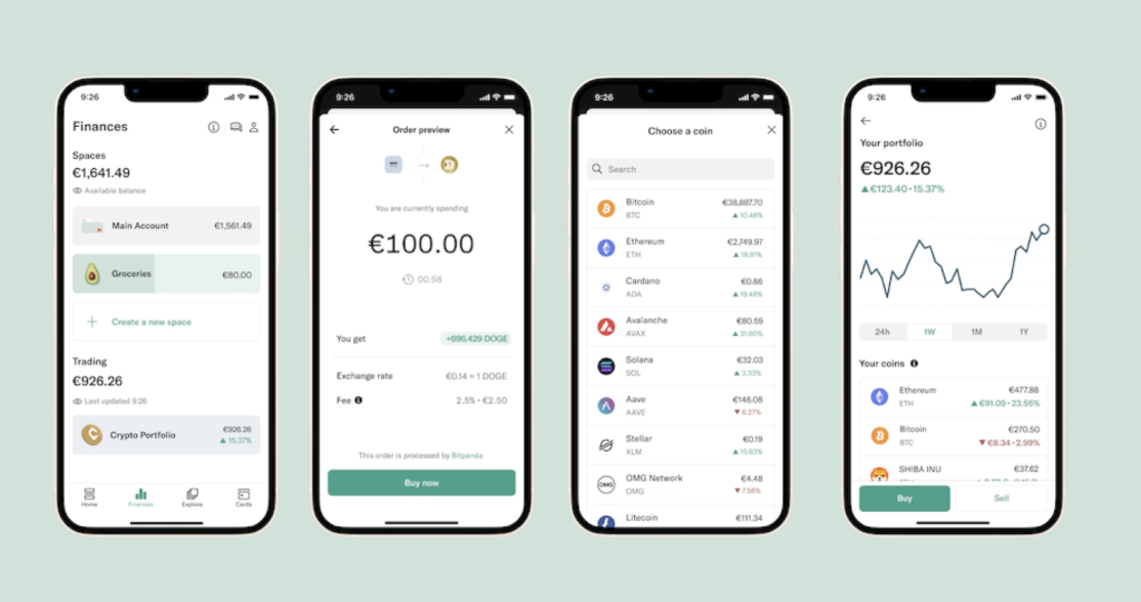
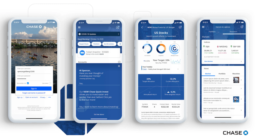
- Chase’s vertical scrolling and progressive disclosure keep the interface clean. Users discover features as needed, reducing cognitive overload.
Implementation tips
Maintain consistency across screens. Icons, buttons, and fonts should align with the minimalist aesthetic. Prototype and test iteratively. Minimalism should enhance usability, not confuse users.
Dark mode dominance: enhancing banking app UX design
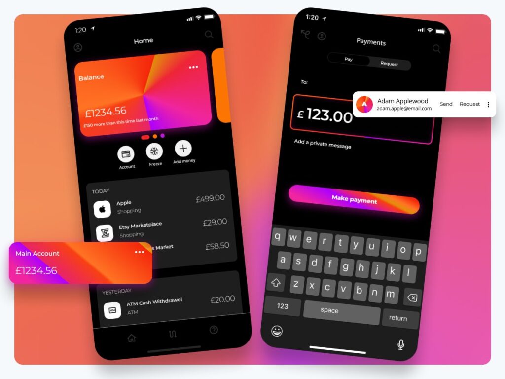
Dark mode has transcended from a mere trend to a consumer expectation. Let’s delve deeper into why it matters and how it’s transforming the mobile banking UI/UX design landscape.
Eye comfort and readability
Why dark backgrounds?
Dark interfaces reduce eye strain, especially during nighttime usage. The lower luminance minimises glare and permits consumers to interact with the application comfortably. Imagine verifying your balance late at night—dark mode guarantees a soothing ambience without harsh light.
Dark text on light backgrounds is standard, but the reverse (light letters on dark backgrounds) is equally effective. Ensure sufficient contrast for legibility. Pick easily decipherable typefaces that maintain clarity even in low-light conditions.
Battery savings and OLED display
OLED, prevalent in modern smartphones, consumes less power when displaying dark pixels. By adopting dark mode, you indirectly contribute to better battery life. Users appreciate apps that don’t drain their batteries excessively.
Aesthetic effect
Dark screens exude sophistication and modernity. Think of it as the “black tie” attire for the program. Trendy solutions, e.g. Apple Music and Twitter, have embraced dark mode for practical reasons and aesthetics.
Real-life examples
Let’s plunge into how prominent mobile banking apps leverage dark mode:
- Chase’s app offers sleek dark mode. The background turns deep grey, and the text appears white or grey. The overall effect is elegant and gentle on the eyes.
- Revolut’s dark mode offers a charcoal background with white text. The app maintains consistency across its various screens, creating cohesive interaction.
- N26, a European mobile bank company, embraces dark mode. The app’s minimalist design pairs well with the subdued colour scheme, boosting usability.
- Simple Bank’s night mode emphasises readability. The background allows the vibrant icons and billing details to pop, crafting easy-to-follow pathways.
Implementation tips
Permit the audience to toggle between light and dark modes customised to their taste. Sync with the system settings to switch modes routinely relative to the part of the day.
Biometric-fueled verification interwoven into banking app design
Consumers capitalise on this advancement to retrieve their financial info and execute transfers.
Fingerprint scanning: your unique key
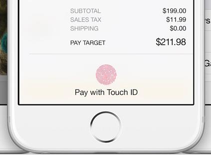
Apple’s mobile wallet activates Touch ID for reliable transfers. Fingerprints are exceptionally distinctive and difficult to forge. There is no need to memorise complicated watchwords; your fingertip becomes the key.
Facial reconstruction: a glimpse into the future
Samsung’s verification suite employs this type of reconstruction. It assesses distinctive traits (interpupillary distance, nasofrontal angle, etc.). The program captures an image during setup and correlates it with subsequent login attempts.

Thus, individuals access their accounts by merely looking at their devices. Unlike static photos, facial recognition mechanisms discern depth and movement, minimising the hazard of spoofing.
Implementation considerations
Inform subscribers about bio identifier usage and seek their consent. Provide substitute identity confirmation mechanisms as a fallback. Preserve records with care and locally on the gadget to thwart illicit entry.
The road ahead
Biometric recognition isn’t just a trend; it’s a paradigm shift. As tech matures, we’ll witness:
- Iris scanning: Unlocking gadgets with a brief look.
- Voiceprint acknowledgement backing on voice patterns.
- Behavioural biometrics: Analysing character input velocity, swiping trajectories, and other behavioural cues.
Contextualisation and algorithmic intelligence
Bringing to fruition these advancements converge to craft contextual consumer encounters.
Audience-tailored dashboards
These display relevant info based on individual conduct, bias, and chronology. Imagine an app highlighting routine transfers, imminent charges, and individualised budgeting goals—all on the home screen. Scripts probe various interactions. If one repetitively checks their investment portfolio, the panel prioritises investment-related data. This empowers visitors to arrange widgets (e.g., visible balance and consumption trajectories) according to their priorities.
Predictive behaviours
AI predicts insights based on historical records. To illustrate, those who consistently pay rent on the 1st of the month are proactively reminded of this.
Predictive insights prevent oversights (e.g., missed bill payments) and enhance financial management. AI suggests relevant services (e.g., credit cards, investment alternatives) in line with client behaviour.
Tangible illustrations
Let’s peek into how some mobile banking apps embrace personalisation and AI:
- Mint evaluates budgetary fluctuations and categorises transfers. Individuals receive tailored-fit budgeting tips and notifications, while AI-driven insights help them optimise their financial decisions.
- Simple Bank’s Goals feature allows users to set personalised savings targets. AI monitors progress and nudges them to stay on track.
- Capital One’s Eno, an AI chatbot, assists consumers with account inquiries, transaction history, and even jokes. Eno adapts its responses based on user interactions.
Privacy and trust
Communicate how AI processes user data. Individuals should understand what information informs personalised features. Safeguard user data rigorously. Encryption, anonymisation, and compliance with privacy regulations are critical.
The future: hyper-personalisation
As AI evolves, we’ll witness hyper-personalisation:
- AI-driven pricing models offer personalised interest rates and fees.
- AI detects user emotions (e.g., frustration during a declined transaction) and responds empathetically.
Voice interfaces Conversations Beyond buttons.
Voice commands are gaining traction.
Hands-free transactions
Today, individuals stay updated with account totals, pick up the checks, and even reorder them using verbal instructions, for instance, with the assistance of Amazon’s Alexa. One can perform banking tasks without tapping buttons or typing. Imagine saying, “Transfer $100 from savings to checking,” and the algorithm executes the transaction.
Verbally fueled interfaces empower those with physical limitations. There is no need to navigate menus; users express their intent directly.
NLP
Algorithms understand context and intent from spoken language. Let’s take Google Assistant: users can converse naturally, as with a human, asking complex questions like, “What’s my spending trend this month?” and receive relevant insights.
People feel like they’re having a dialogue, not just issuing commands. NLP adapts to variations (accents, phrasing) seamlessly.
Implementation considerations
Balance convenience with data protection. Ensure voice interactions don’t compromise sensitive information. Authenticate users before executing critical tasks. Provide auditory feedback (e.g., “Transfer initiated”) and seek confirmation (“Confirm transfer?”). Users should know their voice commands are understood.
The future: multimodal interfaces
As voice interfaces evolve, we’ll witness the following:
- Combining voice with visual cues (e.g., on-screen prompts).
- Detecting user emotions to tailor responses (e.g., calming tone during a declined transaction).
Gestures and fluid animations: navigating without a hitch
These tricks elevate banking app UX design beyond mere button taps.
Swipe gestures
These facilitate seamless display transitions. For instance, swiping left or right to switch profiles or explore order info. To bring to fruition this method, pick a consistent swipe direction (e.g., left-to-right) for specific actions. Provide visual cues (e.g., subtle animation).
Fluid animations
These create a sense of continuity. Elements slide, fade, or morph gracefully. Think of opening an account details screen—the transition should feel like flipping a page.
Instead of abrupt loading screens, use spinners that appear smoothly. When you tap a menu icon, let the menu expand smoothly.
Real-life examples
Let’s see how mobile banking apps embrace gestures and animations:
- Chime’s app uses swipe gestures for navigation. Users can swipe between transaction categories effortlessly. Fluid animations accompany transitions, making the app feel responsive.
- Monzo’s transaction feed employs fluid animations. Scrolling through transactions feels like gliding through a timeline.
- Simple Bank’s account switching uses swipe gestures. Users swipe left or right to toggle between accounts.
Implementation considerations
Optimise animations for smooth performance across devices. Avoid gratuitous animations. Each one is meant with a purpose (e.g., guiding others or providing feedback).
Accessibility matters: barrier-free reach for everyone
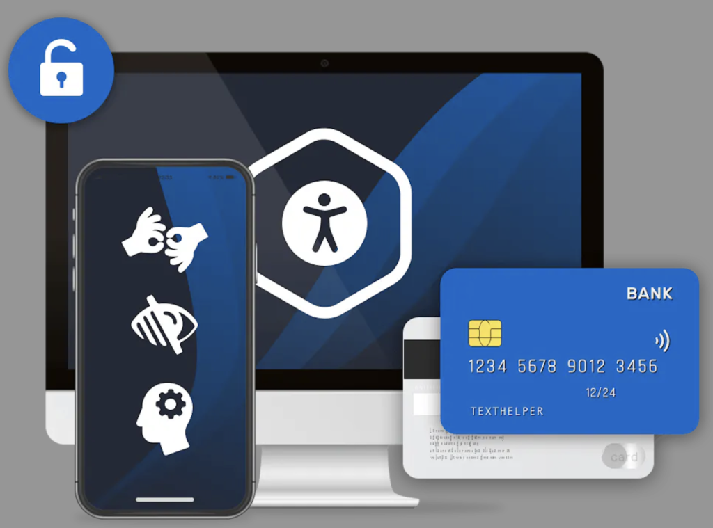
Designing with diverse representations in mind promises universal usability to enjoy mobile banking app design.
Typeface parameters and disparity
Clients have varying visual abilities. Permit them to experiment with typeface parameters. Consider alternatives like tiny, medium, and ample dimensions.
Organise sufficient interplay between readability and backdrop. Understandable content is of utmost significance for all—test readability in different lighting conditions (e.g., bright sunlight, low light).
Auditory tech and VoiceOver
These assist visually impaired users by reading aloud what’s been displayed. Employ semantic tags (e.g., headings, lists) to provide context.
iOS devices come with VoiceOver, a built-in screen reader. Ensure your app works seamlessly with it—label UI elements appropriately for VoiceOver pathways.
Keyboard-based shortcuts
Some users rely on these due to motor disabilities. Guarantee that fundamental navigational components are accessible via keyboard tabbing.
Real-life examples
Here’s how developers prioritise accessibility:
- Bank of America’s solution offers variable text scaling and contrast-enhanced adaptability. It works well with VoiceOver, suggesting a bland feel for visually challenged clients.
- Wells Fargo warrants smooth keyboard manoeuvrability to perform tasks with a pointerless control.
- PayPal leverages semantic elements that accurately expound the essence.
The human-centred approach
Involve those who face limitations in usability testing. Their feedback is invaluable. Consider the hurdles confronted by those with distinct aptitudes. Envision with empathy.
Omnichannel consistency: seamlessly connecting gadgets
This trend guarantees the audience flows without interruption across miscellaneous gadgets and channels.
Fluid layout
This mobile banking app design category guarantees that an application is device-agnostic and the audience enjoys uniform interactions across miscellaneous gadgets. To help them avail themselves of this possibility, bring to fruition scalable grids to arrange content. Elements should be adjusted proportionally. Adjust styling (typeface, layout) tailored to viewport resolutions.
Coherent branding
Maintain a uniform image across web and app screens. Users should recognise your brand instantly. For this purpose, adhere to standardised tints, badges, and typography. If your company boasts a site with a blue header, its app should echo the same colour scheme.
Real-life examples
Let’s see how developers achieve omnichannel consistency:
- HSBC’s website and app share a common design language. Users transitioning from one to the other experience familiarity. The logo, lettering, and tint palette remain consistent.
- ING Bank’s device-agnostic site naturally accommodates handheld dimensions. Visitors can perform tasks, avoiding being disoriented. The solution mirrors the website’s branding, reinforcing trust.
- Citibank’s consistent branding extends to its digital products. The audience enjoys the same graphic attributes and blueprints. Whether they log in via browser or app, the pathways align.
Implementation considerations
Map out user journeys across devices. Identify touchpoints where consistency matters. Periodically examine your program on assorted instruments and browsing platforms. Fix any inconsistencies promptly.
Conclusion
Developments must stay agile, empathetic, and innovative as mobile banking continuously progresses. By embracing these trends, your company will be in the correct position to elaborate mobile banking apps that empower consumers, simplify financial management, and foster trust. Remember, the pivotal point lies in zeroing in on client aspirations, balancing aesthetics with functionality, and offering a superb pathway—one tap at a time.
