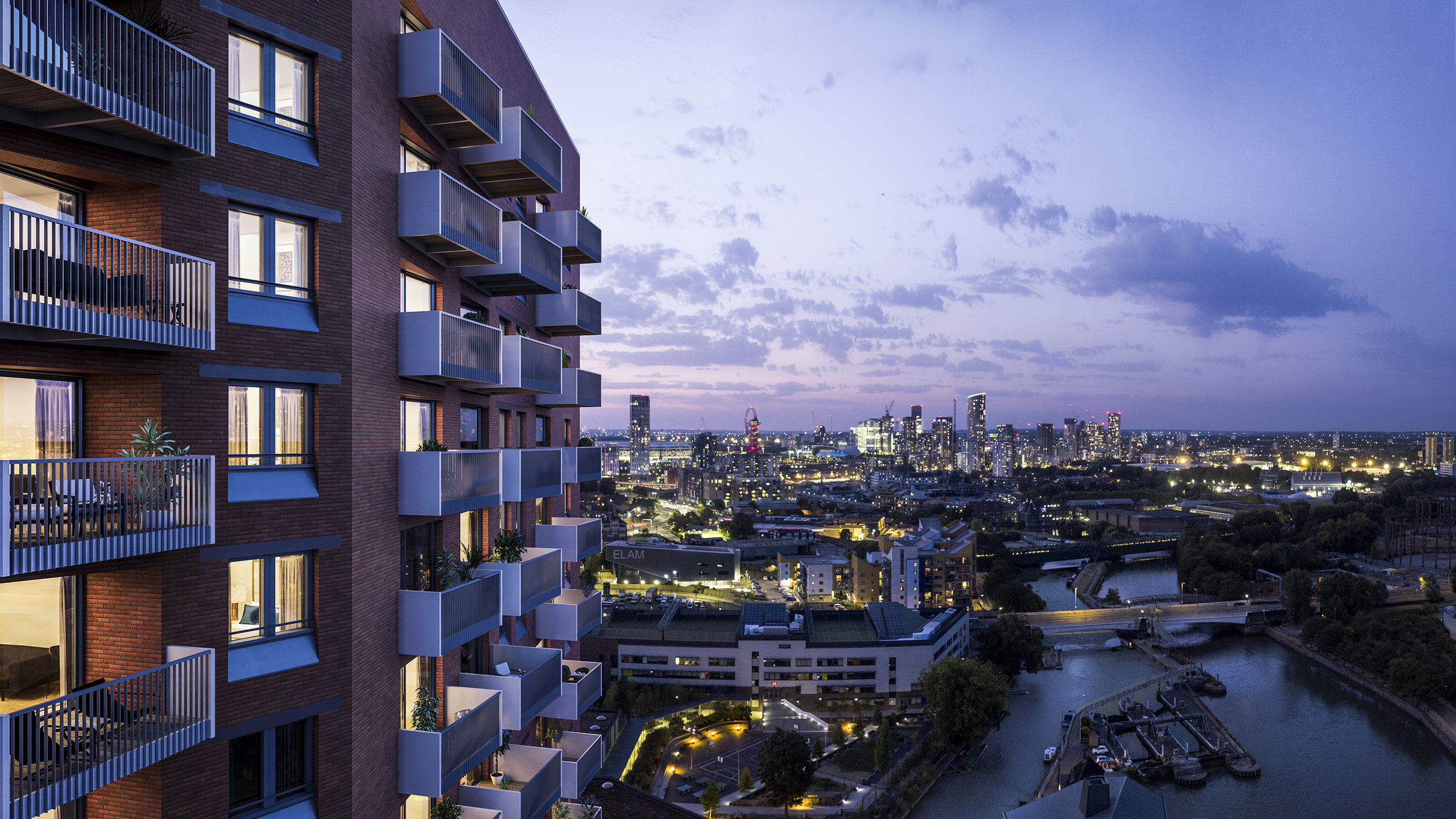
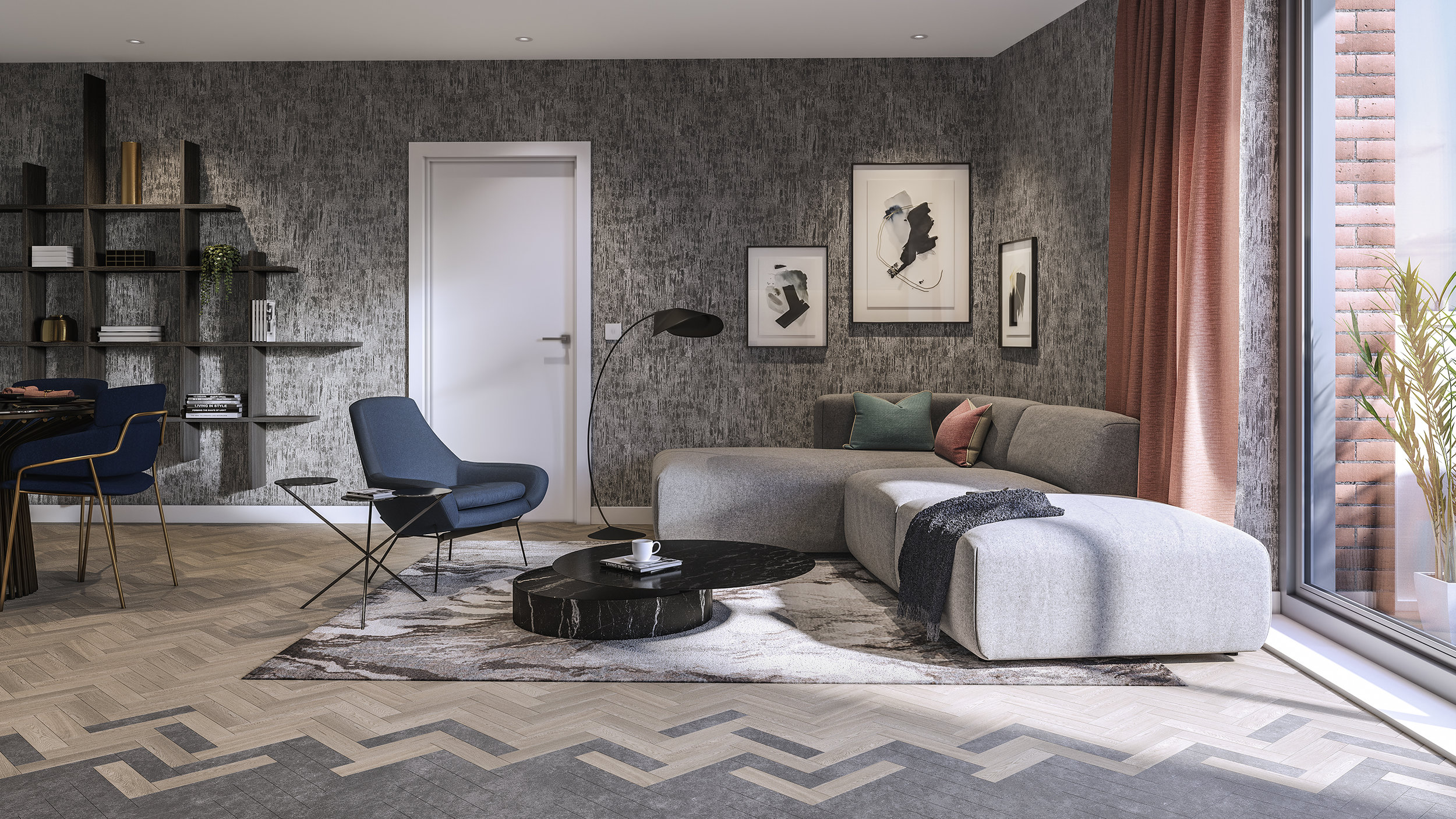
Located in the heart of east London, Three Waters is a development of more than 300 new apartments, designed to combine city living with a waterside lifestyle. Here, the three waters of Bow Creek, the Limehouse Cut, and the River Lea meet in London’s fastest growing area. Raised gardens, roof terraces, and private balconies offer cityscapes with headspace and with the Tube and DLR moments away, Three Waters offers Zone Two living with Zone One journey times.
A joint development between Mount Anvil and Peabody, the team appointed us to define the name, creative strategy, and branding and advertising that positioned the development within the realms of “disruptive luxury.” The branding was followed by an extensive rollout across print, digital, and environmental graphics.
![]()
The brand identity centres around a calligraphic mark made with ink and water. The three lines represent the characteristics of each waterway that surrounds the development. Bow Creek, The River Lea and The Limehouse Cut, each represented by a linear form, have their own characteristics, whether that’s a tidal rhythm, man-made canal, or meandering river.
The brand is supported by hand-rendered calligraphic elements, used for illustrations and infographics, reflecting the ebb and flow of the water.
![]()

The branding comes together in the brochure design, which is divided into three sections through a bespoke tab system.


The visual identity is underpinned by the core proposition “Minutes from the City, metres from the water.” This is accompanied by a suite of creative headlines such as “crafted by the water,” and “close to the City, connected to the world.” A neutral colour palette of earthy tones and concrete grey is a nod to the development’s unique location. Highlights in bright red reference the London red brick of the development’s architecture, whilst a bespoke suite of icons combine style and functionality.


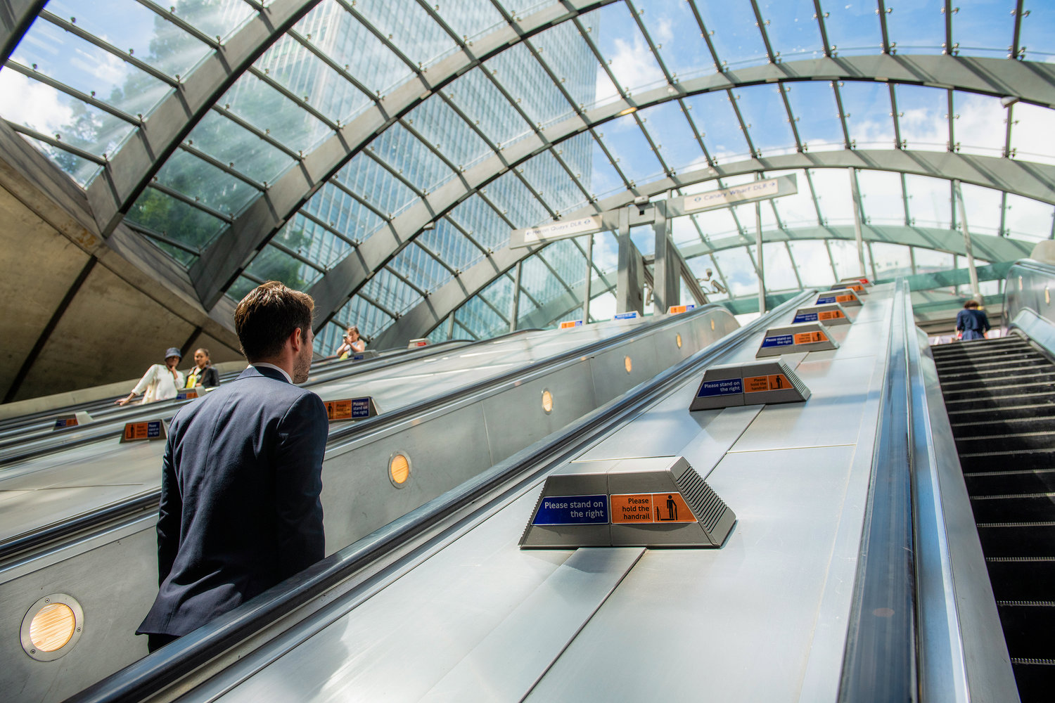
We art-directed a photoshoot and brand film to capture the quality of life that living by the water offers, whilst also reinforcing that key central London landmarks and business centres are just minutes away.


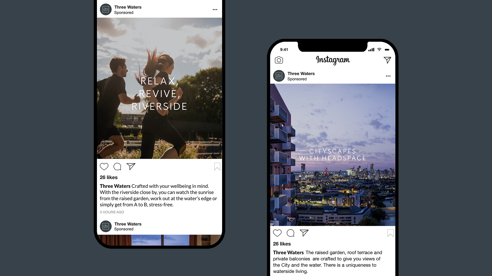

We worked with the in-house team at Mount Anvil to ensure consistent application of the brand across the globe, from the UK marketing suite through to launch events in Asia. Comprehensive brand guidelines serve to protect the new identity system, and today we continue to support the brand in the delivery of key print and digital marketing material.

With thanks to Wonderhatch for photography and film production, and Millerhare for CGI and animation.
More from Lantern.


Comments
Classy, posh, but not stuffy. A good flow between modern, luxury, and approachability. Beautiful work.