Mode by Gretel
Opinion by Sarah Malik Posted 21 February 2023
How to make a data business approachable yet hold gravitas? Can it be engaging yet authoritative, sage yet cool? These are the implicit tensions NY-based Gretel has grappled with in its branding of Mode, a data intelligence and technology business seeking to widen its appeal. Gretel has established a brand identity which is triumphant and clean. It balances the contradictions that so often emerge when a business is on the march.
Gretel has taken the sagest of colours – forest green – and drawn the main palette from complementary tones. The agency demonstrates that quality branding is in the detail here with combinations that feel fresh and unexpected. Forest green acts as an anchor when coupled with a crunchy apple green. This in turn is disrupted by a lighter, almost (but not quite) neon green. This is all tied together with what the guidelines describe as a ‘pale arsenic green’.
The result is a selection of duo tones that feel ever changing and ‘well lit’. This is a high contrast and therefore accessible palette. In its rules for pairings Gretel manages to steer well clear of resembling BP (the energy company). A secondary palette allows for further disruption – pink, blue and purple. However unexpected these colours feel, they are all muted by their pastel tone, leaving the palette extension feeling vibrant but not dumbly so.


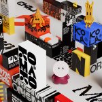
Interestingly, ‘shifting modes’ are called out as the core behaviour of the identity system. Indeed the grid system allows for a fluid dance of graphic elements. Square but with rounded edges (or in other words rational but warm), the graphic elements shift around each other in a solid and rhythmic way. Indeed, even the logo itself is dynamic moving with a ‘slot machine’ satisfaction. It is built off the variable typeface WT Zaft² by WiseType, which allows for animation based on shifting weights and thicknesses, lending playfulness to the classic typewriter indents.


Further graphic elements are used to similar effect. Numbers, for example, are exaggerated in disproportionate weights and further rounded. Placed at scale and dwarfing all other elements, the numbering here feels almost like grotesque yet beautiful bodies. The exaggeration allows for the other elements, like body copy, to be calm and sensible in layout and form; adhering to column and grid without shifting or unsettling. It’s a nice demonstration of balance through tension. The identity also informs the new look of the platform, and is further extended to visualise tools in comms and marketing using the robust system.
Gretel claim ‘the strategic positioning of the brand builds on Mode’s optimism for a new era of business intelligence’ and while it’s not the boldest possible take on this theme, I’m inclined to agree. In a sense the brand voice ties this all together. Its aim is to make the product offering feel accessible while challenging the deep rooted idea that data analysis is dry. Indeed, the brand ID, much like the brand voice, works to offer a sense of inventiveness and adventure. The elements work together to suggest ‘picture’ from information and through ‘picture’ comes clarity, ease and dare I say it – joy.