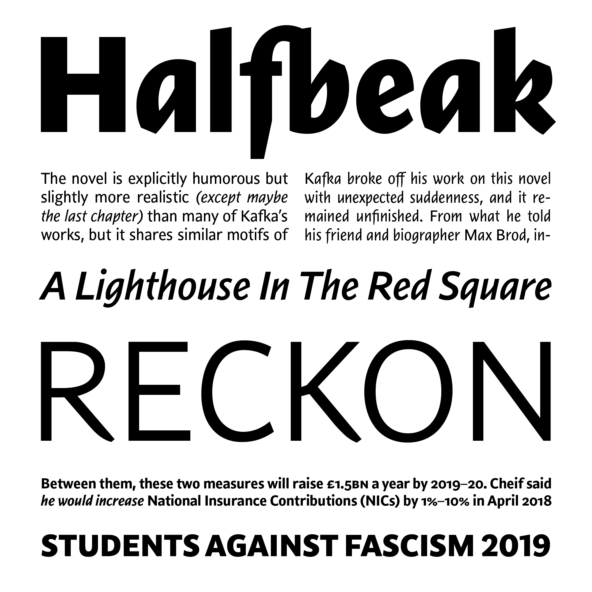
The word “exciting” is not one I normally expect to reach for when writing about a humanist sans serif — in many ways, the vanilla ice cream of typeface genres. But this brand of vanilla comes with extra hot peppers: Nara Sans’ solid roman is accompanied by unexpectedly expressive italics. Two of them.
The family structure is inherited from the same designer’s seriffed Nara (2009). I remember being fascinated by Nara — a family that, between its unconventional handling of contrast and its two italics, seemed to take a series of unexpected turns. Letting just one of these strong ideas play out on a calmer stage has made Nara Sans a focused follow-up, interesting in a rather different way.
Nara Sans’ roman feels solid, pleasing, workable, fairly predictable. It’s not too soft — there’s something reliable and understatedly forceful about it, with gentle tapers accentuating the monolinear design. Switch to the italics, though, and the family shows its teeth.
There’s an upright Cursive that is narrow, expressive, energetic, and, yes, rather exciting, with speedy curves and angular bends. That’s in the lowercase: looking all the way back to the Aldine Italic, cursiveness is understood here as affecting only the lowercase, which is accompanied by roman capitals. This works surprisingly well and makes for an animated pattern that, in such a clean and contemporary execution, feels both ancient and fresh. (Figures and punctuation retain their roman forms as well; I caught myself wondering if a cursive-ified version of the oldstyle figures could have been interesting, for blending in closely with the lowercase.)
Rather than pulling away from the roman in a uniform way, thus, the Cursive amounts to a distinct overall pattern and voice. For situations where clearer, consistent emphasis is needed, Nara Sans’ Italic follows the same construction and narrow proportion, but is additionally sloped forward. Both italics are proudly idiosyncratic; these are not subservient variants just here to add emphasis, but counterparts that dare to speak in a distinct voice. That’s not going to be appropriate for every kind of content, but where italics with added spice are welcome — whether for text or display — Nara Sans will shine.


