Divine Farmer by Base Design
Opinion by Emily Gosling Posted 17 January 2023

International creative studio network Base Design is behind the branding for Divine Farmer, a California-based wellness company with an identity centred on New Age-style iconography and a heavy reliance on storytelling.
Divine Farmer was founded by Polina Bowler, an acupuncturist and herbalist and owner of LA-based holistic wellness centre East Meets West who came up with the idea for the brand during the pandemic when she was forced to work with patients over Zoom. The Covid-19 pandemic precipitated a surge in mental health symptoms, as well as a broader shift towards prioritising mental and physical health; and this was reflected in the increase in patients approaching Bowler looking for help with things like anxiety, depression, and insomnia.
As such, she set about developing a blend of Chinese herbs and Nano-Emulsified Water-Soluble CBD to help their symptoms. Overwhelmingly positive feedback led to her expanding the venture to open up the formula to a wider audience, birthing the first Divine Farmer product, Illuminate, which claims to help calm emotional instability, promote restful sleep, positive moods and more.

Base worked on everything Divine Farmer needed to take it from product to brand, including naming, brand identity, art direction, packaging, and its digital presence. The name is borrowed from the Chinese legend of Shennong – largely translated as ‘Divine Farmer’ – a cultural hero believed to have taught Chinese people how to use herbal medicine and agricultural tools in ancient times. ‘The notion of a spiritual teacher perfectly mirrored Polina’s desire to provide education about alternative medicines and healing, whilst also encapsulating the only-natural nature of her ingredients,’ says Base. ‘Ethereal, trustworthy, and natural: Divine Farmer encapsulated it perfectly.’

The name perfectly chimed with the brand’s roots in traditional Chinese medicine, and the branding’s broader focus on storytelling and education looks to further its ambition to ‘build deeper understanding and trust in alternative remedies’.
Base describes the visual identity as embodying a ‘contemporary New Age spirit’ that builds on the name through using symbols inspired by mythological and natural references. These work together as part of the holistic brand world to tell stories around ideas of ‘harmony, vitality, and earthly connection’.


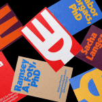
The colour palette uses ‘earthy’ tones based predominantly around shades of yellow, making it eye-catching but still amping up the product’s natural credentials. A circular logotype device shows the brand’s ‘D’ and ‘F’ in a typeface that’s highly redolent of that used on the Whole Earth Catalog – an American counterculture magazine and product catalogue published several times a year between 1968 and 1972, and something of a cult design favourite thanks to its quirky typography, deliciously DIY aesthetic and its homegrown style of illustration and diagrams.
Elsewhere across the brand’s website and packaging, Base opted to use the fonts SAA Series A, designed by Hamburg-based foundry URW++ in 1980; and GT Alpina, described by Swiss foundry Grilli Type as a ‘workhorse serif’ that ‘reaches into the grab bag of typographic history’.

The branding is smart in uniting references that are very obviously based in the 1960s and 1970s with contemporary wellness cues; meaning things don’t veer into retro pastiche and engendering a sense of trustworthiness. It could perhaps do slightly more in terms of indicating what the product actually is and does, but since it’s sold through the Divine Farmer site and doesn’t have to compete on-shelf at this point, this doesn’t matter as much as it would for products sold through physical retail.

While the designs do skew heavily towards the more conceptual side, they skilfully manage to just about avoid going so hard on the esoteric reference points that you’re stumped as to what the products even do.
The Divine Farmer identity chimes with the new breed of ‘wellness’, which moves beyond the world of smug Instagram influencers and towards a more holistic vantage point that unites the physical, mental, and even spiritual. How we view our bodies and minds has shifted significantly in a post-pandemic world, and Divine Farmer’s branding is adroit in its acknowledgement of these broader cultural movements.
Things like work/life balance have never been higher on people’s agendas, and the widespread introspection provoked by lockdowns have led many to re-evaluate both their priorities in life and their needs when it comes to self-care. Divine Farmer taps into those feelings and cannily dresses them up in the textures, letterforms and iconography of the 60s, a time that rose tinted glasses tell us was so full of optimism – something we’ve perhaps never needed more.