'A tall logo for a tall captain': Mucho takes an elongated approach to its 'hooked' identity for Big C Charters
When you're given a chance to rebrand a company founded by and named after a former professional basketball player, you'd definitely take your design skills to new heights. Creative studio Mucho literally ran with the name Big C Charters to craft an identity that features an iconic logo with a tall hooked 'C'.
Big C Charters is the premier charter service in the San Francisco Bay Area that offers hands-on fishing trips and excursions. Founded by 6'8" former professional basketball player Christian Cavanaugh, Big C gets its name from the big man himself and his local reputation for the biggest catches. With a growing fanbase and fleet, Mucho was commissioned to rebrand the firm for its expanding business and audiences. The resulting visual identity consists of a new logo, colour palette, typeface, photography and brand collateral.
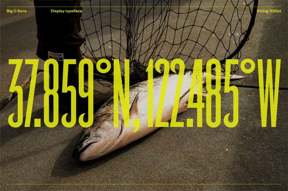
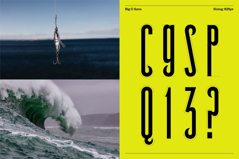
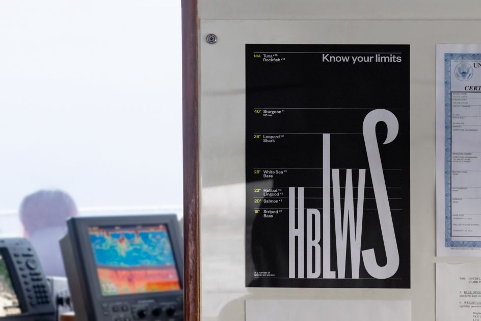
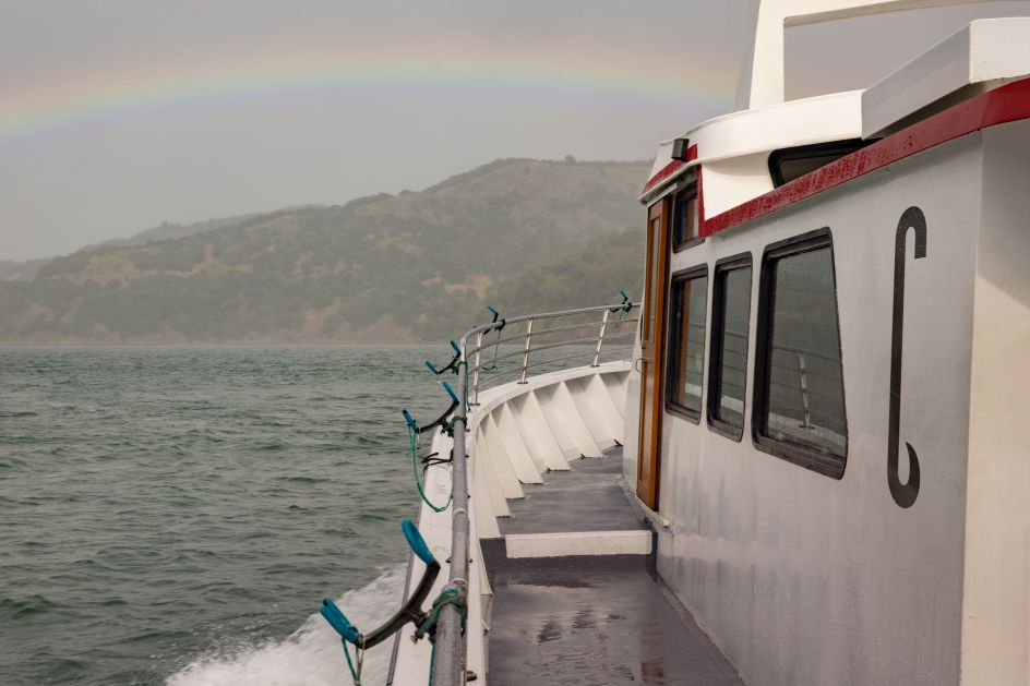
The name Big C Charters itself was an opportunity to create an iconic logo – not just because of its tall founder but also of the fishing theme of the business. In this case, an unforgettably tall, hooked 'C' – pointing to both. Alongside this symbol, a bespoke display typeface aptly named Big C Sans was developed. Inspired by the vernacular of charters, the custom typeface features elongated letterforms with a characteristic fishing hook or wave-like terminals that bring together early san-serif lettering with a contemporary typeface.
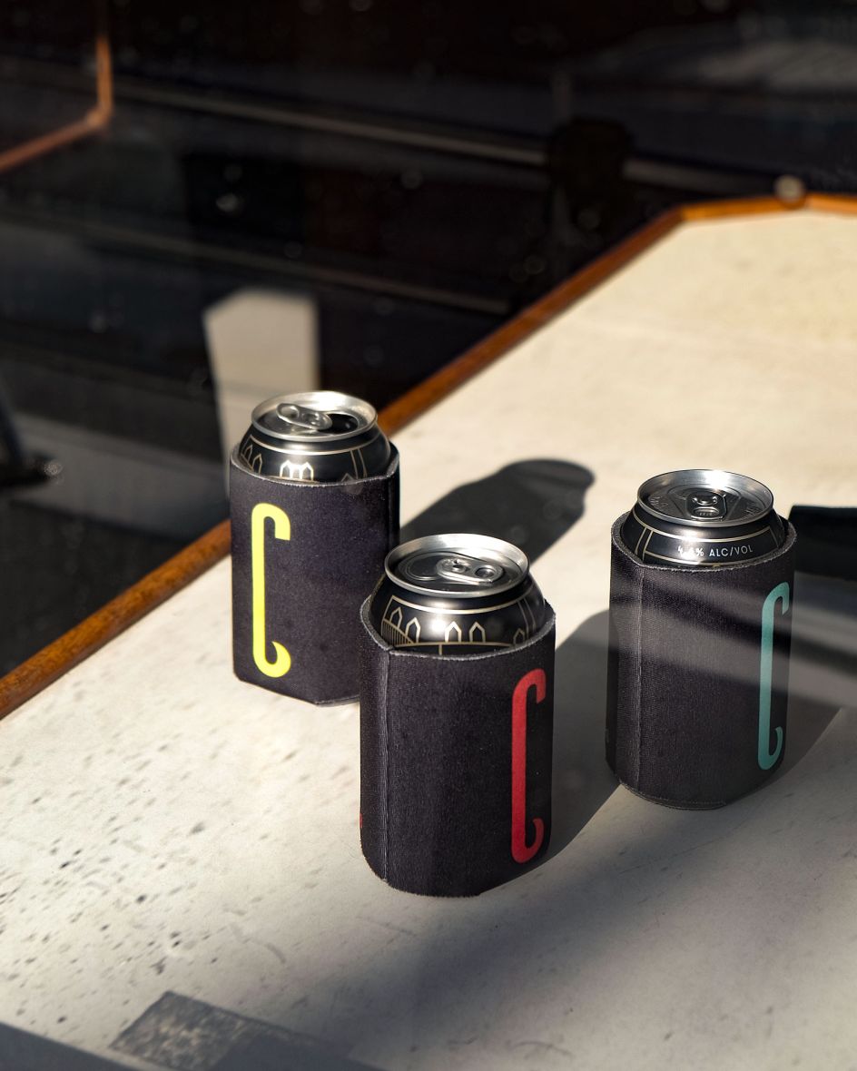
The broader visual language uses a vibrant palette inspired by the pop of colours found onboard their boats – we're talking hi-vis clothing, bait flashers and hooks. Although familiar and comforting, these colours buck the category cliché of 'ocean blues', which allows the brand to move away from that old-fashioned perspective around fishing (Captain Birdseye, anyone?). A suite of reportage style photography was also created, capturing real moments out on the sea.
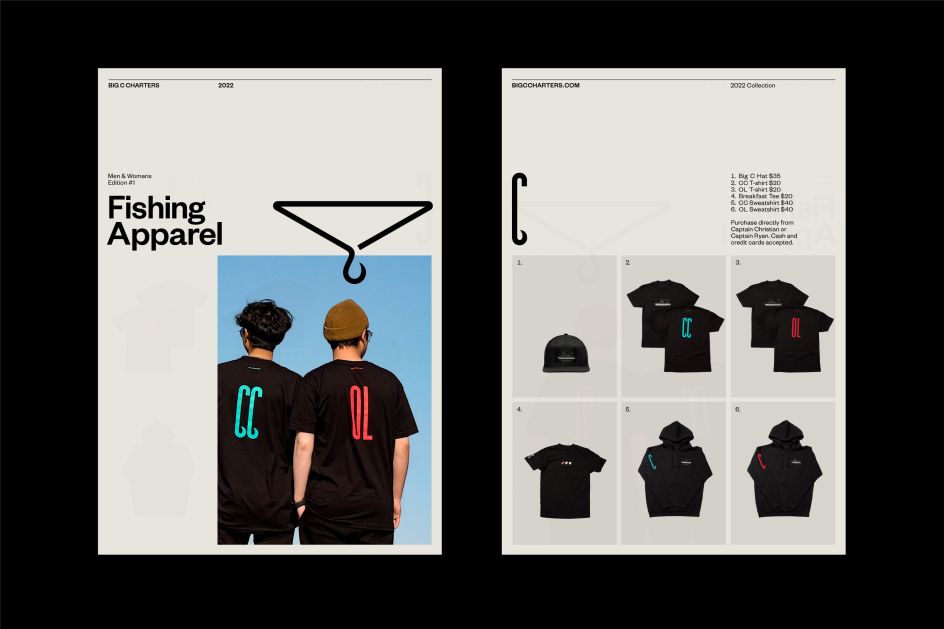
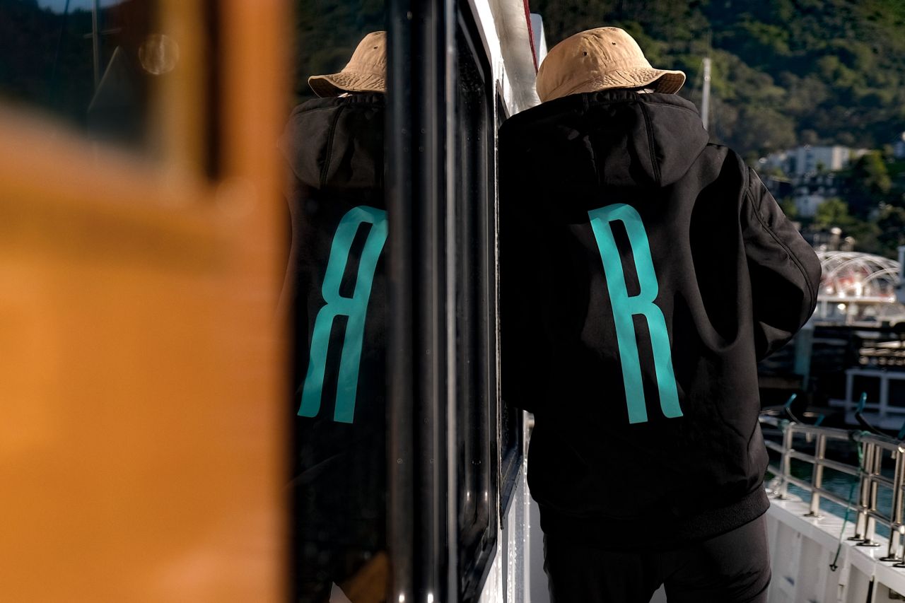
Rather wonderfully, the visual identity champions the individual crew members and boats that make Big C Charters' service beloved. The crew were each given custom jackets with their initials, which signal how valuable they are to the team and help passengers identify and put names to faces. Their fleet is also differentiated since passengers often have an attachment to a particular boat and the unique experience being on the water offers.
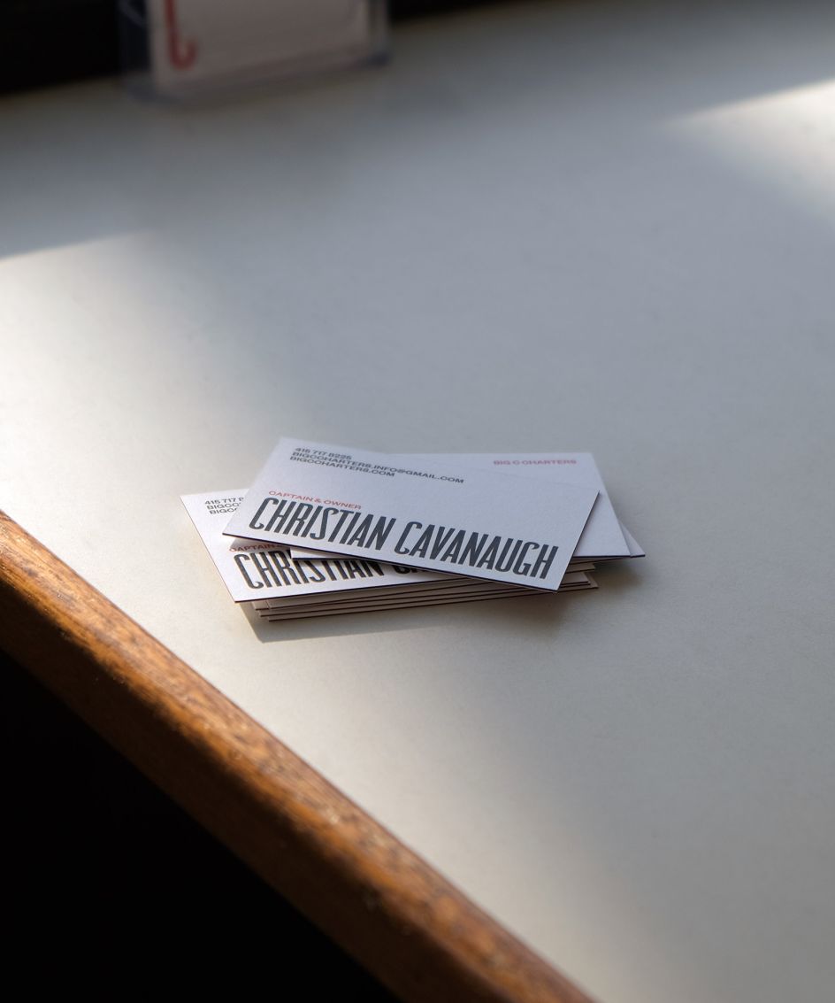
When rolling out the visual identity, Mucho looked to create fun and memorable moments within brand collateral. This included playful use of scale with the 'Big C' logo and typeface as well as extending the language of fishing hooks in "unexpected ways".
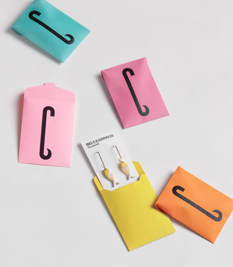
And as Big C is a local charter, Mucho felt it was only fitting to work with other local creators. One such example was in its collaboration with a local handmade jewellery maker, Cali Clay, who crafted a limited-edition collection of Big C earrings, further playing on the hook of the 'C'. Other fun experiments include bookmarks, paper clips and motion design assets.
