January, 2008

article thumbnail

Large Hats & Small Caps

Fonts by Hoefler&Co.

Having begun the week with Senator Barack Obama’s typeface , it seemed appropriate to look back at the typography of campaigns past. Here’s a splendid piece of Americana that will be at auction at Christie’s next week: a carved polychrome and gilt political hat, dated 1872, from the collection of Marguerite and Arthur Riordan. It captures a number of quintessential period styles: bold sans serifs in caps and small caps, “catchwords” festooned with calligraphic flour

article thumbnail

DAVID LEVINE: MUCH IS TAKEN, MUCH ABIDES

Illustration Art

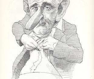
David Levine, whose caricatures adorned the New York Review of Books for more than 40 years, recently stepped down due to failing eyesight. “If I look at somebody’s face. I can’t tell until the person gets within five feet of me who it is.” After nearly 4,000 caricatures-- a solid body of work to make any artist proud-- Levine has not contributed a new drawing since he was diagnosed with macular degeneration.

Artist 36
Insiders

Sign Up for our Newsletter

This site is protected by reCAPTCHA and the Google Privacy Policy and Terms of Service apply.

Trending Sources

article thumbnail

A Change We Made

Fonts by Hoefler&Co.

Literally: that’s our Gotham typeface, as used by Senator Barack Obama. Curiously, John Edwards is also using Gotham, giving the font a combined 68% of the vote in Iowa! —JH.

Fonts 44
article thumbnail

Introducing Archer

Fonts by Hoefler&Co.

We’re delighted to introduce Archer ®, a new slab serif in forty styles. Sweet but not saccharine, earnest but not grave, Archer is designed to hit just the right notes of forthrightness, credibility, and charm. Romans and italics in eight weights each, including a delicate hairline for display work, and featuring small caps, fractions, tabular figures, and our Expanded Latin character set for extended language support.

40
article thumbnail

Let's Talk Trends: Designing for Maximum Impact

Speaker: Amber Asay, Creative Director and Founder of award-winning design studio Nice People

Understanding what trends are happening and how they’re impacting the competitive landscape is crucial to providing top dollar design strategy to your clients. With so many trends coming and going, it can be overwhelming to determine which ones you should capitalize on and which ones might not be worth the trouble. In this exclusive webinar with Amber Asay, we’ll explore graphic design trends that need to die, trends that are starting to pick up and why, trends that have come and gone, and how t

article thumbnail

Introducing Archer

Fonts by Hoefler&Co.

We’re delighted to introduce Archer ®, a new slab serif in forty styles. Sweet but not saccharine, earnest but not grave, Archer is designed to hit just the right notes of forthrightness, credibility, and charm. Romans and italics in eight weights each, including a delicate hairline for display work, and featuring small caps, fractions, tabular figures, and our Latin-X® character set for extended language support.

40

More Trending

article thumbnail

Groovy Tech

Fonts by Hoefler&Co.

Spy shots from Macworld! If only. This is one of Mark Richards’ spectacular photographs from Core Memory Project, his terrific survey of vintage computers. Mark’s sexy shot of the DEC PDP8/F explains all those day-glo set dressings in The Prisoner and The Time Tunnel, both worlds in which the higher the technology, the brighter the orange.

40
article thumbnail

Powers of 41

Fonts by Hoefler&Co.

Ours isn’t a government that holds designers in especially high esteem; a glance at the back of the $20 bill says as much. So it was with both delight and surprise that I learned this morning that the U. S. Postal Service is scheduled to roll out this set of stamps next summer, honoring the great contributions of Charles and Ray Eames. Our entire profession owes thanks to USPS designer Derry Noyes, not only for raising the public profile of design with this marvelous project, but for answe

article thumbnail

Precisely What the Author Had in Mind

Fonts by Hoefler&Co.

40
article thumbnail

High Scores for Service and Style

Fonts by Hoefler&Co.

With the arrival of a new year comes a new Zagat Survey , and with this year’s edition comes a special typographic surprise: a complete redesign using our Whitney family. The indomitable Zagat team has given the fonts one of their most rigorous workouts ever, using Whitney’s many special features to excellent advantage — here’s some of what’s inside.

Fonts 40
article thumbnail

The Democratization of Design: Giving Creators & Marketers the Tools to Succeed

Brands must create and share impactful content to thrive, but they have less people, tighter budgets, and fewer resources to do so. Learn how to publish and market digital content with the same professionalism as organizations with million-dollar budgets.