Graza by Gander
Opinion by Anna Marar Posted 6 April 2023
Using olive oil has never been so squ-easy. That’s how Andrew Benin, founder of Graza, would like us to feel. As Kelsey McClellan reports for the Wall Street Journal, Benin knew the last thing the world needed was another snobby olive oil and the key goal was finding ‘the sweet spot between flavor and affordability’. This product does feel different to others on the market: it is at a slightly lower price point than other trendy olive oils, like Brightland or Fat Gold, but a quality level above what you might find at a local supermarket. And, of course, that distinctive squeezy bottle, inspired by Benin’s time in restaurant kitchens, is a complete innovation in the home cooking space.
That said, Graza has faced some criticism for this bottle. In an age where every product seems to have an environmentally-friendly angle — organic, recycled, sustainable, responsible, locally sourced, energy-efficient, biodegradable (albeit to varying levels of greenwashing) — it is unusual to find a product like this launched with a bottle made of plastic. We typically expect to find high-quality olive oil packaged in glass. Addressing this in the FAQ section of their website, Graza points out that they use ‘post-consumer plastics’ and the bottle ‘is 100% recyclable’; but they also acknowledge that ‘single use packaging is not the long term solution’ and they ‘are in the process of innovating exciting solutions’. Watch this space.


Brooklyn-based studio Gander has developed a brand identity for Graza which is fresh, inviting and fun; and it does not attempt to be as serious and sophisticated as some others in the market. Gander emphasizes that Graza sells ‘incredibly high-quality, single-origin Spanish olive oil’ but that it is ‘very fancy oil in a decidedly un-fancy format’. The visual language is needed to strike this careful balance between high and low.
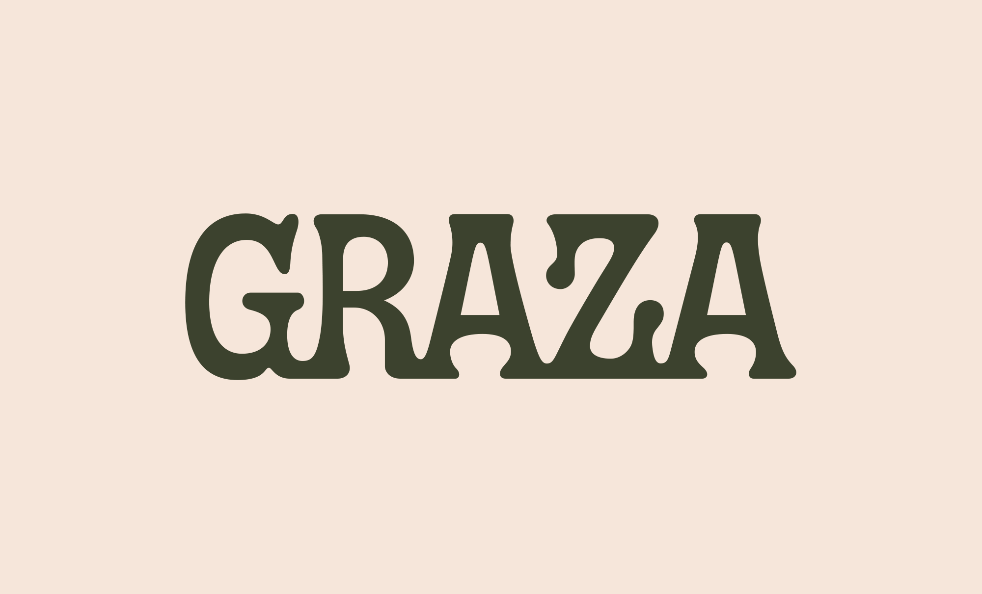
A colour palette of tonal greens may feel on-the-nose for an olive oil, but the brightness and saturation of these bottles makes them stand out from their competitors. The neutral dark green colour provides a counter to the vivid neon green and bright lime yellow; these greens are also paired with a subtle peachy-sand colour, which features heavily on the website.
![]()


The illustrations, done in-house, feel handmade, warm and approachable. Photographic imagery on the website includes both the expected (beautiful shots of olive trees in Spain) and the unexpected (olive oil being drizzled over a bowl of ice cream). Across this project as a whole, Gander knows exactly where to be quirky, and where to keep it simple. The logotype is ‘set in exquisite and Spanish-inspired typography’, with perfect drip accents, ‘while the secondary type keeps it simple, as is the copy.’ That secondary type combo (ITC Garamond Condensed and GT Alpina Typewriter) may suggest a back-to-basics approach, and the writing is clear and punchy, but there is a lot going on here (in the best way).


Alongside those playful illustrations, the bottles themselves are text-heavy, with little use of negative space, suggesting both expertise and enthusiasm. The website is similarly packed with information, written in an entertaining and engaging way. The brand features some excellent copywriting, from the online ‘Glog’ (Graza blog) to one-liners like ‘this olive oil is special, but it shouldn’t be’. Graza’s two products are very satisfyingly named ‘Sizzle’ and ‘Drizzle’, suggesting which stage in the cooking process they should be used (‘cooking oil’ and ‘finishing oil’ respectively). While this name pairing is completely effortless and unforced, Gander may have set themselves a tricky challenge as Graza expands their product range in the future. Apparently ‘Frizzle’ (a canola oil alternative) will be launching soon, but good luck to the copywriters beyond that point!

Graza has found massive success since it launched. Their Instagram account currently has over 33,000 followers, with a dedicated fan base who keep up with every limited-edition product launch. Last year, one fan even went as far as getting a tattoo of the ‘Sizzle’ illustration. Benin is matter of fact about this success, explaining that ‘we have the right quality at the right price with the right supply chain, the right packaging and the right machinery investments with the right market’ (McClellan, Wall Street Journal). It may be hard to determine whether the excellence of the product or the packaging is the key factor here. But with that squeezy bottle, the boundary between packaging and product is blurred — as Marshall McLuhan famously said, the medium is the message.