
Paul McNeil and Hamish Muir told an interviewer not long ago that they think of themselves not as type designers, but as designers who make type. I understand wanting to avoid claiming for themselves skills they don’t have, and they probably want to keep their typographic work in its proper context in their larger practice. But they do make a lot of type all the same.
As the name suggests, TwoPlus’s fonts expand the TwoPoint system that MuirMcNeil released in 2014 (I reviewed them here on Typographica the following year). The studio began to build on their earlier work as they developed identities for two design shows at the London College of Communication; eventually, they finished seven new sets of fonts that became the basis of the Society of Typographic Aficionados’s TypeCon 2016 identity.
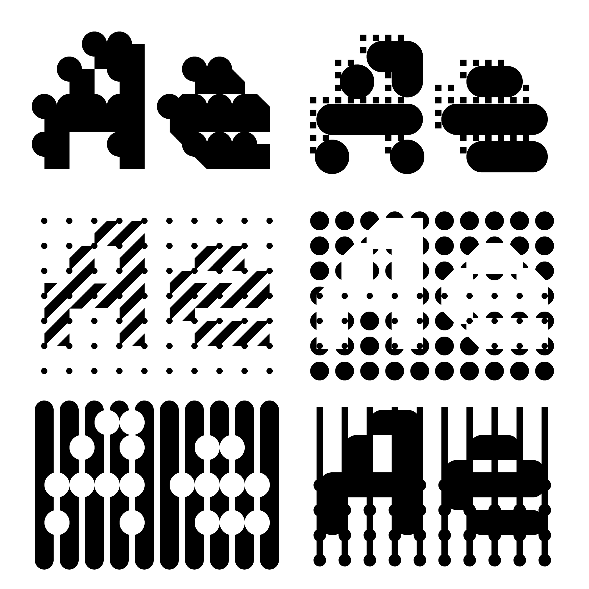
TwoPlus adds 48 new fonts to the 28 in TwoPoint, all of them designed on the same grid so that they easily can be layered over, knocked out of, and offset from each other. McNeil and Muir note that there are now 5770 unique pairwise combinations in the full system of 76 fonts. Combining three fonts yields over 70,000 possibilities; combining four, nearly 1.3 million. The TypeCon applications, and all the work the studio have been making and sharing on their website and through various social media represents only a small fraction of this system’s potential for play and discovery.
In my review of their previous releases, I argued that there’s more to these designs than their formal playfulness — or, rather, that there’s more to that playfulness than designers might appreciate. Beyond the graphic possibilities of their projects — like supergraphics and architectural/structural applications, or new possibilities for color fonts — there’s a lot to learn from extending the logic of a font system’s construction to its extremes, even past legibility. Messing about with those boundaries; abstracting, deconstructing, and recombining letterforms — this kind of play discloses new relationships between and among letters and their components. It also underscores an observation on the nature of type that Muir and McNeil made regarding their ThreeSix family of fonts: The identities of a letter in any typeface, even the most conventional or traditional one, is always located both in its relationship to its counterpart in an ideal or exemplar alphabet (like Roman majuscules, or Carolingian minuscules) and in its relationship to the other letters in the typeface’s formal system. (They explored this idea, for example, in Unit Editions’s U:D/R 03, published in 2011, which showcased ThreeSix and placed it in its historical context.) Again, as the designers themselves have pointed out, to explore the balance between external and internal reference through the formal play of experimental designs like theirs is a way to test the ability of typography to represent language itself.
The pedagogical potential of these projects is obvious, and Muir and McNeil regularly put that potential into practice giving workshops in modular type design. But I want to stress their critical relevance as well.
The technological changes in type design since the late 1970s and early 1980s have been dramatic, even in the context of how the field has transformed itself since the late 19th century. Yet some of the most fundamental questions raised by these changes have not been getting much attention. For example, the font variations feature in the most recent version of OpenType released last fall is just the newest component of a digital environment in which the instructions for drawing letterforms themselves can be (re)generated in real time in response to the context in which they’re applied. In principle they could respond to any information, not just about parameters like line length and spacing, and along any axes a designer can define with vectors.
Now that, as Stephen Coles put it recently, a single font file can contain any number of typefaces, shouldn’t we ask what exactly a “font” is in the first place? Does it even make sense to keep using the term? And if “typography”, as Gerrit Noordzij would tell us, is writing with preformed letters, then is technology making typography itself — or at least, the way many people understand typography — obsolete? Being able to use OTVar to fit type dynamically and seamlessly to screens and windows is a huge step forward; that level of typographic control is long overdue. And the feature’s potential for digitally typesetting scripts that rely on contextual and combinatorial variations (Arabic and Hangul, just to name two) is enormous. But in view of these larger issues, these agendas also feel a little myopic.
Or consider this: Some type and typographic designers have begun to wonder recently whether the field’s preoccupation with technology and the pressures of a saturated and hypercompetitive market have led to a self-conscious, conservative incrementalism in type design, and to a general lack of a larger vision for type and typography. (In their call for entries for the ProtoType competition at TypeCon 2016, for example, the organizers suggested background reading that included some of these arguments.) But conversations in the field about these questions have tended to grind off their sharper edges. Take the debates last summer over Rudy Vanderlaans’s complaint about what he called ‘in-fillism’ in type design. Whatever he originally meant by his comment, discussion about it might have encouraged designers to ask themselves: what has type design become, and what could it be? The exchanges that actually took place, though, centered on another question: should type designers keep doing what they’re doing? Since nearly everyone involved felt the answer to this question — at least for themselves — was “yes”, the potential for a more searching critique of contemporary practice evaporated. (To be fair, it’s a genuinely human response, like a child puzzled at being asked to clean up her room. Why?, she wonders. Everything’s exactly where I put it.)
It’s because of questions like these that I was pleased to see TwoPlus at the core of the TypeCon 2016 identity. The formal play and and experimentation of this and MuirMcNeil’s other work is appealing and engaging, and I’m sure they’re having a great time making and using it. But taking experimental projects like theirs seriously — as they clearly do — can open up space for a more self-critically aware dialog about type and design. How does, and how can, digital type and typography represent language and ideas, and enable a designer or a reader to make meaning from experience? How do, and how can, designers balance the history and conventions of type, its formal and systemic affordances, and the capacities and boundaries of its technology?
“Designers who make type” they may be, but perhaps MuirMcNeil’s work, besides being fun to play with, could provide that bit of self-critical distance, that shift in perspective, that type designers could use to their advantage.
P.S. This fall, Laurence King will be publishing Paul McNeil’s The Visual History of Type, an illustrated survey of the development of typeforms from the advent of movable type in the mid-15th century to the present. His presentation in Seattle last fall on the history of “the search for the perfect language” suggests it’s worth looking forward to.


