
Maximiliano Sproviero is a skilled young type designer specializing in script and display typefaces, some with a distinctly ’70s vibe. He has even done a pitch-perfect ’70s script typeface called Seventies.
I started my design career back then. Herb Lubalin and his various collaborators dominated the New York design scene, and ITC dominated the type world. I was heavily influenced by all this in my formative years as a young designer. It sparked my own ambition to do type design someday.
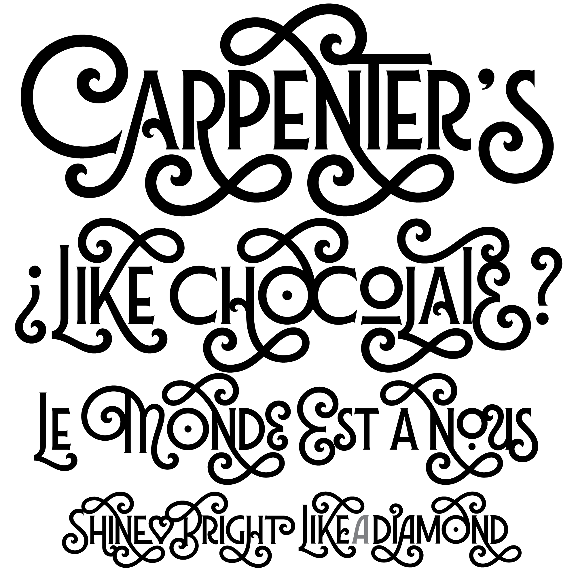
Sproviero’s Lubaline is clearly based on a specific bit of lettering: the cover of a book called Beards, designed and lettered by Lubalin partner Alan Peckolick in 1976. The basic “BEARDS” lettering has been extrapolated out into a complete typeface. I’ve done this sort of thing myself a few times, and it’s an interesting creative challenge. Often, it’s not as easy as it looks, and maybe not even possible.
Lubaline goes well beyond the six letters forming the “BEARDS” lettering. It’s a caps / small-caps design, with alternates for each character, including several swash variations. You could use the font to create endless designs similar to the original BEARDS design. It successfully replicates that look and feel. But you could also use it in a more restrained way, to get a nice period effect. Which period? Well, that’s maybe hard to say. Not precisely the ’70s, but not really Victorian, either, which seems to be what Peckolick may have been going for.
To widen the range of effects possible, Lubaline includes a set of companion fonts beyond the basic style: a lighter weight, several shadow and shading fonts, and an “extras” font whose swashy graphic elements help make your Lubalinesque design fantasies look more like hand lettering.
Overall, I think Lubaline succeeds at emulating Peckolick’s original. Whether anybody really needs this, I don’t know. But it sure is a fun typeface.


Beards is one of many designs mistakenly attributed to Lubalin. While this artwork was produced at Lubalin, Smith, Carnase & Peckolick, the lettering and design was by Alan Peckolick. Given that so much of the lettering that inspired Lubaline was drawn by Carnase or Peckolick, maybe the typeface should be called Peckocarnaline.
The ‘Beards’ lettering was designed by Alan Peckolick and the actual lettering was done by Tom Carnase. I have studied Tom Carnase’s lettering over many years and you can tell at a glance that it is his. Keith Morris.
Note. I am quite sure that Alan Peckolick, whilst designing lettering and logos wasn’t a lettering artist himself.
[…] Lubalin coined the term “typographics” to refer to illustrations made with words. He and his talented partners painted text pictures by painstakingly drawing letters, or modifying […]