Top 10 Worst Logo Design Clichés to Avoid
Hey there, fellow designers and branding enthusiasts! Today, we're diving deep into the world of logo design and, more specifically, the clichés that can bog down even the most promising logos. You know what I mean – those overused, tired concepts that make your eyes roll harder than a RuPaul's Drag Race contestant.
Look, I get it. We've all been there, staring at a blank canvas (or, more likely, a glowing screen) and feeling the pressure to create something iconic. But here's the thing: falling back on played-out logo tropes isn't cut. Not in today's design landscape, where originality and creativity reign supreme.
So, buckle up, grab your favourite beverage (mine's a good old cuppa), and explore some of the most egregious logo design clichés you should avoid. Trust me, by the end of this article, you'll be armed with the knowledge to create logos that stand out from the crowd.
Table of Contents
The Problem with Generic Shapes
Ah, the generic shape. It's like the vanilla ice cream logo design – safe, predictable, and boring. I'm talking about those ubiquitous circles, squares, and triangles that pop up everywhere.
Don't misunderstand me; simple shapes can be practical when used thoughtfully. But they lose their impact when they become the default choice, devoid of any unique interpretation or context. It's like wearing a plain white t-shirt to a fancy dress party – it just doesn't cut it.
Circles, Squares, and Triangles, Oh My!
Picture this: you're scrolling through a list of logos, and it's like a game of spot-the-difference but with geometric shapes. Circle, square, triangle, repeat. Yawn.
Sure, these shapes have their place in design. But when they're used as a lazy shortcut, without real thought or creativity, they become clichés that scream “uninspired.”
Breaking Free from Geometric Monotony
Now, I'm not saying you should swear off simple shapes entirely. But let's get creative with them, shall we? Combine them uniquely, add depth and texture, or even break them apart to create something original.
Remember, a logo isn't just about the shapes themselves; it's about how you use them to tell a story, convey a message, or evoke a specific feeling. So, instead of reaching for the same old circle or square, challenge yourself to think outside the box (pun intended) and create something truly memorable.
The Pitfall of Abstract Swooshes
Oh, the abstract swoosh. It's like the design equivalent of a shiny new toy – everyone wants to play with it, but it loses its lustre after a while.
I'm sure you've seen those sweeping lines or curves meant to convey movement, energy, or some other vague concept. And while there's nothing inherently wrong with abstract elements in logo design, the swoosh has become a bit cliché.
The Ubiquity of the Swoosh
A plague has swept through the design community, and everyone's logos have been infected with the swoosh virus. You see it everywhere – on corporate logos, sports teams, tech startups, you name it.
And look, I get the appeal. Swooshes can add a sense of dynamism and energy to a logo. But when they're overused and lack real context or meaning.
Breaking Away from the Swoosh Addiction
So, what's the solution? It's time to break free from the swoosh addiction and explore other ways to convey movement and energy in your logos.
Think about using more organic shapes or even incorporating typography in a way that suggests motion. Or, dare I say it, maybe consider a logo that doesn't need to scream “energy” at every turn. Sometimes, a sense of calm and stability can be just as practical.
The key is to be intentional with every element in your design. If you choose to use a swoosh or other abstract element, make sure it has a clear purpose and meaning within the context of the brand.
The Trap of Literal Symbolism

In logo design, there's a fine line between clever symbolism and literal representation. All too often, designers find themselves falling into the trap of the latter.
You know what I'm talking about: those logos that take a brand's name or product and translate it into an overly literal visual representation. Someone took the subtlety out of the design and replaced it with a giant neon sign that says, “Look, we're a plumbing company, so here's a wrench!”
The Perils of Being Too On-the-Nose
Sure, there's a certain charm in simplicity and straightforwardness. However, when it comes to logo design, being too literal can strip away the opportunity for more profound meaning and interpretation.
Think about some of the world's most iconic logos. They don't just slap the product or service on a canvas and call it a day. Instead, they use symbolism, metaphor, and abstraction to create a visual identity that transcends the literal and speaks to something more profound.
Embracing Subtlety and Nuance
So, how do you strike the right balance? It's all about finding that sweet spot between being too literal and being too abstract.
Start by thinking about the brand's essence – what it stands for, what emotions it wants to evoke, what stories it wants to tell. Then, use that as a jumping-off point to explore visual metaphors and symbols that can communicate those ideas more nuancedly.
And remember, sometimes less is more. A simple, understated logo can be as powerful as one packed with layers of meaning if it's well-executed and strikes the right chord with your target audience.
The Curse of Overused Motifs
Do you know those design trends that seem to sweep the industry like wildfire? The ones that start as fresh and innovative but then get co-opted by everyone and their uncle until they become the visual equivalent of a played-out pop song?
Yeah, I'm talking about overused motifs – those recurring visual elements that somehow find their way into every other logo design. And while they might have been cool the first few times, they quickly descend into cliché territory.
The Rise and Fall of Trendy Motifs
Think about some of the motifs that have come and gone in recent years. Maybe it was the hipster-inspired vintage badge, the sleek minimalist wordmark, or the geometric “flat” logo that was all the rage a few years back.
At first, these motifs felt fresh and innovative. Designers were pushing boundaries and exploring new visual languages. But then, as is often the case, the masses caught on, and suddenly, these once-unique elements were everywhere you looked.
Staying Ahead of the Curve
So, how do you avoid falling into the trap of overused motifs? It starts with awareness of what's trending in the design world and consciously trying to steer clear of the bandwagon.
But it's not just about avoiding the latest fads – it's about developing a keen eye for what's truly unique and original. Study the history of logo design, explore lesser-known styles and influences, and push yourself to think outside the box.
And remember, just because something is trendy doesn't mean it's inherently wrong. The key is to take those trends and put your unique spin on them, or even better, create something entirely new that sets the stage for the next big thing.
The Scourge of Generic Stock Imagery

Oh, stock imagery. It's like the fast food of the design world – convenient, readily available, but often lacking in natural substance.
Now, I'm not here to bash stock imagery altogether. It can be a valuable tool in a designer's arsenal when used thoughtfully and sparingly. But all too often, designers fall into the trap of relying too heavily on generic, overused stock imagery in their logo designs, leading to a lack of originality and distinctiveness.
The Pitfalls of Generic Stock Imagery
You know what I'm talking about – those cheesy, overly-staged photos of people shaking hands, smiling inanely, or holding random objects meant to symbolise something deep and meaningful.
And let's remember the clipart-style illustrations that look like they were plucked straight out of a 90s PowerPoint presentation. Sure, they might be easy to find and slap onto a canvas, but they rarely tell a compelling story or create a lasting impression.
Crafting Unique and Memorable Visuals
So, what's the solution? Well, it's time to start thinking beyond the confines of generic stock imagery and tap into your creativity.
Consider commissioning custom illustrations or photography tailored to your brand's unique story and personality. Or, if you're feeling particularly adventurous, try creating your visuals – whether through illustration, collage, or even experimental photography techniques.
And remember, visuals don't have to be simple and manageable to be effective. Sometimes, the most memorable logos use simple, well-executed visuals that convey a clear message and leave a lasting impression.
The Bane of Outdated Typefaces

Typography is a crucial element in logo design, and yet, all too often, designers fall back on tired, overused typefaces that do little to elevate their designs.
You know the ones I'm talking about – the Comic Sans of the World, the Papyrus, the Curlz MT. These outdated, clichéd typefaces have become the design equivalent of a bad haircut from the 90s – something that should have been left in the past but somehow keeps rearing its ugly head.
The Importance of Typographic Choices
Typography can make or break a logo design. It's not just about choosing a font that's legible and easy to read (although that's certainly important). It's about selecting typefaces that complement the brand's overall aesthetic, convey the right tone and personality, and create a cohesive visual identity.
Embracing Modern and Distinctive Typography
So, how do you break free from the shackles of outdated typefaces? Well, it starts with staying up-to-date on current typography trends and exploring lesser-known fonts that have the potential to make your designs stand out.
Look for typefaces with a unique character or personality, whether through unusual letterforms, unexpected textures, or a sense of playfulness or eccentricity. And feel free to combine multiple typefaces in a single design as long as they work harmoniously.
And remember, sometimes, the most effective typography is the simplest. A well-executed wordmark or logotype can be as powerful as a complex typographic treatment if it's well-crafted and speaks to the brand's essence.
The Trap of Overly Complicated Designs

In the world of logo design, there's a common misconception that more is better. You'll create something memorable and impactful by packing as many elements, flourishes, and details into a logo as possible.
But here's the thing: overly complicated logo designs are often the opposite of practical. They can be confusing, cluttered, and downright overwhelming, leaving viewers scratching their heads instead of forming a lasting impression.
The Pitfalls of Design Overload
Picture this: a logo that features a literal representation of a product (let's say a wrench), surrounded by an abstract swoosh, with a funky typeface thrown in for good measure, and maybe even a tagline or two crammed in there for added chaos.
It's like a visual assault on the senses, with each element competing for attention and ultimately detracting from the overall message and impact of the design.
Embracing Simplicity and Focus
So, what's the solution? It's time to embrace the power of simplicity and focus in your logo designs.
Start by identifying the brand's essence – the one or two key ideas or concepts you want to convey. Then, strip away extraneous elements that don't directly contribute to that core message.
Remember, a great logo isn't about cramming as much information as possible into a small space. It's about distilling the brand's identity to its most essential, memorable elements and executing them precisely and clearly.
And don't be afraid of negative space – that empty canvas can be just as robust as the elements you choose to include. A well-balanced, focused design with room to breathe will often leave a much stronger impression than a cluttered and overcrowded one.
The Curse of Irrelevant Symbolism
Sometimes, in the quest to create a visually striking logo, designers can get too carried away with symbolism and metaphor, leading to visuals wholly disconnected from the brand they're meant to represent.
You know what I'm talking about – those logos that feature abstract shapes, animals, or other random elements without a clear connection to the product, service, or industry. It's like someone said, “Let's just throw a dolphin in there because dolphins are cool!”
The Importance of Brand Relevance
A logo isn't just a pretty picture or a collection of shapes and symbols. It visually represents a brand's identity, values, and core message. And if the visuals used in a logo don't align with those essential elements, the entire design falls flat.
Sure, symbolism and metaphor can be powerful tools in logo design. But they must be used thoughtfully and intentionally, clearly connecting to the brand's story, personality, and essence.
Finding the Right Symbolic Connections
So, how do you ensure that your logo's symbolism is relevant and impactful? Well, it starts with a deep understanding of the brand you're working with.
Spend time researching the company, its history, its mission, and the emotions and ideas it wants to convey. Look for connections between the brand's identity and potential visual metaphors or symbols that could communicate those ideas meaningfully.
And remember, sometimes the most potent symbolism is the simplest. A well-executed typographic treatment or a simple geometric shape can speak volumes when used intentionally and connected to the brand's essence.
The Bane of Lazy Rebrands
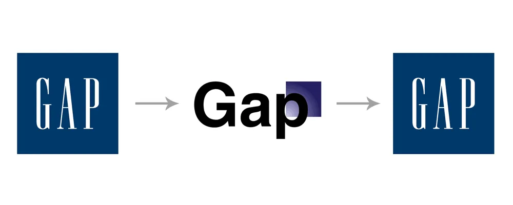
Rebranding is a tricky business. On the one hand, it's an opportunity to breathe new life into a brand's visual identity and align it with changing times and trends. But on the other hand, it's all too easy to fall into the trap of lazy rebranding – making superficial changes that do little to improve the brand's overall impact and memorability.
You know the ones I'm talking about – those rebrands that involve a slight tweak to a typeface, a minor colour adjustment, or a subtle reshaping of an existing logo element. It's like putting a fresh coat of paint on a house with crumbling foundations – it might look a little prettier on the surface, but it doesn't address any underlying issues.
The Importance of Meaningful Change
A successful rebrand isn't just about making a few cosmetic changes to a logo or visual identity. It's about deep diving into the brand's core messaging, personality, and positioning and using that as the foundation for a truly transformative visual overhaul.
It might mean scrapping an outdated logo entirely and starting from scratch, or it could involve a more subtle reimagining of existing elements. However, the key is ensuring that every change serves a clear purpose and contributes to a more cohesive brand identity.
Embracing Bold and Thoughtful Rebranding
So, how do you avoid falling into the trap of lazy rebranding? Well, it starts with a willingness to be bold and to think outside the box.
Don't be afraid to challenge assumptions and break free from the constraints of an existing visual identity. Explore new directions, styles, and ways of conveying the brand's message and personality through design.
And remember, a successful rebrand isn't just about creating a new logo or visual identity – it's about crafting a cohesive brand experience that extends across all touchpoints, from packaging to digital platforms to physical spaces.
Demographic and Cultural Faux Pas
In today's increasingly diverse and interconnected world, logo designs must consider their target audiences' cultural and demographic nuances. Unfortunately, all too often, designers fall into the trap of making insensitive or tone-deaf choices that alienate certain groups or perpetuate harmful stereotypes.
The Importance of Inclusive Design
A great logo should speak to a broad range of people, regardless of their cultural background, age, gender, or other demographic factors. It should be a unifying force that brings people together rather than a divisive element that excludes or marginalises certain groups.
However, achieving that level of inclusivity takes more than good intentions – it requires a deep understanding of the diverse communities that make up a brand's target audience and a commitment to designing with empathy and sensitivity.
Avoiding Cultural and Demographic Missteps
So, how do you ensure your logo designs are inclusive and respectful of different cultures and demographics? Well, it starts with education and research.
Take the time to learn about the cultural nuances, symbolism, and visual languages that resonate with different communities. Study how design choices can perpetuate harmful stereotypes or make certain groups feel excluded or marginalised.
And don't be afraid to seek feedback and input from members of the communities you're designing for. Collaborate with diverse voices, listen to their perspectives, and be willing to make changes or adjustments based on their insights.
Remember, inclusivity isn't just a buzzword – it's a fundamental principle that should guide every aspect of your design process. By embracing it wholeheartedly, you'll not only create more impactful and successful logos, but you'll also contribute to a more equitable and inclusive design landscape overall.
The Importance of Brand Consistency
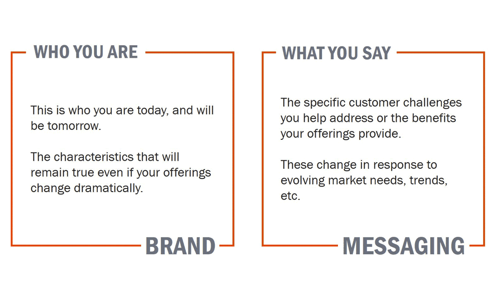
While we've touched on many clichés to avoid in logo design, one overarching principle deserves its section: the importance of brand consistency.
A logo isn't just a standalone design element – it's part of a more significant visual identity encompassing everything from colour palettes and typography to imagery and brand messaging. And if those elements aren't working together in harmony, it can create a disjointed and confusing brand experience that fails to leave a lasting impression.
The Pitfalls of Inconsistency
Imagine a brand that has a sleek, modern logo but pairs it with a dated, serif typeface and a colour palette that feels entirely out of sync. A company can also have a consistent visual identity across its website and social media, using a wholly different set of design elements on its packaging or in-store signage.
These inconsistencies can be jarring and undermine the impact and memorability of even the most well-crafted logo. They create a disconnect, leaving customers questioning the brand's identity and messaging.
Crafting a Cohesive Brand Experience
So, how do you ensure that your logo designs are part of a cohesive and consistent brand experience? Well, it starts with a holistic approach to branding and visual identity.
When designing a logo, consider how it will work with other design elements like typography, colour, and imagery. Consider how it will translate across different mediums and touchpoints, from digital to print to physical spaces.
And remember, consistency doesn't mean uniformity. There's room for variation and flexibility within a brand's visual identity as long as a clear underlying logic and cohesion tie everything together.
By taking this holistic approach to design, you'll create a brand experience that feels seamless, memorable, and impactful, with the logo serving as the anchoring element that ties everything together.
Conclusion
Well, there you have it, fellow designers – a deep dive into some of the most egregious logo design clichés you should avoid in your work.
But remember, avoiding clichés isn't just about creating visually striking logos. It's about crafting designs that are thoughtful, intentional, and deeply connected to the brands they represent. It's about pushing boundaries, challenging assumptions, and creating visual identities that transcend the ordinary and leave a lasting impression.
So, go forth and design boldly. Embrace originality, simplicity, and context. And never be afraid to break the mould and blaze new trails in the world of logo design.
Because at the end of the day, that separates the genuinely iconic logos from the forgettable ones – a willingness to take risks, think outside the box, and create something that stands the test of time.
FAQ:
What are the most common logo design clichés?
One of the most common logo design clichés is the overuse of generic shapes like circles, squares, and triangles without any unique interpretation or context. While simple shapes can be practical, using them as a default choice without creativity often leads to uninspired and forgettable logos.
Are abstract swooshes always a bad choice?
Not necessarily. Abstract elements like swooshes can be practical when used intentionally and with a clear purpose or meaning within the context of the brand. The problem arises when swooshes are overused without context or justification, making them cliché.
How can I avoid literal symbolism in my logo designs?
Rather than translating a brand's name or product into an overly literal visual representation, look for opportunities to use subtlety, metaphor, and abstraction to communicate the brand's essence more nuancedly. Focus on capturing the core emotions, values, and stories behind the brand rather than just depicting the product or service itself.
Why is it essential to avoid overused motifs?
Overused motifs like vintage badges, minimalist wordmarks, or geometric “flat” logos can initially feel fresh and innovative but quickly become clichés as the masses co-opt them. Staying ahead of the curve and developing a keen eye for what's truly unique and original is crucial for creating memorable and impactful logo designs.
How can I ensure my logo designs are inclusive and respectful of different cultures and demographics?
Take the time to educate yourself on the cultural nuances, symbolism, and visual languages that resonate with other communities. Seek out feedback and input from diverse voices, and be willing to make changes or adjustments based on their insights. Embrace inclusivity as a fundamental principle guiding every aspect of the design process.
