July, 2008

article thumbnail

The Oxford English Dictionary in Limerick Form

Fonts by Hoefler&Co.

Nineteen years of designing typefaces has amply proven H&Co’s Third Law, which states that for every act of exhaustive research, there is an equal and opposite act of total silliness. This principle extends from typography into other disciplines as well: behold — no kidding — the Oxford English Dictionary in Limerick Form. Precisely the kind of project that the internet was made for, the OEDILF (stop snickering!

article thumbnail

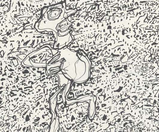
GARY PANTER: CHER IN JOHNNY ROTTEN'S CLOTHING?

Illustration Art

Artist Gary Panter is all over the news lately. Hollywood gossip magazine Entertainment Weekly placed him on this week's "Must" List along with Cher's new Las Vegas show. The New York Times applauded the arrival of a fancy new two volume, boxed collection of his work. His recent New York gallery opening was touted (by the gallery) as a "visual tour de force.

Artist 36
Insiders

Sign Up for our Newsletter

This site is protected by reCAPTCHA and the Google Privacy Policy and Terms of Service apply.

Trending Sources

article thumbnail

Type in Three Dimensions

Fonts by Hoefler&Co.

Taking a break from my top secret Independence Day project that combines typography and patriotism (more about this later ), I came across something marvelous that I had to share. The August 2008 issue of Print has this arresting image on the cover. I recognized that the typography grew out of our Gotham Rounded font, which is the magazine’s signature typeface, and had assumed that this treatment was a clever and curious bit of digital rendering on someone’s part.

Print 40
article thumbnail

A Word For That

Fonts by Hoefler&Co.

Is that the sound of a designer waiting for Adobe Updater to complete? No, just a brief response to a question on Docs Populi , via Coudal Partners : “What does one call the use of random non-alphabet characters to indicate cursing? It’s a universally understood device, and is applied in both graphic and textual settings. It is such a commonly accepted staple that I assumed it must already be defined and described — but apparently it’s not.” But it is!

Adobe 41
article thumbnail

Let's Talk Trends: Designing for Maximum Impact

Speaker: Amber Asay, Creative Director and Founder of award-winning design studio Nice People

Understanding what trends are happening and how they’re impacting the competitive landscape is crucial to providing top dollar design strategy to your clients. With so many trends coming and going, it can be overwhelming to determine which ones you should capitalize on and which ones might not be worth the trouble. In this exclusive webinar with Amber Asay, we’ll explore graphic design trends that need to die, trends that are starting to pick up and why, trends that have come and gone, and how t

article thumbnail

Type Night at Delta House!

Fonts by Hoefler&Co.

Describing the sand casting method for making type, Rob Roy Kelly quotes eighteenth century printer Christian Friedrich Gessner thus: “The ingredients of casting sand are fine sand, to which is added calcinated baking-oven glue, the redder the glue the better. This mixture is finely pulverized and passed through a mesh sieve. Thereupon the mixture is placed upon a level board.

40

More Trending

article thumbnail

Heavy Metal

Fonts by Hoefler&Co.

Four hundred years after Gutenberg’s death, “metal type” was still being made the way he made it. Using files and gravers, a steel rod was cajoled into the shape of a backwards letter; this steel ‘punch’ was struck into a brass blank, called a ‘matrix,’ which would serve as a mold for the casting of individual pieces of lead type.

Print 40
article thumbnail

Four Shortage Strikes Nation

Fonts by Hoefler&Co.

The New York Times reports on crippling shortfalls in the nation’s strategic four reserve: ‘With regular gas in New York City at a near-record $4.40 a gallon, station managers are rummaging through their storage closets in search of extra 4 s to display on their pumps. Many are coming up short… “Typically, we have a lot of 9 s and 1 s, and we had a shortage of 3 s before we got a lot of 3 s in,” Mr.

Coding 40
article thumbnail

Spotting the Long-Necked Kern

Fonts by Hoefler&Co.

This publicity photo, from the Berthold foundry’s Specimen No. 525B (late 1950s?) shows the foundry type for Arabic Shaded No. 50. In addition to demonstrating the maker’s facility with both non-Latin scripts and elaborate ornamentation (this is an outline face with a drop shadow, produced at 30pt), this diagram shows an interesting technique for kerning Arabic’s many delicate features.

Print 40
article thumbnail

Learn Typeface Design with H&Co’s Sara Soskolne

Fonts by Hoefler&Co.

Hands-on instruction in typeface design is notoriously hard to come by. Those interested in learning the craft have either to content themselves with a one-hour workshop at a professional conference, or commit themselves to a year of graduate school abroad. But this month, the Book Arts Center at Wells College Summer Institute is hosting a one-week class in typeface design with Sara Soskolne , Senior Typeface Designer at H&Co.

article thumbnail

The Democratization of Design: Giving Creators & Marketers the Tools to Succeed

Brands must create and share impactful content to thrive, but they have less people, tighter budgets, and fewer resources to do so. Learn how to publish and market digital content with the same professionalism as organizations with million-dollar budgets.

article thumbnail

Learn Typeface Design with H&Co’s Sara Soskolne

Fonts by Hoefler&Co.

Hands-on instruction in typeface design is notoriously hard to come by. Those interested in learning the craft have either to content themselves with a one-hour workshop at a professional conference, or commit themselves to a year of graduate school abroad. But this month, the Book Arts Center at Wells College Summer Institute is hosting a one-week class in typeface design with Sara Soskolne , Senior Typeface Designer at H&Co.