Future Circular Collider by Bleed
Opinion by Benjamin Elwyn Posted 25 October 2022
After the scientific successes of CERN’s Large Hadron Collider (and its blessed failure to create any world-destroying black holes), the research organisation has an even greater need for speed. The team of scientists over in Geneva has been illuminating the nature of our universe since 2009: accelerating and smashing particles together, then snatching glimpses of their tiny collisions. Their appetite whetted with revealing results, they want more.

The Future Circular Collider (FCC) is a placeholder name for what this bigger and more powerful particle accelerator will be. It is also a banner for the ‘international collaboration of more than 150 universities, research institutes and industrial partners from all over the world’ tasked with proposing, engineering, and planning how it all might come about. Bleed, a design studio based in Oslo and Vienna, was briefed to create an identity that could represent the collider, its team, and the studies that will make it happen.

The logo Bleed designed is a simple circle, but with a twist (literally). In its flat, head-on view – the canonical version – we have a monochrome line flowing in a perfect arc until it fades just before it meets its own tail. It can live alone, or alongside a simple wordmark set in an all-caps grotesk typeface (Dr, designed by Bureau Brut and released by Production Type). Despite its simplicity the design manages to communicate a neat collection of useful messages.

Firstly (and obviously), we have the shape of the FCC itself. Secondly, the fact that the circle isn’t entirely closed, hints at the potential for flow in and out. In the case study, Bleed is explicit about wanting the ‘visual concept to radiate openness and transparency’, thereby alluding to how the FCC team share and receive knowledge from the global scientific community. It could also be nice to think of this arcing line as a benevolent arm embracing and bringing together the diverse group of people and professions all contributing to making the future of the FCC a reality. And lastly, is there a shy, minimalist ouroboros lurking somewhere in there? Its message of eternal and cyclical life would be a nice (if not profound) touch here… Because from the sub-atomic perspective of the FCC, aren’t we all just bundles of particles anyway? Never really dying, just combining and recombining, etc etc.


That’s a lot of work being done by a simple symbol! But the semantics don’t stop there. Rotate the circle along the x or y axis and we discover it wasn’t a circle after all. As befitting the non-deterministic quantum universe that we inhabit, the 2D shape can realise multiple forms: either a pair of oscillating wave forms, or a coiled spiral. With this reveal, Bleed hopes to ‘surprise the audience with new dimensions, shapes and insights’ in a relatively modest move that echoes the bigger revelations that CERN hopes to provide about how the universe works.
There’s also a fun allegory in the use of a third, and even fourth dimension (of time, because it animates) in the creation of the FCC identity… One of the theories being investigated by CERN’s colliders is the potential existence of multiple spatial dimensions beyond our quotidian three. So in the unexpected appearance of extra dimension in its logo, the FCC could be hinting at grander dimensional revelations.

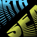
This morphing and moving also plays some functional roles. In animating from state to state and then back to its original form, we get a perfectly looping, and therefore never-ending, piece of motion design; ideal for the web, and social media posts. In addition to this, the different views we get of the circle as it rotates in space provide an almost infinite variety of shapes. These have been used on posters and other secondary materials, lending them a research-poster-feel with graphics resembling charts and graphs that also happen to rhyme with the original identity.
Logos usually live in a flatland of paper and pixel arrays, so it’s not a surprise that most of them inherit this two dimensional form. But we can see here the benefits you get when you include a third axis to play with, both in the opportunities to explore extra narratives latent in the identity, and also in the abundance of additional logo-adjacent imagery.

Bleed is not alone in this approach. With the logos for the Leeum Museum of Art by Wolff Ollins, and Museum Panorama Mesdag by Studio Dumbar, we find treatments of type that bend and rotate in ways suggestive of tubular shapes (both of them communicating something about the architecture of the buildings they represent). And in Johnson Banks’ branding work for Jodrell Bank – a radio telescope in Macclesfield – a flat-seeming wordmark rotates in space thereby revealing that it is in fact satellite-dish-shaped.
Despite giant leaps in computer processing we are still mostly experiencing graphic design in two dimensions, with the third only implied by movement or shading. In the rapidly advancing future, with some rich and powerful companies burning piles of cash in an attempt to drag us all into the full-blooded 3D world of VR and AR, will there be a demand for logos that can natively inhabit these spaces? Perhaps something that can be recognised when viewed from every angle? For now at least, let’s just be satisfied with these relatively tamer (but still fun) forays into three dimensional identity design. Who knows how many extra dimensions we’ll need to design for once we learn what the FCC has to teach us!