Sans-Serif vs Serif Fonts: The Typography Debate
Sans-serif vs Serif fonts? This question has sparked heated debates among designers and typographers for decades. Selecting the right font is critical in design – it can make the difference between text that's inviting or off-putting, professional or unpolished, classic or modern.
Let's dig into the origins, strengths, and use cases of these two font families to uncover when each style works best. Get ready for the Sans-serif vs Serif showdown!
Table of Contents
A Historical Look at Serif Fonts

Serif fonts had graced the pages of published books and newspapers since around 1465 when printer Nicolas Jenson first used the Roman-style serifed typeface we still see today.
Serifs are small lines or ornaments extending from the edges of letters. You'll notice them at the tips of letters, giving them a traditional and graceful appearance.
The serif style has Roman roots. Roman stone carvers chiselled small lines at the ends of letters to define neat edges. As printed communication emerged, type designers mimicked these stone letterforms, and the style has stuck around for centuries.
Serif fonts maintain an air of nostalgia and tradition thanks to their centuries-long history in published media. They bring authority and polish to their words.
Some classic serif font examples include Times New Roman, Garamond, Baskerville, and Bodoni.
Sans-Serif Fonts: The Modern Kid on the Block

Sans-serif fonts only emerged in the late 18th century and gained steam in the 20th century as advertising and commercial design proliferated.
As the French name indicates, sans-serif fonts ditch the serifs, opting for clean lines and open simplicity. They have a contemporary vibe compared to mannered serif fonts.
The first sans-serif typefaces were designed for clarity and legibility. Designers found them more accessible to read at smaller sizes, and they worked well for headlines and posters.
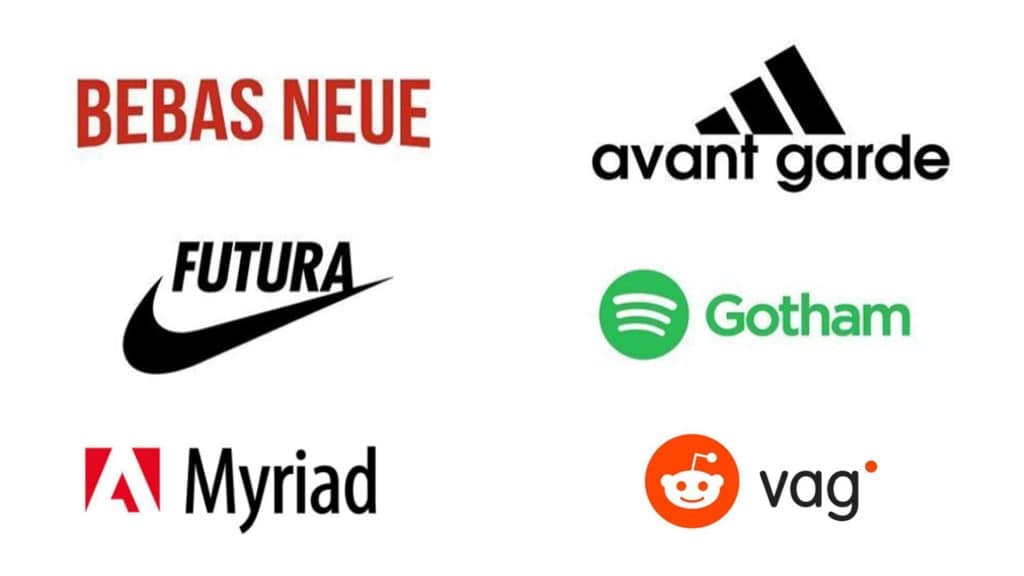
Over time, many stylised sans-serif fonts emerged. Today, the style spans sleek minimalism to retro-inspired curves. Popular options include Helvetica, Arial, Futura, Gotham, and Avant-Garde.
Sans-serif vs Serif: A Design Duel
So when should you choose a serif or sans-serif font? This question ignites fiery opinions among designers. The styles cater to different aesthetics, and there's merit on both sides of the debate.
To fuel this typography showdown, let's look at the defining traits of each font category and how they impact design.
Serif Fonts: Sophistication and Readability

The central question in the sans-serif vs serif debate is: which is more readable?
Typography research has attempted to determine how serifs affect readability and whether they help or hinder the reading experience. The results may surprise you.
Do Serifs Improve Readability?
Early studies in the 20th century found a slight advantage for serif legibility, especially for passages set in smaller point sizes. However, as research methods evolved, more recent studies show mixed results.
For most purposes, there is likely no significant difference in readability between serif and sans-serif fonts. Counterintuitively, serifs do not seem to guide the eye as many designers believe.
However, some studies do indicate that serifs can improve readability under certain conditions:
- Smaller point sizes – Serifs enhance letter recognition when set at 12-point size or below. The “feet” help distinguish letters that might otherwise blend.
- Low-quality printing – Serif fonts maintain legibility when printed under less-than-ideal conditions, such as a laser printer running low on toner.
- Body copy – Serifs may make long passages of text easier to parse, though findings are inconsistent.
So, while serifs don't provide definitive readability benefits in most digital situations today, they can enhance legibility for tiny types. This explains why many newspapers continued using serif body copy in the digital age.
- Used Book in Good Condition
- Craig, James (Author)
- English (Publication Language)
- 176 Pages – 05/01/2006 (Publication Date) – Watson-Guptill (Publisher)
Perceived Credibility and Authority
Beyond potential impacts on readability, serif fonts confer other advantages. The classical heritage of serif designs lends an air of credibility and authority.
Some studies indicate that serif fonts are perceived as more formal than sans-serifs. Readers more easily accept information presented in a serif font as trustworthy and legitimate.
This perceived authority makes serif fonts an intelligent choice for applications like:
- Books
- Newspapers
- Magazines
- Legal documents
- Academic papers
Skilled designers can leverage the formal and traditional associations of serif fonts to establish credibility and professionalism in their work.
- Serif fonts exude an air of sophistication and tradition. Their delicate serifs and cursive details create an elegant, almost calligraphic texture.
- The serifs help lead the eye along the shape of letters smoothly. This can aid readability in long passages of printed text.
- Serif fonts align with formal business communications, such as reports, official letters, and professional branding.
- They work well for book typography as the serifs guide the eye across the page.
- Italic serif styles add style for headers and accents.
- Classic serif fonts like Times New Roman represent established institutions and traditions.
Sans-Serif Fonts: Clarity and Minimalism

The clean lines and neutral forms of sans-serifs offer their own set of benefits for designers. Let's explore the powers of the sans.
Enhanced Clarity and Legibility
Studies demonstrate that sans-serif fonts improve legibility and readability under specific conditions:
- Small sizes on screens – Sans-serifs display with greater clarity on screens at 12 points and below. The more unadorned letterforms prevent letters from blending.
- Online reading – Most online content is easier to read set in sans-serif typefaces. The neutral letterforms enhance scannability.
- Disabled readers – Removing serifs increases legibility for readers with visual impairments or cognitive disabilities.
So, for digital applications like websites, ebooks, mobile interfaces and on-screen presentations, sans-serifs provide superior clarity and enhanced scannability.
A Modern and Minimalist Aesthetic
Sans-serif fonts perfectly complement modern graphic design aesthetics. The pared-down forms project a contemporary vibe and minimalist style.
By eliminating decorative serifs, sans-serifs focus on the letterforms themselves. This simplicity of form lends an elegant and uncluttered look.
Brands leverage this streamlined aesthetic to cultivate a forward-thinking identity. Sans-serifs provide the perfect font choice for designers seeking a cutting-edge look.
- Hardcover Book
- English (Publication Language)
- 240 Pages – 09/01/2020 (Publication Date) – Hoaki (Publisher)
Versatility Across Applications
Beyond their modern appeal, sans-serif fonts offer versatility across applications. Their minimalist forms are the “go anywhere, do anything” typeface.
Sans-serifs work excellently for:
- Websites
- Mobile apps
- Posters
- Packaging
- Presentations
- Signage
- TV graphics
This versatility makes sans-serif fonts the ideal core in company brand guidelines. They provide consistency across both digital and print materials.
Now that we've surveyed the powers of sans-serifs, let's move on to making the optimal font choice by purpose and context.
- Sans-serif fonts embody a clean, simple, contemporary vision. This makes them ideal for digital mediums.
- Minimal sans-serif styles align with modern and minimalist aesthetics. They can lend sleek sophistication.
- Sans-serif typography provides clarity and legibility, especially in small sizes or for digital reading.
- They make eye-catching headings as they stand out from blocks of serif text.
- Brands leverage sans-serif fonts to cultivate a youthful, forward-thinking image.
- Creative San serif styles with attractive curves or lines suit quirkier aesthetics.
As this battle indicates, serif and sans-serif fonts wield valuable superpowers. There are merits to both styles depending on the design goal and context.
Best Uses for Serif Fonts

When is it best to unleash the serifs? Here are prime use cases:
Long-Form Printed Documents
Those gracious serifs excel at guiding the reader across printed pages. Use serif body copy for materials like:
- Books
- Newspapers
- Magazines
- Academic papers
- Legal documents
- Reports
For digital versions, serif text remains very readable if the resolution is high. But sans-serif will provide greater clarity on screens.
Prestigious Branding
Serif typography aligned with heritage, tradition, and trust. Brands often leverage serif fonts to cultivate prestige. Serif logos and branding work well for:
- Traditional institutions – banks, universities, hospitals
- Legacy luxury brands
- Professional services – law firms, accountants
- Established companies looking to convey trust
Visual Interest in Headers
While serif fonts suit text-heavy documents, they also provide visual flair in headlines. Especially when paired with a sans-serif body.
Italic serif styles make elegant headers to accent a page. Playful serif display fonts can also grab attention while conveying the brand's sophisticated edge.
Best Use Cases for Sans-Serif Fonts

On the other side – when should designers go sans-serif? Here are some top use cases:
Digital Interfaces
Clean and straightforward sans-serif fonts shine on screens. Crisp San serifs clarify small text and help users quickly scan digital interfaces. They excel for:
- Websites
- Mobile apps
- Software
- Video
- Presentation slides
If the digital experience involves lengthy reading, serifs can sustain attention. But sans-serifs accommodate users dipping in and out.
Modern and Minimalist Branding
Flat and minimalist aesthetics are hot in visual branding. Sans-serif logos and fonts complement this pared-back style. They work for:
- Tech startups
- Trendy brands targeting Millennials and Gen Z
- Fashion and lifestyle companies
- Creative agencies and studios
Visual Impact for Headers
Sans-serif headlines make the words leap off the page. They provide pops of contrast from the serif body copy.
Use striking san serifs for:
- Blog headlines
- Magazine feature titles
- Advertising taglines
- Packaging descriptors
- Hardcover Book
- McNeil, Paul (Author)
- English (Publication Language)
- 672 Pages – 09/26/2017 (Publication Date) – Laurence King Publishing (Publisher)
Best Fonts to Compare Sans-Serif vs Serif Styles
Still on the fence between Sans-serif vs Serif? Looking at popular fonts in each style will crystallise the differences.
Serif Fonts
- Times New Roman – The classic readable serif, designed for a newspaper (The Times of London) in 1931.
- Garamond – Renaissance-era elegance with swirling serifs and old-world grace.
- Bodoni – A late 18th-century Didone serif with strong vertical stress and decorative hairline serifs.
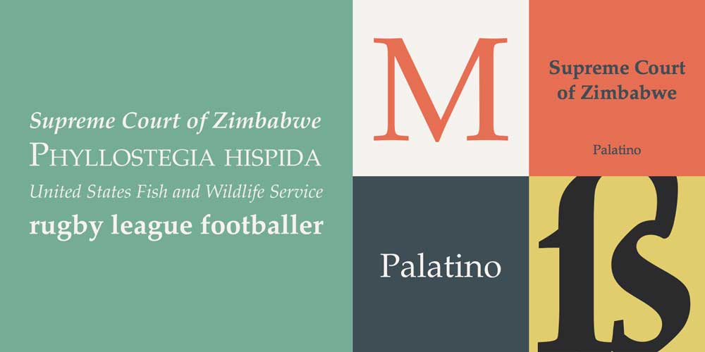
- Book Antiqua – Nostalgic serif designed for, you guessed it, book printing. Palatino is very similar.
- Baskerville – An ultra-refined Transitional serif from the 1750s.
Sans-Serif Fonts
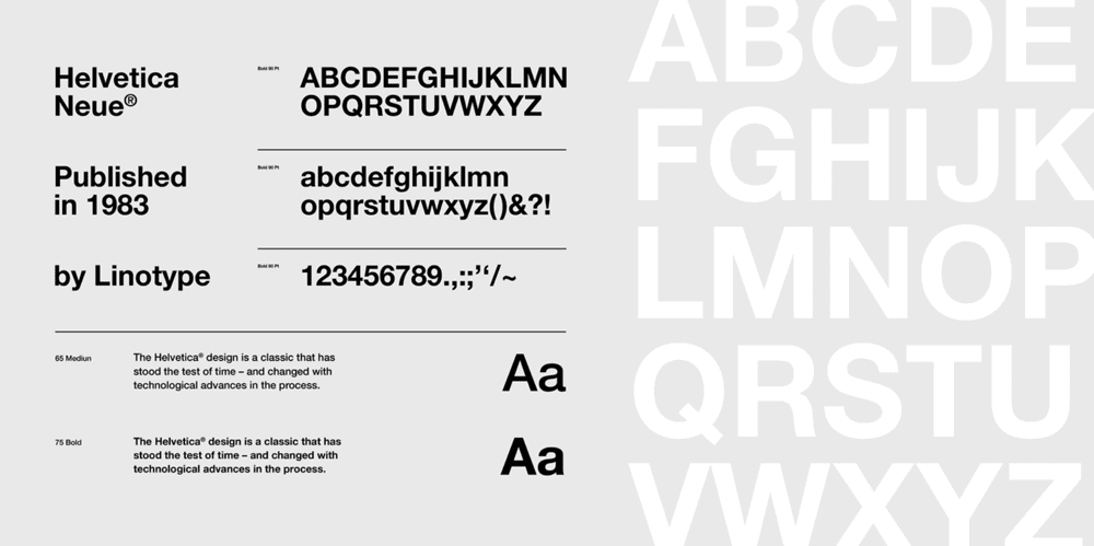
- Helvetica – The quintessential modern sans-serif, designed in 1957. Often called the “takeaway font.”
- Futura – A clean geometric sans-serif conceived in the 1920s Bauhaus style.
- Arial – A widely-used neo-grotesque sans-serif developed for the digital age.
- Gotham – A beloved contemporary geometric sans serif inspired by mid-century architecture.
- Avenir – A fluid yet bold take on the geometric San serif model, designed in 1988.
Expert Tips for Choosing Fonts

As we've seen, serif and sans-serif fonts have strengths depending on the context. Keep these expert tips in mind when selecting typefaces:
- Consider the medium – Printed materials lean toward serif body text; digital mediums work best with sans-serif for clarity.
- Suit the tone – Lighthearted brands do well with friendly sans-serifs; traditional serifs convey heritage for legacy companies.
- Mind the length – Serifs sustain attention for long-form reading; sans-serifs allow quick scanning.
- Watch the weight – Choose lighter fonts for blocks of text. Go bold for impactful headers.
- Pair wisely – Combine a serif text font with sans serif headlines or vice versa.
- Review at size – Test fonts at the actual resolution or paper size to evaluate readability.
- Trust instinct – Beyond all technicalities, choose the font personality that intuitively fits.
Serif and Sans-Serif Fonts: In Conclusion
The great typography debate will undoubtedly continue – but hopefully, we now see the poetic potential in both Sans-serif and Serif.
Serifs bring a touch of the scribe's hand to the text, guiding the eye with grace. They suit formal business needs and make wise choices for lengthy printed materials.
Sans-serifs embody clarity and objectivity. They serve readers well on screens and excel when paired with serifs for contrast.
Beyond all rules, find fonts that shape the voice of your brand. Let serifs whisper tradition or sans-serifs using simplicity. The letters you choose make a statement. Select them wisely and set your words free.
FAQs: Using Serif and Sans-Serif Fonts
Still pondering Sans-serif vs Serif? Here are answers to commonly asked questions:
Which is easier to read in print – serif or sans serif?
In lengthier printed materials, serif fonts are generally more accessible to the eyes. The serifs lead the gaze from letter to letter smoothly. But well-set sans serif text remains very legible.
Do serif fonts look more professional?
Many people associate serif fonts with prestige and tradition. But that perception is shifting as sleek minimalism rises. Sans serifs now look visionary and tech-savvy.
Can I mix serif and sans-serif fonts?
Yes, serif and sans-serif fonts complement each other beautifully. A typical designer practice pairs a serif body font with sans-serif headlines.
Should I use a sans or serif font for my resume?
For resumes, consensus favours serif body text. But a sans serif header adds modern flair. Or try sans serif body text for a clean, digital-friendly feel.
Is sans serif easier to read online?
Sans serif fonts are designed for clarity on screens. They work well for digital interfaces of smaller sizes. Still, serifs remain highly legible at higher resolutions.
Last update on 2024-05-02 / Affiliate links / Images from Amazon Product Advertising API


