
Abad is a family furniture design company in Getxo, Spain. They’re in a new business stage they’ve called “Abad: The recomposition” where the keys products are formed with a mixture of materials, concepts, and textures.


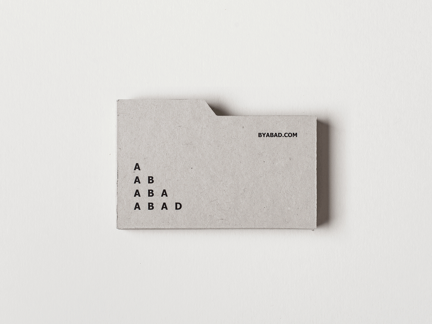
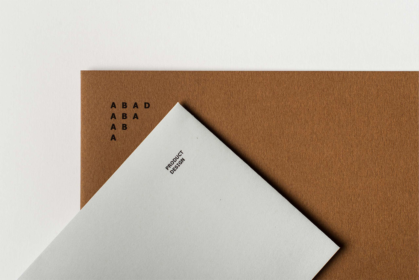
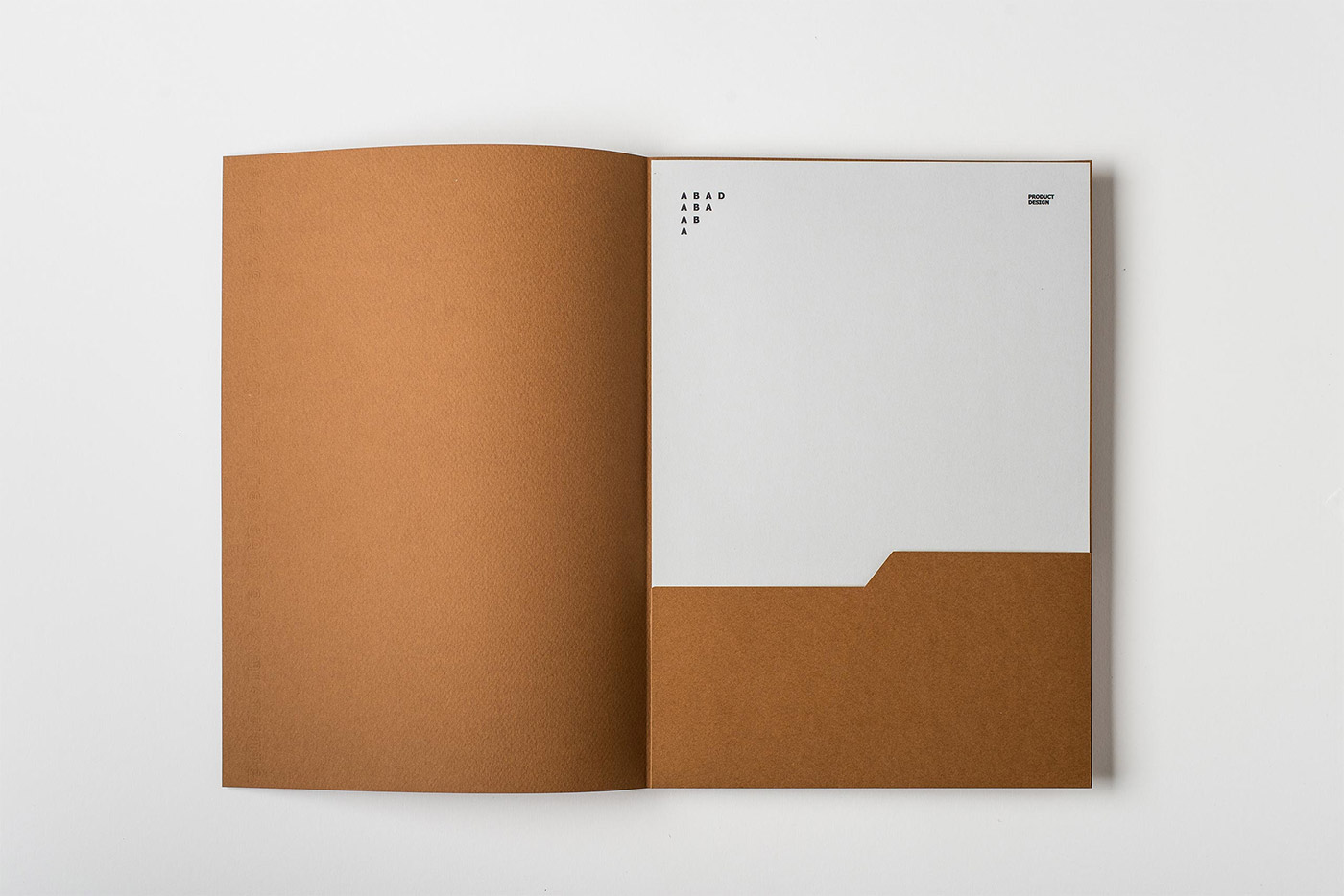
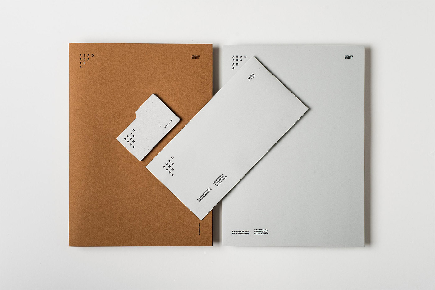
The identity was developed upon the idea of “texture collectors.” We designed the logo and marketing pieces based on sample boxes of geologists and collectors: the box is Abad’s product catalogue, and the filing dividers are the business cards.
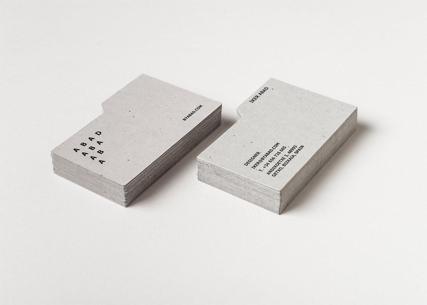
Tahoma is the typeform selected for the logo and as the main typography. We were looking for something masculine and Tahoma fit perfectly.
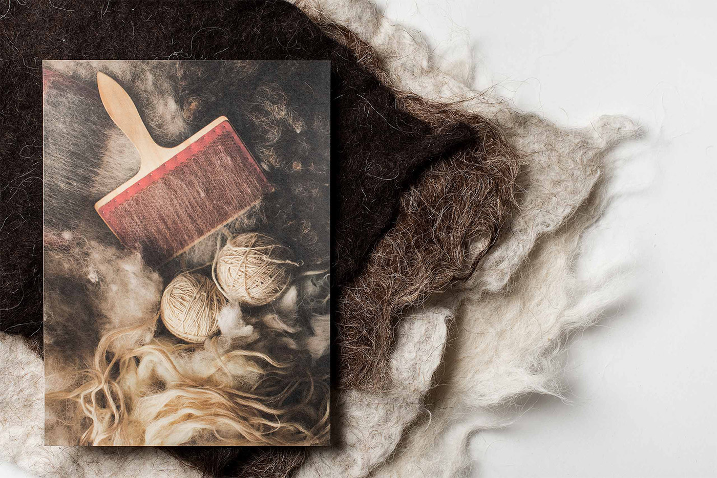
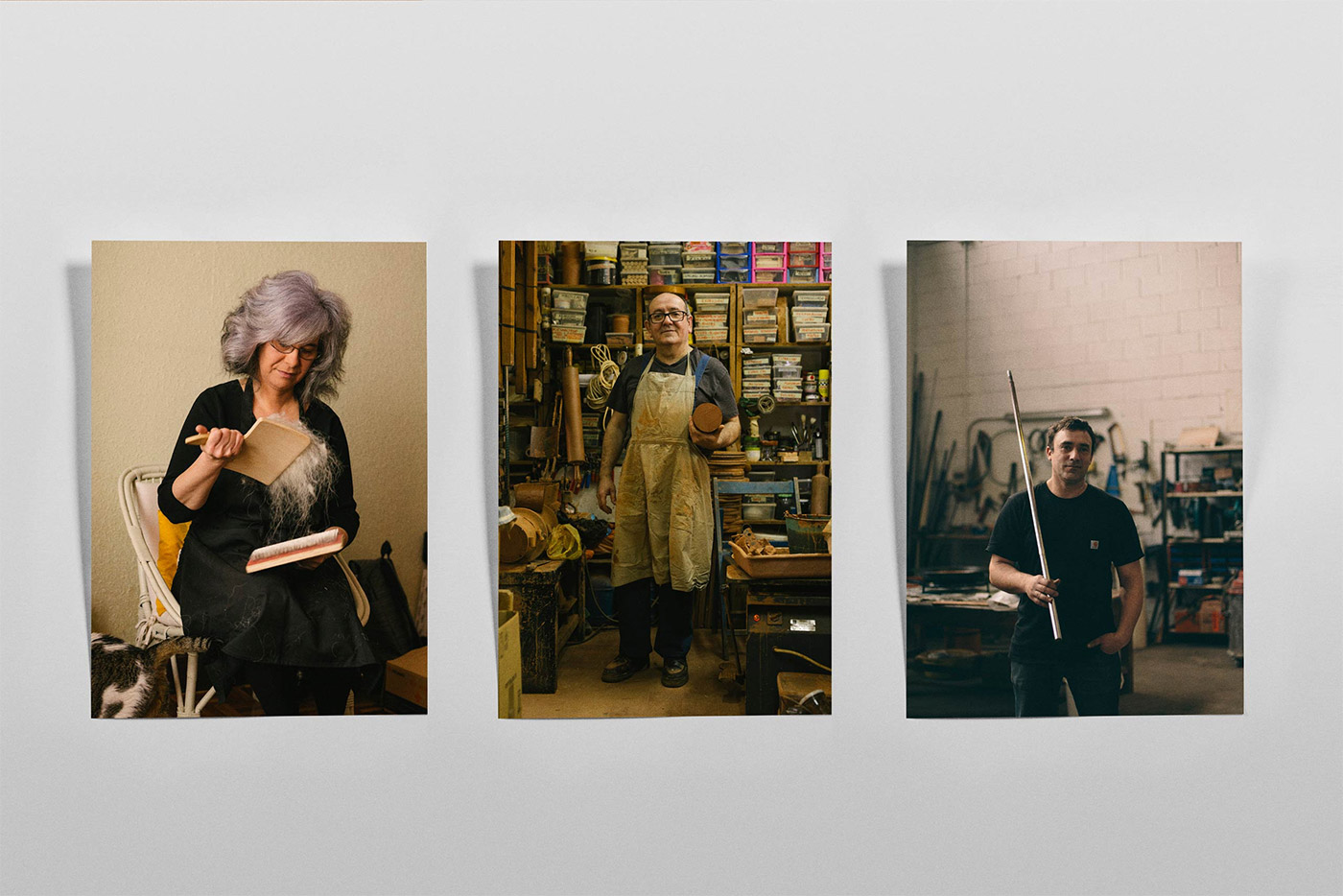
In Abad’s collection they show the materials’ universe, craftsmen, and processes. We developed Abad’s furniture catalogue in an attempt to catch the attention of furniture editors, and to stand out from all the other proposals the editors receive.


With the 3D catalogue we wanted to activate senses in the receiver such as touch and smell to evoke the universe of Abad products and to awaken the potential customers’ curiosity.
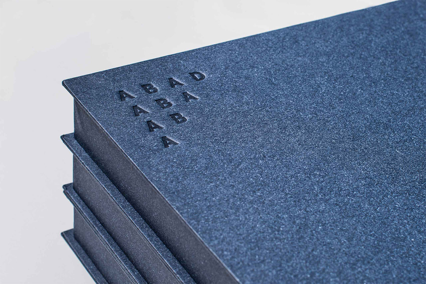
We produced a total of 52 customised boxes, each lined with Napura thermo-reactive paper. We chose that paper because if we apply heat while embossing the logo on top of each box the paper changes colour (as you can see in the pictures). Additionally, we fell in love with the particular shade of blue.
Models for including inside each box were created with a 3D printer, and the photographs were printed in digital inkjet in order to achieve the quality of offset in such a short run.


For the website, we thought of the concept as “creating the web” as if we needed to fill a physical space with all the elements we wanted to share and show: the products, the texts of the different sections, and the Abad brothers themselves, of course! We recorded a video that tells the process.


More from Marina Goñi.


Comments
Clean and minimal fuss with the identity. I especially like the design for the fun and different homepage opener.