
Frieze reveals typographic rebrand for its 30th anniversary
Pentagram’s Luke Powell and Jody Hudson-Powell have redesigned the organisation’s identity, which aims to unify its publications and international art fairs.
Pentagram has designed the new visual identity for Frieze, to coincide with the art organisation’s 30th anniversary.
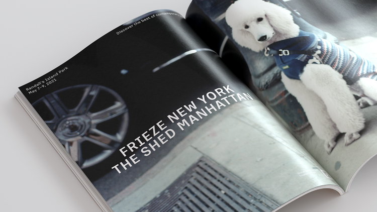
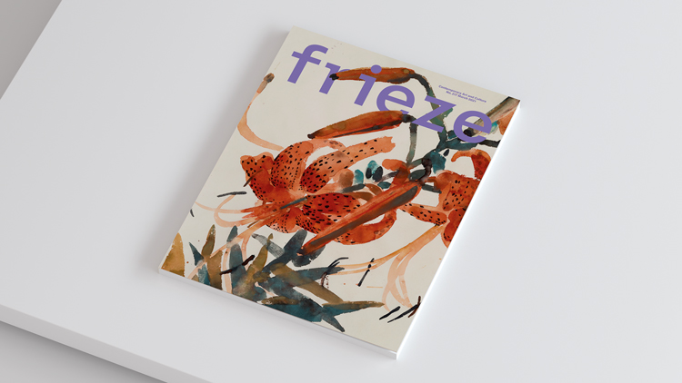
Established as a magazine in 1991, the organisation now has three publications: frieze, Frieze Week and Frieze Masters Magazine. It also runs four art fairs anually in London, New York and Los Angeles.
More recently, it has expanded into the digital sector with online platform Frieze Viewing Room as well as a line of podcasts and talks.
Owing to the number of sub-brands, a variety of identities and wordmarks had emerged over the years without a unifying look or relationship, according to Pentagram.
The project’s aim was to “reconcile the creative and visual approach to form a consistent visual identity” for the existing brands and any future products, the studio says.
“Modern, sophisticated and ownable”
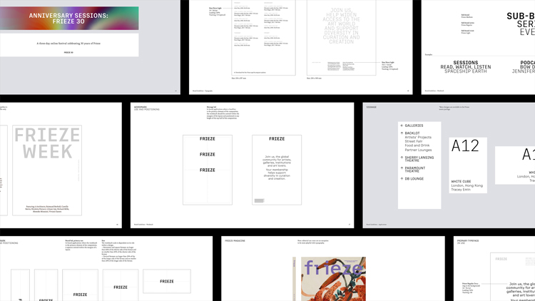
After an analysis of the existing brand architecture, Pentagram’s Luke Powell and Jody Hudson-Powell decided on a typographic approach for the identity. “A key part of the brief was to create an identity that maintained flexibility so new brand products or sub-brands could easily be incorporated,” the team says.
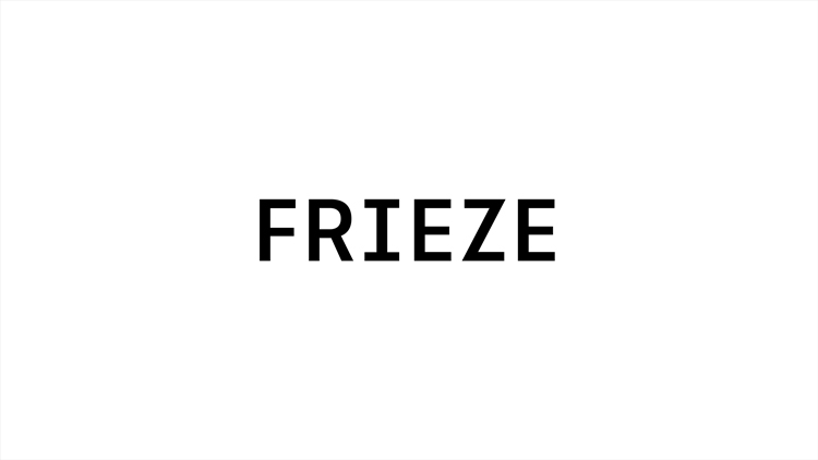
The new Frieze typeface has been inspired by the organisation’s 30-year legacy, including the frieze magazine masthead which was created by British visual artist Tom Gidley and subsequently redesigned by graphic designer Paul Barnes.
The new typeface is “modern, sophisticated and ownable”, the studio says. While it retains the original masthead’s features (including curved brackets and “occasional” slab serifs), it has been expanded to a full character set.
Typographic system with four weights

The team developed the narrow uppercase characters to “create a natural continuation of the typewriter/monospace features” in the magazine’s masthead.
The typeface comprises four weights and was developed in collaboration with typographer Luke Prowse.
The design team says the typographic system allows for greater flexibility in the new identity, as “any configuration of a wordmark can be created”. It also creates a “graphic separation” between the newly-adapted masthead and Frieze’s primary wordmark.
A black and white colour palette has been adopted, which “allows the colours and textures of the visual content to play a prominent role in the way the brand is expressed”, Pentagram adds.
The Frieze typeface has been paired with supporting serif typeface Sina Nova, which “has a high legibility and lends a warmth and intelligence to the designs,” the studio says.
Pentagram has worked with the Frieze in-house design department for the brand roll-out, which includes art fair signage and programmes, magazine covers, print advertising, website UX and social media.
Artist-led anniversary campaigns
Frieze creative director David Lane has used the new identity to develop campaigns that will mark milestones in the organisation’s 30th year throughout 2021.
These campaigns have been created in partnership with the artists or the visual content at the centre of each event.
New York artist and computer programmer Zach Lieberman, known for his code-inspired artwork, has created a series of animations to represent the brand’s 30th anniversary.
Photographer Chris Rhodes has also planned a campaign shoot for Frieze New York which hopes to capture “the essence of the city”, Pentagram adds.


Oh look it’s Pentagram in Design Week…. again!
Over the past year, Design Week has featured more projects from Pentagram than any other design firm. Can we please have some balance, especially when we have to read stuff from Pentagram’s PR on their new Frieze logo stating, “The new typeface is “modern, sophisticated and ownable”, what utter tosh! Who writes this stuff?
Thank you for your comment Mike. Since July 2020 we have published 99 branding news stories. Of those, seven are about Pentagram. In 2021 we have published 20 stories about branding and of those, two cover work by Pentagram. We always attempt to and nearly always succeed in interviewing designers about their work before publishing anything. It is not always possible if a story is breaking. You’ll find that while we are likely to cover the rebrand of a well known brand we do also cover many identity projects for new and less well-known brands where we think there’s a strong story and more importantly where we think it’s good work. We also maintain a good relationship with many small and medium sized consultancies. I’d be happy to talk you about how we choose what to report on in more detail. Best, Tom
Not just ‘branding’ projects Tom. I was commenting on all areas of Design Week’s platform. Pentagram seems to smartly navigate their PR across all of DW’s nooks and cranny’s, and yes, we all know they are a talented group. All I’m saying is, spread the love a little wider. I am unsure of how you collect items. Do you wait for them to pop into the inbox, or do the staff go after stuff? There is little criticism or comment from DW on projects featured, an example that I commented on last week was the Irish language TV station, TG4 and their use of a London-based agency to produce the creative work. It would have great had DW question them about that. It must be very demoralising for Irish based creatives.
I focused on the branding news stories in my last comment as that’s where almost all of the Pentagram coverage is. The only exception to this is some work by Yuri Suzuki and Jon Marshall, which accounts for maybe a couple of stories over the outlined period. If you look at Pentagram across the whole site as you suggest, they appear in less than 1% of what we publish. We will go out to Pentagram partners occasionally for comment, but you’re much more likely to come across other voices on Design Week. You’d be surprised at how many Pentagram stories we hear/find out about and don’t cover too. In terms of our sources and lead generation a lot of stuff comes from direct relationships with designers and industry folk. We go out to people speculatively, we find out about things and we generate our own features too. Receiving information from PRs also happens. It’s a mix, but I would say the same mix as it has always been. This is a fairly reductive summary on my part. I’d be happy to explain in detail over email or on the phone. Regarding the TG4 story, we spoke to the designers at length. All of our project news stories are, as they have always been, reported objectively, without opinion. You are right though, we could have asked the client why they didn’t appoint an Irish agency. Thanks again, Tom
Glad i started this debate 😉
Thank you for your Pentagram analysis, Tom, I stand corrected, my apologies. And I appreciate your honesty concerning TG4 story. I will direct my question directly to them.