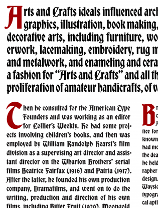
If you’re looking for a blackletter without the baggage,1 Bradley DJR may be the typeface for you.
David Jonathan Ross’ first attempt at producing a blackletter,2 Bradley DJR is a revival of an 1895 ATF face based on lettering done by the prolific American graphic designer Will Bradley, whose style straddled the gap between arts and crafts and art nouveau. For me, as a longtime student and passionate fan of blackletter, the original eccentricities in Bradley’s lettering are not entirely to my taste. But Ross, known in the type world as DJR, has brought his usual high level of craftsmanship to this project and smoothed over some of the less agreeable quirks while keeping the good ones. He has served up a solid contemporary version of the original ATF type.
Bradley’s work for the 1894 Christmas edition of the Inland Printer provided the inspiration for this typeface. He blended the late-medieval blackletter styles of bâtarde and prescissus with uncialesque capitals and a few outlier roman-based letterforms to make an unusual and festive script with a retro/fantasy feel. The irregularities in the original lettering reflect the handwork behind it. Bradley’s letterforms had virtually no descenders and short ascenders, to conform to the layout and tight linespacing. This made for a very funky looking g, for example. These issues were somewhat mitigated when Hermann Ihlenburg, working for ATF, created the typeface based on Bradley’s lettering. The letterforms have been further refined by DJR, who has reduced the clunkiness and imperfections of the original lettering without sacrificing its liveliness and personality.
Spacing was a little erratic in both the metal and Hamilton Wood Type versions, so DJR cleaned it up. He also seems to have decreased contrast from the ATF version, noticeable in the a and g, where he thickened up the thins. This provides a more uniform color to the type on the page, although I would like to see what might have happened if he had gone in the opposite direction, adding contrast by thinning the strokes on some of the more ungainly letters.
After the initial round of digitization, DJR found the typeface too spiky and crisp, so he put it back through the wringer and smoothed the corners a bit, which he felt honored its metal-type origins and gave it more of a 115-year-old foundry feel.3 Despite this, though, he actually increased some of the spikiness from the Ihlenburg series. The serifs on P and B in the larger sizes are rounder in the original. Same goes for the ear on the g. DJR has turned these nubbins into little devil horns, a most welcome transformation for aficionados of the black art(s).
The prescissus elements of Bradley almost anticipated the schaftstiefelgrotesks, or jackboot grotesks, in that many of the strokes that render blackletter types illegible to readers accustomed to roman faces are eliminated or reduced (think the flat feet of the prescissus m versus the diamond feet of a gothic textura). But the myriad swelling curves and flares, likely stemming from art nouveau influences, keep this type from looking too Third Reich. Instead, it retains its calligraphic origins and humanity.
DJR focused exclusively on the ATF version of Bradley’s lettering in this revival. I wonder what might have happened if he had considered an amalgam of the various other late 1800s versions (at the time, several other foundries had jumped on the Bradley bandwagon). For example, DJR might have incorporated elements of Abbey Text, Saint John, or the similar Tudor Text, which each provide their own take on Bradley’s style of lettering. All three faces have their quirks, but to my eye, the Tudor Text T would have blended in better with the rest of the capitals, and some of the letterforms in Saint John, such as the L, X, and I, might have been a better fit for twenty-first-century readers.
Despite these minor quibbles, DJR’s Bradley is a great typeface if you are looking for a solid, strong, yet Nazi-free blackletter with humanity, curvaceousness, and just the right amount of fantasy.
Notes
- See also Paul Shaw and Peter Bain, eds., Blackletter: Type and National Identity (New York: Princeton Architectural Press, 1998) — probably the definitive work on blackletter types to date.⤴
- And he clearly enjoyed himself, as he has just crafted a second, albeit very different, one: Clavichord.⤴
- As a printer, I must dispute the notion that foundry type, printed well, can’t be rendered crisp and sharp, but I get what he’s trying to say.⤴


