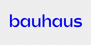
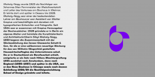
Mohol was developed as a custom typeface for the László Moholy-Nagy Design Grant in 2016. Designer Adam Katyi’s musings about a sans serif inspired by the broad-nib pen, layered in two separate movements does not, at first glance, strike me as a very convincing idea for channeling the prolific output of the famous Bauhaus artist. Why stick with the direct traces of a writing tool when Moholy-Nagy himself allowed abstraction to guide his compositions?
Nevertheless, the results are convincing. The repeated juxtaposition of two contrasting “directions” — of the blunt strokes and sharp intersection, the subtle straights and obtuse rounds — is a nice reflection of the dynamic tension evident in Moholy-Nagy’s work. The way Katyi allows elements of translation to become the raw material for abstraction reminds me of the limited palette that gives concrete poetry its striking power.
A project like this is always in danger of devolving into a tired cliche of Bauhaus typography. But Katyi has managed to lift it above and beyond while shining a spotlight on Moholy-Nagy’s work for a new generation.
I am not well-versed enough in type history to state with any confidence that the high-versus-low-contrast style started here, but that there has been a string of releases these last few years that draws inspiration from Mohol is not an understatement. The project garnered attention when it was announced in 2016 and was subsequently adopted for the ATypI 2017 identity.
The Mohol typeface was released in 2018 by Katyi’s Hungarumlaut foundry. The retail release, which includes what I gather is an expanded character set, reveals some shortcomings. The capital eszett is too narrow; the Æ and Z are too wide. The M is a key character, but I wonder if it wouldn’t benefit from a wider top counter. Some of the numerals and symbols could do with a loosening up of the rules.
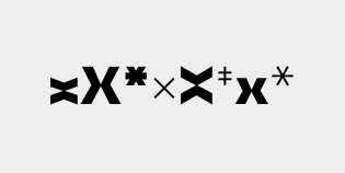
Of the distinctive shapes, I find the X, G, g, y, s, and f particularly interesting. However, I also know better than to be fooled into thinking novelty makes a typeface good. But Mohol’s letterforms come together well as words and sentences in Katyi’s hands.
Another typeface, with a related name and heritage, was released alongside Mohol. The much more texty Laslo is available in two widths and five weights, but without italics. It draws inspiration from vernacular lettering from the Bauhaus, and as such doesn’t have much in common with Mohol. Although the two typefaces aren’t marketed as belonging to the same family, there is a historical connection between them that could potentially play out in compelling ways in a typographic palette.


