
I picture five-year-old James Edmondson, sitting on the floor of his dad’s graphic design studio back in the early 1990s, poring over vintage Letraset catalogs and copies of U&lc from the 1970s, absorbing it all like a sponge.
I have no idea if anything like this ever happened. But it seems possible when I look at Ohno Blazeface and Blazeface Italic.
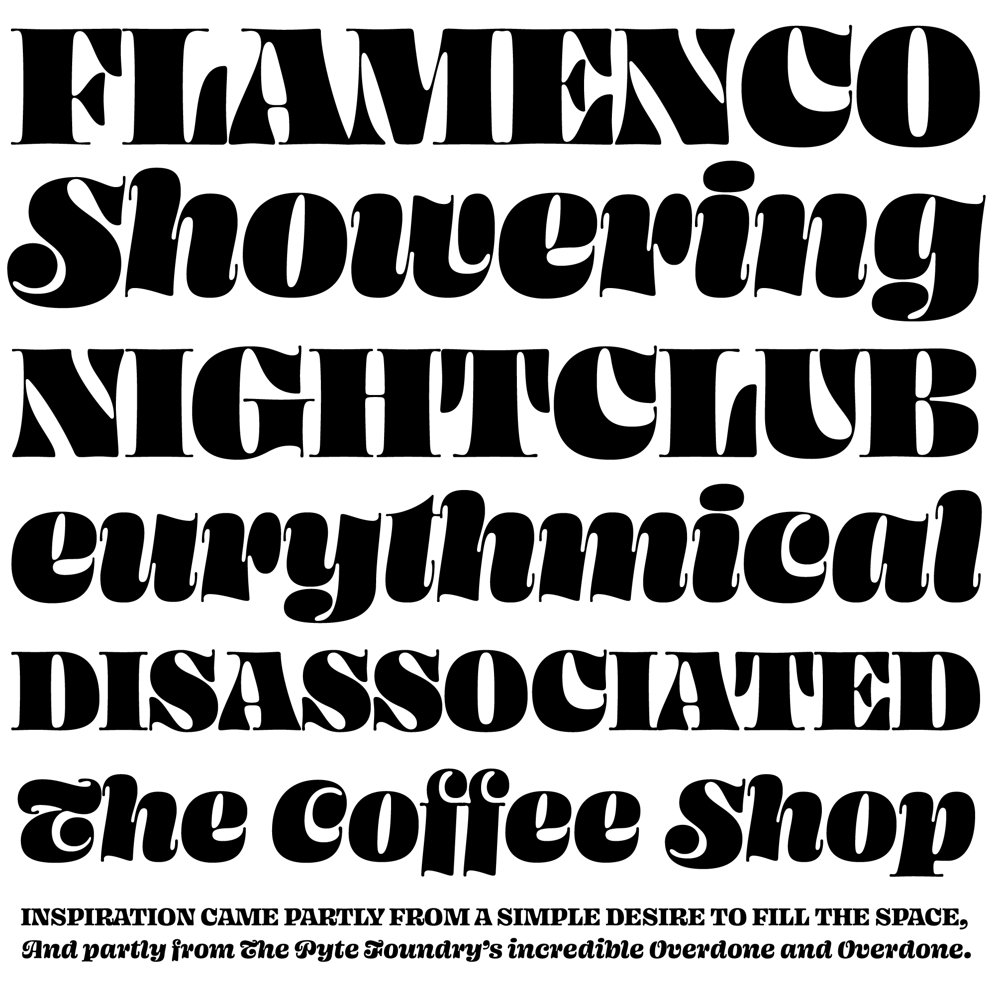
Edmondson chose to tap into a 1970s Herb Lubalin vibe when he was asked to design a T-shirt for the 2017 Typographics festival. The lettering for that project eventually became Blazeface.
His starting point was Lubalin’s famous Oh! Ah! identity, but he pushed the design in a direction that also reminds me of Motter Ombra (1972), Motter Femina (1980), ITC Zapf International (1976), and Stilla (1972). Like these faces, Blazeface has letterforms that are expressive, organic, and sensual. They have a kind of goopy, liquid quality, like blobs of ink or mercury.
Blazeface’s seventies vibe is almost more intense than the real thing. But it’s not a caricature. Edmonson has created something original, and I think it’s largely due to the way he questions conventions of letter construction. Ostensibly, it’s in service of better color and spacing, but it’s also what gives his designs their unique look. He’s messing with the rules.
Certain letters traditionally have large pockets of negative space in them, like F, J, L, T, and r. This is usually minimized somewhat with kerning and subtle optical adjustments. Edmondson takes a different approach, using the shapes of the letters themselves to solve the problem, adjusting proportions aggressively to force out the problematic negative space. He does this again by using a very large x-height and short descenders, minimizing the negative space above and below. This creates a problem with the top of the f. He solves it by ditching yet another convention: that the crossbar must align with the x-height. And it all works.
Blazeface clearly takes inspiration from the past, but Edmondson’s unconventional approach to type design makes this typeface distinctive and highly appealing.


