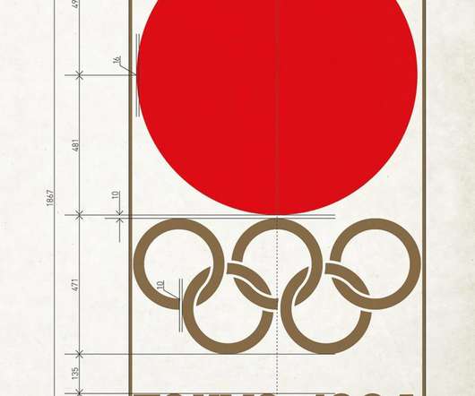
Tokyo Olympics 1964 Logo Design Guide Sheet Design by Yusaku Kamekura
The Logo Smith
DECEMBER 16, 2019
The post Tokyo Olympics 1964 Logo Design Guide Sheet Design by Yusaku Kamekura appeared first on The Logo Smith. Tokyo Olympics 1964 Logo Design Guide Sheet Designed by Yusaku Kamekura The Tokyo Olympics 1964 Logo Design Guide Sheet, by Yusaku Kamekura, isn’t something I believe I can ever recall seeing, so it was cool to see it in my tumblr feed today.


Let's personalize your content