Inspired by the elements of the vineyard within each of the wines, Ankida’s labels are floral and whimsical. Designed by Watermark Design, the Rosé label highlights the redbuds, the Chardonnay concentrates on the pollinators and blooms of fruit trees, and the Pinot Noir emphasizes foliage and fruit found on the forest floor. The cheerful colors and botanical approach cast a feminine, soft nature upon the packaging system.
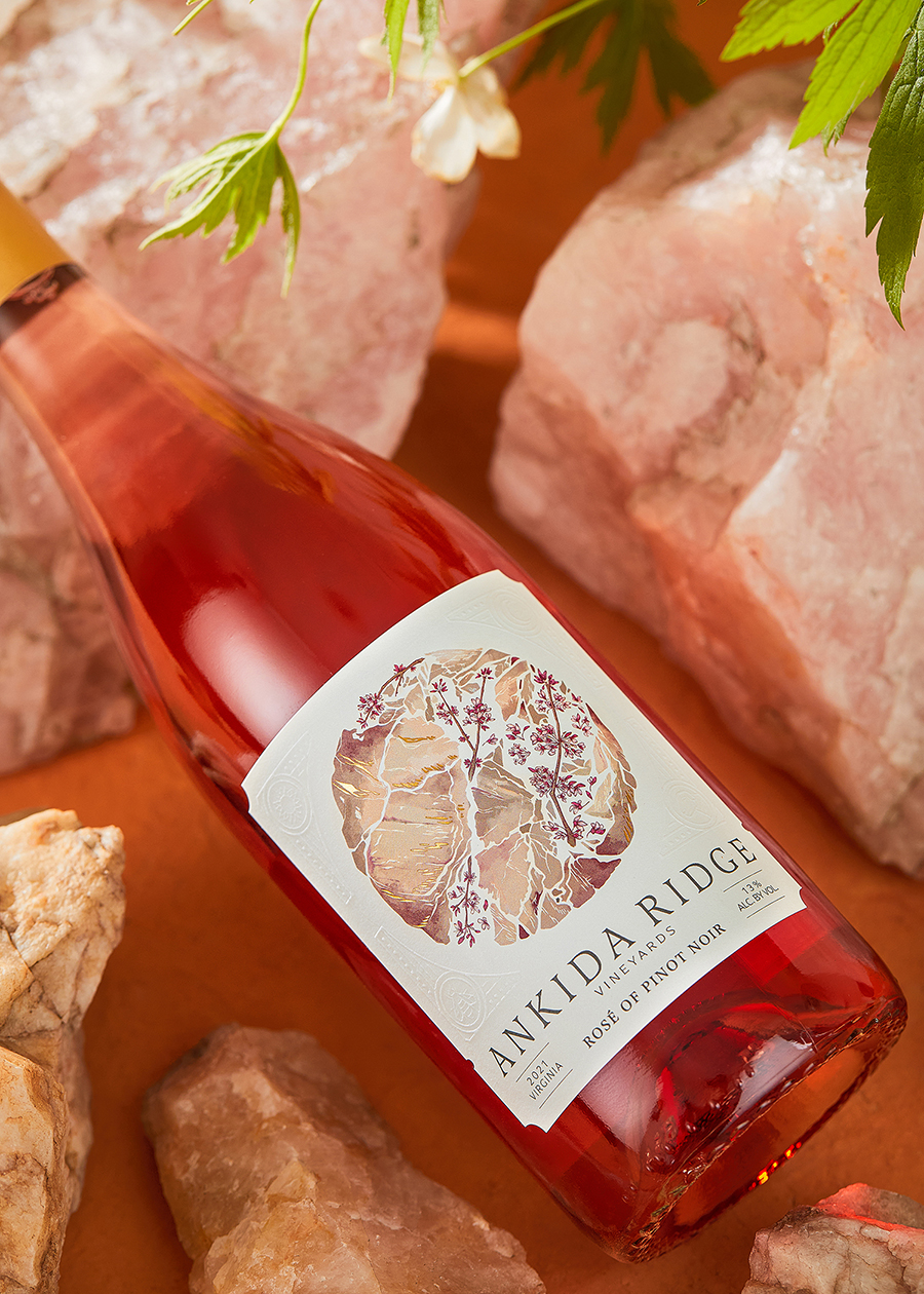
More than a decade after the first release, Watermark refreshed the Ankida Ridge Vineyards brand and packaging to reflect the growth they had experienced since we had first started working together in 2011. Ankida wanted to stay true to their brand and winemaking philosophy, but also update to have a more modern look & feel.