
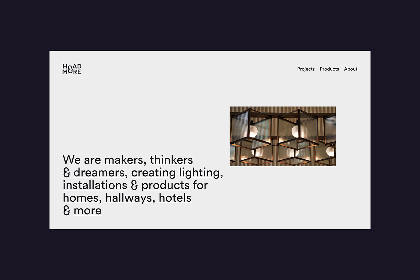
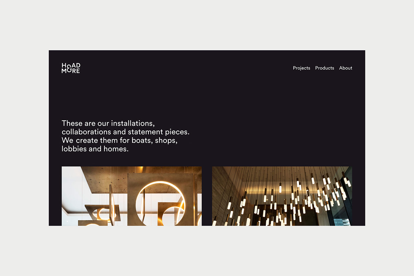
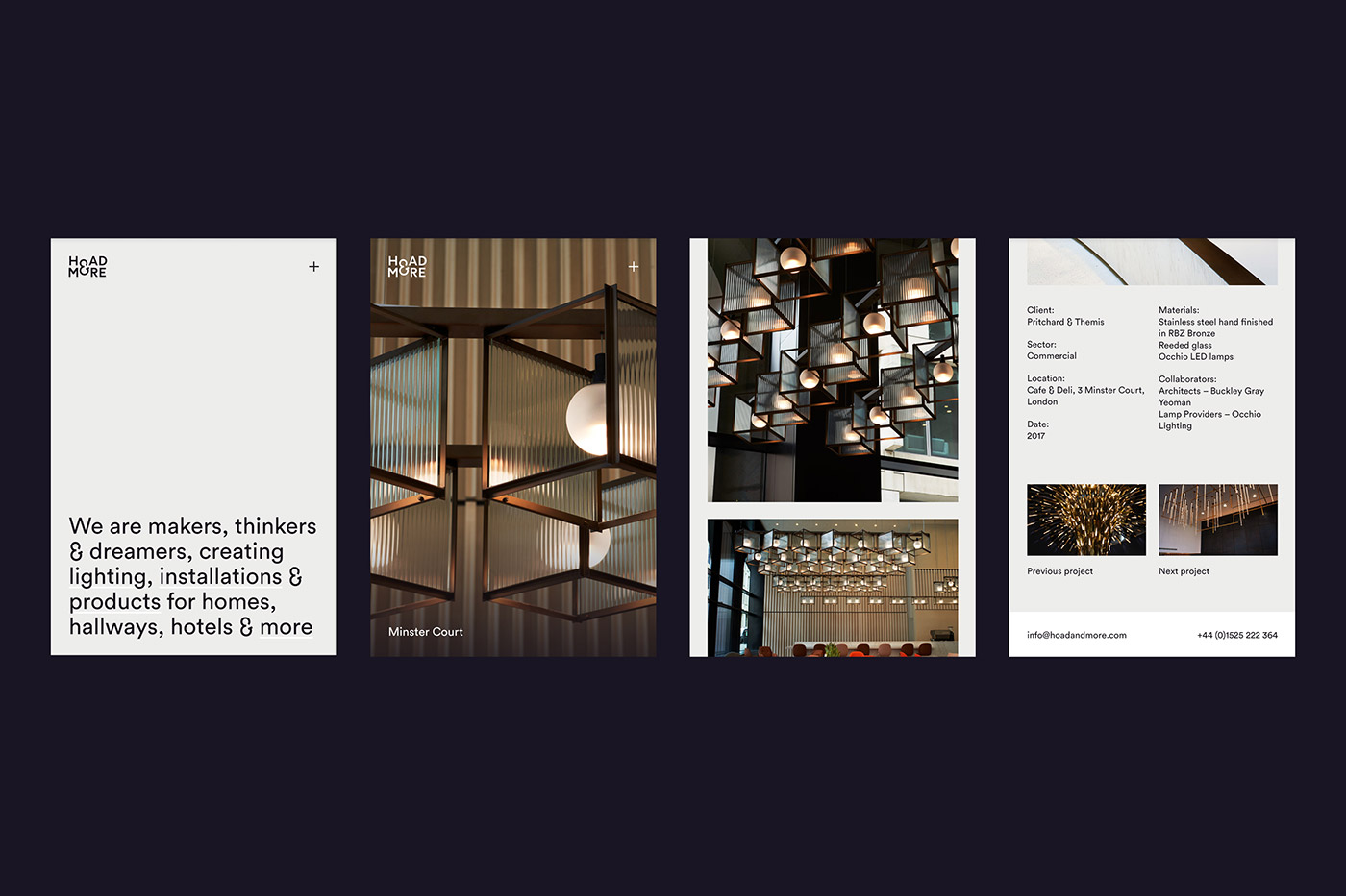
Formerly Jona Hoad Design, Hoad & More create lighting, among other things. They build installations as well as products and are as passionate about thinking and dreaming as they are about making and implementing. We renamed the company as well as creating a new identity and website. The name “Hoad & More” not only reflects their collaborative way of working, it also speaks of the varied nature of their projects, from beautiful light switches to large scale chandeliers.

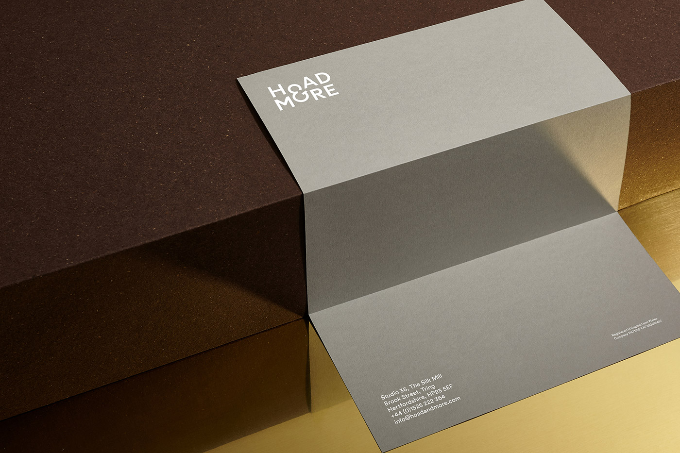
As they are natural collaborators we created an ampersand at the heart of the logo and used “& More” as a suffix on items such as business cards.

The ampersand also gives Hoad & More a distinctive shorthand logo that’s used editorially and as a maker’s mark. A special cut of Circular was created by Lineto that incorporated the ampersand into the font.

As part of the rebrand we also created a new website which shows more of the journey from sketches to the finished pieces. The homepage is deliberately explorative, so there is an element of ‘& more’ as you rollover the words, revealing short films and imagery. The series of short films show snippets of the life of the studio, people, workshops, moquettes & more.


Stationery was printed on a deliberately varied selection of stocks, again to represent Hoad & More’s explorative use of materials. All elements are foil blocked in a matt white foil.


Collaborators, suppliers, and materials
- All papers from GF Smith (Gmund Treasury “Tradition” / Colorplan “Real Grey” with Morocco embossing / Marlmarque “Grecian Tan” / Plike “Dark Blue”)
- Stationery printed by IST
- Copywriting by Reed Words
- Web development by Neal Fletcher at Cliff Studio
- Films by Lindsay Knight
- Photography by Tim Smyth


Comments
This is so well designed! Really thought through the logo and whole design of the identity.
Loving the typography.