Mobile App UX Design: The Ultimate Guide
User experience (UX) design for mobile apps has become critical in recent years. As more and more people access apps through their smartphones and tablets, having an intuitive, seamless user experience is vital to an app's success. This comprehensive guide will explore what makes for effective mobile app UX design.
Table of Contents
Understanding Mobile Users
Before diving into specifics on mobile app UX design, it's helpful to understand some critical things about mobile users.
Critical Insights About Mobile Users
- Attention spans are short – people often access apps “on the go” and have limited time.
- Expect instant gratification – if an app is slow or confusing, they'll quickly abandon it.
- Value convenience and ease of use – even over advanced features
- Use a variety of mobile devices – designers must consider various screen sizes
- Often, we use apps in distraction-prone environments – simplicity is key.
Considering these facts, designing for the mobile context requires different considerations compared to desktop UX design.
Fundamental Principles of Mobile App UX Design

When designing the user experience for a mobile app, there are several overarching principles to keep in mind:
Simplicity
Less is often more with mobile UX. Avoid clutter and too many options on each screen. Stick to the core, most-used functions and keep navigation simple.
Scannability
Design screens and content in scannable ways, allowing users to extract critical information quickly. Use clear headings, short paragraphs, bullet points and highlighting.
Efficiency
Value users' time and attention. Enable them to complete critical tasks rapidly, minimising the number of steps and taps required.
Consistency
Use familiar interface patterns and maintain consistency in design elements across the app. This builds intuition so people know how to use features easily.
Responsiveness
Account for varied connection speeds and device capabilities. Apps should load quickly and perform well across many devices without lag or crashes.
Remembering these principles throughout the design process, you’ll craft an experience optimised for mobile usage.
Critical Aspects of Mobile UX Design
Let’s explore some of the most crucial areas when considering mobile app UX design.
Navigation and Menu Systems
Navigation heavily impacts the user experience – if people can't quickly move through the app to find what they need, that causes frustration. Considerations for navigation UX:
- Intuitive hierarchy – ensures that the information architecture and grouping of menu items make innate sense. Frequently used functions should be the most prominent.
- Visibility – the main navigation menu should be visible on all key screens. Don't hide it away.
- Consistent placement – put navigational elements (menus, buttons, search bars, etc.) in a consistent spot on every screen.
- Simplified menus – editing down long desktop menus to only the most used items. Hide less common functions.
- One-handed use – ensure menu items are within reach of people's thumbs when using the app one-handedly.
Here's an example of effective mobile navigation UX:

The tab-based bottom menu is visible across all screens, provides top tasks upfront, and is easily accessible.
App Onboarding
The onboarding process – the screens you see when opening an app – requires thoughtful design, too. It should:
- Quickly explain the core purpose – what the app does and how it will benefit users
- Demo essential functions – a simple tour showing people how to navigate and use the main features
- Encourage exploration – don't explain everything upfront; leave room for users to discover functionality
- Allow easy signup/login – don't make signing up overly complicated if possible
A refined onboarding flow results in people successfully learning the app, so they continue using it.
Forms and Data Entry
Entering data is often inevitable in apps. Design intelligent forms and input fields by:
- Minimising required fields
- Using appropriate input types like checkboxes or swipe controls to expedite input
- Employing validation to reduce errors
- Auto-advancing focus between fields
- Storing entries to minimise re-typing
These tactics make forms faster and less annoying to complete on mobile.
App Settings
Good app settings UX comes down to is:
- Easy to access – use a standard menu icon that is universally understood
- Visually scannable – use clear headings and grouping of related options
- Stripped down – show only key settings, hide advanced ones
- Simple toggles – for boolean preferences, toggle switches are fast and clear
Settings should enable personalisation without overwhelming users with too many configuration options.
Error Handling
When things go wrong, how your app handles errors also makes a significant UX impact. Best practices include:
- Using clear, plain language explanations (no obscure technical jargon!)
- Providing specific guidance for resolution
- Allowing easy retries with one tap
- Using subtle animation and colour to call attention to errors
- Testing error scenarios thoroughly so they don't feel “buggy.”
Well-designed errors create confidence instead of frustration.
Loading States
We've all encountered app loading screens that take way too long. Follow these tips to design better loading states:
- Show loading progress rather than just a spinner, if possible
- Indicate what content is being loaded
- If loaded content appears slowly, use placeholders while images/text load
- Specify the cause of delays – “Slow connection…”
- Time out or provide options if taking more than 10 seconds
Great loading design helps set proper expectations around performance.
Visual and Motion Design
Visually appealing and thoughtful animations bring joy and polish to mobile apps. For best results:
- Establish a consistent visual style – colours, iconography, etc.
- Use motion purposefully to direct attention, explain changes
- Minimise battery consumption from animation
- Ensure text remains readable atop visuals
- Allow personalisation like alternate colour themes
balanced visual design makes apps not only more usable but also more delightful.
Optimising Display Size and Orientation Experiences

Crafting UX that works well on smartphones and tablets while gracefully handling shifts between portrait and landscape orientations improves versatility.
Multi-Device Considerations
To adapt UI based on display size/device properly:
- Real estate – leverage extra space on tablets for more content/controls or multi-column layouts
- Precision – account for less precise touch targets on phones by spacing UI elements appropriately
- Layout – use flexible containers that reflow content based on width
- Interactions – consider multi-touch capabilities on some tablets, enabling more decadent gestures
- Rotation – test both orientations thoroughly
With responsive frameworks, apps can detect screen characteristics at runtime and adjust the layout accordingly.
Orientation-Specific Design
For handling changes between portrait and landscape, apps can:
- Seamlessly transition layouts based on orientation using animation
- Re-layout by collapsing multi-column views into a single column in the portrait view
- Hide/reveal secondary panels of supplementary content ONLY in landscape
- Subtly adjust element sizing and spacing to maximise real estate
Adapting to orientation changes without breaking task flows or obscuring critical information improves versatility.
Optimising Touch Targets
Since mobile apps rely on touch, ensuring UI elements are “tappable” is critical for usability.
Touch Target Guidelines
To enable easy tapping:
- Minimum sizes – ~7-10mm button sizes work reliably
- Spacing – leave at least ~8mm between targets, accounting for uncertainty in tapping precision
- Responsive enlargement – temporarily enlarge touched elements during interaction
- Strategic placement – position key buttons near screen edges for easy reachability
With mindful tap target design, even those with motor impairments can effectively use apps.
Fat Finger Syndrome
“Fat finger syndrome” refers to difficulties in precisely manipulating UIs due to factors like:
- Finger size variances
- Hand tremors for some users
- Use while walking causes interaction instability
By accounting for imprecision with generous spacing and sizing of touch targets, apps minimise accidental taps.
Personalisation and Customisation
Allowing customisation makes apps feel more personalised, keeping users engaged long-term.
Common Personalisation Options
Some personalisation features commonly seen in mobile apps:
- Alternate colour themes
- Font size controls
- Re-ordering or hiding menu items
- Widgets and configurable home screens
- Notification settings
- Passcode locks
Even minor tweaks like colour theming foster user investment in apps.
Intelligent Defaults
The paradox is that personalisation requires initial effort by users to indicate preferences, which not all will invest in upfront.
Intelligent defaults help by:
- Using periodic prompts to encourage setting updates after onboarding
- Making reasonable guesses about options based on usage data and trends
- Allowing changes to defaults at any time
Gradual user-driven customisation, versus complex initial setup, balances personalisation with simplicity.
Optimising App Performance

With fickle users ready to abandon lagging apps instantly, ensuring consistently speedy performance is non-negotiable for mobile UX.
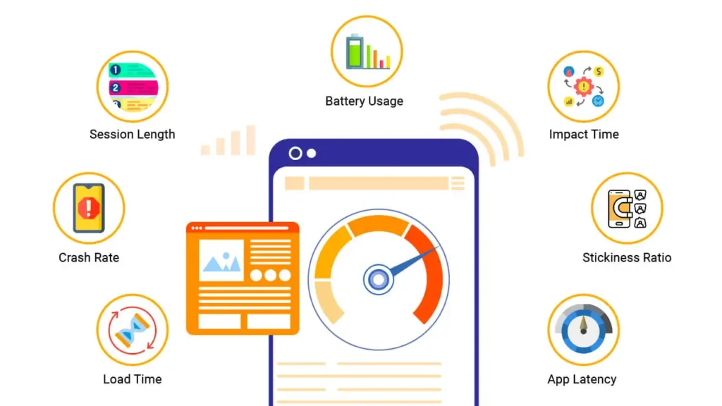
Key Performance Indicators
Benchmark metrics to track:
- Load time – how long for the app to become interactive after the launch
- Render time per screen – latency when navigating between routes
- Frame rate – lagginess during scrolls or animations as measured in FPS
Ideally, apps load in <5 seconds, render new screens in <1 second, and maintain 60 FPS.
Optimisation Tactics
Some ways developers improve mobile performance:
- Lazy loading – only load content visible on the screen
- Compression – shrink images and text assets
- Caching – store common assets locally after the initial download
- Performance testing – profile code execution to remove bottlenecks
- Minifying code – stripping out whitespace and comments
- Using native languages – Java, Kotlin for Android or Swift for iOS instead of react-native web languages
With ongoing optimisation, apps feel fluid across low-end to high-end mobile devices.
Adaptive Performance
To handle variability in network conditions:
- Graceful degradation – selectively disable/simplify experiences on slow connections
- Throttling – simulate slow networks during testing
- Allow downloads over metered connections – give a choice about when to upgrade apps if large
Optimisation balances rich functionality with reliability by adapting to device constraints.
Integrating Platform Capabilities
Leveraging unique hardware and software capabilities of mobile platforms enhances experiences.
Apple iOS Ecosystem
Capabilities to integrate into iOS apps:
- Handoff – continuing activities started on other Apple devices
- Haptic feedback – taptic engine vibrations for realistic tactile feedback
- FaceID/TouchID – biometric authentication
- Apple Pay – mobile payment convenience
- ARKit – augmented reality features using camera and motion sensors
- Spotlight search – enable content discovery beyond the app
Tight platform integration delights Apple fans with familiar capabilities.
Android Ecosystem
Notable Android-specific capabilities:
- Google Assistant – voice control and hands-free use
- Nearby Share – proximity-based content sharing between Android devices
- Live Caption – real-time captioning for accessibility
- Overlays – floating widget-like UI layers displayed dynamically
- Foldables – leveraging foldable form factors for dual-screen experiences
Android hooks enable diverse hardware innovations.
Cross-Platform Approaches
To support both ecosystems:
- React Native – build apps using web languages that compile into native UI components
- Flutter – Google's native-quality toolkit for crafting mobile apps using Dart
- Ionic – web-based UI framework optimised for cross-platform devices
- Unity – game development platform supporting both Android and iOS
With some tradeoffs, cross-platform tools help reach all mobile users.
Specialised Device Considerations
Optimising UX for particular device types calls for additional customisation.
Wearables Design
For wearable gadgets like smartwatches:
- Glanceability – enables checking essential info with a glance
- Actionability – make frequent tasks executable right on the watch through taps or voice
- Prioritisation – surface only the most timely, relevant alerts and data points
- Custom controls – small, touchable button scrollers optimised for wrists
Distilling experiences down to bare essential interactions is critical.
Automotive UX
In-vehicle infotainment systems have unique needs like:
- Legibility – easily readable typography and controls while driving
- Glanceability – voice control helps keep drivers' eyes on the road
- Passenger access – allowing co-riders to browse safely
- Driver locking – turning off complex tasks unless parked
- Gesture interaction – contact-free controls through mid-air gestures
Voice and subtle audio cues enhance eyes-free use while driving.
TV Platforms
Big-screen TV app UX adapts approaches like:
- Remote-friendly – more significant, more spaced out tiles as targets
- 10-foot UI – large text suited for couch viewing distances
- Motion inputs – waving gestures enabled by game controller tracking
- Second screen – coordinating with mobile devices for text entries
- Lounge-able – pleasant visuals suiting extended session viewing
TV app UX harmonises with relaxing user mindsets.
Adapting UX design to specialised use cases and form factors heightens delight.
Testing Mobile App Usability

To catch UX issues before users do, rigorous testing throughout development is essential.
Types of Testing
Approaches to systematically test mobile UX:
- A/B tests – trying variations of features to determine preferences
- Lab usability studies – observing representative users completing tasks
- Heuristic analysis – judging designs against established usability principles
- App store reviews analysis – reviewing user comments for pain points
- Summative vs formative – validate finished designs vs iterative tests
Testing early, often and with real users shapes designs dramatically.
Creating Tests
To craft practical UX tests:
- Outline essential tasks tied to app goals
- Create test scenarios that probe misleading or confusing areas
- Use post-task questionnaires to capture subjective feedback
- Plan logistics – devices, prototyping tools, remote options
- Recruit participants representing actual user demographics
Well-run studies uncover the deeper “why” behind usability problems.
Interpreting Findings
Analysing results requires:
- Identifying task failure points and their severity
- Looking for confusion patterns – were testers unsure how to proceed?
- Talking through impressions post-test while memory is fresh
- Estimating impact on app goals – number of users affected?
- Capturing verbatim participant quotes to illustrate raw feedback
Thoughtful analysis converts raw data into actionable insights that directly shape designs.
Driving Engagement Through Delight
Beyond purely functional UX, designing delightful details differentiates mobile apps.
Pleasant Microinteractions
Small flourishes during mundane interactions – like animated checkbox toggles or confirmation swipe gestures – inject personality.
Easter Egg Surprises
Hidden gag screens are unlocked under special conditions to surprise and amuse users.
Appealing Visual Branding
Using colour, typography, and icons to develop a cohesive aesthetic style creates positive first impressions that convey quality.
Gamification
Applying game concepts like scores, challenges, and rewards encourages return visits.
Persistent Avatar or Profile
Letting users craft a virtual identity through an illustrated persona or profile pic fosters ongoing attachment.
Adaptive Help Tips
Displaying brief helper text snippets when users seem to struggle and might abandon tasks offers a helping hand at crucial moments.
With charm and polish amplifying apps beyond the purely functional, UI design becomes an art.
Conclusion
In summary, a highly effective mobile app UX design requires understanding fundamental user needs regarding convenience and simplicity and applying design best practices tailored to mobile contexts.
By optimising navigation, visuals and interactions for the constraints of mobile devices while also thoroughly testing usability, apps can become truly intuitive, delightful experiences, resulting in satisfied, loyal users.
While mobile app UX design involves many intricate tradeoffs and considerations, putting users front and centre throughout the process vastly enhances outcomes. Mobile apps evolve from tools into beloved lifestyle staples by considering functional and emotional human needs.
Frequently Asked Questions
What are some differences between iOS and Android design?
Some platform differences include: default interface patterns vary slightly between Apple and Google devices; capabilities like Apple's FaceID or Android's Google Assistant necessitate tailored UX flows; form factors range more widely across Android devices.
How should UX designers collaborate with developers?
Close collaboration between designers and devs improves outcome coherence. Developers give feedback on technical feasibility during prototyping phases while designers underscore key human factors needs throughout implementation.
What should mobile UX designers study?
Relevant areas of study include visual, motion and interaction design principles; interface guidelines for major mobile platforms; information architecture theory; working knowledge of front-end coding; and user research methodologies like usability testing.
Does mobile UX change for business apps versus consumer apps?
The core principles largely align, but business tools may emphasise broader device support, accommodating office use cases and roles, higher security, and more interconnectivity with other systems.
