
Brigade Court is a residential development at the former headquarters of the London Fire Brigade. The Grade II listed building was one of the capital’s first ever fire stations where the firefighters lived and trained.
Located in Borough, the new development features period conversions in the original Victorian building, as well as many new-build apartments. The visual identity, name and marketing communications needed to sell both parts of the development and create standout in a saturated corporate market. The target audience was both Londoners and international investors.
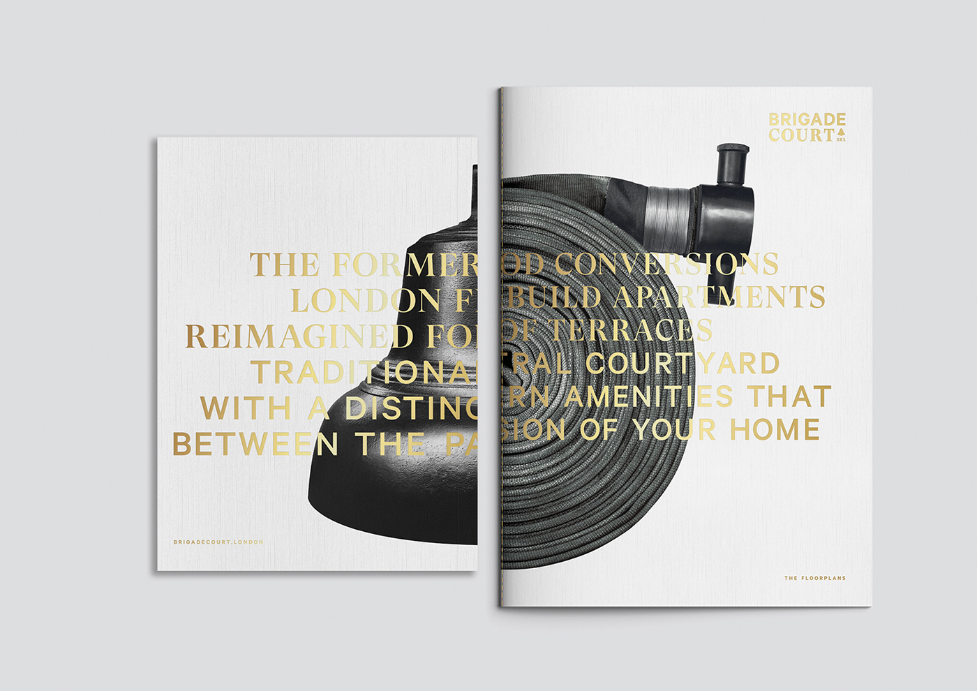
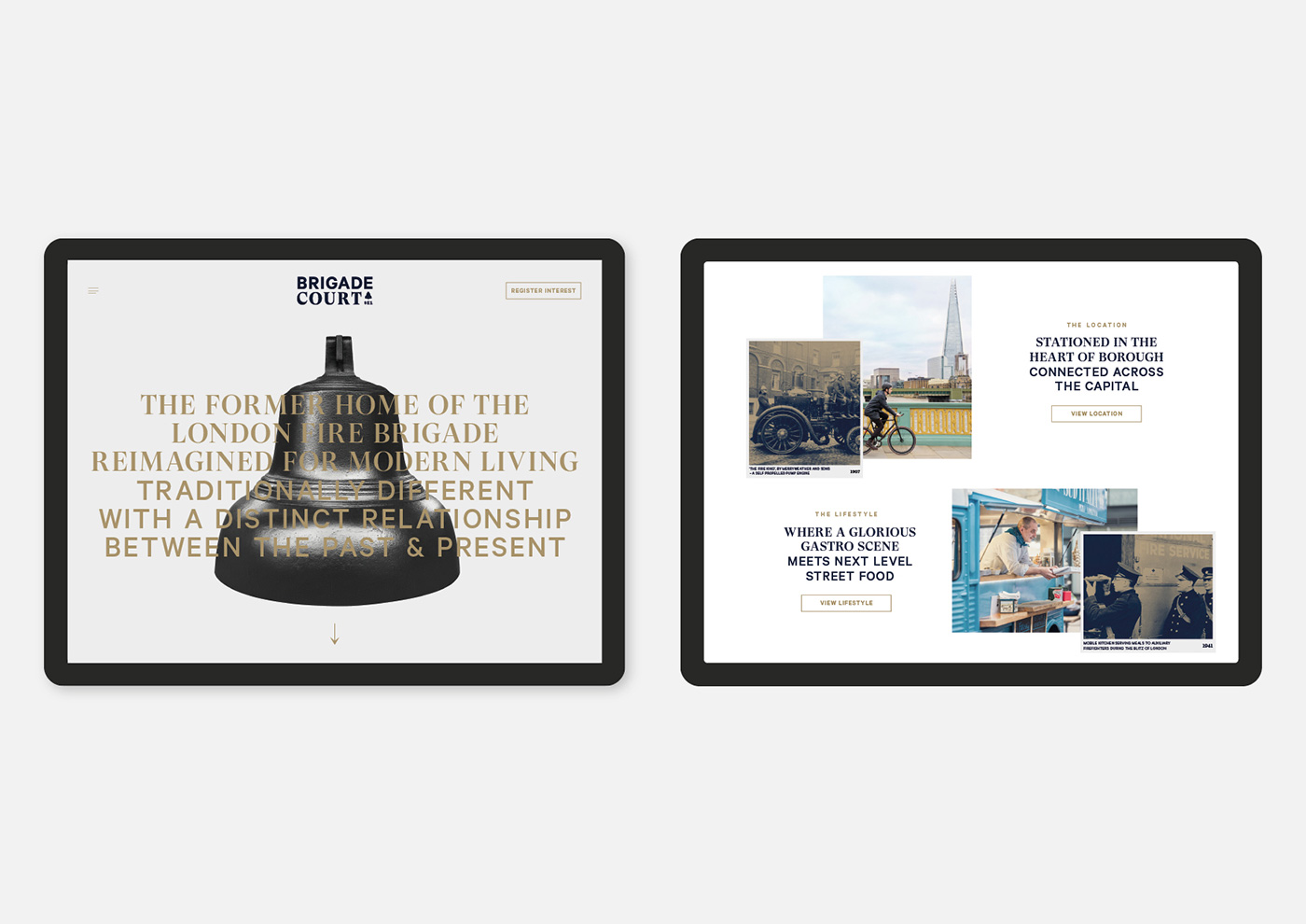
The juxtaposition of heritage and cutting-edge architecture informed the brand idea: “Traditionally Different,” celebrating the distinctive contrasts of the development. Archival photographs of the original fire station and the firefighters align with images of the new apartments and local area – creating a series of collages that convey the site’s distinctive marriage of old and new, with a sense of local neighbourhood personality.


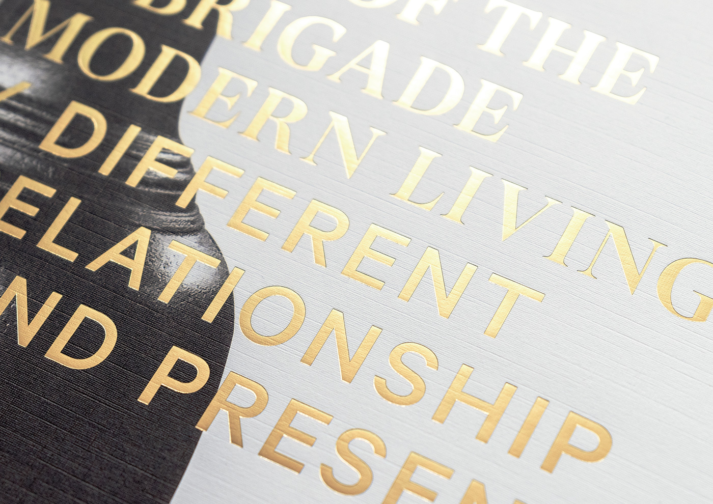
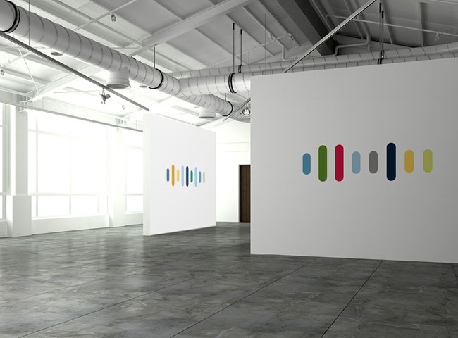
The relationship between past and present runs throughout the typography and messaging of the brand through the use of the elegant serif GT Super, alongside the more robust and modern Calibre. The brand colour palette was inspired by the traditional navy uniforms and brass helmets worn by the brigade in its early years.
On the property and floor-plan brochures, each cover features an icon of the original fire station wrapped around the front and back alongside a gold foil statement of the key selling points.
The in-house amenities borrow their names from areas within the original fire station. The gym is named “The Training Yard” and the cinema became “The Watch House.”
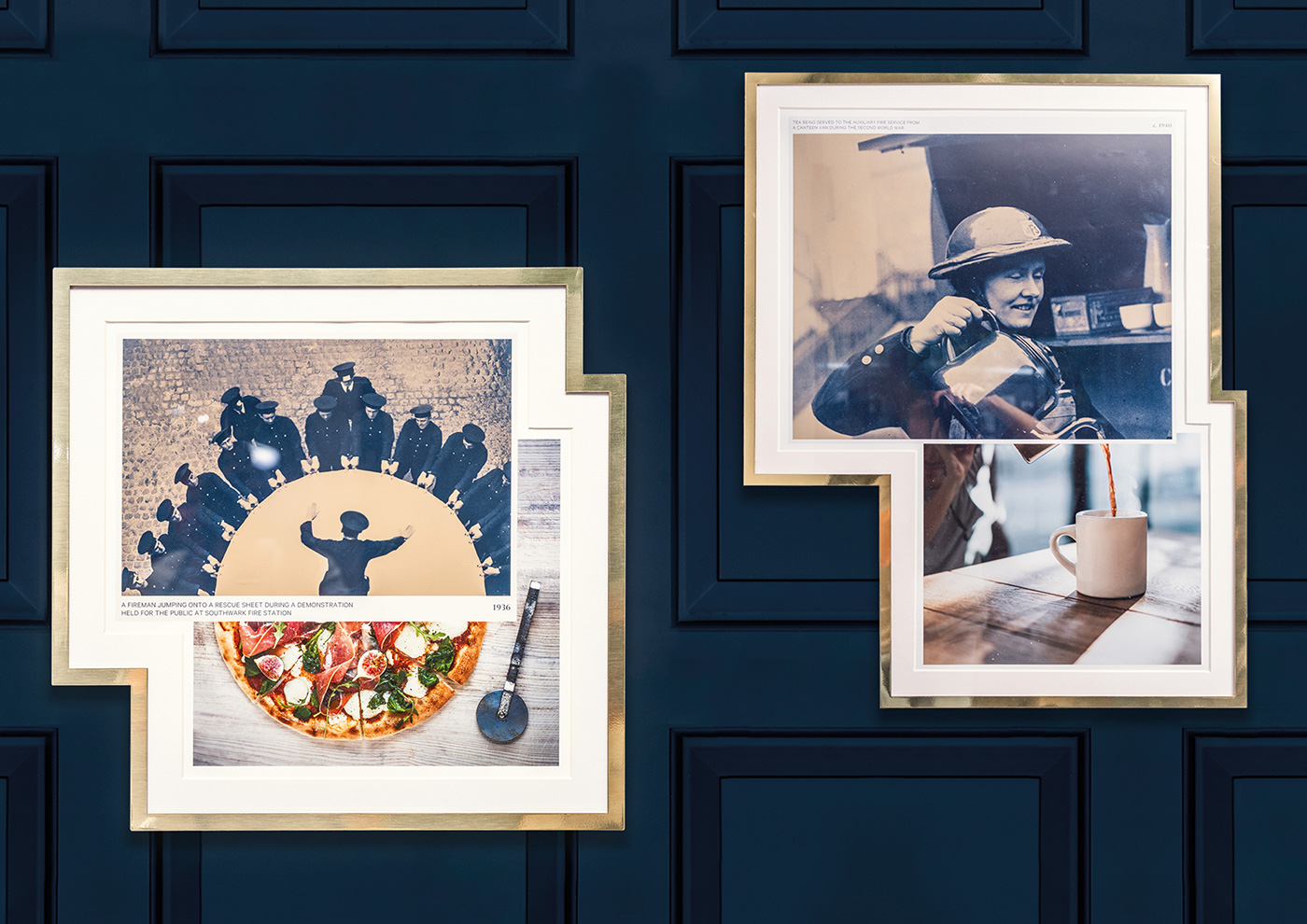
The Brigade Court marketing suite features a café deli named “The Mess Hall,” featuring light-hearted image combinations of firefighters appearing to prepare and serve food, mounted in custom-made brass frames. In addition, iconic fire brigade equipment is championed on the graphic window displays.


Typefaces:
GT Super – Grilli Type
Calibre – Klim
Brochure paper stock:
Cover: Colorplan Bright White with Linen Emboss
Text: Marazian Ultra
Print: Gavin Martin Colournet
Jack Renwick Studio elsewhere on ID: Carpenters Wharf.


Comments
Jack Renwick Studio has a flair for identities (Carpenters Wharf was excellent) from the past and making them new, modern, without losing the heritage. This one is brilliant, cheeky, and refined. Thanks, Jack Renwick.