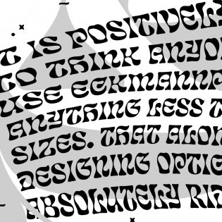
James Edmonson’s Eckmannpsych and Cheee may look different, but they share a similar spirit.
Eckmannpsych is a revival of Otto Eckmann’s eponymous Eckmann-Schrift, originally released in 1900 at Rudhard’sche Gießerei in Offenbach. Eckmann’s training as a fine artist is evident in this typeface, which is expressive rather than utilitarian. Eckmann-Schrift is an embodiment of the art nouveau style, fashionable at the time of its release.
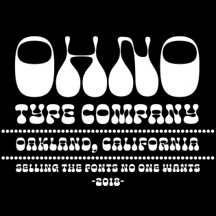
Cheee is a free interpretation of Aldo Novarese’s Sintex, originally designed in 1973 for the Phototype foundry Visual Graphics Corporation (VGC). Novarese is known for his designs for the Nebiolo foundry, like Microgramma or Stop; Sintex (a space-age design with heavy horizontals and thin stems) is a bit of an outlier in his repertoire.
In revisiting these designs, Edmondson didn’t attempt faithful replicas of the originals. Instead, he took what was good about them and brought those ideas to the next level, replacing (in the case of Eckmann, at least) century-old design decisions with a healthy dose of funk.
Originally drawn as lettering for Vulfpeck’s North America Tour Posters, these free revivals often stray from the originals much further than expected — if Edmonson hadn’t disclosed the influence of Sintex on Cheee, I never would have made that association. With its spaghetti-thin stems and blobby terminals, his interpretation made me think of balloon modeling rather than the distinct shapes of Sintex.
It’s difficult to imagine what would have happened if Eckmann had been reincarnated in San Francisco in the sixties. Eckmannpsych gives us at least an idea. Edmonson’s interpretation of Eckmann’s work carries it to an extreme by exaggerating the contrast, changing the proportions, and making the floral forms of 1900 become more . . . exotic? At any rate, Eckmannpsych looks much more dangerous than the original Eckmannschrift.
2018 was not only a year of excellent type releases; it also saw the birth of Future Fonts, a platform that allows designers to sell typefaces in progress.
Eckmannpsych and Cheee were released as some of the first Future Fonts. Supporting uppercase letters only, one might think of them as digital rub-down alphabets — the low introductory price of $6 seemed fair.
The story could have ended here, but the feedback loop built into the Future Fonts website (and — presumably — its commercial success) encouraged Edmonson to keep thinking about these projects. As a consequence, both designs quickly gained useful additional glyphs like numbers and punctuation, and accumulated additional weights.
2018 was also the first full year in which major design applications (such as Adobe Illustrator) supported variable fonts. Luckily, Edmonson decided to enthusiastically embrace this technology.
Eckmannpsych received a size axis, which allowed users to interpolate the psychedelic high-contrast display variant to a much friendlier looking, wider (almost blobby) text size. This axis alone is worth several lessons in typography: it clearly illustrates the benefit of (and need for) optical sizes.
Cheee was outfitted with a weight axis, which allowed the user to change both heaviness and contrast at the same time. Only a month later, a “gravity” axis was added, which enabled the movement of letter mass up or down (weight being renamed “yeast”). The final axis (so far, at least) is “temperature”, released just in time for Halloween — it entices the user to create dripping letters, revisiting the idea of a Hobeaux dripping with blood.
Edmonson’s playful approach managed to explain the whole point of variable fonts better than any technical demonstration could. Cheee and Eckmannpsych may not be everybody’s cup of tea, but I think they teach us two valuable lessons:
- Opinionated revivals are much better than historically accurate ones (I don’t see the “faithful” Eckmanns used very often).
- New technologies are meant to be embraced (and made fun of).
I congratulate Edmondson for effortlessly drawing two of the most impressive fonts of 2018 (and letting everyone take part in their development). I can’t wait to see what he will come up with in 2019!


A healthy dose of funk, indeed. Beautifully written review of inspirational, useful and funkful typefaces. James well done.
Yeah, I agree. However, I find it sad that the “temperature” axis was dropped in V3. It was my favourite axis, to be frank, but thankfully there’s still Version 2 to use!