Studio Bennu's brand identity for Kuko transforms how children learn and grow
London-based brand and design agency Studio Bennu has collaborated with education startup Kuko to create an identity which will appeal to its demographic of children. And by making a vibrant, colourful brand, Studio Bennu hopes it will help transform how children learn and grow.
Where do children learn? For many kids, most of their education takes place in a school environment, but that hasn't always been the case. Even though it appears to be on the decline, learning outside of school is full of benefits, yet it's an approach that not many brands seem to prioritise.
That's where Kuko comes in. The startup aims the buck the branding trend of only putting a child first in a commercial sense by using an identity which encourages them to learn and grow via learning instead. And by tasking Studio Bennu to define a brand strategy through careful research, Kuko can now position itself in the market with an identity it can own.

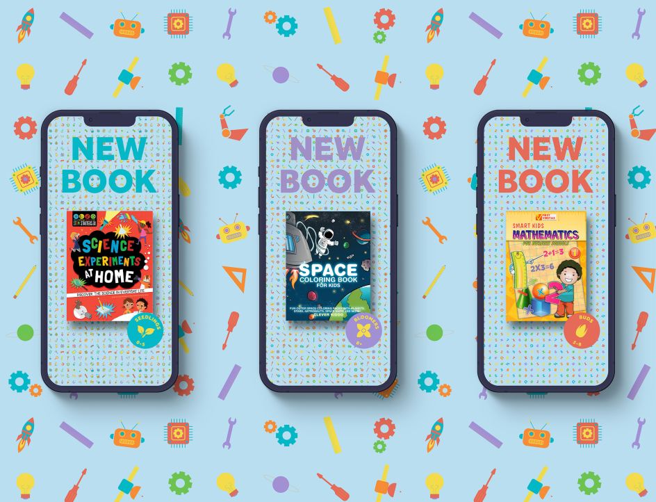
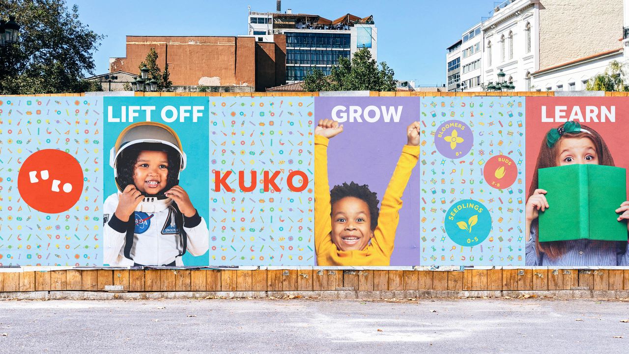
Relying on bold colours and relatable imagery, including photographs and cartoon patterns, the Kuko brand is engaging and unintimidating. This latter factor is a crucial part of the identity, as research has shown that children are more excited to learn when it becomes easier.
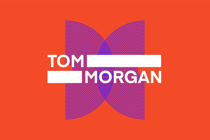
"When customers can't find the best way to help their children quickly, they move on," says Tom Berry, Creative Director at Studio Bennu. "This insight influenced the design language of the brand. Products, categories and the intended reader's age had to be understood fast." To this end, Studio Bennu also created three key age groups, named them and brought them to life with individual colour palettes.
In fact, every element of the brand is designed around the enjoyment learning can bring. As well as showing how learning can make children feel excited and happy through its imagery, the logo construction also fits into this mould by being simple and relatable to children.
Kuko even hopes that this relatable icon will help children to spread awareness of the brand themselves. "The age groups allow children to interact with the brand and become part of the community."
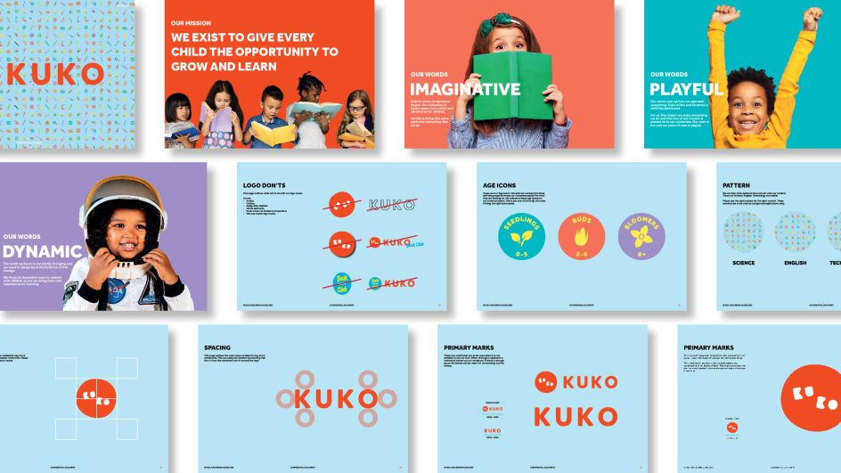

As for the brand name itself, this has been carefully tailored too. While it sounds fun in itself, Kuko is derived from the African language, where the brand has its foundations. Derived from two African words, which mean 'grow' and 'learn', the spirit of Kuko and its mission statement runs through every aspect of Studio Bennu's identity.
"Kuko is built on the idea that when children are excited to learn, it becomes easier," adds Tom. "This idea has influenced every brand element from inception through to the end consumer."
Editor's Picks


Trending


](https://www.creativeboom.com/upload/articles/86/862919952c0ad18439004228895a431dc6e45ffc_732.jpg)
Podcasts


Editor's Picks
Further Reading