10 Movies Graphic Designers Should Watch
There’s no end of places that graphic designers can turn to for inspiration. A vast back catalogue of film, television, art and design is at your disposal, and thanks to the internet, there’s never been a better time to search for inspiration.
For graphic designers specifically, it is easy to fall into habits without a source of new motivation.
We will look at a few of the most memorable, innovative and exciting movies you can turn to when you need some ideas.
We are going to cover some films from a variety of genres, including:
- Striking noir films
- The perfect dystopia
- Unique urban feels
One film that managed a feel that was both unique and strangely generic was Se7en. The masterpiece is the perfect modern gothic, with a heavy noir style.

Perhaps one of the most exciting things about the film is the strange, uneasy feel they have managed to give the movie.
There’s virtually nothing in the way of specific locations and little in the form of clues as to where in the US it is.
The police station and other interiors are a certain, dark wood and glass design that says mid-Twentieth Century America like nothing else.
There’s plenty to recommend the film, especially locations and set design.
Fincher’s work is an excellent example of the importance of evoking an emotion from the audience, which is one of the goals for eye-catching graphic design.
Table of Contents
Dystopias Have Pushed New Designs Forward
Sticking with the mid-Twentieth Century, Dark City was a cult hit that somehow managed to slip under most people’s radars.
Released several years before The Matrix, the film bears more than a passing resemblance to that film, mainly regarding the story.
However, concerning design, there is nothing else like it.
Set in a nameless, perpetually dark city, the film uses a selection of beautiful Art Deco motifs to create an uneasy yet familiar atmosphere.
There’s heavy use of tropes and borderline cliches, but it is all in keeping with the tone and story of the film.
The design is notably well showcased when the city is rebuilt every night. The attention to detail in creating a newness each night is inspirational.
It kicked the cyberpunk scene right into the mainstream and brought black trenchcoats to the fore like no film before.
The Matrix benefited from providing an audience with two opposite worlds at once.
The ship Neo finds himself in is the real world, defined by available technology and a familiar almost nautical feel within the Nebuchadnezzar.
Contrasting the world of the Matrix, a world that combines the slick yet understated style of the movie's heroes with the familiar but generic design of the artificial world which surrounds them.
Continuously finding a contrast, light and dark or the real world and the world of the Matrix, is a refreshing reminder of the importance of contrast in all aspects of art. Altogether, a beautiful and influential movie for many reasons.
Science Fiction Is a Trial Ground for Innovative Design

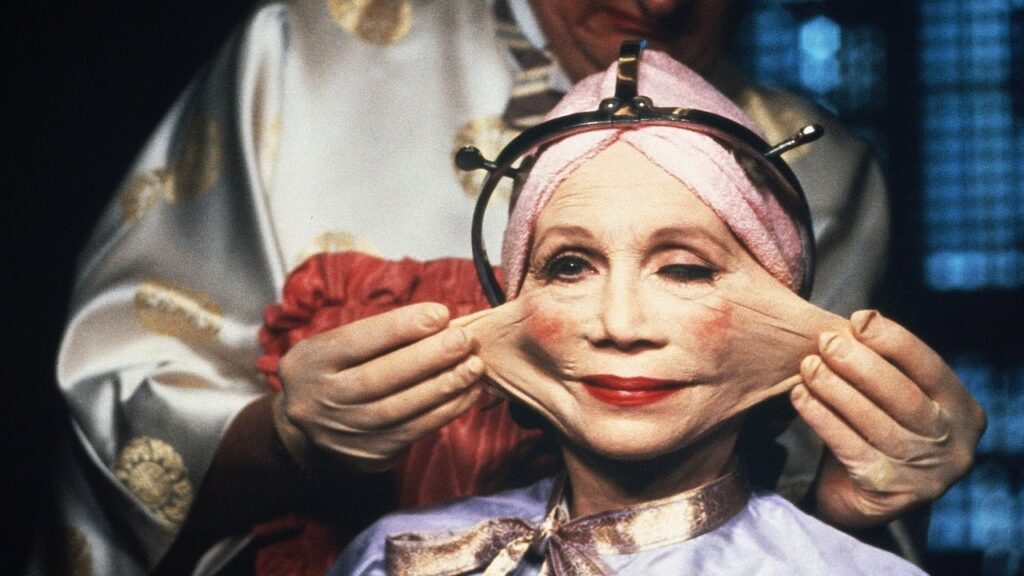
While there are many contenders, the absolute classic view of dystopia has to be Brazil. Terry Gilliam’s bleak yet hilarious classic combines 1984 with a collection of highly English sensibilities.
Its influence can be seen in films such as Richard Ayoade’s The Double, and the image of a bureaucratic, soulless workplace filled with antiquated machinery has been mimicked repeatedly in movies.
The dark, nightmarish world in which the story is set is countered by the main character’s dreams, featuring classic Gilliam surrealness and terror.
Stanley Kubrick is renowned as one of the greatest directors ever lived.
He has a string of successes behind him, but none stands out more on a design level than A Clockwork Orange. This nightmarish film is truly a creation of the early Seventies.
The design is recognisable of the era, with many aspects of Sixties design incorporated into the hellish view of the future.
The film also uses one of the most instantly recognisable pieces of architecture in London. In Erith, southeast London, the Thamesmead Estate has been used in many films and TV shows.
Its strange, brutalist look is perfect for the film, as are the other choices made. This film is a source of inspiration for many graphic designers because of its distinct design elements.
The influence from these recognisable designs provides some comfort in the audience’s familiarity. There is something important about clarity, familiarity, and consistency for art viewers, whether in movies or graphic design.
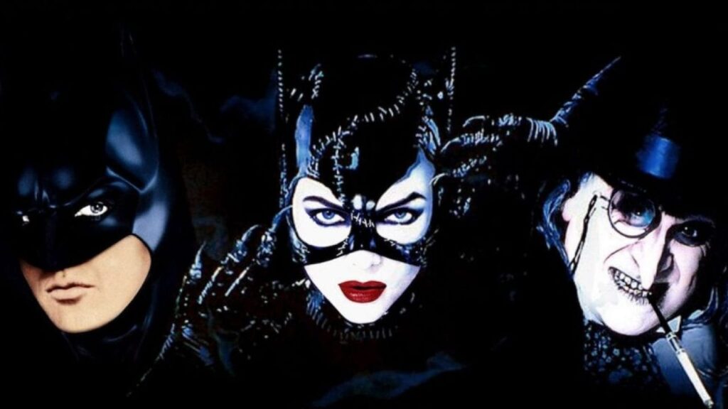
There was a time when superhero films were fun, rather than four pieces of overwritten, expensive nonsense. Tim Burton’s original Batman film stands out as one of the highlights of this branch of cinema.

Burton understood the inherent campness and fun at the heart of the world of superheroes. His set design takes advantage of some fantastic locations to create a world that could not evoke the comics more.
Moreover, as far as costume design goes, he endeavours to capture the same ridiculous swagger of the original works to create the definitive Batman movies.
Tim Burton is one of the most significant influences in the film industry. Known for his distinct style, ability to set the mood based on lighting, and use of nonverbal interactions that evoke raw emotion in the actors, this emotion transcends to the viewers.
This ability to evoke an emotion from viewers is something that graphic designers can be undeniably inspired by. It is crucial for graphic designers and artists, in general, to communicate the emotion they are trying to convey to the people who are viewing your art, and Burton is iconically known for successfully doing just that.
Science fiction has always been a significant area for innovative design in movies, and none is more groundbreaking than Alien.
The film redefined how we saw the future, trading in a world of exciting possibilities for gritty workaday labour and exploitation by the corporation.
The film shot at Acton power station in West London created a unique look for space travel.
Previous science fiction films’ sleek, airline-style features were traded for grim, functional surroundings utterly free of any frills or comfort.
Alien marked a sea change in science fiction cinema, starting to reflect the harsh realities of the Seventies and Eighties in contrast to the ambition and optimism of the Fifties and Sixties.
The feel would continue to be replicated in many later films and is still generally the go-to for any directors and designers looking for a realistic, gritty atmosphere.
Trainspotting Redefined the Nineties
Danny Boyle has risen to become one of the best-respected directors working in the UK.
He was responsible for the opening ceremony at the 2012 Olympics, but his career got started with the release of Trainspotting.
Taken from the Irvine Welsh novel of the same name, the film was a hit and kicked off the careers for many people.
Its influence was felt across the board.
The soundtrack defined the Nineties for many people, and the design was striking enough to make Boyle a hot property.
The film is set and filmed in Leith, Edinburgh, but the set design makes it seem far more surreal and apocalyptic.
Boyle uses striking colour schemes and innovative cinematography to make ordinary apartments seem doom-laden and nightmarish.
Some of the more surreal scenes have become famous for the innovative use of sets and outlandish concepts.
Even the exterior shots make the most of their surroundings and stand out.
It is easy to see why the film was such a success and why so many people remember it as the defining film of the Nineties.
Something about how the mise en scène comes together in this film is genius, the way all of these design elements come together to create this vision of a nightmarish Edinburgh in the nineties.
Peter Greenaway is well into the avant-garde end of the UK cinema world. His work is instantly recognisable, atmospheric and surreal.
One of his most famous films is The Cook, the Thief, His Wife and Her Lover.

The film follows a straightforward story of love, betrayal, and revenge, as with all his work.
However, with astonishing performances from Helen Mirren and Michael Gambon, an exceptional supporting cast and elegant, beautiful design, this film is one of a kind.
The majority of the film takes place in a restaurant decked out in vibrant red, beautiful paintings and excess in just about every feature.
Strangely, Greenaway uses the bathrooms to provide a stark, bright contrast to the rest of the restaurant, even going so far as offering his characters different costumes when they enter the room.
Many scenes closely resemble oil paintings of the great masters, no mistake from a director with such a unique vision.
Again we see the influence of colour and costumes throughout the film and how they contribute to the overall tone and mood of the film.
This film shows what can be achieved with innovative design and the willingness to stage a marked departure from the normal.
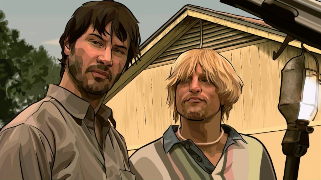
Rotoscope technology has been around for some time, but few filmmakers still make heavy use of it in movies.
Richard Linklater is the exception, and perhaps his most exciting use of rotoscope and design, in general, is Waking Life.
This strange, philosophical film does not have much of a story and is a strange journey through a dream-like world filled with exciting characters.
Linklater’s use of a rotoscope makes it seem like the film could not exist in any other format.
He uses the freedom that this technique allows presenting the viewer with a familiar and psychedelically unreal world.
As with much of the best design, the film puts us in a world that we recognise but that is consistently subverted.
Allowing viewers to relate to some familiarity allows them to understand a base level knowledge while exploring the intended inspiration of the art.
He would use rotoscope in his adaptation of Philip K. Dick’s A Scanner Darkly, a film more firmly rooted in our world, albeit populated by hard drug users.
The film had a similarly philosophical look to Waking Life and earned many deserved plaudits for its innovative and surreal style.

Find your Inspiration
These are just a few of the movies that have made significant leaps forward regarding design and can provide you with a tremendous amount of inspiration.
All in all, these are the films we mentioned that will provide a sense of inspiration for graphic designers:
- Seven
- Dark City
- Brazil
- The double
- A Clockwork Orange
- Batman
- Alien
- Trainspotting
- The Cook, the Thief, His Wife and Her Lover
- Waking Life
- A Scanner Darkly
Some of the above stood out for their ability to leap forward concerning design, changing what we view as the familiar motif of a genre.
Other films stand out for their ability to interweave familiar style details with the unfamiliar and present us with a world that is recognisable and disturbingly off at once.
All the movies remind viewers of the influence colour and design have on setting the tone of their art.
Graphic design is constantly evolving, and with that, it is on them to find new inspiration. This new inspiration doesn’t necessarily have to come from a recent art exhibit, instead can be found reflecting on what past creators have accomplished and communicated through their past work.
As different seasons of life happen, it’s essential to continue to find art that intrigues graphic designers to create something new. If you are in a non-artistic mood, there is always room for growth and inspiration.
Whether you are looking for inspiration in your work as a graphic designer or want to remind yourself of what well-placed creativity is capable of, you stand to gain a lot when you check out any of the movies above.
Author Bio: Nika Goddard – Psychologist, writer-freelancer, traveller and creative person, lover of world cultures, languages, food, wild spaces and urban places by nature.
