This is a review for the best font of 2020. Because I am writing this in 2020. In 2019, I gravitated toward sharp edges. Toward stylish rebelliousness. Toward a refined diligence with a kick. Things couldn’t get more pointed, because things had a point. They needed speed and alertness. They required a chisel-like efficiency to make it in before the doors slammed shut. Getting in wasn’t guaranteed, but it was still a viable possibility. But now, late into 2020, like perhaps many, I’ve given up.
I’m wearing an ex’s hoodie, and the things I think about now are simple. I walk through local parks for entertainment. Friends have taken up birding. We all spend time with just those we’re closest to. And that definition, of closeness, gets forged in simple exchanges. New friendships, having too many hurdles of meeting-up, never fully cement themselves. What initially, perhaps in late spring, seemed grotesque — the way the pandemic warped and shifted so many people and industries — has by now had its edges worn down.
While the world continues to get more interconnected, more global, today it also feels incomprehensibly smaller. I’m reminded of decade-old photos: simple snapshots, a group of friends in the woods, pranking and beaming. They didn’t need to be the greatest woods. No one flew halfway around the world to say they saw them. They were just there, and those shared moments were all the richer, all the more textured, for their simplicity and familiarity. For their routine. And then, all those simultaneous moments in micromovements everywhere gave rise to the diversity and richness we now leap carbon-emitting hurdles to get to.
I often sensed that brutalist graphic design emerged as a soft uprising against glossy commercialism. Against overproduction. One-off fonts like those released by Raphaël Verona’s Altiplano foundry feel like the rightly needed retort toward superfamilies. Toward multiscript, committee-approved, “cover the earth” neo-grotesque sprawl. And Nirvana just happens to be my favorite of the offspring.
The letters themselves are somewhere between liquid and solid. The W ends up with a circular addition. The G completely closes up on itself. I find myself mentally tracing the lines, as if filling in with a marker pen against a stencil template. The i and j dots connect with a flip of the stylistic sets (and make me wish all the other accents shifted accordingly).
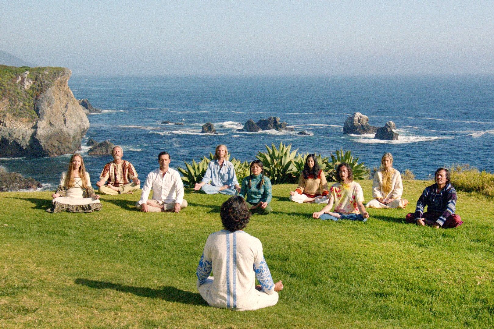
The visuals for Nirvana are both a throwback and futuristic. An off-the-beaten-path seventies cult, reborn with more technology and burnished lines. They straddle the unfamiliar. The video Anthony Vernery and Hugo Dumont captured it in nods to Michel Gondry, to not-quite Švankmajer. To a past visual of an imagined offshoot future. Plopping Nirvana on a book cover is a done-deal design, a travelogue toward elsewhere or elsewhen. Working as a designer in the early ’00s, novice clients kept asking me for happier layouts and friendlier typography, which they’d generally interpret to mean a direct ask for circles and rounded edges. Nirvana showcases that to have been an at least somewhat valid connection, giving us a glimpse of inviting mystery and pleasure — a “type paradise” indeed.