Akzidenz-Grotesk is a well-known typeface family with a long history. After the release of its first style in 1898, the family continued to grow. As a result, individual styles and sizes show many inconsistencies that have the effect of making the typeface unique and interesting. It comes as no surprise that many foundries have developed their own fonts based on Akzidenz-Grotesk. A recent addition to this lineage is Söhne, designed by Kris Sowersby of Klim Type Foundry in New Zealand.
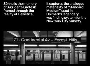
The starting point for Söhne was not the Regular style but the “Halbfett”, or Semibold. It makes sense: we’re all familiar with the famous New York subway signage system or iconic works by Josef Müller-Brockmann. As Sowersby points out in his detailed description: “When I think of Akzidenz-Grotesk used by the modernists, it’s only two weights: Halbfett and Fett”. He had no shortage of inspirational sources to work with, since the original typeface was sold by several type foundries under different names, sometimes with slightly adjusted lettershapes. This is reflected in two alternative forms of a and g.
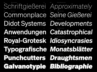
Sowersby has brought Akzidenz-Grotesk to perfection. Söhne retains Akzidenz’ analog feel but makes the whole family more consistent, more balanced. The fonts have perfect kerning, excellent diacritics, and a set of arrows reminding me those used in NYC subway signage. All weights have traditional German names. This may slightly confuse some users, but I enjoy this reference to the days of hot-metal typesetting.
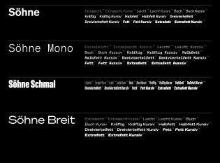
The collection is divided into four subfamilies: Söhne, the condensed Söhne Schmal, wide Söhne Breit, and monospaced Söhne Mono. All subfamilies come in eight weights with matching “Kursiv” versions. My personal favorite detail: the fonts show up in font menus with a proper umlaut!
Although I agree with Sowersby’s description — “Söhne is the memory of Akzidenz-Grotesk framed through the reality of Helvetica” — I would argue that Söhne contains more Akzidenz-Grotesk than Helvetica. It’s more unique, less monotonous, more dynamic, less boring. A beautiful yet universal sans serif family.


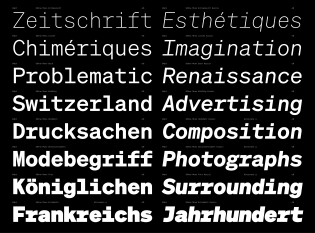
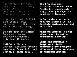

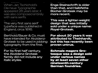


I love this font. ChatGPT / OpenAI uses this font family too.