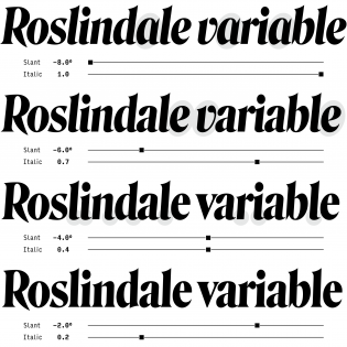
First, let’s talk about the variable in the room. Do people still talk about variable fonts? Seems like they’re something lovers love, haters hate, and honestly, we just haven’t decided yet. Our opinion is still … sliding on a variable axis of its own.
And now that we’ve gotten that off our chest, let’s talk about Roslindale Variable Italic. Or should we call it RVI? RVI by DJR. Our official favorite release of 2019. It’s a high-contrast, bold, condensed, display addition to the Roslindale family — carefully spaced, pointy yet soft, and full of little surprises for the ones who zoom in.
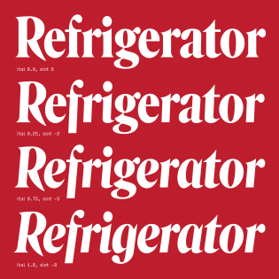
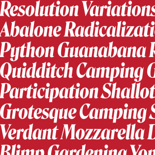
Born on the first day of 2019 as part of the Font of the Month Club, RVI brings life to the italic axis. We’ve taken that train before, but suddenly there’s a good reason to look out the window and enjoy the four stations along the road. First, the terminals change from dual-sided serifs to upstrokes, and descenders of f and ß grow deeper. Second, the e, v, w, and ampersand get rounder constructions. Third is a single-storey a, and fourth is a double-storey g.
A good reason for a variable font doesn’t come along every day, and RVI makes us want to see more. Can this design space be applied to other typographic styles? Can it be applied to uppercase as well? Figures? Other scripts? As type designers, we are big fans of releases that make our minds wander around and start asking questions.
Finally, we love RVI because of its high educational value. In its own humble way, this typeface actually teaches its users. With all of the little changes that pile up, the differentiation between slantation and construction, and the precise freedom it allows — RVI makes you look carefully, pay attention to details, and learn a thing or two about italics. Maybe all roads really do lead to Rome.


