
In a marketplace full of puffery, the typeface name “Okay” seems like a declaration of mediocrity, and in fact it’s coming from a foundry of the same unassuming name. But this is not just another example of the self-effacing character of designer Jackson Cavanaugh (who hit the scene with a type called “Alright Sans”). In this case, the name is also motivated by rearranging the letters of “Kayo”, the “knockout” weight of Eric Gill’s sans family from the 1930s.
In an obituary for Eric Gill from 1946, Robert Harling praised the late designer’s Gill Sans and Perpetua as the works of a master, but dismissed Kayo as a “commercialized denigration of his excellent originals” committed by the Monotype Corporation. We’re in a different world now, three quarters of a century later, in which encomiums to the problematic designer are embarrassing and historians are uncovering the unsung contributions of the corporate drawing offices. Elsewhere, Harling predicted that by the twenty-first century, typographical historians would consider Kayo an “odd outburst.” Instead, it is everywhere. In ads and signage and packaging, Gill Sans Ultra Bold (as it came to be called) has become a go-to for copy that has to be big, loud, and friendly. Posters for cartoonish movies are a frequent application.
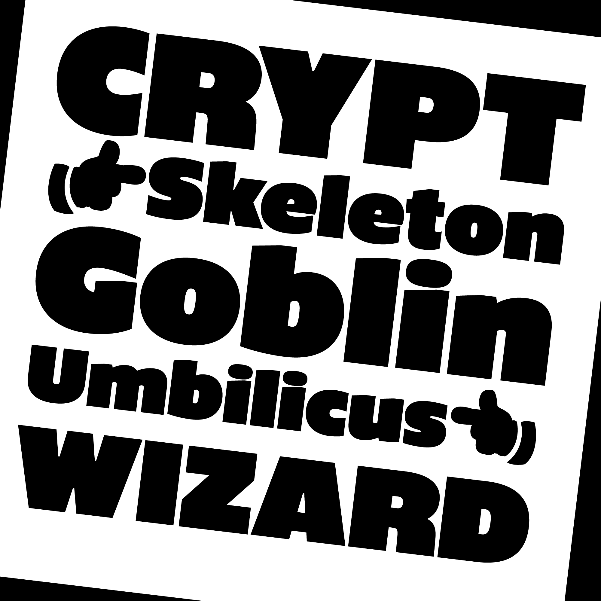
Surely graphic-designer inertia and corporate shaping of the type industry bear some blame for Kayo’s overuse, but we also have to credit the design for doing what it does well. It offers a mix of pneumatic energy, whimsy, and geniality that has many applications. Still, in being charmed by its personality, I had overlooked its defects, which are not few. For example, poor solutions for dense lowercase letters like a, e, and g result in wild weight shifts of strokes. Cavanaugh’s Okay sets out to revise Kayo, retaining its personality but rethinking its wrong turns.
Of course, there have been many superbold sans types in recent decades, but most, fettered by an obligation to relate to a set of quieter and skinnier family members, miss the characterful aspect of Okay (and of Kayo, which freely departed from the design of the other Gill Sans weights). As letterform design moves from midrange bold weights to the heaviest extremes, it undergoes a qualitative transformation. There is a tipping point where instead of black linear strokes on a white background area, the eye starts to see black areas distinguished by more linear white spaces within and between the letters. On the far side of that inversion, we visually prioritize even spaces over even strokes. Okay lives entirely at that end of the spectrum, and is well outfitted with felicitous shapes and precise tight spacing, both superior to the prototype.
Drawing is strong throughout. Capital R and italic k are some favorites, but Cavanaugh’s skills are best appreciated in those dense lowercase letters that had thrown Gill off. Okay’s a and e are exponentially better than Kayo’s, and (in the roman) Cavanaugh even succeeds in assembling a persuasive binocular form of g, something that Monotype apparently found impossible in the 1930s. The design includes a gentle bevel on the tops of lowercase stems, where I wonder if a curve would have been a more fitting way to soften the tops of these inflated letters. The obtuse angle does not meet the rounded tittles happily, to my eye (though it is certainly less bothersome than Gill’s goofy ball-and-cup-game i’s). Okay’s e and italic g have an uninhibited grin, and it’s hard to look at all these letters and not grin back.
The cuts offered are Black, Narrow, and Condensed. The wide Black is satisfyingly generous, and Narrow happily doesn’t feel narrow. Condensed does, but of course fitting copy into compact spaces might demand it. In facing that, graphic designers are well served not only by these widths, but perhaps even more so by the variable font offered with the family, which facilitates interpolation between them.
Fitting text to space available is also eased with an OpenType stylistic set that retracts extenders, allowing interlinear spacing to share some of the tightness the fonts achieve horizontally. Some of the diacritics get unhappily squashed here: perhaps the base glyphs have to cede more vertical space for accented letters in this setting, in the same way the regular i and j stems smartly hunker down below their dots. Here, too, the variable font offers graphic designers fine-tuned ways to fill up the space, which is why they reach for ultra bolds in the first place.
There’s some evidence that Eric Gill himself did not take Kayo very seriously, and certainly his snobbish contemporaries looked down their noses at it. It has a voice that typesetters and graphic designers have found irresistible for generations, though. Notwithstanding its humble name, the Okay typeface is poised to take up this mantle. Crafted with care and smartly solving the challenges inherent in heavyweight letters, Okay may become a new go-to type for when volume and affability need to be high.


In fact Gill himself called Kayo “an ugly type for an ugly profession”. But he made it anyway, evoking something else he said, to a conflicted fellow designer seeking advice: if you have work, don’t take the job; if you don’t have work, take the job.