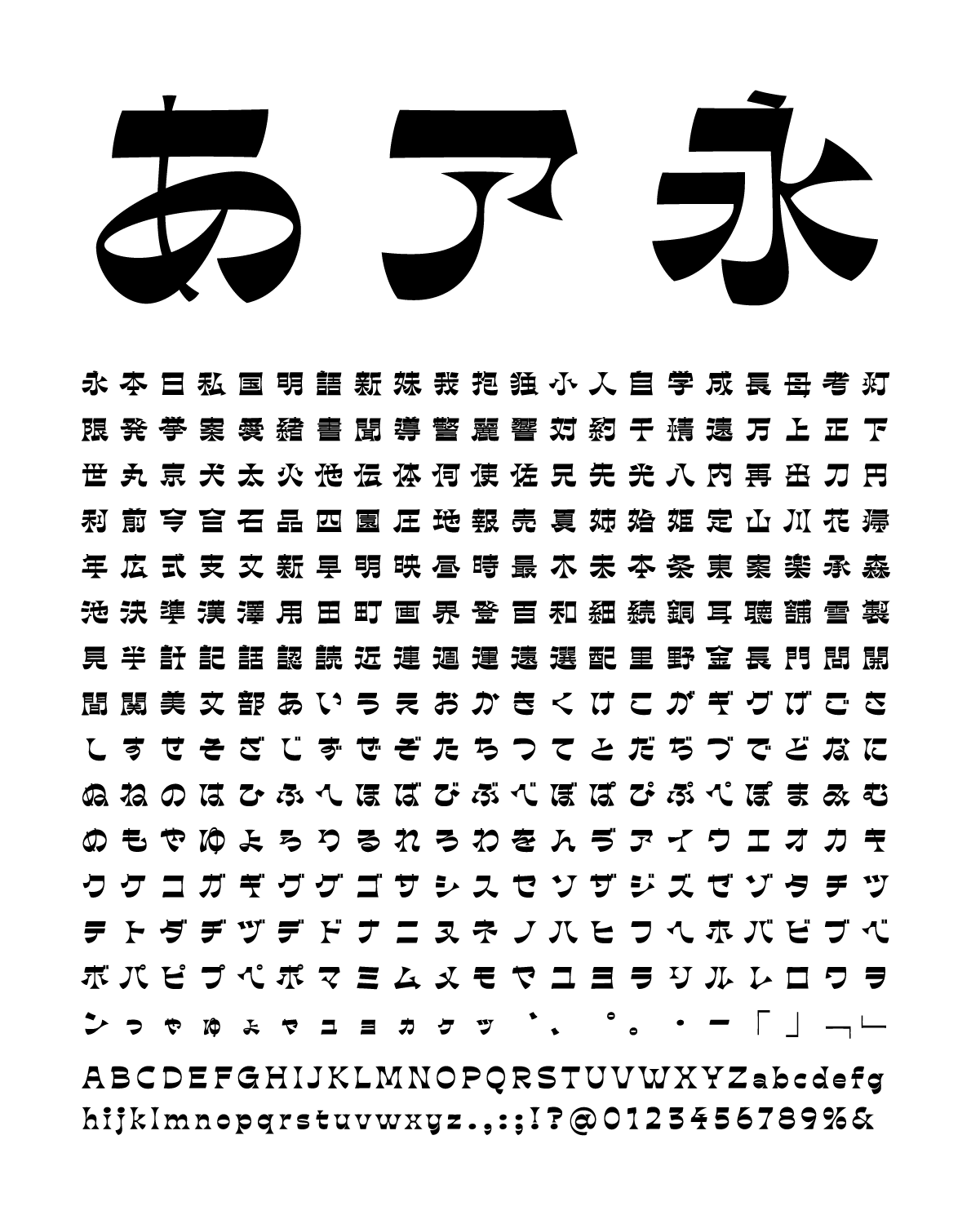
Following the wave of reverse-contrast typefaces, Ribaasu by TienMin Liao captures this idea across Latin, Japanese, and Chinese scripts with strong lettering influences. In creating this ebullient typeface, Liao sought to emphasize strong horizontal connections and evenness of weight as a way of translating the idea of reverse-contrast from Latin letters.
The typeface’s idiosyncrasies evoke the exuberance of Japanese logotypes and lettering experiments of the late ’60s and early ’70s, but Ribaasu has a display personality all its own. Interestingly, the Japanese serves as a mediating visual set that negotiates between the complexity of the Chinese and the relatively simple Latin horizontals, verticals, and curves. Ribaasu’s logic is most apparent when all three versions are viewed together, where the horizontality of the type is emphasized at the necessary expense of the vertical — traditionally, Chinese and Japanese are read vertically.
When considering the “quirkiness” of the Chinese, whose structure was loosely derived from the rectilinear tendencies of the clerical script, one sees that the optical core and densest part of the characters were put on a severe diet, with extremities on the periphery fattened up. In the process, characters were widened in a nod toward horizontality. The result is a veritable hall of mirrors, with the scripts looking at one another in mind-bending and positively unexpected ways.