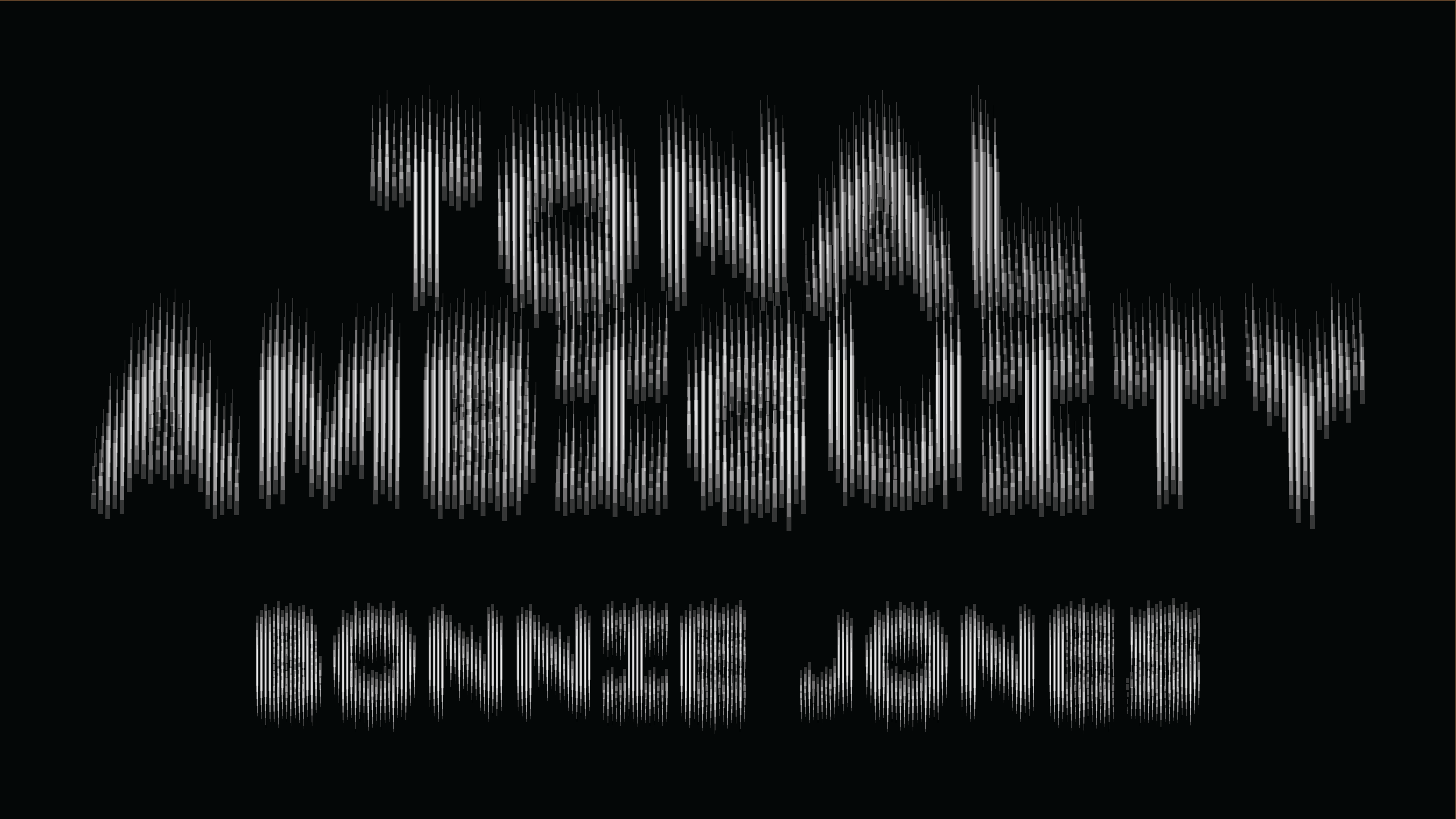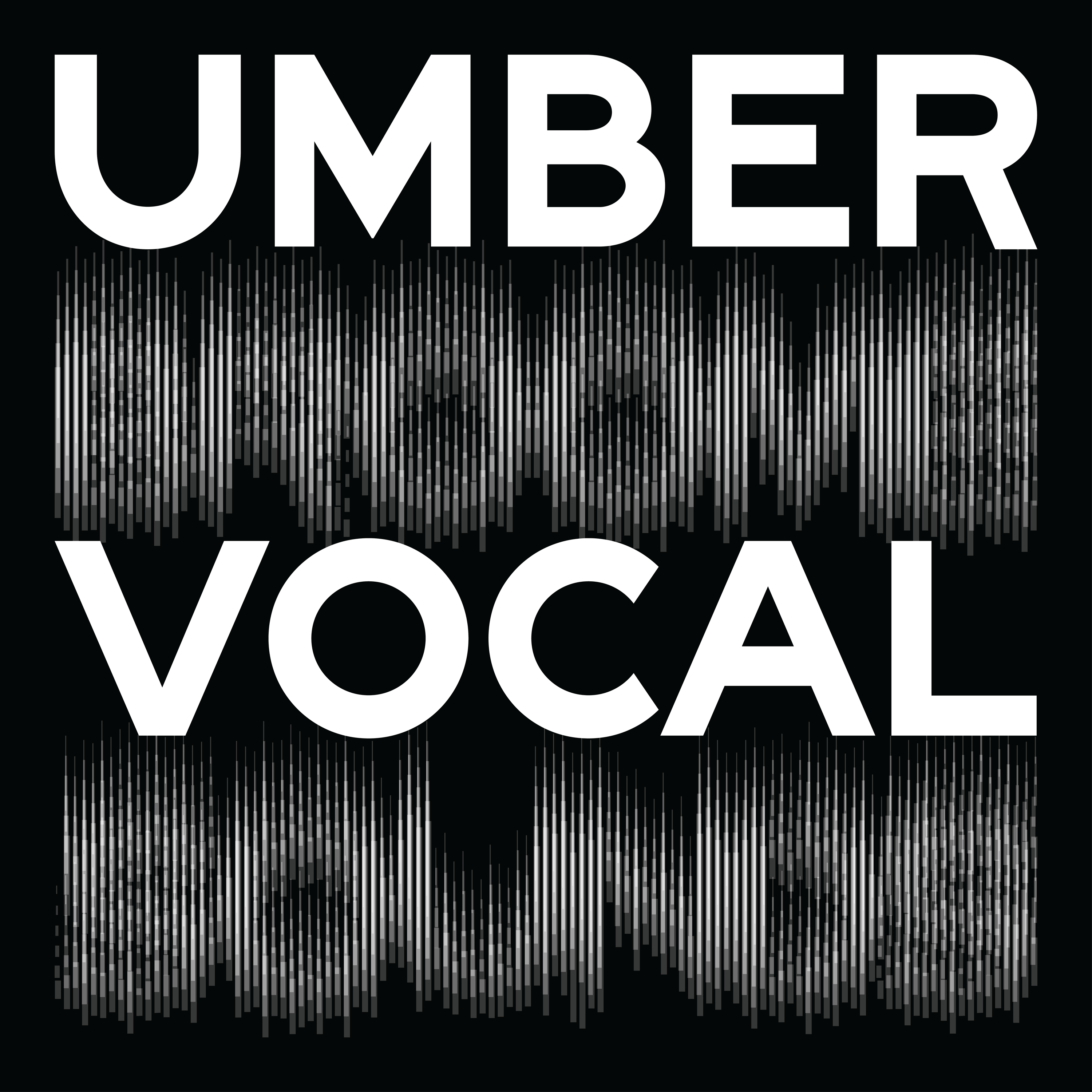
Broome Sound, a custom typeface designed by Tré Seals for the third issue of Umber Magazine, intrigues me for several reasons: its important historical reference; its craft; its simple beauty; and, above all, its status as a work of distinct experience — an optical translation of sound.
As someone fascinated with the history of motion graphics, I am struck by the way this typeface resonates with that history. It’s a history that begins with artists who sought to convey what they believed was a natural correlation between music and colorful abstract animations — what became known as visual music. And it was this relationship as well — music in relation to moving imagery — that we recognize today as motion graphics.
Other historical correlations between music — or sound — and visual imagery are the graphic representations of sound used in audio software: the animated undulating waves, rainbow bars, or jagged lines that represent qualities like shifts in tone and volume over time. And still another historical relationship between visuals and sound is visual audio tracks. These tracks, appearing on the edge of filmstrips in the work of artists like Norman McLaren, translate into sound when the film runs through a projector. In other words, they aren’t musical notations to be performed, but visuals that manifest as sound.
As a graphic designer rather than, say, an animator who loves motion graphics, I’m most interested in the typographic element. The magic of typography for me is that it allows words, dressed in visual “costumes,” to perform all kinds of meaning. We read and see simultaneously. And this is the experience for me with Broome Sound: we hear the words. We see sound. A crescendo of meaning and experience.