Thu.Dec 31, 2020

article thumbnail

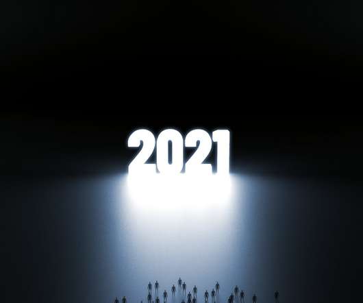
Influencer Marketing Trends: Predictions for 2021

Noupe

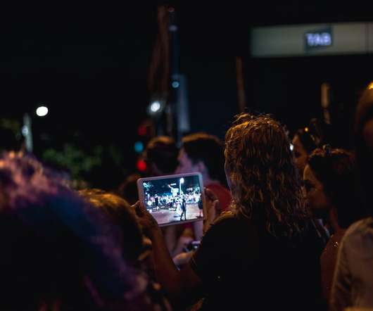
They are loved and trusted. Influencers. These top influencer marketing trends will empower your brand and help earn the customers’ trust in 2021. What if the influence is something different than we used to think before? In 2021, digital marketing practitioners expect a drastic change in the understanding of influencer marketing. While social media still is the hottest area of influence, 2021 brings many new trends based on the growing needs and expectations of the follower community. .

Marketing 134
article thumbnail

Brando Arabic

Typographica

Arabic typography has long suffered from stagnation due to the sacralization of calligraphy. Brando Arabic is an innovative contribution to the Arab world, which now produces publications of all sorts and embraces modern requirements of communication.

Insiders

Sign Up for our Newsletter

This site is protected by reCAPTCHA and the Google Privacy Policy and Terms of Service apply.

Trending Sources

article thumbnail

“Someone Else’s Dream”: ’80s-Inspired Illustrations by James White

Design You Trust

James White aka Signalnoise is a Canadian illustrator and designer living in Newcastle upon Tyne, UK. He creates neon-infused artwork for his various personal projects as well as for clients such as Lego Movie 2, Far Cry 3: Blood Dragon, Hasbro, Metallica, Nike, Universal Music etc. He’s very stuck in the 1980s. More: Signalnoise , Behance.

article thumbnail

Movement

Typographica

I have always been fascinated by the various tools used to create letterforms. How an object like a nib, a chisel, or even an imaginary tool can shape glyphs is what I find most interesting in type design. These tools are usually limited by the human body?—?the hand, in particular. So when I heard that Movement was inspired by a dancer, I was especially intrigued.

article thumbnail

Let's Talk Trends: Designing for Maximum Impact

Speaker: Amber Asay, Creative Director and Founder of award-winning design studio Nice People

Understanding what trends are happening and how they’re impacting the competitive landscape is crucial to providing top dollar design strategy to your clients. With so many trends coming and going, it can be overwhelming to determine which ones you should capitalize on and which ones might not be worth the trouble. In this exclusive webinar with Amber Asay, we’ll explore graphic design trends that need to die, trends that are starting to pick up and why, trends that have come and gone, and how t

article thumbnail

This Artist Transforms Electrical Cabinets To Beautiful Outdoor Art Exhibition

Design You Trust

In small town of Finland, local water company Keski-Savon Vesi Oy asked the artist to spray paint electrical cabinets to prevent vandalism. Ugly boxes turned out to be the most beautiful outdoor art exhibition. Artist Nino Tolvanen spray painted nature-inspired pieces to fit the gorgeous scenery filled with lakes and forests. More: Instagram , Facebook h/t: boredpanda.

More Trending

article thumbnail

Previous Generations Sure Knew a Thing or Two About Style

Design You Trust

“My movie star looking grandparents sitting for a portrait in the early 1940s”. thechive. Do you ever get the feeling that people are not as stylish and glamorous today as they were in the past? Many of us had this thought pass through our minds when watching a period drama or even when looking through old family photos. It could be that people put more effort into their appearance back then, or it could be the fact that taking a picture was a much rarer occurrence than today, so everyone made s

Fashion 67
article thumbnail

Maelstrom Sans

Typographica

I appreciate and adore Maelstrom and its wacko Italian Futurist approach to reverse-stress letterforms, with the historically noteworthy (and entirely crackpot) E. But I didn’t expect to like the sans as much as, or even more than, the serif.

128
128
article thumbnail

Stunning Photos of Cher Taken by Richard Avedon for Vogue in 1966

Design You Trust

Born 1923 in New York City, American photographer Richard Avedon began working as an advertising photographer for a department store in 1944, but was quickly endorsed by Alexey Brodovitch, who was art director for the fashion magazine Harper’s Bazaar. Lillian Bassman also promoted Avedon’s career at Harper’s. h/t: vintag.es. In 1945, his photographs began appearing in Junior Bazaar and, a year later, in Harper’s Bazaar.

Fashion 59
article thumbnail

Typefesse

Typographica

Typefesse gives a whole new meaning to type anatomy. Defying logic or reason, each letter manages to squeeze in a contorted foot, leg, and buttock or two while maintaining a surprising level of readability. Given the year the world has endured, we all deserve more moments of collective levity, more silly quips, and more type that kicks some ass.

117
117
article thumbnail

The Democratization of Design: Giving Creators & Marketers the Tools to Succeed

Brands must create and share impactful content to thrive, but they have less people, tighter budgets, and fewer resources to do so. Learn how to publish and market digital content with the same professionalism as organizations with million-dollar budgets.

article thumbnail

How to make a habit of creativity

Marloes De Vries

During the summer I started painting landscapes. I had time on my hands because of loss of work due to the crisis. Best time ever, honestly. I’ve been saying for years how I would love to do more personal work and it took a crisis to do it. I took some online courses, created two paintings I enjoyed and then after a few months jobs started coming in again, so I neglected painting I have started, but haven’t finished a painting since.

Print 97
article thumbnail

Okay

Typographica

In a marketplace full of puffery, the typeface name “Okay” seems like a declaration of mediocrity, but this may become a new go-to type for when volume and affability need to be high.

Fonts 105
article thumbnail

SB C&S Recruit Information

Communication Arts

With an ethos derived from this information technology product company’s values, F&S Creations designed a site that attracts potential employees through visuals.

article thumbnail

Zangezi Sans

Typographica

Zangezi Sans doesn’t come across as just another naked sans or neutralized friend of a serif family. Varied stroke weight, fluid counters, and spiky tails give Zangezi Sans a nonbinary vibe. This typeface bridges the serif/sans divide with shapes that borrow from calligraphy and stone carving.

105
105
article thumbnail

From Visualization to Execution: Exploring Our Strengths as Designers

Speaker: Sean Adams, ArtCenter College of Design

Thomas Edison once said “Vision without execution is hallucination.” This statement applies not just to invention, but to graphic design. One of the greatest strengths of graphic designers is the ability to first develop a concept and then execute it to make it real. From visualization and ideation all the way through to actuation and execution, each step of this process takes skill and expertise.

article thumbnail

SAGA Grand Gin identity

Communication Arts

The identity for Distillerie Grand Dérangement’s new gin pays homage to the Acadians who were deported from Canada in 1755.

72
article thumbnail

Söhne

Typographica

Although I agree with Sowersby’s description — “Söhne is the memory of Akzidenz-Grotesk framed through the reality of Helvetica” — I would argue that Söhne contains more Akzidenz-Grotesk than Helvetica. It’s more unique, less monotonous, more dynamic, less boring. A beautiful yet universal sans serif family.

95
article thumbnail

Happy New Year!

Abduzeedo

Happy New Year! abduzeedo 12.31.20 It’s hard to describe the past year. Perhaps the best definition is the word change, closely followed by anxiety. The pandemic has changed lives forever. People have lost loved ones, that cannot be diminished or taken lightly. People lost jobs, businesses shuttered overnight, families had to adapt to a new routine of having their kids being home-schooled.

Media 76
article thumbnail

Schijn

Typographica

Type can be a helpful means of escape. The mad toyshop designs of Arthur Reinders Folmer’s Typearture foundry are kind treats to puzzle over in bad times. In appearance, Schijn is a product of its pre-COVID era?—?a faceted 2019 rife with Instagram crystals and fragmentation on the pop-culture brain. But the font belongs to 2020 because it looks purpose-built for use in a gentle iOS or Nintendo Switch game, the kind played to seek out private calm in a tense quarantined household.

Fonts 68
article thumbnail

Rethinking Creative Workflows: Increasing Efficiency in the Design Process

As the design industry evolves, teams are facing new challenges and a need to produce more outstanding creative work than ever. Leaders must learn how to adapt their processes to solve today’s—and tomorrow’s—unique design challenges. In this e-book, you’ll learn how to establish your creative workflow and leverage the power of CorelDRAW® Graphics Suite to streamline the entire design process, from start to finish.

article thumbnail

What Will Be the Graphic Design Trends for 2021?

Tuts Plus

For design fans, there’s plenty to be excited about in the coming year. With our design forecast, you can hop into the trend time machine and discover the direction of graphic design for the year ahead. 2020 was quite a year, but things are starting to look brighter, with optimistic design , soothing colour palettes , and activist-infused design paving the way for a more positive and confident future.

article thumbnail

Ribaasu

Typographica

As a reverse-contrast typeface in Latin, Japanese, and Chinese, Ribaasu is a hall of mirrors, with the scripts looking at one another in mind-bending and positively unexpected ways.

63
article thumbnail

Broome Sound

Typographica

Broome Sound, a custom typeface designed by Tré Seals for the third issue of Umber Magazine, intrigues me for several reasons: its important historical reference; its craft; its simple beauty; and, above all, its status as a work of distinct experience?—?an optical translation of sound.

article thumbnail

Triptych

Typographica

Where other fonts are promoted as workhorses, this one is a mule. It is often said that “workhorses” do their work without a murmur, quietly and in the background, conforming to the text they carry without coming to the fore themselves. Those are not horses, but chameleons, butlers, and crystal goblets. Elmer’s mules will deliver the job without pretending to go unnoticed.

Fonts 58
article thumbnail

Creative Insights: Data-Backed Trends to Help You Design Successful Content

In today’s competitive markets, how do you make sure that your content not only stands out but performs well? How can you predict whether certain design choices will result in clicks, engagement, downloads, and other drivers of ROI? Shutterstock’s Creative Insights Report (Q3) is your window into the hottest trends that are transforming the creative world.

article thumbnail

Hudhud

Typographica

There is a fluidity of movement that is very appealing in this typeface. The low contrast and openness of forms helped to create the contemporary feel. Both of these design features capture a sense of joie de vivre, and a light and pleasant atmosphere in spite of the boldness of weight.

58
article thumbnail

Antonia

Typographica

Antonia is a contemporary serif typeface that interlinks a sharp-edged character with cheerfulness. Combining characteristics that don’t seem to be compatible is one of the most difficult arts of type design and was one of the trends I recognized this year. Most often, such attempts result in unconventional display type. Sometimes, though, they add a fresh note to a more serious genre.

Art 58
article thumbnail

Roslindale Variable Italic

Typographica

We love RVI because of its high educational value. In its own humble way, this typeface actually teaches its users. With all of the little changes that pile up, the differentiation between slantation and construction, and the precise freedom it allows?—?RVI makes you look carefully, pay attention to details, and learn a thing or two about italics.

article thumbnail

Quinn

Typographica

With type styles and influences as divergent as contrasty Didones, chunky Clarendons and straightforward Transitionals, Quinn is a nicely done portmanteau. It can be used for sedate text as well as shouty yet elegant headlines.

58
article thumbnail

How to Create Stunning Typography With the Corel Type Tool Kit

Download this free eBook to learn how you can create stunning typography, using the basics, such as placing text, to advanced controls like ligatures, variable fonts, effects, tracking, range kerning, and everything in between. Learn how to: Use Character Control to add variety to your font styles. Use Paragraph Control to manage spacing, alignment, justification and more.