Mob’s rebrand puts the character back in food
The food platform has dropped ‘Kitchen’ from its name amid a playful branding update from Studio Nari
The culinary world was once an exclusive space, veiled in mystery and hidden from view. In the last decade the scales have tipped in the opposite direction, with the proliferation of polished cooking programmes and increasingly ambitious competitions breeding a generation of armchair food critics.
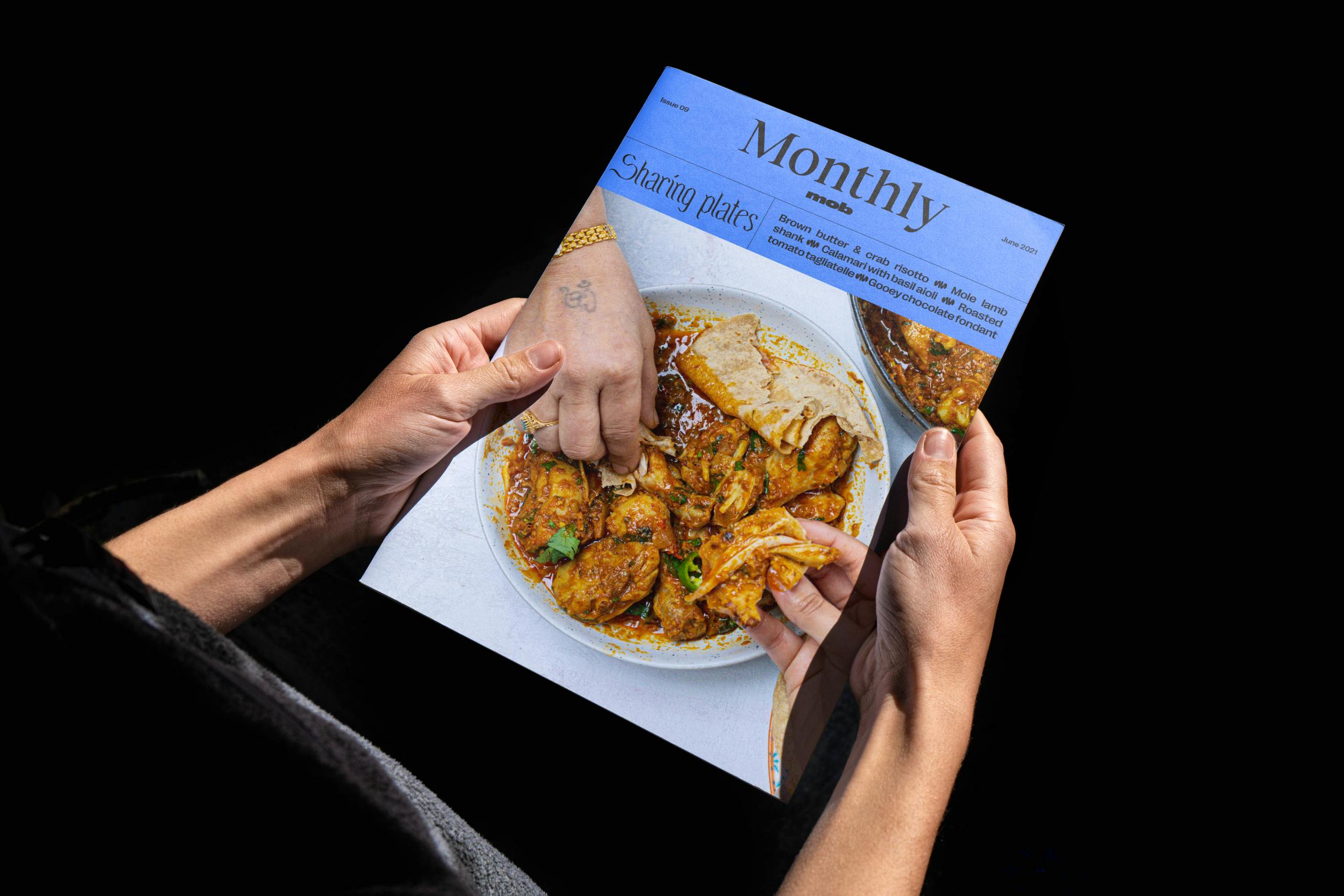
At the same time, food platforms like Mob (FKA Mob Kitchen) have set out to take the stuffiness out of cooking. Launched in 2016 by Ben Lebus, Mob began with a handful of overhead cooking videos and has since expanded to a vast online catalogue of recipes and tips, several cookbooks and in-person activities that tour around the country.

Mob has just started to roll out new branding that capitalises on its no frills, fun approach to food, created by London-based Studio Nari over the course of ten months. “The project began primarily as a brand refresh, but when we started working into their brand strategy and tone of voice, it became clear that Mob needed a full rebrand,” explains Studio Nari founder Caterina Bianchini.
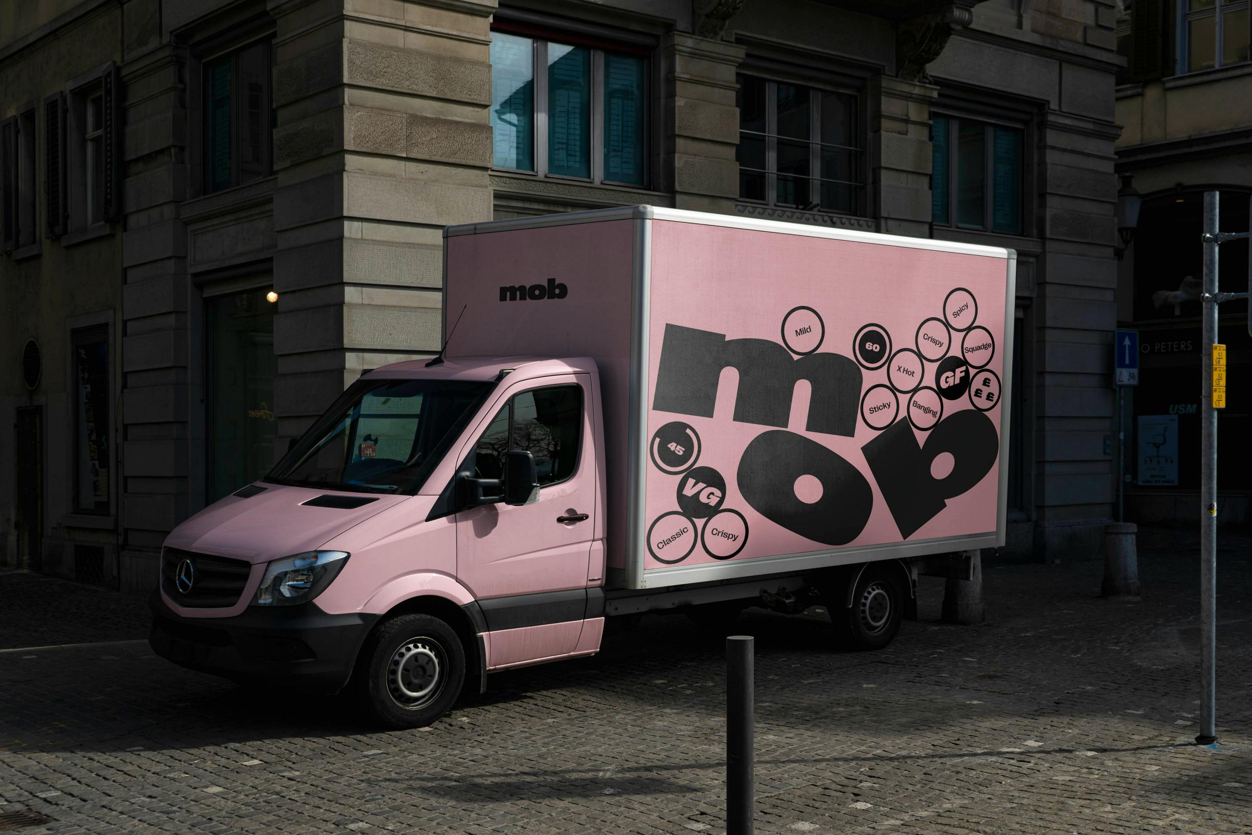
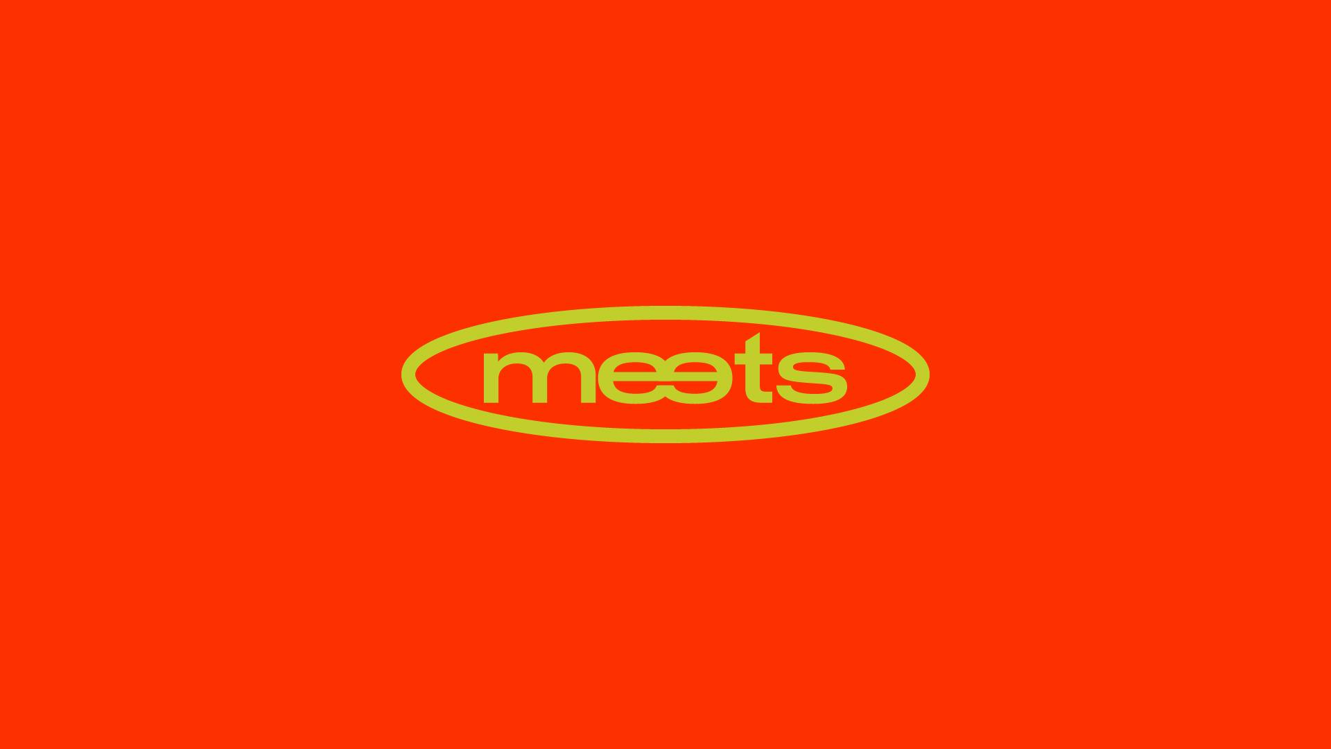
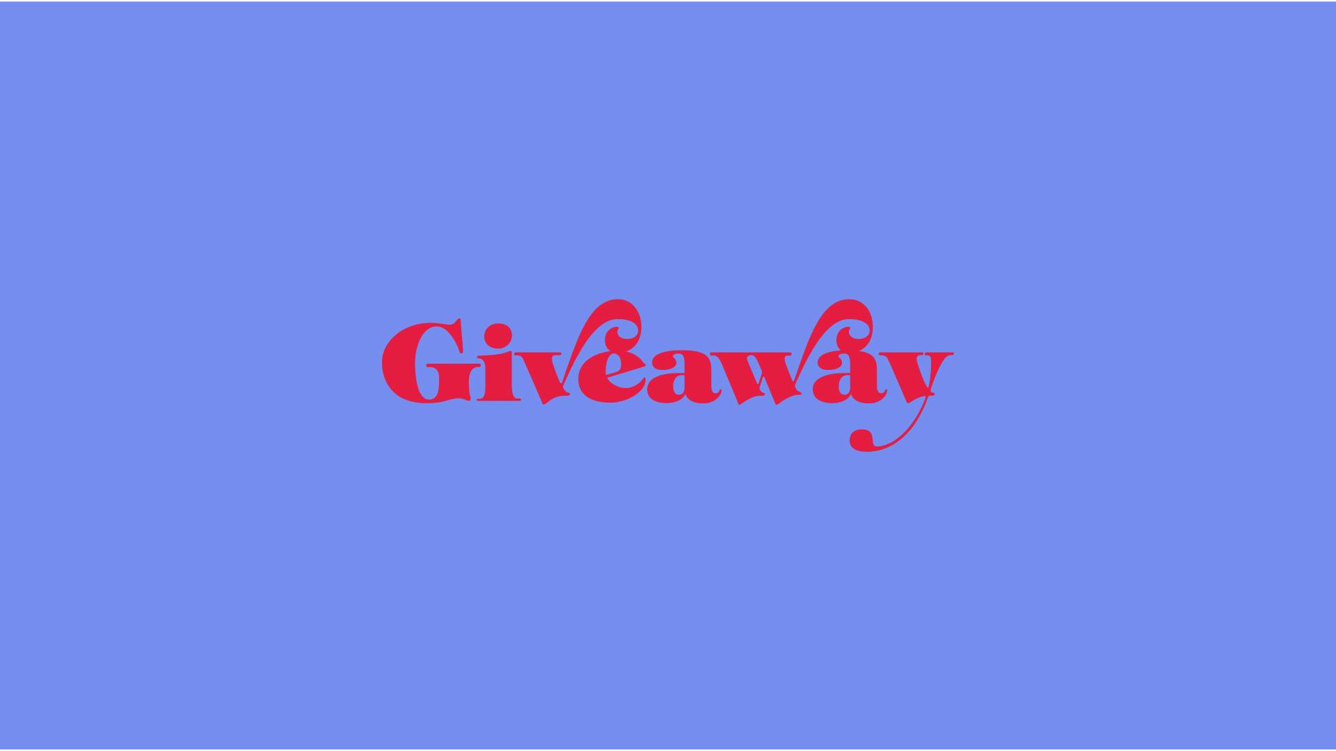
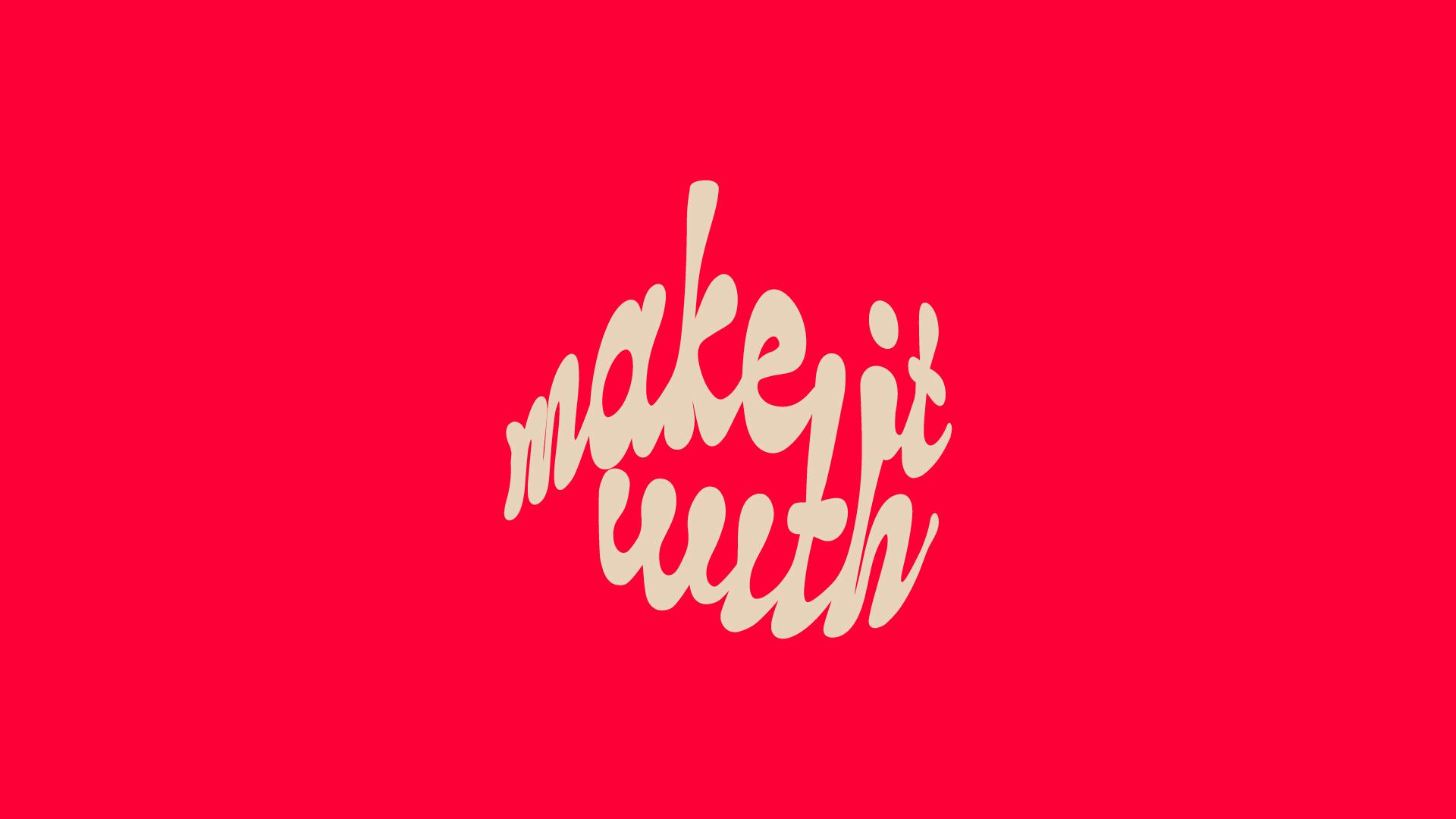
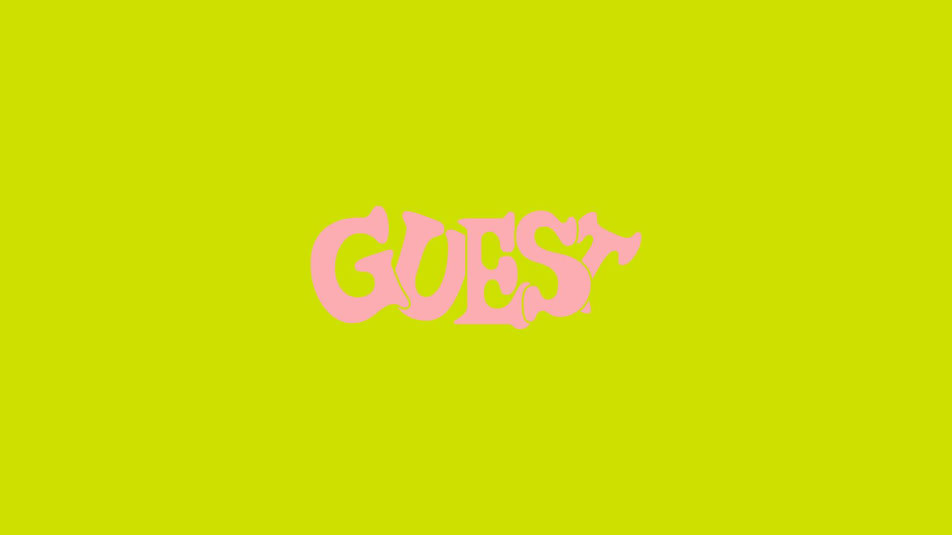
“As a company that has so many different elements – series, talent, content – we needed to create something that was flexible and could evolve over time, whilst showcasing Mob’s unique personality, flaws, and all.” Alongside the core brand overhaul, the project also encompasses distinct sub-identities for all of Mob’s activities and series that sit under the main brand: Guest, Street, Make It With, Giveaway, Hot Takes, Causes, Meets.
“First and foremost, it was important to us that the core identity adopted a ‘channel’ approach. By this, we mean to have the weight and strength to be at the core of a vast visual architecture yet the neutrality to be able to hold sub-brands and exist within a multitude of different environments,” Bianchini says. “By doing this, it allows for longevity and the scope to grow – which we believe Mob will continue to do exponentially.”
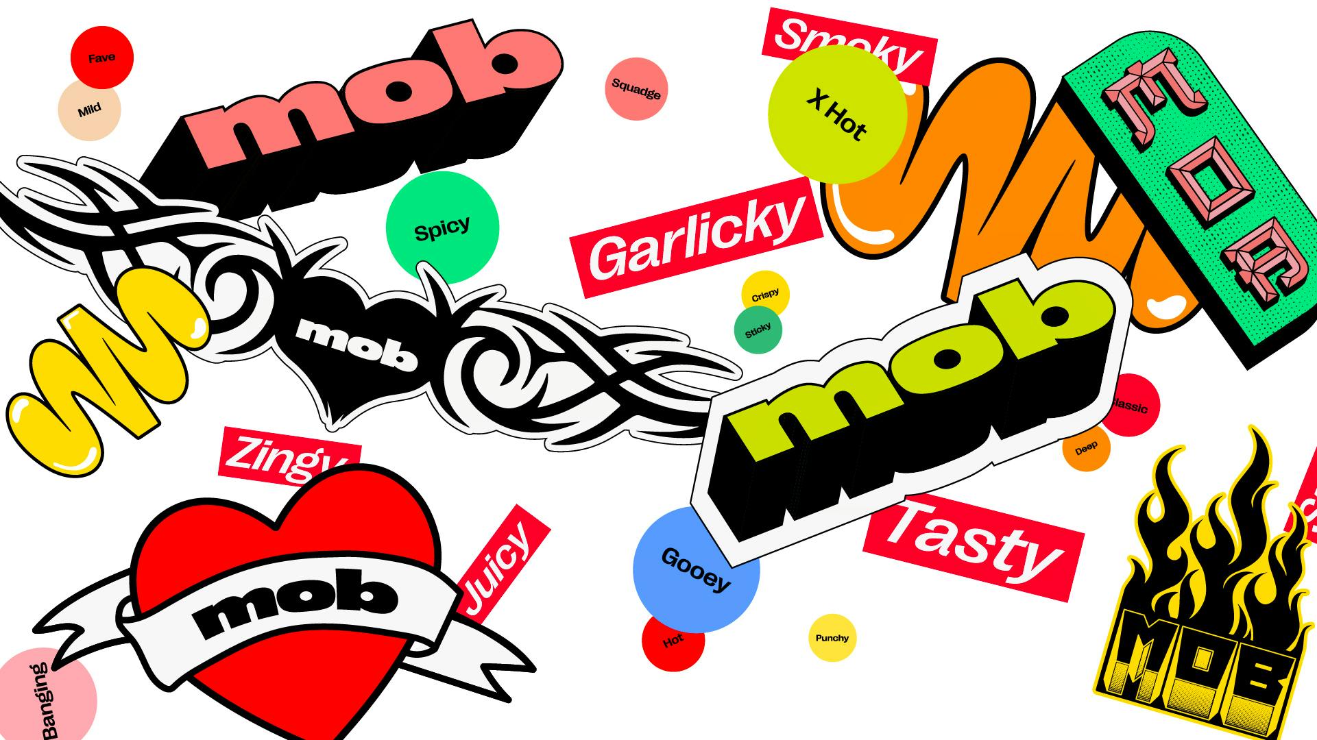
The new Mob wordmark is enjoyably squat and squishy, its cheeky sensibility emphasised by animations reminiscent of cartoon titles, created by motion design practice Connor Campbell Studio. The wordmark, Bianchini says, was “drawn primarily to feel as though it was ‘full’, with the characters all feeling as though they are stuffed to the brim with delicious Mob food. Not only did this provide a semiotic nod to what Mob are all about but it allowed the logomark to feel human and youthful – values we know their audience connects with through working on the strategy.”
“On top of this, we worked in small inconsistencies into the counters,” she continues. “These are very slight but speak to the idea that Mob’s food isn’t about a high-end presentation or overly complicated set of ingredients, but rather, ‘Food You’ll Actually Cook’, the enjoyment of making it and all the mess it brings with it.” The brand mark, shown below, was “drawn with a similar idea, representing a splodge of sauce and an abstract M.”
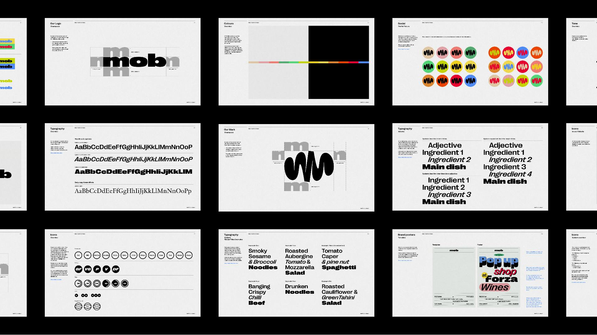
The new typeface, drawn from a selection of variables from Right Grotesk, was a “key element” of the rebrand, as it “fronts up one of the primary touch points between Mob and their audience: their online recipes,” Bianchini says, explaining that it was chosen to continue the “new playful, bold and descriptive tone of voice”.
Creative aside, one of the most instantly noticeable aspects of the rebrand is the shortened name. “’Kitchen’ was dropped as we felt this was a natural progression for Mob, it was the indication of a new era. It also felt relevant as the way Mob often refers to itself and their audience as ‘The Mob’ so we felt by removing ‘Kitchen’, the brand was more representative of Mob and their audience,” Bianchini explains. “In the future, our aim is to have Mob recognised through the brand mark only, so this was a good first step to simplifying the brand.”

As food and beverage brands lean into softer visuals, is branding helping food become less pretentious? Bianchini suspects the shift marks “a natural evolution as ‘good food’ becomes more accessible to everyone. Food brands are wanting to connect with younger audiences yet also reposition their product/service as attainable. After all food is part of life, it’s something we interact with on a sensory level multiple times a day, so it’s almost remiss to create an aesthetic that doesn’t feel human or tactile.
“When working with Mob, we set these as ‘non-negotiable’ touch points for us to hit with the new aesthetic and tone – and we can imagine this is a part of other studio’s thought processes when working with food, in this era.”