
Death warmed up: will writing service adopts “light-hearted” identity
Illustrator and creative director Anna Charity has created a brand for Farewill to help people feel “less anxious around death”.
“Technology-led” will writing service and so-called “death expert” Farewill has adopted a new brand positioning in an attempt to “rebrand death”.
The project was led by illustrator and creative director Anna Charity, who previously worked on the identity for wellness app Headspace. Although Charity did not update the wordmark her illustrative style has been rolled out across all brand communications.
The new look, which can be found across Farewill’s will, probate and cremation services, has been designed to feel “friendly and approachable” according to Charity, who says: “Even the word ‘death’ can be intense for a lot of people, the pictures it conjures up makes a lot of us want to bury our heads in the sand.”

“Isn’t death supposed to be grey?”
Moving away from more corporate law firm identities, Charity worked to give Farewill something visually different she says.
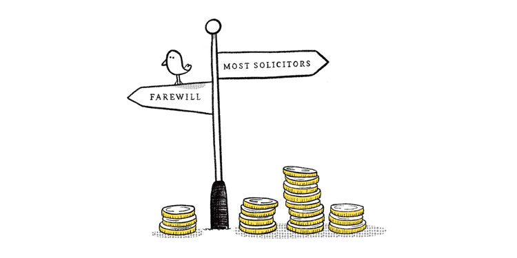
“When you look at the solicitors and law firms Farewill is competing against, there’s stock photography everywhere you turn, and the branding is all bit fifty shades of blue,” she says. In comparison, for Farewill’s identity, Charity adopted a softer yellow and white colour scheme.
“I hope the immediate reaction is that it feels surprisingly warm, bright and memorable – [because] isn’t death supposed to be grey?” she says. “It was important to introduce a world that felt warm, friendly and non-threatening.”
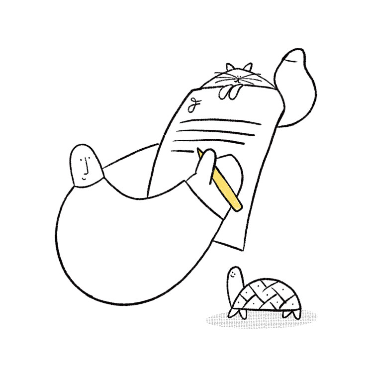
Continuing this approach, Charity settled on an illustration style that matched. The result is a cast of illustrated characters, centred around Farewill mascot Blob. In supporting roles alongside the “soft, protective, big friendly giant” Blob, sits a tortoise and a cat.
“The animals are essentially metaphors for different ways of viewing death,” she says. “I felt that these two specific animals conjure up ideas and feelings of time, through the prehistoric aesthetic of a turtle and the nine lives of a cat – these metaphors for time make us feel that life is precious.”
Breaking taboos but still taking people seriously
Creating a visual identity that was sensitive to the nuances across all Farewill’s customer touchpoints was a particular challenge for Charity.
Where wills are a “less sensitive topic” that can benefit from “characterful language”, some of Farewill’s other services are more delicate.
“For probate and cremations, it was slightly trickier because you know you’re dealing with someone who’s bereaved, so it’s important to get the balance right between friendly warmth and legal professionalism.”
According to Charity, creating something that could “break down taboos” while also “taking people seriously” was at the core of the project.
She ends: “I hope that it makes people feel more positive about the supposedly banal task of writing a will and more importantly, how they view death.”

Read this next
-
Post a comment


