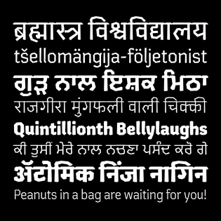
At first, Chikki seems contradictory: How can something brittle, crisp, and textured evoke a feeling of such warmth and familiarity?
If you are familiar with chikki, the Indian snack food to which this typeface owes its inspiration and name, you will understand. Prepared by coating peanuts in a warm syrup made from jaggery, rolling the mixture into a thin slab, and cutting it into squares after cooling, chikki is a household staple in India. It is rare for a typeface to elicit feelings of nostalgia, especially around something as innocuous as a snack, and yet Kimya Gandhi did just that when designing Chikki.
Uninhibited by the rules of the pen, Chikki is instead tenderly rolled out, letting the pieces fall where they may. Where one normally sees rounded shapes in a Devanagari or Gurmukhi typeface, there are corners; and yet, the lack of curves brings an unexpected warmth to the typeface. One could imagine taking a character from Chikki and snapping off a piece at a joint, where the contrast subtly decreases, to indulge in its sweetness.
The multiscript family includes Devanagari, Latin, and Gurmukhi. It carries six weights from light to black, and even offers a free variable version with a purchase of the full Chikki family.
Chikki contributes a voice to the modest landscape of Indian display typefaces by including both Devanagari and Gurmukhi scripts. While many Indian typefaces can fall victim to the trap of latinization, in this case, the Latin emerged much later from the near-complete Devanagari design. The Gurmukhi design started as part of the 35 Days of Gurmukhi challenge and was eventually extended into a full character set. A playful addition to the Gurmukhi design is textile-inspired patterns, pulled from traditional Phulkari folk embroidery designs originating in Punjab.
If ever there were a typeface I could eat, Chikki would find its way to the top of the list.


Very nice work, Kimya Gandhi.
Love this! The accuracy is spot on.