
The interaction between cultures has increased to unprecedented levels, thanks largely to the commercial web, and multiscript visual communication has become crucial to many designers’ practices as a result. Although this necessarily presents lots of intricate complexities and challenges, it also offers exciting new design opportunities.
Visually translating letterforms from one script into another is one such opportunity. Translation means not only faithfully interpreting the style and aura of the original sample, but also understanding the source while remaining true to the conventions of the destination script.
As typeface designers at London-based typeface-design studio Dalton Maag, where creating multiscript custom typefaces for global brands is an important part of our work, we grapple with multiscript communication often and at scale. In 2018, we had a chance to put our experience into practice in a particularly stimulating context: Armenia.

Yerevan, the capital city of Armenia, combines traditional Armenian with contemporary international elements. Shown here is the Cascade, built between 1971 and 1980 by Jim Torosyan, Aslan Mkhitaryan, and Sargis Gurzadyan.
In Armenia, people don’t write only with the Armenian alphabet. From signs and brands to text messages, content often appears in both Armenian and Latin; Cyrillic also crops up often, on street plates as well as on posters. Cohabitation of scripts is therefore no novelty — this rich landscape provides complex challenges to local graphic designers, especially considering the limited selection of Armenian typefaces.


Latin appears predominantly alongside Armenian in contemporary signage. This role used to be played by Cyrillic, which also still figures frequently in the city landscape. These two examples can be found in Yerevan today; the second is a road sign honoring the celebrated inventor of the Armenian alphabet, Mesrop Mashtots.
Many of tomorrow’s Armenian graphic designers come from the ranks of TUMO, an institute that provides teenagers with an education at the intersection of design and technology. A free extracurricular program founded in 2011, TUMO is forming a new generation of designers who will play a key role in shaping the future visual culture of the country.
So when TUMO invited us to give a workshop at its facility in Yerevan, we gladly accepted. For two weeks, four hours a day, we worked with a group of about fifteen students who had little or no experience with type design. Some of them had previously attended workshops led by Khajag Apelian, Gor Jihanian, or Letterjuice. The most experienced students, Mariam Grigoryan and Araz Pogharyan, helped us plan the course.

TUMO hosts thousands of students every week, making innovative programming and state-of-the-art equipment available free of charge.
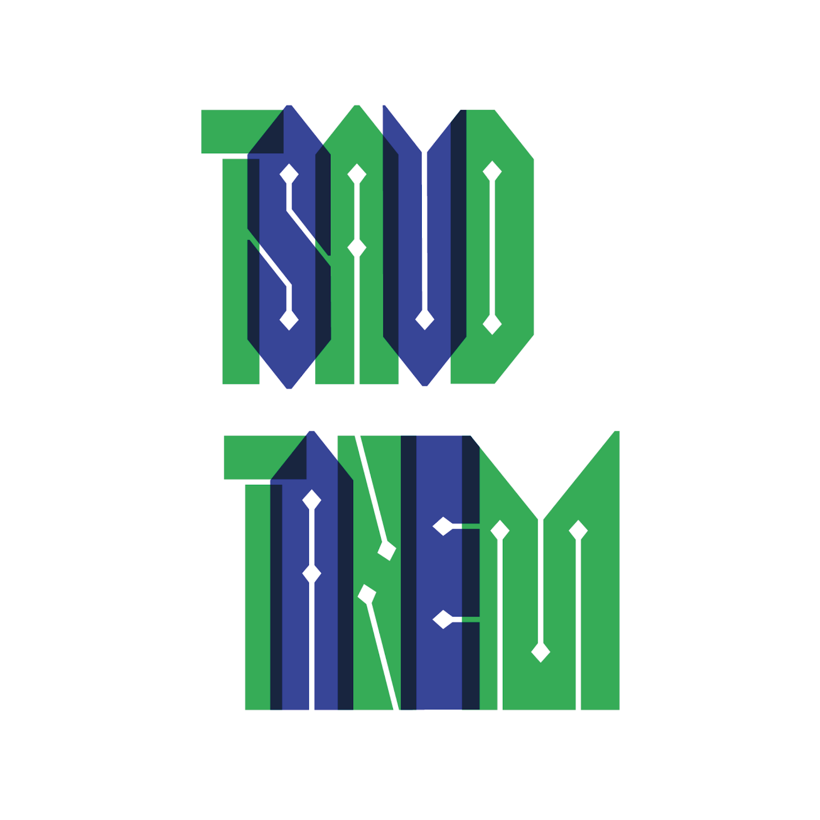
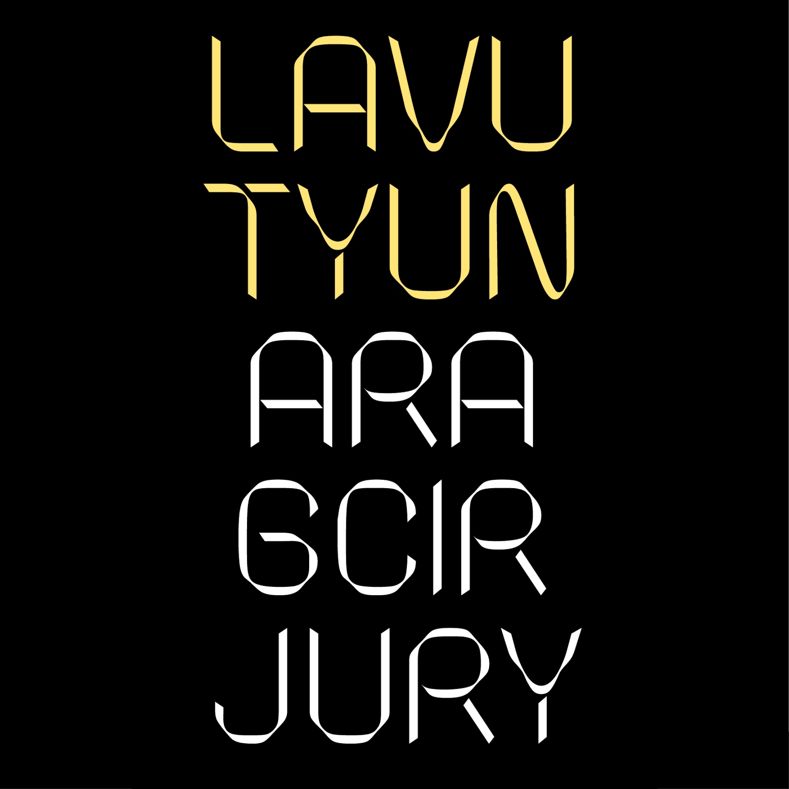
Our workshop had two main objectives: to gain a better understanding of how Armenian and Latin scripts relate to each other, and to teach the students the basics of Latin typeface design. We decided to work with actual sentences, drawing from the unique tradition of Armenian proverbs with their strongly evocative character. Each student selected an adage and set about rendering it as a piece of digital lettering using the Latin alphabet. For the shapes, we wanted to explore the heritage of Armenian vernacular letters; we had compiled a significant database of samples from the twentieth century (ranging from carved slabs on the buildings of Yerevan to lettering manuals) for the students to use as models.
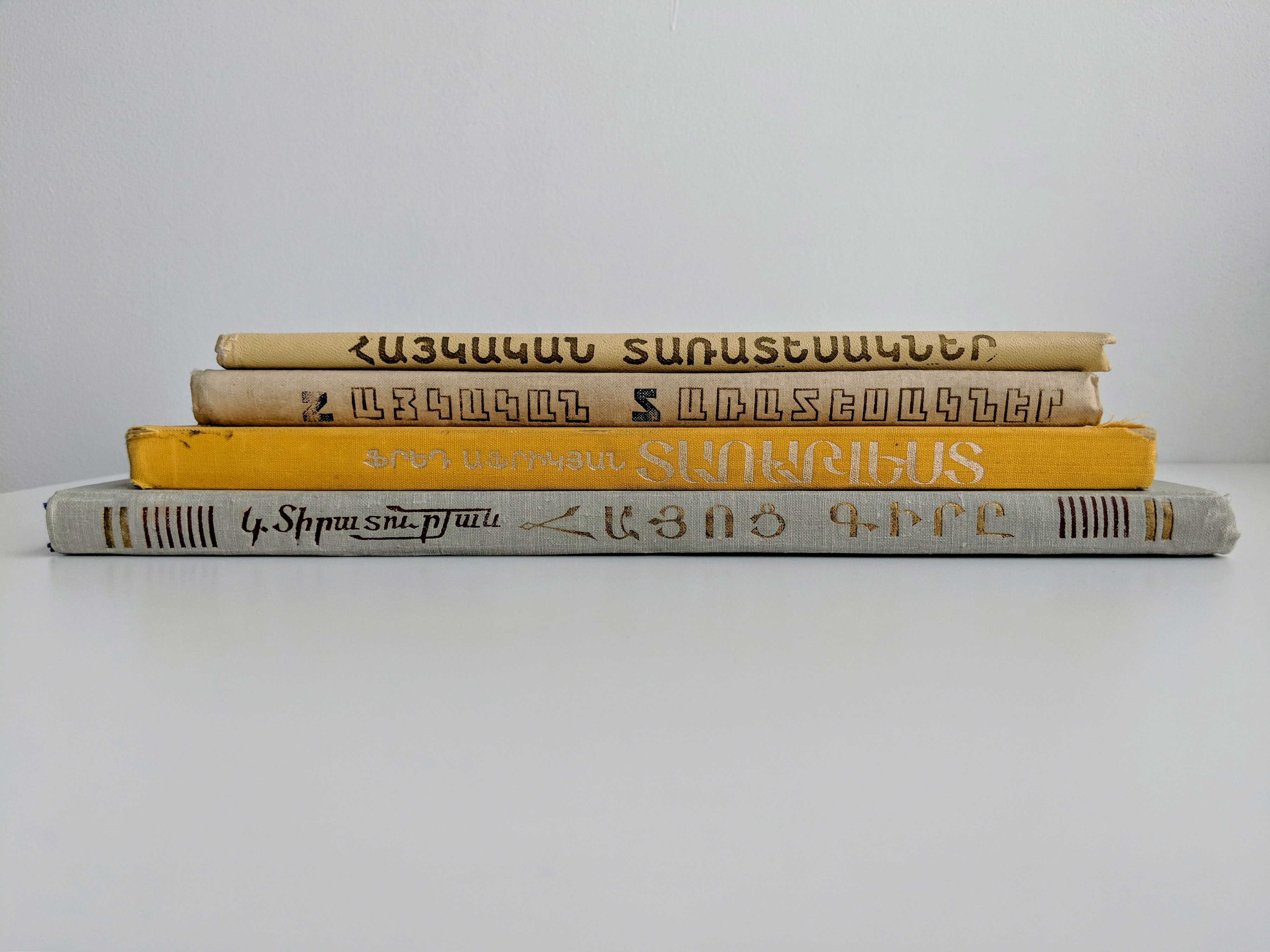

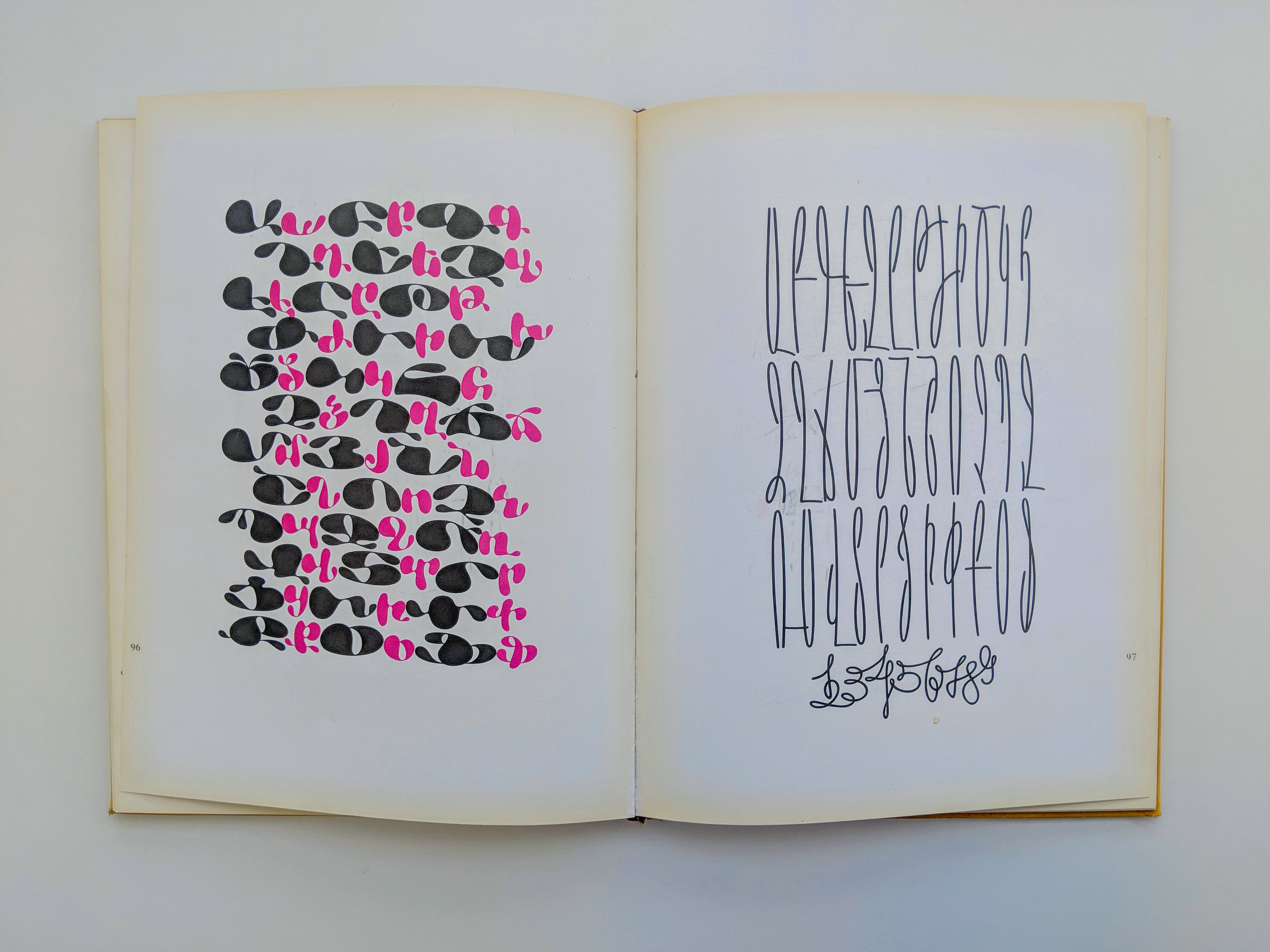
The Armenian lettering manuals of the second half of the twentieth century were among the main sources we used. Top: the lettering manuals of K. Tiratowryan (1963), H. Mnacakanyan (1972), H.N. Gorçakalyan (1973), and Fred Africkian (1984); the latter was the most popular among the students. Center: the frontispiece of Fred Africkian’s manual is a well-executed example of script cohabitation, featuring information in the Cyrillic, Latin and Armenian scripts, in two different styles. Bottom: a spread from Africkian’s manual showcasing two expressive Armenian alphabets.
The first couple of days were dedicated to the exploration of the Latin alphabet. We introduced the students to the fundamentals of broad-nib-pen calligraphy to help them understand Latin letter construction, as well as to the basic optical principles that inform good letter drawing, such as adjustments needed for different sizes. We then introduced the history of the Latin alphabet and the main typographic styles. The schedule was split between short theoretical sessions and longer practical ones that included basic sketching techniques.


Calligraphy and letter-drawing exercises introduced the students to both the Latin alphabet and the discipline of type design. Top: parallel-pen exercise. Bottom: Naïma Ben Ayed leading a group review of a lettering exercise.
On day three, we broached the theme of matching scripts by analyzing differences and similarities between the Latin and Armenian alphabets. We established a set of parameters to facilitate this analysis: alongside formal features like character width and contrast, we included a “Keywords” parameter to encourage students to list some emotional attributes associated with the letters (cf. TypeCooker). To further contextualize this work, we analyzed, as a group, examples of multilingual logotypes found in the streets of Yerevan.

The students analyzed their chosen models according to certain categories, which helped them start building the narratives that would inform their Latin lettering exercises.
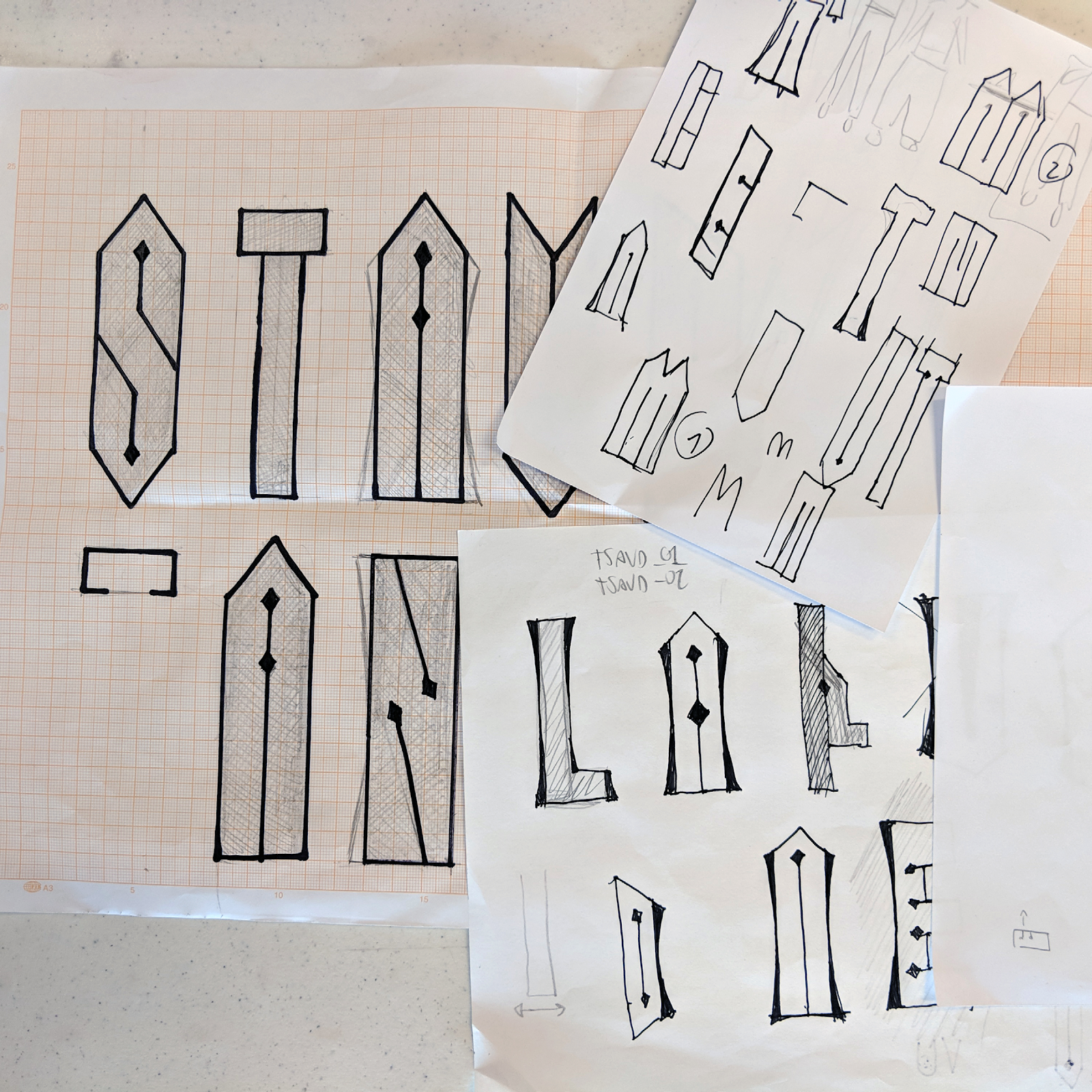
Afterward, each student selected a couple of Armenian lettering references, which they analyzed according to the parameters we defined; they also chose a sentence, taking into account how meaning and letterforms would match. By the fourth day, the students had started sketching their Latin letters, putting to work what they had learned up to that point. The last day of the first week was dedicated to the basic principles informing digital outline drawing, as well as to the introduction of the main functions of the Glyphs font editor. Having laid down solid foundations for the project, we started the second week by digitizing the sketches.
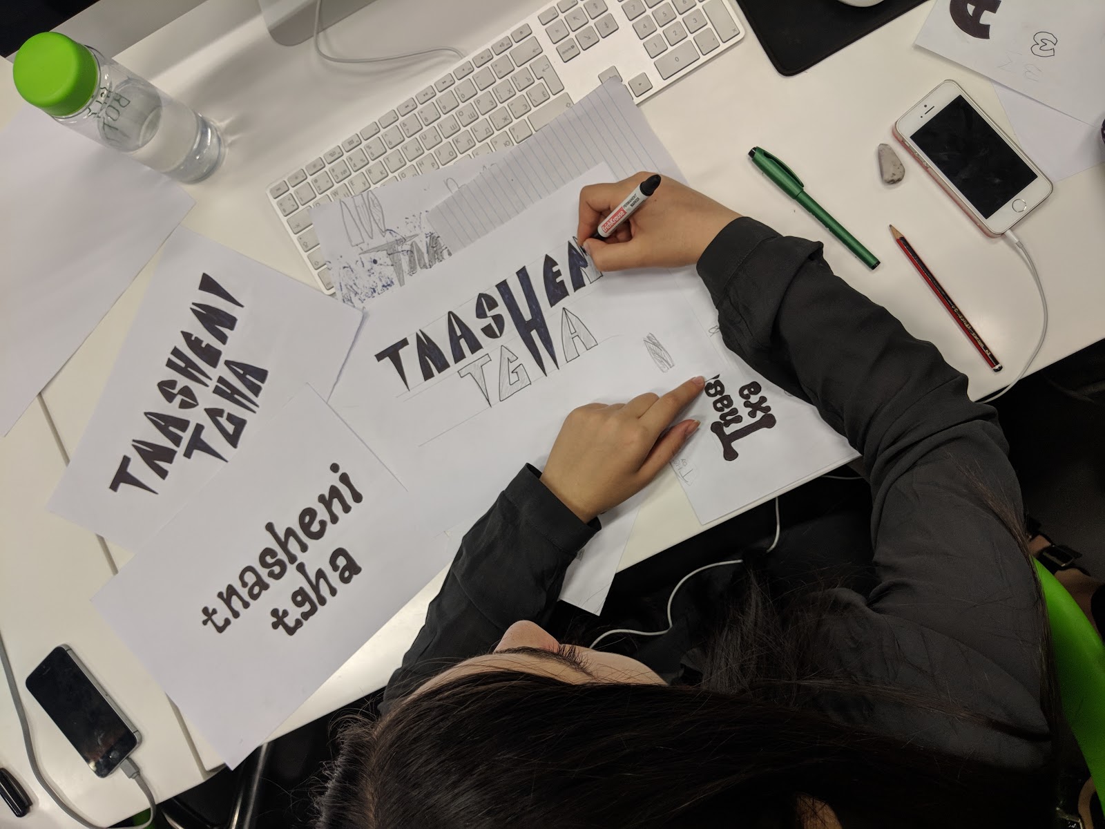

Each student experimented with exploring different design routes by hand before shifting over to the digital environment, where they crafted the final product.
If the first round was a bit rough, each student later managed to achieve a satisfying result after putting in the necessary effort. Refinement is not easy to understand — or to explain. Both of us gave the students extensive individual feedback. We guided them through the steps needed to fine-tune their designs, from consistency of weight and proportions to smoothness of curves to appropriate node placement.
During this second week of work, we did a few collective reviews to sharpen the students’ critical thinking and discuss the common challenges they had been facing. The treatment of capital diagonal letters like A, N, and K was a recurrent issue: since the Armenian uppercase doesn’t have any diagonal strokes, the students had to decide whether to add diagonal strokes to the vocabulary of the Latin forms they were using or avoid such strokes altogether by forcing the lettershapes into verticals and horizontals only. This range of different approaches prompted further discussion about fidelity to the tradition of the destination script (Latin) versus adaptation to that of the source script (Armenian). As a group, we looked at everyone’s Glyphs files on a large screen to go over progress and make final adjustments. We encouraged the students to push their designs further and introduce alternate forms, ranging from conventional to more experimental, sometimes even creating a complete set of alternates.


Group reviews helped students make progress quickly and reduced the learning curve. Top: a full house for a group review session. Bottom: Ruslan Tumanyan discusses his work with Naïma Ben Ayed.
On the second-to-last day, the students brought the typographic artwork using their letters into Illustrator, and we reviewed the results as a group. This step helped bring to light some issues with the actual letterforms, and occasioned the sort of shuttling between font- and text-editor software so typical of the type designer’s daily practice. Ultimately, it felt rewarding for the students to put the expressive potential of their fonts to use in Illustrator. Avoiding any graphics or photographic elements and focusing solely on the composition and color palette allowed us to evaluate the expressive potential of the lettershapes.
The idea of creating postcards occurred to us after we arrived in Yerevan. The choice of this simple, popular format reinforced the concept that, beyond designing letters, each project was about making a particular Armenian story portable and potentially accessible to a global audience.

Each student produced a postcard; this is Gurgen Afrikyan’s. From the top: the Armenian reference sample; sketches illustrating Afrikyan’s process; the front of the postcard; and the back of the postcard, showing the original sentence, its transliteration, its translation into English, and a quick explanation of the meaning.
We anticipated that the students’ lack of familiarity with the history of Latin type design (in addition to working with rather extravagant Armenian letters as a model) could be an asset, helping them bring a fresh perspective to Latin letterforms. When pointing out and discussing design issues, the students surprised us more than once with unexpected solutions. We strove to highlight such aspects in the final public presentation, which is the culmination of every workshop at TUMO. This is the occasion for students to showcase their output, presenting their projects on a large screen in front of an audience: from their references to the final result, with a journey through their sketches. The audience was made up of friends, curious students, parents, and TUMO staff; the room was packed and a little intimidating. Each student explained their design process with enthusiasm and confidence. It was truly inspiring to watch.


Before an audience of relatives, colleagues, and friends, the students showcased the work they produced. Top: Ellen Demirian. Bottom: Yulia Hovsepyan.
It’s important to mention that the references chosen by the students mostly came from the four main Armenian lettering manuals of the late Soviet era — especially the most recent one, that of Fred Africkian, published in 1984. This provided an unforeseen homage to his body of work, which deserves further exposure. Indeed, we hope the fruits of our workshop help give these manuals, which can still readily be found at flea markets, the recognition they deserve. We also paid tribute to Armenia’s rich stone-carving tradition, both through photographic references and through a student visit to Artur Melqonyan’s studio.
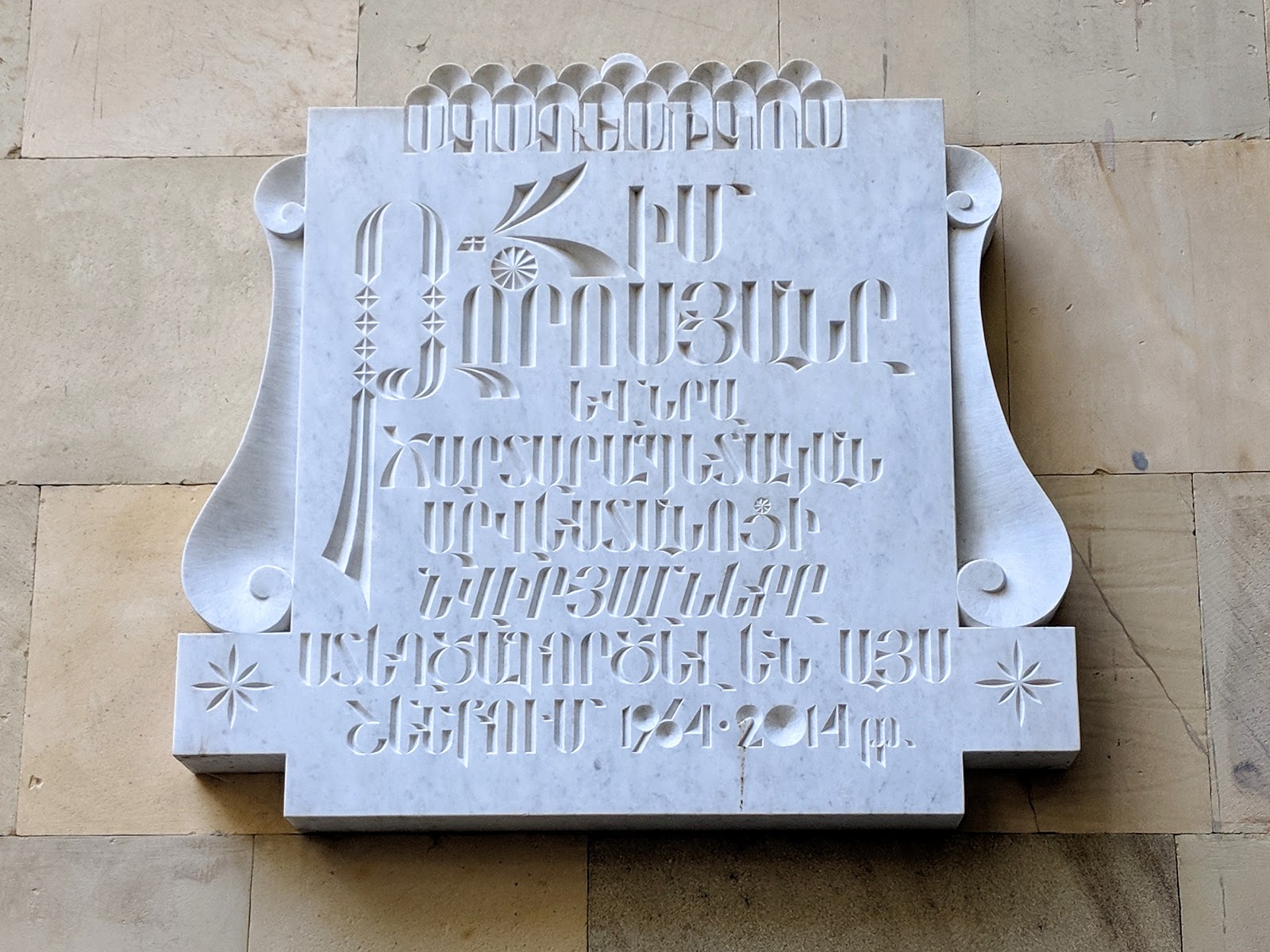

Armenia boasts a strong tradition of stone carving. The lettering styles used are characteristically diverse; slabs are produced to be applied on buildings, typically to commemorate an important person who once lived there. Top: the slab marking the studio of Jim Torosyan, architect of the iconic Cascade building shown at the beginning of this article. (Thanks to designer Vahan Balasanyan for pointing us toward this.) Bottom: students hold the original drawing for the Jim Torosyan slab during a visit to Artur Melqonyan’s stone-carving workshop, where it was cut.
Taking inspiration from such references, we wanted to heighten the students’ awareness of the rich local lettering heritage. Connecting it to everyday sayings allowed the students to tell a story in the context of Armenian identity — a story connecting letterforms to language, and design to culture.
In addition to learning new tools that we hope will prove relevant in their future design practice, the students developed their ability to harmonize different scripts. That’s an important skill set to have in the unique visual terrain of their homeland, but it’s also equally relevant elsewhere, as the global appetite for the design of multiscript typefaces and visual identities continues to grow.
Working on such timely and significant design problems with this young audience made for a remarkable experience. We hope this article encourages others to invest their time in similar contexts, and provides an inspiring teaching method. And we very much look forward to seeing not only how these talented students grow as designers, but also what they bring to the global design scene in the coming years.
Details from postcards designed by Ovsanna Gasumyan (top) and Hovhannes Hovhannisyan (bottom).
We would like to thank all of our wonderful students: Alieta Danielyan, Ani Vahramyan, Christine Proshyan, Ellen Demiryan, Gurgen Afrikyan, Hasmik Andreasyan, Hovhannes Hovhannisyan, Milena Nahapetyan, Naneh Harutyunyan, Natalya Grigoryan, Ovsanna Gasumyan, Ruslan Tumanyan, Yulia Hovsepyan; the Tumo team, Mariana, Astghik, George and Aram for their precious input and constant support and kindness, our great and talented assistants Mariam Grigoryan and Araz Pogharyan; Gor Jihanian, Khajag Apelian, Elena Papassissa, and Hrant Papazian for their invaluable advice and help; and, finally, Dalton Maag for the support.
What a great workshop! Lovely results, thanks for sharing!
Thanks for sharing! I wish you could offer such workshops also for adults. I would definitely join.
This group of Armenian students are so fortunate to be in a two-week workshop with Dalton Maag designers. I’m quite envious. Enjoy reading this.
An inspirational initiative exploring an innovative typographic landscape — intriguing and wondrous. Would love you one day to work with my students exploring typography through time and how that signals the social environment.